Poll results
Save to favorites
Add this poll to your saved list for easy reference.
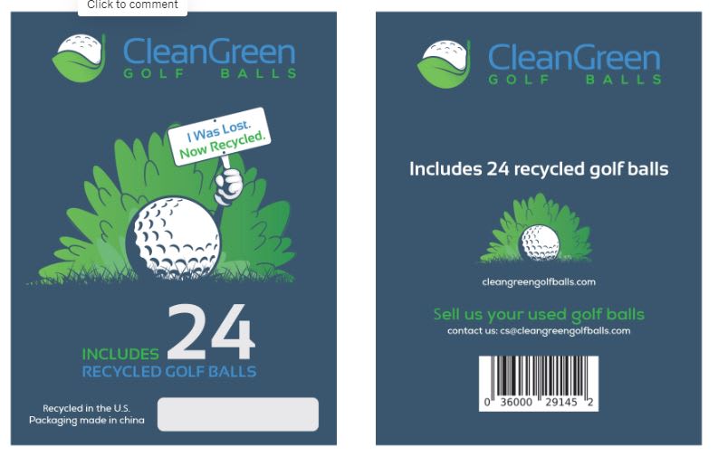
We are designing a product package for walmart shelves. The product is for recycled brand name golf balls. Which of these two product labels would be more likely to entice you to purchase?

13 Responses to Option A
The drawn logo looks really nice and fits the theme well
As this is a green product, the minimalist packaging is very fitting for it.
I like the overall look and feel of the colors and graphics in A. It looks like a 60s board game with a modern purpose. However, it is easier to read what the product is in B
I like the simplicity of the package design. Everything feels very uniform. The large white font used for the number tells me exactly what I'm getting while also being easy to read at a glance. I also like the sign being held up by the golf ball.
This packaging shows what the product is the best and is the most appealing.
This is a really tough choice as both are fantastic. Option B caught my eye first so I was going to select it, but the more I looked, the more I liked Option A so chose it. It still has a very professional feel to it, but the combination of the pun and adding some human elements to the golf ball was cute and memorable. I also liked the color scheme in it. I don't think you can go wrong either way, but personally would select Option A.
I love the graphic. It's funny to see a little golf ball holding up a sign. I love the messasging, too - a lost golf ball, recycled. It's great and attention-grabbing in a way you wouldn't expect. This would definitely grab my attention on a shelf.
I have this weird preference of color over white. It stems from webpages, which the whiteness is blinding sometimes, using a dark color with white text is very much appealing to me on websites and I guess it carries over to other things as well. I like the minimal usage of white on the packaging. I also like the cartoon of the golf ball.
Option B has too many issues. Too many colors (different shades of green). The golf-ball pattern in the right half of B is just straight up ugly. It looks like something from the 90s. A looks CLEAN and modern.
I think the design of A looks more modern and whimsical. B looks very low-effort, plain, and is harder to read in the 2nd white golf ball background image.
The design seems more stylish to me, and stands out as more unique and high-quality
Option A has very beautiful packaging which I appreciate very much. The background of blue with lot of green is very appealing and most impotantly, it makes the white text easier to read. Because I can understand and see the text right away, I know what I am buying. Option B is not bad however. What I do not like about Option B is the back page. Way too much text which makes me feel like I am reading an information booklet. I like simple information and I believe option B does that. I actually think a combination of front page of Option B with back page of Option A is almost ideal but I do appreciate Option A little more. Option A cleverly and with a little bit of humor also lets us know that the balls are recycled so we can be ready to sell used golf balls.
I prefer this option the best. I like the front of the box where it is clear that the package contains lost balls or used balls that have been sold to the company for resale. I think this is a great idea and I would try a box to see what type of balls are in the package.
37 Responses to Option B
I like that option B's recycled is larger and up front compared to option A.
The primary reason is that it's immediately clear that they're recycled as the text is more prominent / visible indicating as such. That's the main reason I would buy them so it's important that it stands out.
More satisfying to see a realistic image
B caught my eye right away. I think A is too muted. I found the information easier to digest with B as well.
I find this design to be more serious. I know golfers take their equipment very serious thus this fits with that idea.
I like the overall design of A better but B catches my attention quicker and more emphatically with the the white banner saying RECYCLED PRO LINE MIX
I like the packaging much better. The colors are vivid and the ball and green looking life-like. It's so attractive it would compel to buy this product.
Options B's packaging looks more attractive and vibrant.
The reason I picked B is because of the overall color scheme. White packaging will definitely show much better than the dark packaging in A. That's very important in a store that carries as many products as Walmart does.
B stands out really well and the picture on the front is enticing. I love the fact I can easily tell at a glance they are recycled and that makes me happy. I enjoy buying green products so this is a no brainer purchase for me and would stand out.
The product packaging in B has more shelf appeal. I like that at a glance, you can tell these golf balls are recycled (thus being more sustainable), and they look like normal golf balls. I think having a real-life image of the golf ball showcased is important. Also, it is easy to immediately know quantity of balls included.
I feel like Option B is more professional. A seems to be more childish and I don't think it shows that they would hold up well after repeated use.
I chose option B because the ball is bigger on the package and also the word recycled is bigger so it shows more attention than A.
The design and the illustrations in option B's image is better.
I picked B as my top choice as I like to see the real picture of the golfball.
Option B has a phone number to call should online contact not be readily available.
Option B's more realistic graphics and enticement to sell then our used golf balls makes it a more appealing choice to me.
I think option B is more eye catching, easier to read, fits the message more, and feels the most premium which makes me the most likely to buy.
First and foremost, as a golfer, this is a great product. Choice A is too monochromatic. My eye immediately went to the "golf ball background" on Choice B. Choice B also has a cleaner, more professional look. If I saw A on the shelf, I would assume the package contained range balls or x-outs, and I would not be interested. The cartoon golf ball on choice A takes away from the credibility of the product. Choice B looks very professional. Golf is not a sport for cartoon golf balls; golfers want packaging that conveys the same passion for the sport they have. Choice B looks similar in presentation to the packaging for new, high quality golf balls such as Titleist.
Option B looks more professional and like a typical golf ball package. It looks like a viable golfball. Option A looks a little weird and not serious.
B has a much more modern design and not as cartoonish as option a. I like being able to see the actual picture of the ball also in Option b. The back of the package is also easy to read and clearly notes that i get 24 recycled golf balls.
The color is the most important thing. The bright white gets my attention more, maybe because it's the same color as a golf ball. Then I can see that the balls are recycled.
It is easier to see that the golf balls are recycled and I like the realistic photo that is used on the packaging. I can also easily see their contact information which makes it seem more trustworthy.
I choose B because B has better graphic design with appealing illustration and detailed information for customers, compared to A
I like that it looks simple enough and I LOVE the idea of selling my used golf balls for a good cause. Kudos to you! Considering how many I lose, I wouldn't mind giving back in some way. Very nice product!
I like option B the best because it's very easy to see that the golf balls are recycled due to the "Recycled Pro Line Mix" tex that is written over the golf ball.
Overall, option B appears to be more professional and well put together. The anthropomorphized golf ball in option A is off-putting, and overall the design appears amateur.
The text is easier to read to make it apparent that this is a recycled pro line mix of golf balls.
I liked choice B since the label looks more confident and respected while being trustworthy. Choice A looks more playful and childish which isn't as appealing.
I strongly prefer the option B clean green golf ball product labels because I like the realistic photograph of the golf ball on a bed of grass much more than the anthropomorphic golf ball illustration seen on the option A product label.
I liked option B the most because the lighter background made it much easier to see the various benefits that were advertised.
I prefer B because the reycled is in the middle so I know that it is recycled. A is too dark and the packaging isn't eye catching.
The design is quite attractive and more engaging than A. The overall color used is very original and professional
I like this label the best because it looks like it has a real picture of a gold ball on it. It does not look too much like a cartoon. I also think it is pretty funny
I prefer the photo of the golf ball to the illustration in A, and generally prefer the overall design.
Option B provides with clear text about the product and an image about the product description with environmental certifications.
Looks more professional
Explore who answered your poll
Analyze your results with demographic reports.
Demographics
Sorry, AI highlights are currently only available for polls created after February 28th.
We're working hard to bring AI to more polls, please check back soon.

