Poll results
Save to favorites
Add this poll to your saved list for easy reference.
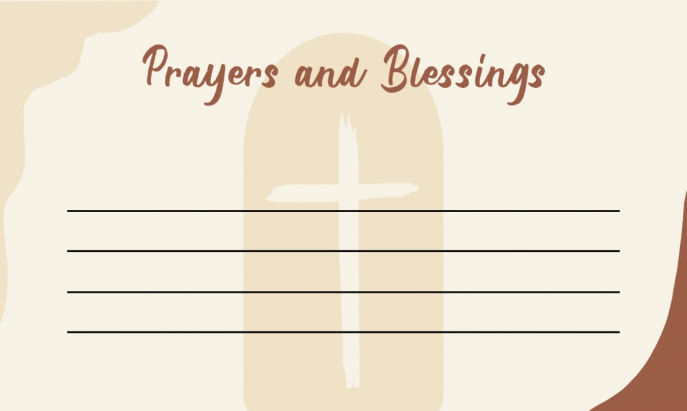
What Designs do you like the most? This is a prayer card that you will write your prayer on and put in a box at the church.
Option A won this Ranked poll with a final tally of 26 votes after 2 rounds of votes counting.
In a Ranked poll, respondents rank every option in order of preference. For example, when you test 6 options, each respondent orders their choices from first to sixth place.
PickFu requires a majority to win a Ranked poll. A majority winner differs from a plurality winner. A majority winner earns over 50% of the votes, whereas a plurality winner earns the most votes, regardless of winning percentage.
If an option does not earn a majority of votes, PickFu eliminates the option with the lowest number of votes. The votes from the eliminated option are reassigned based on each respondent’s next choice. This process continues in rounds until a majority winner emerges.
Scores reflect the percentage of total votes an option receives during the vote counting and indicate the relative preference of the respondents. If there is no majority winner, look to the scores to see how the options fared relative to one another.
| Option | Round 1 | Round 2 |
|---|---|---|
| A | 42% 21 votes | 52% 26 votes +5 |
| C | 40% 20 votes | 48% 24 votes +4 |
| B | 18% 9 votes | Eliminated 9 votes reassigned |
Age range
Education level
Gender identity
Options
Personal income range
Racial or ethnic identity
Religious affiliation
21 Responses to Option A
I think the print should be on top. Other than that, I liked these graphics the best.
I choose "A" because it says "Prayers and Blessings" with a cross on the stone.
I like the cross in the background as that represents faith in Jesus and prayer
Just a sun is boring and doesn't tie in to the idea of the prayer card. I like the small stars, and option A is the best with the background.
A is more attractive than the other 2 cards. The background attracts my attention
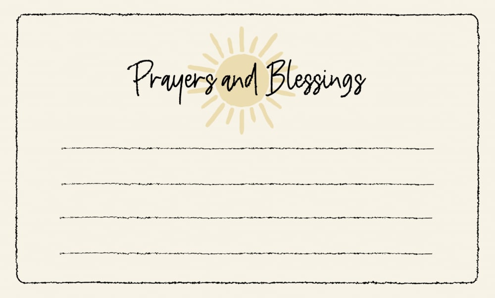
I prefer option "A," because I can immediately read what this card is for, and I don't have to scan the entire card. I picked option "B," as my second choice, because the color of the lettering, was easier to read, than the black color on option "C." With option "C," I could not easily read what the words were saying, because of the black lettering. I found the black color of the lettering, to be difficult to read, even while wearing my glasses.
I really liked the cross in the background of Option A - it was prominent and would make me feel connected to God while writing on the card. I also liked the font in that option the most. I liked Option C second best because the sun behind prayers and blessings looked vibrant and appealing to me. The design was simple, but attractive. The design on Option B looked a little disjointed to me. I did not like the way the different elements were spaced out and it just looked a little chaotic compared to the other two choices.
To me, if I am going to leave this in a prayer box in a church, I think Option A is the best choice. I like the cross in the background of the card and I like the more muted colors. I think for something like this, a simpler design is better.
Option A is very clear and i love the font followed by option c
Option A is such a lovely choice. It looks so peaceful and could see myself writing a prayer on it.
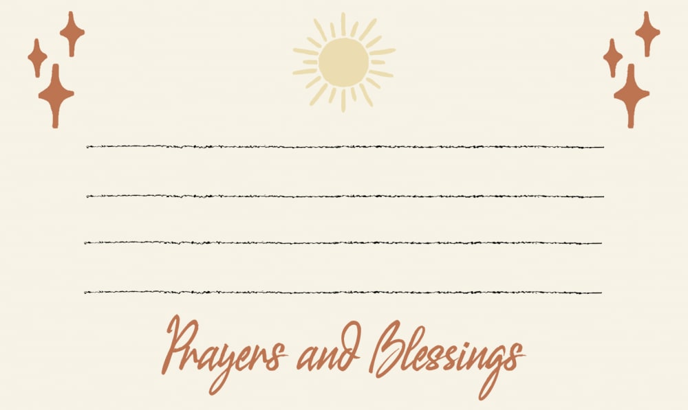
I like having the title at the top. I do prefer the more cursive font of B. I think the image in the background is a nice touch. I am not sure why there's the curved section in the bottom right. It should match the design of the top left.
I selected the prayer cards that I felt were the most visually appealing, attractive and pleasing to the eye.
I like option C with the cross in the background.
Option A is my first choice because I love the large cross being in the background in the center of the page. This cross reminds me of faith and that is what we need when we pray. Option B is my next choice because It has crosses on each side and the center has the sun that God has created. Option C is my least favorite. The sun is a beautiful design but since I am asking for prayers I like the addition of the cross added to the prayer card, as in A and B.
I chose A first because I like the design of the cross on the card.
A and B are both very nice. I like the cross image on A just slightly more than the stylized ones on B. I'd like either one at my church though. C is not very attention grabbing. Still it would be an appropriate choice. I think A is most classic, and I lean that way.
I like the one with the cross on it. This one looks warm and happy and like it would spread cheer.
I prefer option A. I like the background cross on this card. Very simple and attractive.
I like A because of the font that is used that make it seems classy . B is next because I like the graphics at the top and C is last because it is too plain
After carefully studying and comparing all three images of Prayer Cards displayed above, I selected Option A as my first preference and the one that I would most likely click on to purchase for my own Church. I felt that this image had the most eye catching appeal to me personally especially due to the cross in the image. Option B was my second choice followed finally by Option C with all three rankings based on my own personal opinion of the relative attractiveness of each product image.
I chose A as my first choice because I like the cross and the placement of the wording. I chose C as my second choice because I like the placement of the sun with the wording over it. I chose B as my final choice because I like the sun placement, the wording placement, and the side images.
9 Responses to Option B
The font felt too serious in A. I liked that it looked more feminine in B and appreciated that it looked lighthearted in C.
I like b first since it is yellow and cute and the font is nice looks pleasing to the eye, then a since it is cute to but the fojnt is not that great than c is ok, not the best a liittle boring
I love how the writing is on the bottom of the page in option C, I also love the font and happy design around the border, very aesthetically pleasing.
I like the crosses and especially the little crosses with the sun in B.
I like B's sun and crosses. it makes it look unique. The black lettering on C makes it stand out. A seems more plain.
While the cross is nice, I light the sunshine and light designs on the other cards better. All of the cards are nice however.
I like the design of option B the most, the sun and the crosses look nice and I like the script. Option A looks nice too, it has just the right amount of design. Option C looks a little plain with just the sun.
I prefer option B because card itself looks more open and bright while still showing nice symbols, there is a good balance throughout.
i like the first card better than any other card designs. I think the first one is more appealing because of how they designed it and it feels more for a card for church
20 Responses to Option C
I like the simplicity of C. I wouldn't want something as busy as A for me to write on. I liked B okay as well.
I think that c looks more inviting and friendly.
I like the sun because it is light. Jesus is light and with light there is hope. With a prayer request we are hoping that something happens or changes. It is a perfect symbol to relay hope.
When I write, I want unobstructed space on the paper. In this order, there's fewer distractions in the writing area.
C has a very soft spoken design and message that I feel is holy and holds a lot of sanctity
I really like the sunshine the best. It makes you feel uplifted.
I like C because I like the sun at the top with Prayers and Blessings across it. I also think the outline around the card makes it look attractive and balanced. I don't really care for B or A because I don't like the orangy red color and I especially don't like the cross on the tombstone in A. That looks odd to me and it's distracting.
I preferred the title of the card at the top. Choice #1 has the sun that is hopeful and joyful for a good future. I also like the cross on #2 but people using the cards probably need the sunshine and hope.
I don't like that their is a background in A. I like the font the most in C.
I like C the best as it is more simple and I like that. B is next as I like the sun. and A is last but ok.
C seems current and inviting to me whereas the other two seem old fashioned and "churchy". A little more color for all of them would be helpful. C seems uplifting with the sunshine on it making me feel warm and encouraged.
I like the simplest design best, although #B is nice too. I don't like the image of the cross covered by lines nor the idea of writing on top of the cross image.
I like the clean design. It is all there at the top. Seems well done. I like the cross on the background. The sparkles on b seem out of place
Option C has a font that is up to date and modern, I love it as a font fanatic person in the past as well as now. I like the little sunshine graphic too. Option A has a cross on it which I am really fond of, it means much to mean to see that on anything. Option B is nice but those tiny stars just don't make things pop for me. There is a lot of sunshine and font there which is pretty nicely done. But it isn't my #1 or #2 choice either.
I like Option C the best. It's fresh looking and charming but still has a sense of solemness. Option B is also quite nice with the script looking modern and alive. Option A is the least successful for me as it looks quite ordinary and not particularly interesting or winning.
I prefer the more cheerful look of C, the A option looks more like a funeral card
The are all okay. C is what I would expect to see in most churches.
The black font over the yellow sun looks best. The design is simple and attractive.
I like the sun and the beams at the top of the page - it makes it look like your prayer will be answered.
I like the sun image in option C because it is bright and it would cheer me up. I also like the cross on Option C. I could see these cards being a wonderful gift for my mom.
Explore who answered your poll
Analyze your results with demographic reports.
Demographics
Sorry, AI highlights are currently only available for polls created after February 28th.
We're working hard to bring AI to more polls, please check back soon.

