Poll results
Save to favorites
Add this poll to your saved list for easy reference.
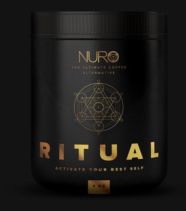
What is 1 thing you like and 1 thing you do not like about this bottle design?
Age range
Coffee drinker
Education level
Gender identity
Personal income range
Racial or ethnic identity
50 Responses
I'm interested in the idea of a coffee alternative, but the logo and title make this look evil to me.
I really like the circle and triangle design, what I dont really like is the sort of gaudy look with the gold
Looks fine to me. I really don't have any problem with it. Well done. Have a nice day
I really like the black background and gold accents. I don't really like the logo
I like how upscale and classic black and gold the look is. I don't like that it doesn't tell me how this coffee alternative is any different than any other. And it's only one oz, I wouldn't buy it.
Like: the dark gold lettering on the black bottle. Implication is wealth and sophistication.Dislike: Te sort of leather look. Perhaps a sleek shiny black look like obsidian or jet would be better?
i think the black color is too dark for me
I like the symmetry of the design. The icon in the center and text give the appearance of a uniform and well laid out product design.I do not like the color chosen. I think gold is generic color to try and imitate prestige.
I like the colors and simplicity of the design. I think the claim to make me my best self is too far.
I love the logo and symbol, theres not really anything i dont like
I like the black and gold together. I don't like how small the text at the top is.
I like the dark coffee like color and hold lettering. It's really small--only 1 ounce.
I like the gold and black color schemeI do not like the symbol and the writing above it. I find it too faded to completely see it.
I like the color scheme. I don't like that the logo is not very prominent.
I like the bold colors but I don't really care for the small font size.
i liked the gold and black colors paired with a modern designi don't like that i really don't know what it is. a coffee alternative? is that just caffiene? do i need a coffee alternative? why?
I like the colors used and I do not like the shape
I like the color combination, it’s bold and striking, and there is nothing to dislike.
i like the black and gold a lot. Personally there is nothing I dislike. I also like the logo by the way
I really enjoy the black and gold color scheme of the bottle. That makes this product appear like a luxury item. The geometric design in the center is also quite pleasing to look at. I am not partial to the geometric design in the 'o' of the product title, 'Nuro.' It seems a little unnecessary and kind of makes the text more difficult to read.
I like that the font for Ritual is really bold and confident. I also appreciate the classy elegance of the gold against the black. I think the font for "the ultimate coffee alternative" is too flimsy and hard to read.
Honestly, this is a beautiful design. I love the sacred geometry, the name, everything about it. What I don't like? The product inside, people can pry coffee from my cold dead hands. I guess other people may not appreciate the pagan/sacred geometry connections. And it's a little pretentious. But it is dead beautiful design. Love it.
I like the sleek design on this label. There isn't anything I can dislike about this.
I really like the attention to detail placed on the product. Everything from the central design, coloring, and even spacing has a ton of heart. That being said, I really don't like the gold box around the "1 oz" label and the "O" in Nuro. If the text itself was gold over the black, or without a box, it would stand out without being noticed as a dominant feature. Too much centered around attraction marketing can create dependence on the design, making it hard to tell if the product itself sold or if the design sold. Simple is sometimes better.
I like the black and gold color scheme and how intense and cool the all black background makes this product look. One thing I don't like is how big the RITUAL name is in comparison to the rest of the text and the logo.
THE COLOR IS CLASSEY AND ELEGANT. I THINK EVERYTHING ABOUT IT IS COOL AND LOOKS LUXURIOUS.
I think the design is very aesthetically pleasing and eye catching. However, the design does not really tell you that it is for a coffee brand.
i like the font it really pops against the black the gold font really is good, i dont like the name in the center it makes me think of witchcraft
I like the black and gold ALOT. I don't like the design and ritual, it almost seems... satanic?
I like that this bottle looks very modern and sophisticated. I do not like the shape of it as it seems kind of tubby to me.
I like the gold on black color scheme but I don't know what the actual product is at first glance.
I love the design and i especially love the colors Gold text looks great on the black. I can't find anything that I don't like about it.
The idea is a good concept of idea because of the uniqueness of the design and the display content of the image, the design looks good and attractive and will call more attentions to it, it a beautiful color design and it is pleasant to the eyes
I like the cool design. I dont like how everything is so dark.
I find this bottle design quite attractive and bold. It fits the product well as I would expect my coffee to be rich and bold. I think black and gold is a good color choice as well since coffee is black in color and gold can represent a premium quality. I suppose the one think I may dislike about the bottle design is the symbol used on the bottle. I don't see a connection with the desing being used and how it relates to coffee.
I love the colors/design. I dislike that the product is hard to tell what it is.
I like that is mysterious and elegant. I dislike that the gold text is so thin because it is hard to read against a black background.
I like the shape and look at the bottle do not like the font size
I like the font because it is bold. I dislike how small the illustration is.
I think the coloring and texture of the logo looks terrific. I love the black and gold. And the design looks interesting. The only iffy part to me is the top with the much smaller harder to read text. Id want that to be larger for "the ultimate coffee alternative"
I like the overall appearance and design. I do not like the look of the lid, looks like it could be hard to open.
love the uniform look its simple yet strong
I like the color combination but don't like how empty the design looks.
There is nothing i dont like about this design. I could see someone maybe making an argument that the symbol envokes satanic symbolisms, but for me i think its great.
I like the contrast of the gold on the black. I don't like the writing under Nuro. It's hard to read.
I like the gold print. I wish the picture had a lighter background because the black background swallows up the black jar and there is no contrast. I like the name ritual and the ritualistic looking symbol.
I like the gold color of the text, it gives the product a classy look. I don't really like the logo and the black background it makes the product look a little creepy and scary, it reminds me of dark forces and magic.
I really like the gold letter foiling. It works well. I dont like that it doesnt tell you what its used for.
I like the color scheme. It has good contrast and has an elegant, clean, eye-catching look. I think that the description of the product should be a bit more clear. Is this a coffee drink? A coffee substitute drink? Is it an energy drink? Pills?
I like the font, I do not like gold, Silver would be better.
Explore who answered your poll
Analyze your results with demographic reports.
Demographics
Sorry, AI highlights are currently only available for polls created after February 28th.
We're working hard to bring AI to more polls, please check back soon.

