Poll results
Save to favorites
Add this poll to your saved list for easy reference.
When shopping on Amazon, which tarot card deck would you be more likely to buy based on the design, and why?
Option D won this Ranked poll with a final tally of 29 votes after 3 rounds of votes counting.
In a Ranked poll, respondents rank every option in order of preference. For example, when you test 6 options, each respondent orders their choices from first to sixth place.
PickFu requires a majority to win a Ranked poll. A majority winner differs from a plurality winner. A majority winner earns over 50% of the votes, whereas a plurality winner earns the most votes, regardless of winning percentage.
If an option does not earn a majority of votes, PickFu eliminates the option with the lowest number of votes. The votes from the eliminated option are reassigned based on each respondent’s next choice. This process continues in rounds until a majority winner emerges.
Scores reflect the percentage of total votes an option receives during the vote counting and indicate the relative preference of the respondents. If there is no majority winner, look to the scores to see how the options fared relative to one another.
| Option | Round 1 | Round 2 | Round 3 |
|---|---|---|---|
| D | 44% 22 votes | 50% 25 votes +3 | 58% 29 votes +4 |
| C | 30% 15 votes | 32% 16 votes +1 | 42% 21 votes +5 |
| B | 18% 9 votes | 18% 9 votes | Eliminated 9 votes reassigned |
| A | 8% 4 votes | Eliminated 4 votes reassigned |
4 Responses to Option A
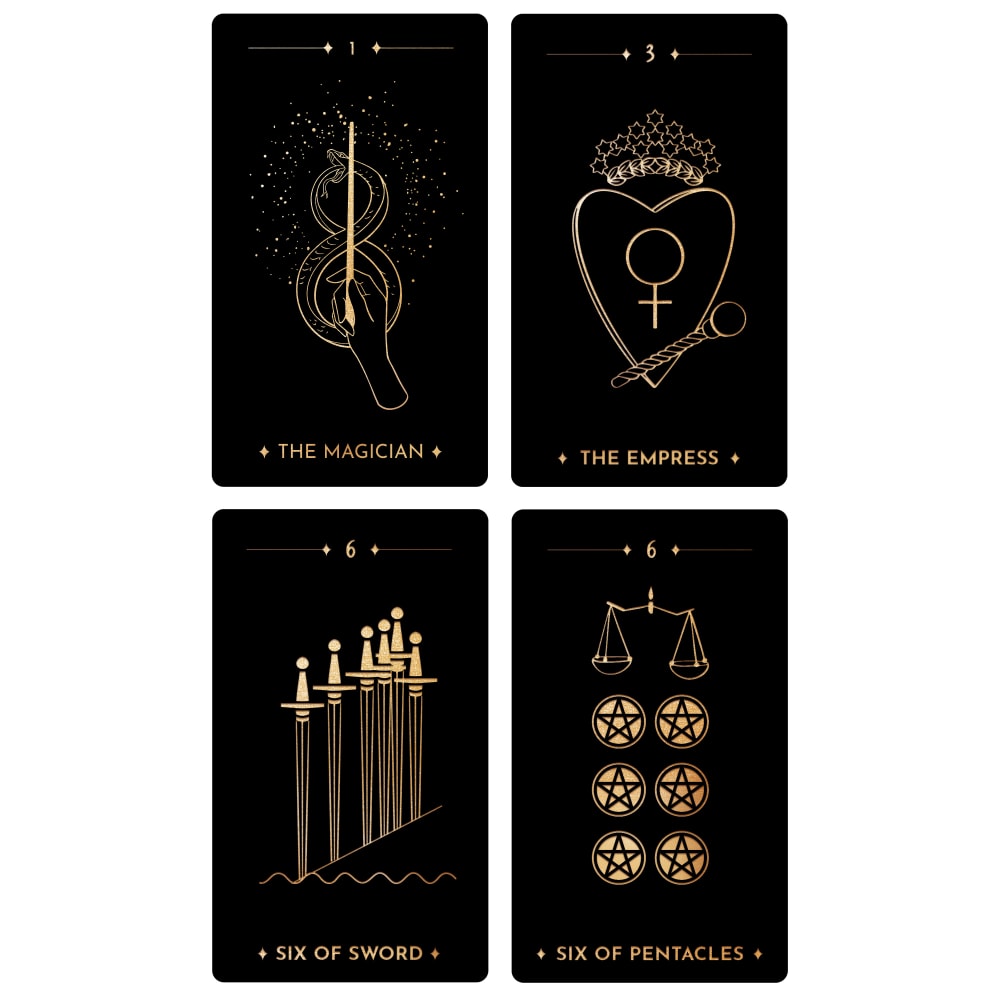
A isn't as overly decorated as the others. That draws my attention. I prefer that.I like the silver and the two-tone color in D so that comes in second.I prefer the gold color to the rose gold of B so C gets third and B gets fourth.
I prefer Option A as my first choice. It's the simplest and plainest in design but there something very appealing about it's simplicity. The symbols can be better discerned and it's sleek looking as well. The remaining options are perfectly fine but way too overly designed. They look A little tacky and the actual cards are hard to read.
I prefer option A because it has the most beautiful, yet simple designs.
I like option A the best. I love the designs and they jump out and grab my attention the quickest.
9 Responses to Option B
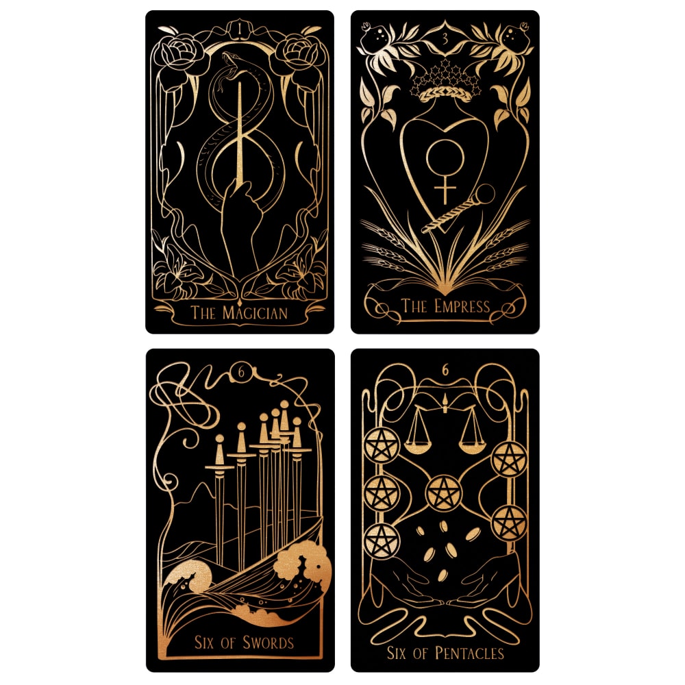
I choose option B because they look more elegant and magical.My second option would be D, because it reminds me of mandalasIn third place would be option A, although they seem very simple to me, they have something elegant in their design.And finally option C I don't like the design is too extravagant and with too many details
I thought option B art design stood out to me. Option C and D, looked good. I liked the art for option C more. Option A, looked a little plain and a bit lacking which is why I ranked it last.
A looked too dull and plain to me. I liked the vibrancy and dynamic nature of the designs for B.
B and C are the most intricate, detailed, informative and high quality. B is slightly more detailed than C. D and A lack detail, making them less interesting/eye catching.
I like the more simple easy to process and not too much going on cards the best.
I like B and D the best. I think they are attractive designs.
I love the mysterious design on B, I like the detailed symbols on C, I love the glimmer on D and I love the simple and sleek look on A.
The design on these are amazing. They are complex, but not too busy where you cannot understand what is going on in them
i like the more gold look of choice B the best and i feel like it stands out more
15 Responses to Option C
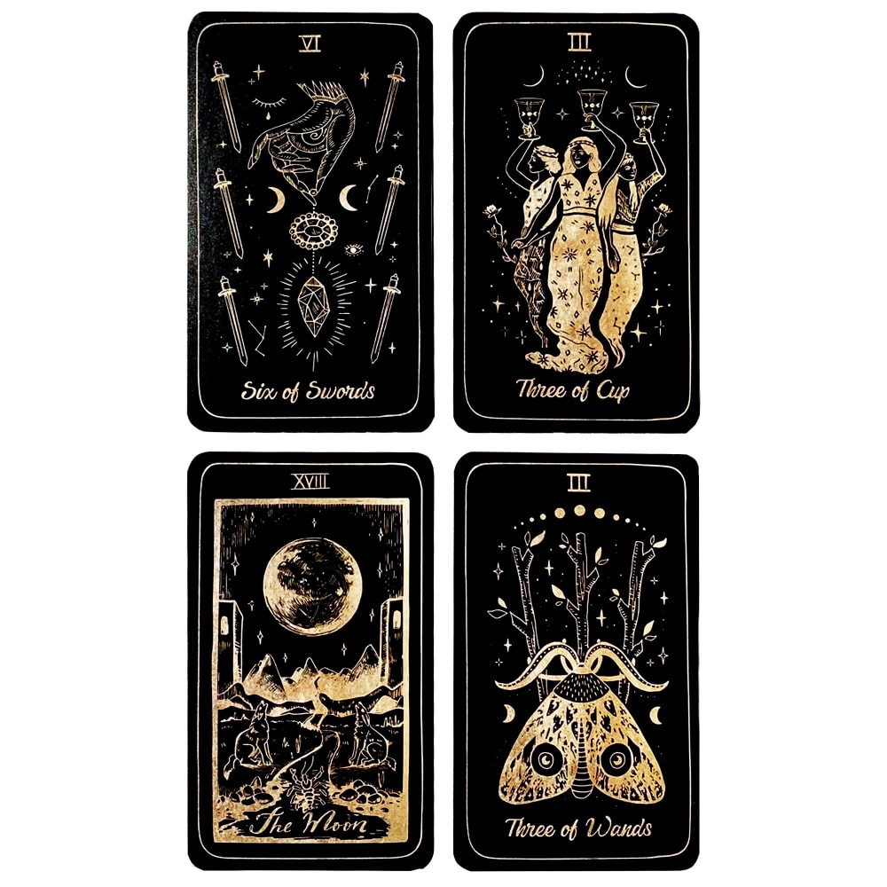
Ranked according to my taste in patterns/pictures.
I like the gold color best in C, B, and A. C and B have the best detailed drawings. D would be better if the gold color was changed.
I like a lot of detail work for tarot cards so I ranked them based on how intricate the design was for each one. C and D definitely were the most interesting ones.
The symbols seem easily recognizable with this design best in this order.
C and D are my most favourite of all of these. They are incredibly detailed and I love the look of them
I like the intricacy of the design and yet they're not overwhelming like I feel B is. I thought that the gold looked a little less bright and more antique, which seems right. My second choice I liked the stars in the background.
the art of option C is out of the box, unique design, its really amazing, I like the design as it is exceptional
I chose the more detailed images because they tell a story and i think the designs are very unique
Choice C is the most intricate design. I like the details and font used. It looks authentic. B and D are nice, but don't draw my attention the way C does. Option A seems very basic and boring.
The images on these cards seem more vibrant and interesting.
I Like the designs of choice C the best. I also like B and D, they have some good items that are engaging. A is a bit plain.
I like tarot cards and enjoy all of these sets. However, my favorites are the ones with the pentagrams and the dead head moth.
I think that C has the most pretty and visually interesting designs. I like the winged insect, especially. The other options with the plain line drawings are a bit boring. I like the gold and black color scheme.
I ranked the ones with the most details in the artwork and writing higher.
out of all the choices option C looks like a luxury product
22 Responses to Option D
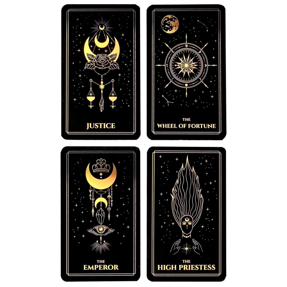
I think that option D does the best job of displaying what the tarot card is. I like the bolded font and how it stands out. Option C would be my next choice because I think that the font is really cool and I like that I can actually read it. Option A would be my next choice because the font is okay and I like that I can actually read it. Option B is my least favorite because I can't hardly read the font at all. I want to know what each card says and not have to strain my eyes to figure it out.
I like seeing the crescent moons. They are appropriate for Tarot cards.
D is the best because the images drew my attention the most. B is the worst because the images look too big to fit into the cards.
The images on option D look whimsical and mysterious. These are the things I think of when I imagine tarot cards.
I picked D because I loved the star background, followed by A because I liked the more minimalist design and B for the illustrations. I didn't like C's font or overly detailed style.
I would be more likely to buy D; the designs are appealing - not too plain, and not too complex, and I can read the titles easily. B and A are just ok. I don't like the designs and the script of C.
I wouldn't buy any option but D. B is busy but still well designed. A looks half finished and a little rough. C is just plain and incomplete still, not worth half as much as the others.
I definitely like each card having some sort of border, so I like D the best. B has frames that are like borders, but sometimes the text is inside of it and sometimes outside, that's a little jarring. A is also okay, but it doesn't have as much of a border, though the layout of each card is the same with the horizontal lie on top and the card name at the bottom so it's still cohesive. C doesn't look like professional art --- really cheap.
I would buy option D, the cards designs are nice and clear and the print is easy to read. Option B has nice designs but the print isn't that easy to read. Option A's designs are a little plain and option C's designs aren't that clear.
I would buy Option D. I really like the borders on these designs. It frames and accents the art really well.
I chose option D first because of the starry background that seems to make the black darker on these cards than any of the other three. I prefer the D designs and how I can read the cards at a glance. I also like C quite a bit because of the designs that have a bit of the starry effect, but like B and A a lot less.
I think option D is the nicest to look at with the double border around the signs. Option D looks very elegant.
I like them more simple art design of option D
Made my choices based on which design I like and would buy based on the design. Design D is the one that I like most and would buy. The design in D stands out and grabs my attention.
D looks both ancient, yet modern and artistic. It is the perfect blend of styles.
I like D because while the pictures are detailed and interesting, they don't take up the whole card so it is not too overwhelming. I also like how clear the font is for the name of the cards. I like C next because I think they are very pretty cards but I don't like the font of the text at the bottom. Choice A is more simple and a bit boring but I like it better than B because B's images don't really make sense to me in context of what card it is supposed to be.
I like being able to easily read the card name, and it's much easier on D than the other options. I also like the artwork. I have to say that I was drawn to the simplicity of A as well, but I liked D just a bit more.
I made my choices based on what I believe that terret cards look like I’m not very familiar with terret cards although I do know what they are but this is what I would expect them to look like and so these are my top choices from 1 to 4. I didn’t want anything that was too horny and nothing that was too simple. I found my top choice to be something that was in the middle of that.
I chose option D first because of the design most especially the fact that it has the wheel of fortune on one of the cards.
I really like the focus on the celestial and the hansa.
I like D the most because I like how the images are drawn for the different cards but then they all have a similar background with the star shapes and constellations drawn out. That gives a nice dimension to the images on the cards. I like how some parts of each design are colored in more so you get a nice pop of gold. A is second because I think the designs on these cards are very original. They have a very unique style to the drawings and the designs for some are not the typical image you would expect, like the one with the planchette. It makes it seem like a lot of thought was put into making these cards unique. B is third because I like how the card designs fill up the whole card, but some of it just turns into a border around the edge of the card, so it's not like the entire space is taken up which helps to keep the designs from being overwhelming. C is last because there is so much going on that it is a little overwhelming like the one shown for The Moon. Maybe that is because more of these drawings are shaded in with gold, so it just looks a little too busy for my taste.
D - It has a very clean and modern look. It really stands out to me as something different. C - A more classic look, intriguing graphics. B - This looks more boring and standard to me. A - Too minimal. It's very dull.
Explore who answered your poll
Analyze your results with demographic reports.
Demographics
Sorry, AI highlights are currently only available for polls created after February 28th.
We're working hard to bring AI to more polls, please check back soon.

