Poll results
Save to favorites
Add this poll to your saved list for easy reference.
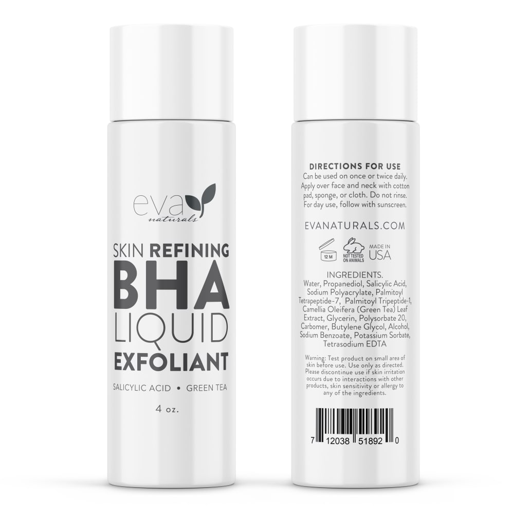
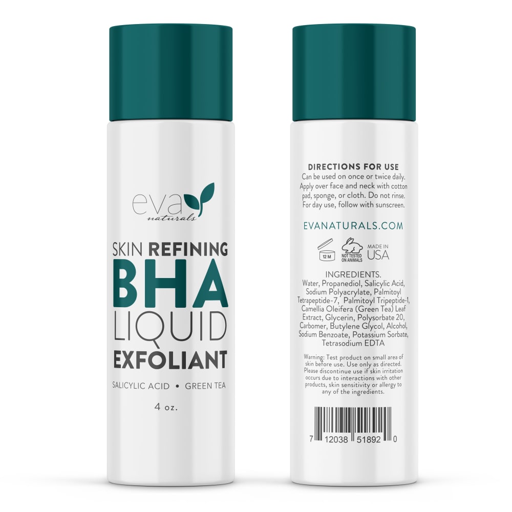
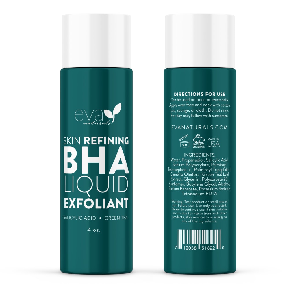
Which BHA Liquid Exfoliant image would you most likely click on to purchase from an online skin care company?
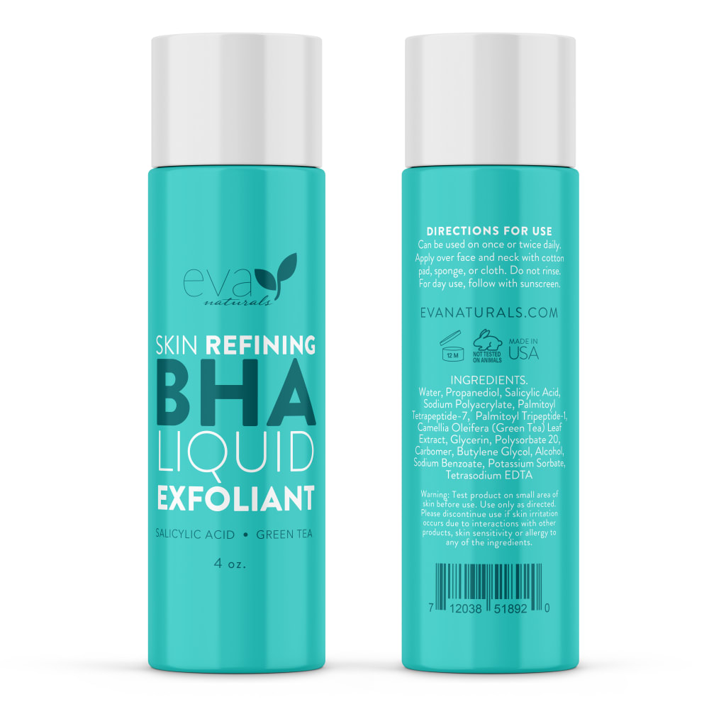
Option A won this Ranked poll with a final tally of 29 votes after 1 round of vote counting.
In a Ranked poll, respondents rank every option in order of preference. For example, when you test 6 options, each respondent orders their choices from first to sixth place.
PickFu requires a majority to win a Ranked poll. A majority winner differs from a plurality winner. A majority winner earns over 50% of the votes, whereas a plurality winner earns the most votes, regardless of winning percentage.
If an option does not earn a majority of votes, PickFu eliminates the option with the lowest number of votes. The votes from the eliminated option are reassigned based on each respondent’s next choice. This process continues in rounds until a majority winner emerges.
Scores reflect the percentage of total votes an option receives during the vote counting and indicate the relative preference of the respondents. If there is no majority winner, look to the scores to see how the options fared relative to one another.
| Option | Round 1 |
|---|---|
| A | 58% 29 votes |
| D | 24% 12 votes |
| C | 10% 5 votes |
| B | 8% 4 votes |
Age range
Education level
Gender identity
Household income range
Options
Personal income range
Racial or ethnic identity
29 Responses to Option A
I think the teal color of A is the most appealing and really makes the bottle pop. The darker teal is more dynamic than the other 2 options which are a little too white and generic for me.
I like A because turquoise is my favorite color and D because its bold color would also make it stand out on a shelf. C and B are kind of bland in comparison.
I like the color of the container. It is really beautiful and bright. It would stand out in a darkened room.
I am immediately attracted to the colors in option A, followed next by the striking contrast in Option C.
I honestly just ranked in the order that I like the color schemes.
I chose A because I like the container with the teal color.
I really like the coloring of this bottle. It is very eye catching and looks high end. This one would definitely make me pick up the bottle to learn more or click on a picture posted on a website.
I choose option A because it looks very delicate, I think it is the most feminine. In addition, the mixture of colors makes me think that it is a good quality product and that it will be delicate with my skin.My second option would be B because although it looks delicate, it is not attractive, it does not attract my attention.My third option would be C, because I don't think they are the appropriate colors for a skin scrub, it seems to me that it may be a bit harsh for my skin.And finally option D, I don't like it, it looks rough, it also seems like an unnatural product
I liked the color for option A the most. Option D looked nice. Option C, didn't pop out as much in terms of design. Option B's design looked a bit lacking which is why I ranked it last.
The aqua color makes me think of refreshing and clean.
I like the aqua color on the bottle; it looks fresh and natural and makes me feel like the contents are the same.
I love the color on A, D is also very bold, C is very sleek and I think B needs more color
The Tiffany blue packaging is much more eye catching and looks the most premium.
Things with bright/bold colors always grab my attention the most.
The color of option A gives off a more natural vibe. Option D also has a good natural vibe but I prefer the lighter one. Option C is kind of bland but stands out with the colored lid. Option B is just boring and blah with plain white.
I like the colors other than bland white.
A - vibrant color but not overwhelming; C - just enough color for the white background; D - color too dark; B - Boring colors
I liked the options with bolder and brighter colors as these felt more vibrant and refreshing.
The bright green aqua is pretty. Since all the products say the same thing on the label, I like the dark green one last. The silver and silver white ones are in the middle because the aqua colored one catches my eye first.
I would click on option A and D because the color of the bottle got my attention very quickly
I really like option A because I like the color combination. The shade of aqua and white font really makes the bottle stand out. I also like D but I think the shade of green is too dark and if it was lighter I would like more that A. I like B but compared to A and D the white and black color combination doesn't stand out as A and D does. I don't like C because white and green cap doesn't look as appealing as A and D does.
I really like this color of blue/ green. I do not like the white background. It makes the product look generic
The 2 greens in A bully. PS I can show you at home crazy and then he got in trouble. He probably thought it was OK. Where is he? Can’t fucking remember what her fucking other good ones really make it stand outD the white really makes the title stand outC and B I don’t like the white background
I would most likely click on the product from image A because I love the bright, aqua color and how the wording is done. It looks unique and very pretty.
I prefer the nice teal color of A or the white ones
I prefer option A. I like the color of the container.
I chose by options that look most modern and also have a gentle sort of look to them.
I choose option A because I like the light-bright green color. It suggests the product is not too harsh, and is healthy. Option D is second because, again I like the green color, it suggests nature, something natural. Option C has the green text, which is fine, option B would be my last choice.
I like the bright turquoise best, then the solid green — the colorful backgrounds are better than the plain white, which just looks generic like it could be anything.
4 Responses to Option B
The solid white B has a clinical feel so it makes me think it would be professional quality. D is the most eye-catching of the remaining ones but I would like it to have a green cap. C and A are about equal to me with a slight preference for C.
B is clean and simple. A stands out and appeals to you. D and C are ok but nothing special.
I picked option B because I prefer the more neutral black and white colors of the bottle and text.
I like Option B. The all white is so bright, positive and easy to read.
5 Responses to Option C
It looks pure but it has some boldness to help me get better.
I like the contrast of the green against the white background in the first product. I always associate renewal with the color green, so I would choose the green packaging next. The last product that is white and black does not "pop" as much as the other packaging.
This one has a nice balance of colors that makes it easy on the eyes. It is also the most attractive design.
I chose Option C as my favorite because it is simple, but gives me the information that I need.
I chose C. because the colors of the product really stand out to me and look like its something new and makes me believe that it will work exactly the way I want it to
12 Responses to Option D
d haas the most attractive packaging so since they are all pretty much the same my choices are based on color prefrences
I would go with D because the darker colored bottles catch my attention first, then A would be next with the lighter green color, then C with the white bottle but with the green accent colors, then B for the white bottle.
I THINK THE WHITE BOTTLES ARE HARDER TO READ. THE COLORS OF OPTION D AND MAKE IT BRIGHT AND CHEERY AND EASY TO READ
D is bold and clear to see the packaging and attributes of the product.
I really like D and C the most because of the colors. The dark green really captures my attention
I like option d because the bottle is easier to read
I think that option D is the most visually appealling and stands out the most. The packaging would help it stand out amongst other products that do the same thing.
I would probably gravitate towards the darker green/blue color of D and C. It just looks a little more mature. The plain white is kind of boring for this type of product.
Option D the label design is highly attractive I love that color and it really makes the lettering pop. It stands out very nicely. it would grab my attention quicker I just love that deep dark green
I prefer Option D because the colors are pleasing to the eye and look fresh and modern.
I would click on this because of the color of the packaging and how easy it is to read the back of the package to see what it had in it.
I prefer option D because this exfoliant looks most attention grabbing and well put together design wise, it looks effective and trustworthy.
Explore who answered your poll
Analyze your results with demographic reports.
Demographics
Sorry, AI highlights are currently only available for polls created after February 28th.
We're working hard to bring AI to more polls, please check back soon.

