Poll results
Save to favorites
Add this poll to your saved list for easy reference.
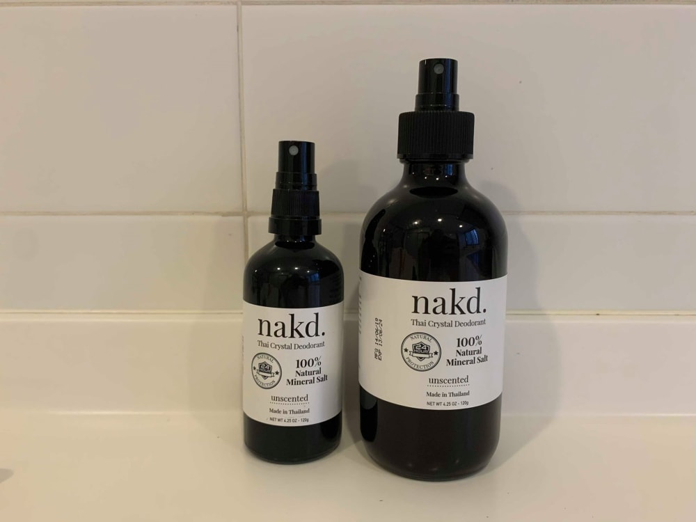
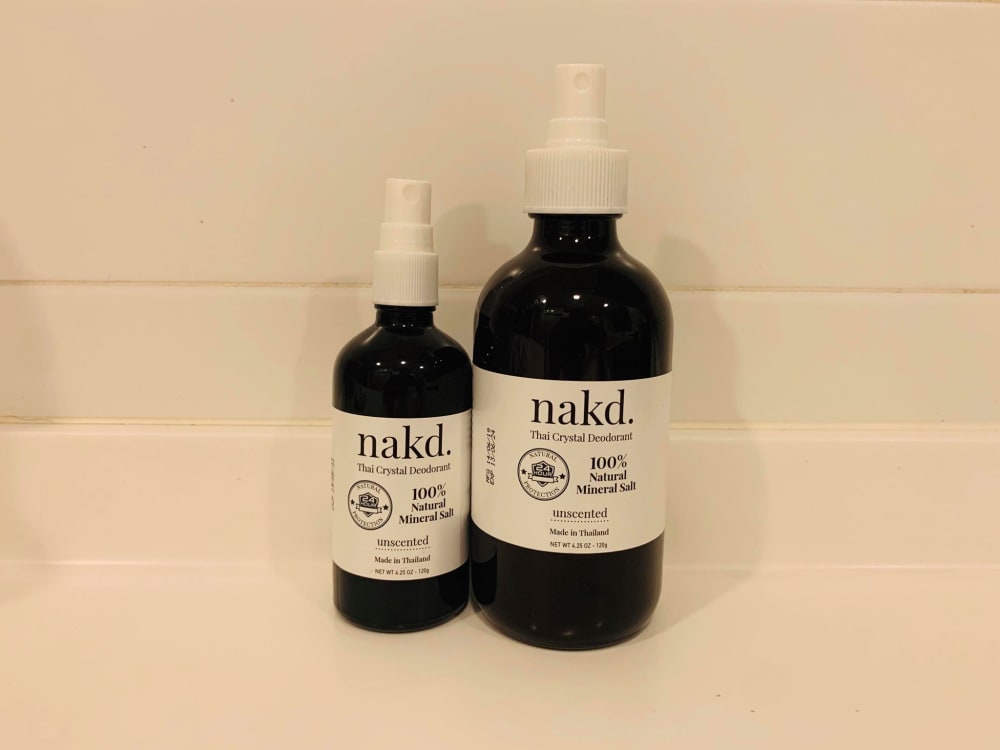
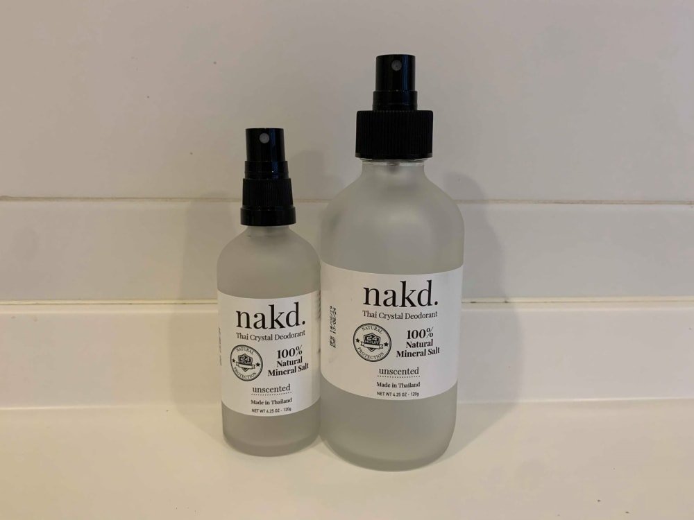
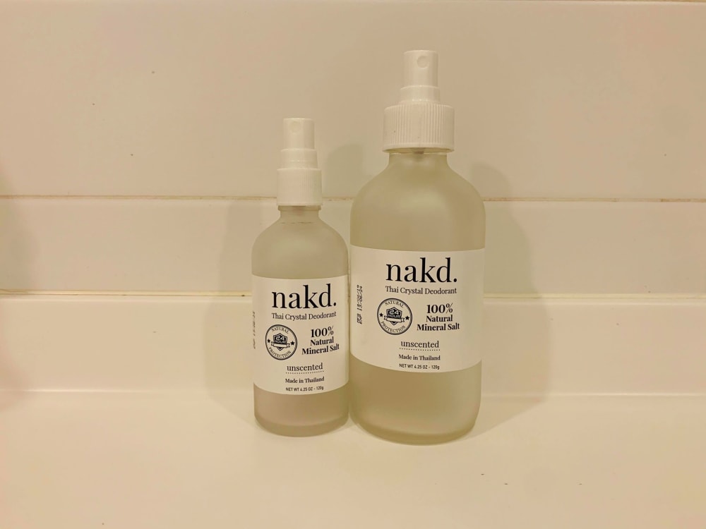
Which Bottle Color & Cap Looks Better With The White Label?


Option A won this Ranked poll with a final tally of 29 votes after 3 rounds of votes counting.
In a Ranked poll, respondents rank every option in order of preference. For example, when you test 6 options, each respondent orders their choices from first to sixth place.
PickFu requires a majority to win a Ranked poll. A majority winner differs from a plurality winner. A majority winner earns over 50% of the votes, whereas a plurality winner earns the most votes, regardless of winning percentage.
If an option does not earn a majority of votes, PickFu eliminates the option with the lowest number of votes. The votes from the eliminated option are reassigned based on each respondent’s next choice. This process continues in rounds until a majority winner emerges.
Scores reflect the percentage of total votes an option receives during the vote counting and indicate the relative preference of the respondents. If there is no majority winner, look to the scores to see how the options fared relative to one another.
| Option | Round 1 | Round 2 | Round 3 |
|---|---|---|---|
| A | 38% 19 votes | 38% 19 votes | 58% 29 votes +10 |
| C | 24% 12 votes | 34% 17 votes +5 | 42% 21 votes +4 |
| B | 24% 12 votes | 28% 14 votes +2 | Eliminated 14 votes reassigned |
| D | 14% 7 votes | Eliminated 7 votes reassigned |
19 Responses to Option A
These are basically the best to least best in terms of product presentation.
I like the darker bottles they kind of look my astetically pleasing in any room which is important.
I think that the white labels look best against the darker bottles. It makes it really stand out and easy to read. It looks sharp and classy and more luxurious.
I think this one looks most like you would see in a salon. It makes the label pop out more and makes you focus on the brand name
A has a much better color scheme
I think that the black caps look more exclusive and high-end than the other ones. They also look more expensive. I selected A because the all black is very striking and appealing. I selected C because It has a black cap but is less attractive than selection A. I chose B because the black packaging is very attractive, but it is paired with the white cap area. I did not select the option that had a clear bottle with a white cap, as it was not that attractive to me.
good and nice one
I like the black glass that is used for the naked bottle in A
I chose option A because I like the completely dark bottle with the white label the best. Having the label as the only contrasting thing, your eye is immediately drawn to it.
Option A's photo has clear resolution and I prefer the dark bottle. Option C is nice with the opaque light colored bottle. Option B had too much pink in the photo
I like option A the best. I like the white label and black bottle and the black spray top. My sister in law is an herbalist and makes things and this is her design for bug spray. I guess I have a biased opinion, but I like the look and ease of use with this. I have a Vitamin C serum that I use, and I accidentally dropped the glass stopper and broke the tip of the dropper, so I threw it away for fear of glass shards. I then liked option C because of the clear bottle and the black lids make it look refreshing and clean and that it isn't contaminated. It looks pure and more high end that B And D. I only picked B because I had to make a third choice and I didn't like option d At all. The lighting on the photos is kind of weird on all of them and that probably make my choice biased as well. I do like option A the best out of these.
Choice A is better visually due to the contrast. I don't like the white cap on choice B because it doesn't seem to completely match the label. Choice C is better than D because D has an odd yellow tint to its bottle that I find very displeasing.
I think I'd avoid the white on white because it looks like a copy of another company. The white on black (or is that blue?) is more distinctive.
I chose A as the first choice because the dark bottle and black caps really make the white label stand out. I chose D as my second choice because I just liked the way it looked better. The colors all blended well together, the label could be clearly seen, and it looked like something I'd have in my bathroom. I chose B for my third choice because they white caps weren't terrible - not great, but not terrible. Option C wasn't chosen because those black caps were terrible on that light bottle.
I really like option A a lot, I think the black bottle and black cap looks really good with the white label and makes the label more noticeable and makes the label "pop." Option C was my second choice because the silver color with the black cap really do look nice together against the white label. Option D was my third and last choice because the bottle cap and bottle color look a little bit off so it looks kind of strange against the label but it's very noticeable for that reason; it looks odd.
A has the clearest image with the best lighting.
I chose A as number one because I think the the dark bottle and cap with the white label looks expensive in a good way. It reminds me of botanicals and apothecaries. C was number two because the black cap really makes it look more expensive. D is third because white cap looks better with matching bottle. I didn't choose B because dark bottle and white cap reminds me of light sensitive medicine you get at the pharmacy that they put in dark bottles and use the same cheap white cap as other bottles.
There is something about the frosted or clear bottles that makes it look like a homemade product - they really look like something I could have done myself.
I chose the ones I did in the order I did because darker is visually better for me. I like the contrast with the white label. Outstanding!
12 Responses to Option B
good an nice one
I like these options best in this order.
good and nice one
Because it looks so contrast in this cap.
The brighter backgrounds make it easier to read the test and see the product.
I chosen with color vice
I like the dark bottles the best. I think that they look more appealing. Based on the product title, I am interested to learn more on what the product does.
B is the best choice the white bottle cap looks better with a white label. It gives an overall appealing look on a dark bottle! C is a black cap but the bottle is lighter in color which helps. A is last choice as I had to pick another black cap so the black cap and bottle makes the white label stand out! But, overall B is the best and most appealing! White cap and white label.
With option B I like how the cap and label are white and the bottle is black. This makes the whole bottle "pop" more in my eyes and. With option A I like that it has the white label with the black bottle because it makes the information on the label easier to pick up. For option C I like that it has the black cap because it draws your attention then to the rest of the bottle.
I like the dark color bottles. They remind me of high end apothecary jars, which seem like a higher value item. It makes the quality seem higher. I like the white lid for a bit of contrast.
I like this one because the label sticks out more. I am easily able to read itThe next one looks more appealing but a little harder to read the label. The last one looks neutral and would be my last pick. Doesn’t look like much effort was put in design.
The black ones stand out the most to me. They provide the best contrast.
12 Responses to Option C
if your brand is nkd then the bottle needs to be as clear as possible. that only makes sense
option C looks better and impressive so i choose this order
I think C looks the cleanest and most friendly to use. I do not like D at all it makes the product look unclean or used.
I really like the clear frosted bottle, it looks classy and expensive. The white top on the black makes it look cheap.
C feels fsncier and higher quality .
I like this one because it blends very nicely and just does a really good job.
I prefer Option C and D more because the clear bottle lets you easily see how much liquid is inside. Option A is good too because the bottle and cap are matching in color
I like the more clear bottles than the dark bottles personally.
Some of the white bottles look all murky and unattractive
it was different types and unique design of the bottle
I love the look of Option C, the clear bottle with the black top. The product looks clean and fresh. I like that I can see how much product is left in the bottle without having to guess. I think that the white label and black top complement each other very well. I think that if this bottle was on the shelf with the others, I would be instantly drawn to it rather than the others. I also like Option A, but slightly less so. I am a fan of dark bottles aesthetically, but they always concern me a bit because I am not good at guessing how much of a product remains. This bottle, top, and label combination remind me of other high end products that I have purchased and been pleased with. Option D looks nice and reminds me of other products that I have purchased before. I like that the clear bottle allows you to see how much product is remaining, but the bottle looks a little yellow. I don't mind the white top here, but I definitely would prefer the black top instead.
C looks the most modern. D looks like something from the 90's. The black bottles looked okay, but I felt the black contrasted too much with the white label. C was perfect in my opinion.
7 Responses to Option D
I like to select
I like the white on white the best.
Lighter color bottles look nicer in my decor. I think it helps my place look less cluttered.
The white bottle looks the best as it gives it a new age look. It also matches best with a white cap, which is why d is first pick. Between the block bottles, it looks better when it's the same shade which is why a is better than b
I like D the most because it is see-thru, allowing me to see the contents of the bottle. I also like that D has a white plastic top because it gives it a "clean" appearance. I like C because it is also see-thru. I like A a little more than B because the black top matches better with the dark bottle.
the clear bottle is more healteir looking as you can see the clear liquid inside
i went with the clear ones because i prefer to see the color of my ejuice. more particularly if the nicotine has discolored over time.
Explore who answered your poll
Analyze your results with demographic reports.
Demographics
Sorry, AI highlights are currently only available for polls created after February 28th.
We're working hard to bring AI to more polls, please check back soon.

