Poll results
Save to favorites
Add this poll to your saved list for easy reference.
Which card would you be more likely to give to someone? Is there anything you would change?
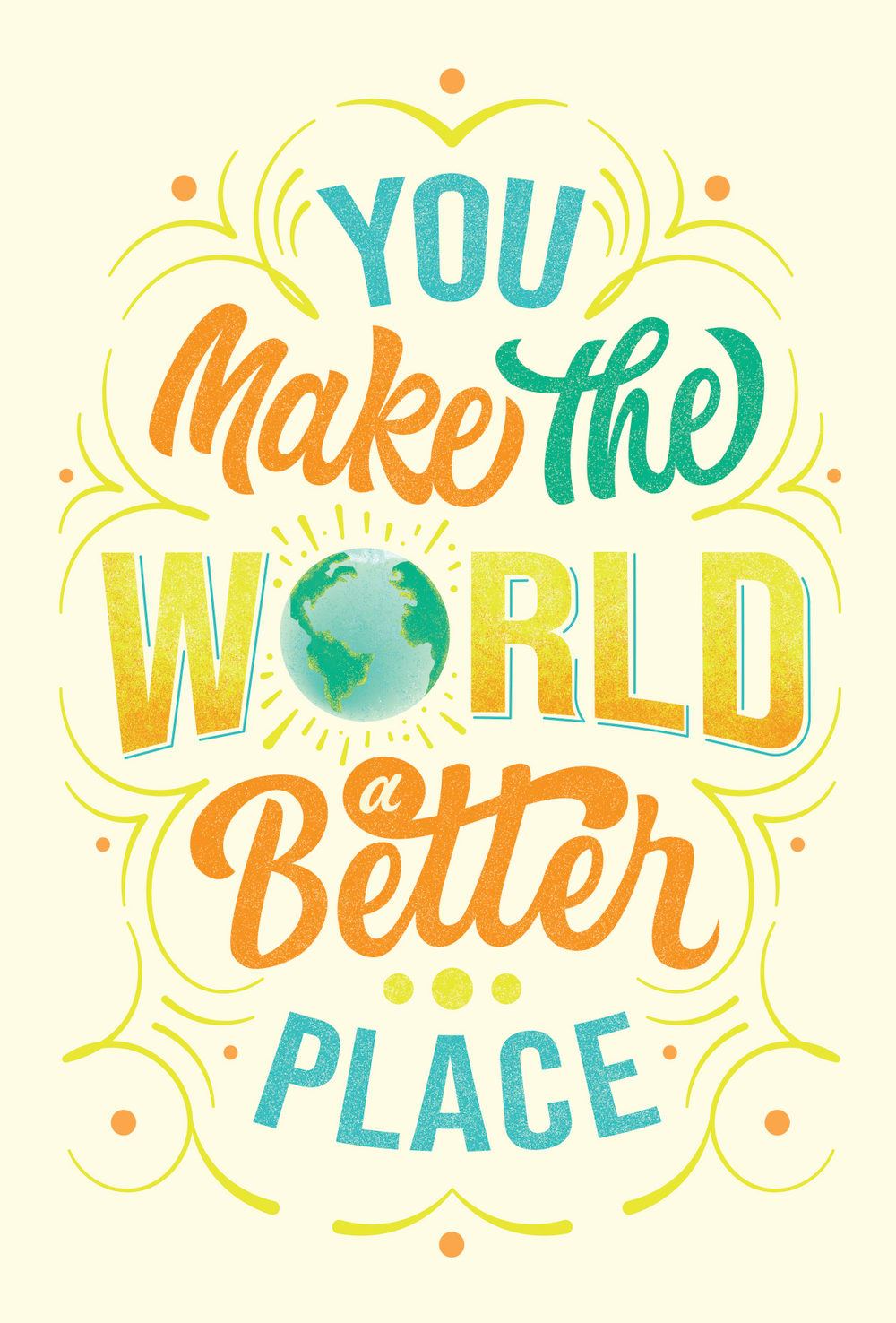
14 Responses to Option A
i like option A better because it is more simple and to the point. it looks good the way it is
I like the graphics with the world as the letter o.
The colors felt a little faded so I would make them brighter, but I loved the warmth radiating from the font as the text seemed full of movement and this design was thus very engaging.
The card is bright and clear.
i think this title is fitting for many people i would get a card for and i would pick it
I would be more likely to give the card in Option A because it looks more lively with the curved graphics around the words and a picture of the world used as the letter O.
The flow of the text is better in option a. The color palette has a really happy feel and I think it matches the message very appropriately.
Option A is very cute. I like how you used image of the world as a letter. I love this design, but I'm not really thrilled with the orange and yellow colors. They look a bit washed out, maybe make them more vibrant. The blue color and the world look great and I love the design.
I thing this is easier to look at because the the background is a solid color.
This one is more charming and cozy!
This one has a cleaner style to it that I think helps the text stand out a little more and look clearer.
A is more simple and focuses on the text.
I like A with the smaller earth. I think both are nice but with the saying I want the world to be more visible and front and center even if it’s a bit smaller.
I picked A because it seemed more colorful and peppy!
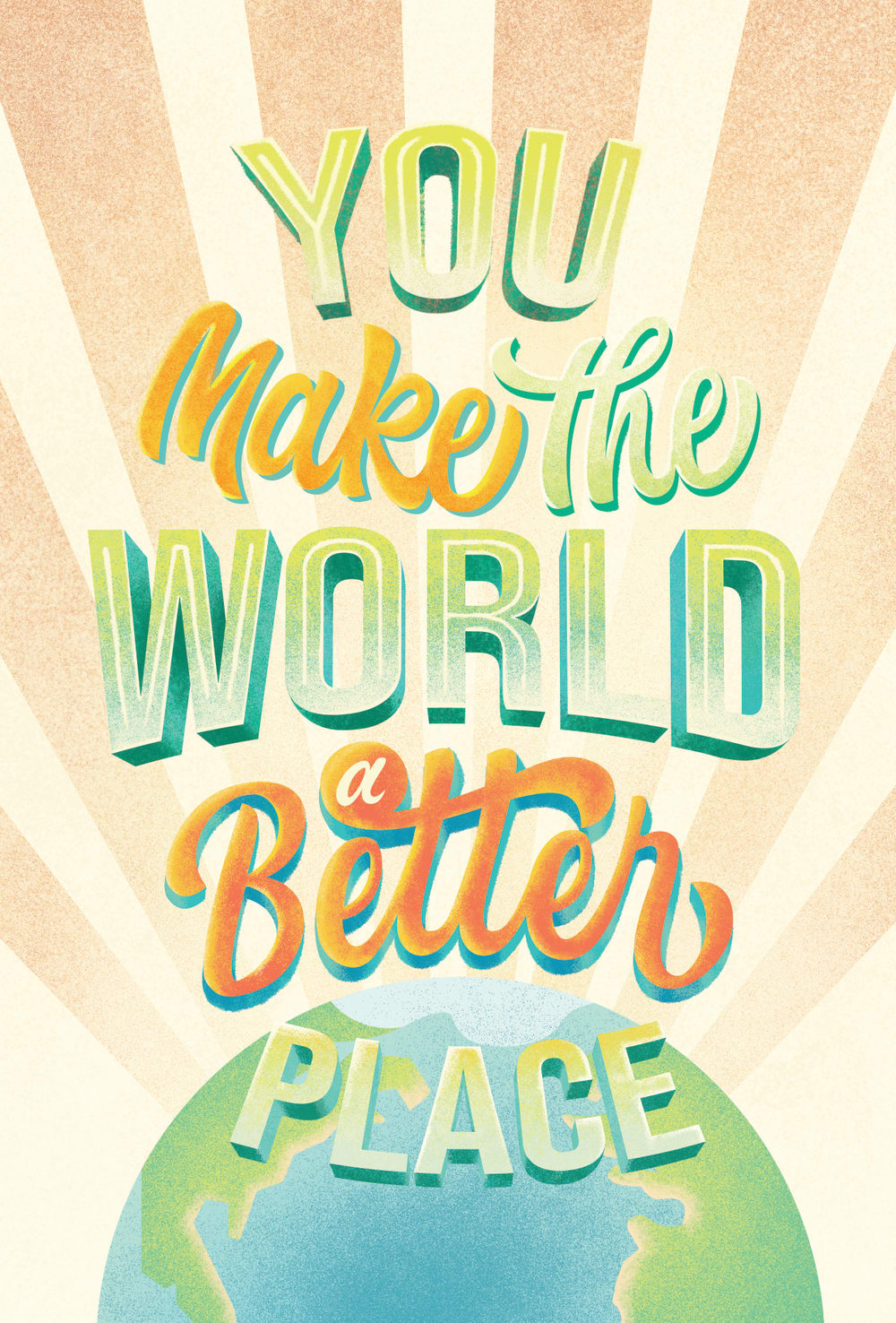
36 Responses to Option B
Option B's background looks more exciting. What I would change: I would prefer the globe picture taking most of the card's space and all the words written inside the globe.
I liked choice B since the lettering looks more welcoming and appealing to look at. Choice A looks a bit more childish and not as appealing to look at.
I like option B because it has more going on and is more colorful.
I like Option B the most because it has a bigger Earth graphic, I personally think the scrolling design would be nice on the other card, but the only thing to definitely change would be the orange starburst pattern coming from the Earth, I would change that to a different color/s, perhaps blue and/or green, maybe yellow? Thank you.
The actual image of the earth found in B really brings the whole message together I feel. I prefer that one.
I think both cards are great but I would choose B because it has a softer and somewhat watercolor texture to it. I like how calming and pleasant the card seems. I also really like the larger world instead of the smaller one as in A. I’m not a huge fan of the sunrays shooting off from the world but they’re not a dealbreaker for me. If I saw this card in the store, I would likely buy it.
The graphics on option B are far superior.
Choice B has less empty space and makes the image and message more clear and prominent.
I think Option B would be the better choice. The main reason is because of the illustration. Having the earth at the bottom of the card's lettering just places more emphasis on the message in my opinion.
The illustration that includes Planet Earth seems quite fitting and the design involving our home is the best variation I've seen thus far.
I like the shape of the text and the background or in this 1. What you might want to consider changing is the smalle black border around the words to make them stand out more. What I mean is a black border around each letter individually
This text has more "shape" to it. It's easier to read because it has more of a 3D effect with shadows.
B looks a little more elegant and clear
the big world looks a lot more pronounced
I would like to buy option B looks nice if there is bold color option will looks more eye catching
the globe addition brings this one a better layout to me
The background makes the words a lot easier to read. I like the message also
I like the picture of the globe. It ties in well with the message on the card.
I really like the design it catches my eyes and overall makes me very interested in the card, it looks really well crafted and exciting.
I chose choice b because i think it looks better than choice a, theres too much going on in choice a
I would pick option "B". The design looks unique and creative.
I like seeing the Earth and the Sun coming behind it.
Very clever to include the “world” in the graphic, plus the words seem more readable in my choice
I would like a different colored background. Maybe light blue.
Chocolate cr b is more eye catching
I prefer option B because the colors are a little darker and more vibrant. This makes it more memorable for me personally.
B is colorful, bright, and complete.
Option B, looks more appealing. I would make it more colorful
Option "B": This version has more visual appeal mainly for the design of shining sun rays behind the planet making it a shiny happy place. It is more engaging comparatively and the drop shadows on the message make it more dynamic.
I prefer the design theme of this card more.
I like having the globe. It reinforces the point about the "world".
I like how the globe is more of a focus in B, which fits better with the statement. I also think there is too much going on around the words in A, which is kind of distracting.
I think it looks better having the picture of the world on it. There isn’t much I would change about it
A is alright, but B seems really nice to me. The overall art style seems classic and stylish.
I would rather give B because it seemed so much more unique. In contrast, A looks like most other cards.
I prefer the option with the more muted color scheme over the image of the Earth.
Explore who answered your poll
Analyze your results with demographic reports.
Demographics
Sorry, AI highlights are currently only available for polls created after February 28th.
We're working hard to bring AI to more polls, please check back soon.

