Poll results
Save to favorites
Add this poll to your saved list for easy reference.
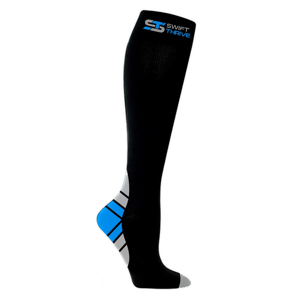
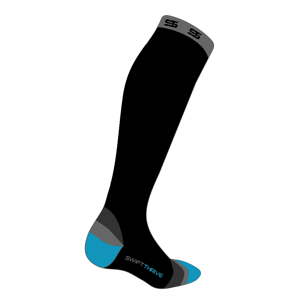
Which compression sock looks better?


25 Responses to Option A
Looks tighter and more eye appealing.
I prefer A because the way the logo is written at the top makes it look more high-tech and competent, which is more motivating
I really like how the blue is layed out on the sock. I also like that the name is on the sock, in a highlighted manner.
I chose A because I like the pattern at the heal and only having 1 color at the toes of the sock.
I like the bright color
i preferred the stripe effect on the heel and the logo around the top of the sock. plus the blue logo at the top of the sock looks more name brand, the other option looked off brand w/ less color
the design on the heel is much better
I like the pattern on the bottom of the sock on Option A better. I also like the logo that is on Option A better. I think the lines more distinct and the logo is easier to read.
i just like the design on A better
This was a close choice - I ended up choosing A because the top of B looks like mens' underwear.
I like this design better.
I don't like the logo being on the foot of the other image.
For me the way the grey accents the baby blue highlights really does it
I like the colors and pattern on the heel.
I love the color scheme and layout on this particular sock. I also like Swift Thrive at the top of the sock instead of on the heel where no one would be able to see it.
I like the solid lines. Looks more professional.
The blue was brighter and caught my eye
I like the heel design better, i think it looks more modern and stylish.
The mored defined areas look better
I chose A, because while I like both designs a lot, the bolder stripes on A are my favorite.
looks more stylish
I like option A because visually it looks better. Another reason is the white color mixed in the compression sick that makes it standout.
I just prefer the look of A, it grabs my attention more than B.
this looks more stylish
I like how the foot looks elongated.
25 Responses to Option B
I hate the look of both
i like the logo better
I like B better because it looks like it has a wider band at the top. I've had to wear compression socks, and the ones with wide bands are more comfortable. I also like the color of the foot better.
I like the lines and design on Choice B over A
I liked this design better. This compression socks looks better and elegant. Option A is not that good. It's more girly.
the top logo is better
I like the design of these more, the toes have the blue on them, and they look nice, the other pair looks a bit boring.
i like the dark top better. it blends in nicely and doesn't distract from the bottom toes where the logo is.
I like the color blocking on this one better.
I prefer the flowing lines of the heal on B and rather than the uniform lines on A. Plus, I like the colorful toe.
This option looks more comfortable around the cuff
I like the color scheme in B better.
The foot looks like it's in a more natural position
I like that B looks more feminine and the logo isn't so obvious. I'm torn on the colors between the two. If I were purchasing this product, either color choice would be fine.
Solid colors go better with any clothing and look professional.
I like this one better because I think there is just way too much going on with the other one, especially with the pattern on the heel.
They are both nice
The black borders between the colors on A have a cartoonish look. B has a more natural and athletic look to it
I think the heal design would peak it if my shoe less.
A feels like an awkward posing of it. B feels more natural to me.
I think compression sock (Option B) looks better because I prefer the simplicity and the color scheme that is shown in this product image. I think the blue in option A doesn't look as appealing.
i chose B because i like the design of the heel a lot better, the other design looks very ugly and the lines stand out way too much
I don't like stripes. I like how the colors merge into each other
The design on the heal was less complicated than the other. Option A was a little to busy for me.
The design looks sleeker and blends well.
Explore who answered your poll
Analyze your results with demographic reports.
Demographics
Sorry, AI highlights are currently only available for polls created after February 28th.
We're working hard to bring AI to more polls, please check back soon.

