Poll results
Save to favorites
Add this poll to your saved list for easy reference.
Which cover do you prefer for a 2021 Kids Dinosaur Calendar?
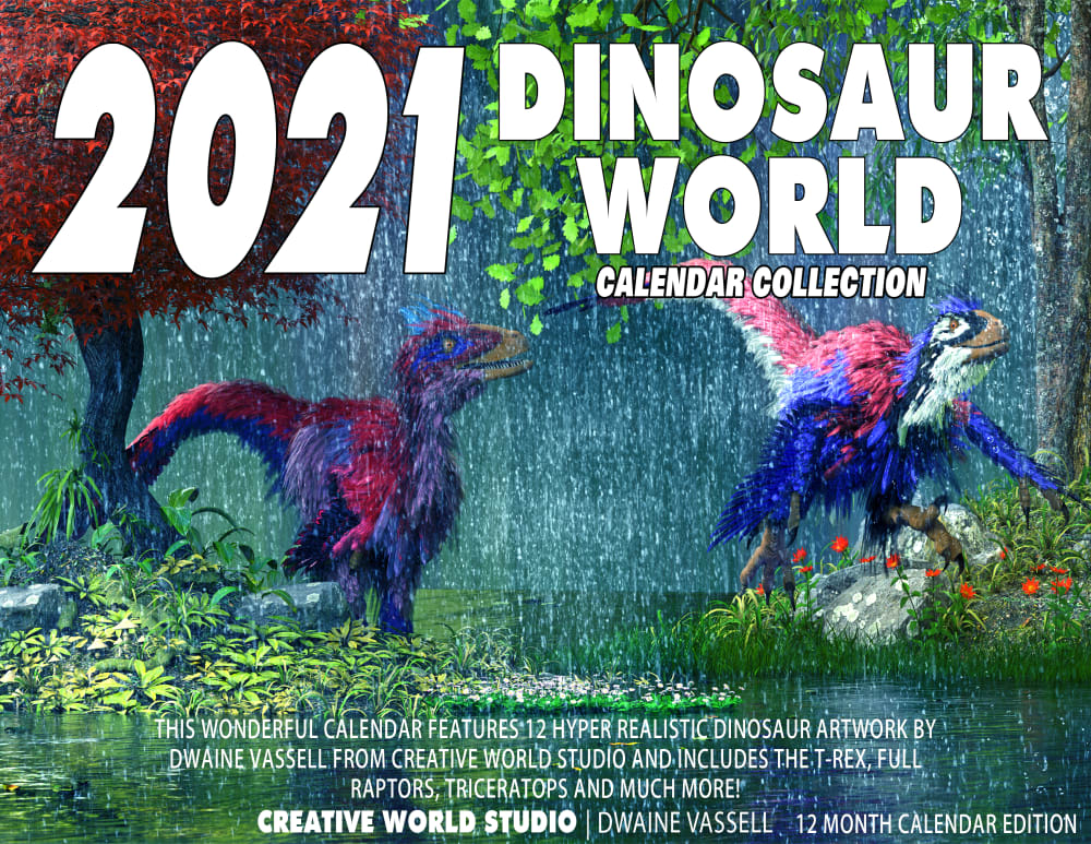
13 Responses to Option A
I like the creativity of Option A. It looks really artistic and has a great setting.
A because they look more realistic.
I like the more impressionistic style of Option A; it stands out because it is different than what I'd normally see for kids and a little more highbrow. The design of Option B is bold but seems more slapped together.
I prefer the colors of this calendar. The design gives a better impression of movement too.
I prefer Option A. Option B looks a bit tacky with the different colors and fonts.
While I find that option B is more attention grabbing than option A, I prefer option A's design and layout over option B. It's less busy, and looks more professionally designed.
I do not like the colorful font. The dinosaurs look better in A as well.
I like the bottom description to tell all that is in the set here
A is more of an action shot and would attract a child's attention more readily (particularly young boys, which is probably the target demographic.)
I like the drawings better and I like the fonts better. Looks like they tried a lot more and didn't just go into MS Word and put some cool fonts over a picture.
This image is a lot more detailed and interesting looking, I like that there's more detail and it looks a little more dramatic.
I chose Option A because it seemed a little more cartoon like and more fun for kids. I thought it overall looked better. Option B was nice too, I liked the brightness but maybe looked a little intimidating and less put together.
I like choice A it has both nature and dinosaurs listed
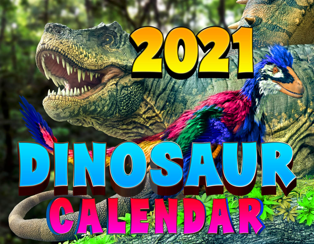
37 Responses to Option B
i would prefer the calendar in option B the most because the text is easy to read and has fun colors
Option A isn't clear on the photo, and Option B is. I would prefer Option B.
I think it stands out more and I like the picture of the T-Rex, since it's the most popular dinosaur.
I like the image of the dinosaurs of option B more than option A. T-Rex is more popular with kids.
I had my 6 year old tell me what one he thought was better. He picked this one and said he like it a lot better
design wise choose this option
This one will appeal more to kids with the bold coloring and the close up images of the animals. They would be more facinatined with the dinosaurs than with the other one.
option B seems to be more attractive and appealing.
I like B because I like the brighter colors and I think the dinosaur on the cover looks more fierce too. I think a kid would like it more than A.
I like the cover in option B because it looks more colorful and exciting. Option A looks more dull and boring to me overall.
i would prefer option B because i like this up close picture of dinosaur it looks real
Option B looks more bold, more exciting and also interesting. I know that my kids would be more interested in option B because of the close up view of the dinosaur. The open mouth look that shows the dinosaurs teeth in such vivid detail is the image that would be best and would get the most attention
Choice B is the one I prefer because I like how it has the mix of the classic scaly looking dinosaur and the more bird like one with the feathers. This a good mix between the two and the pose that they have is good.
Kids don't want to see all the small white text on option A
I think seeing an actual real looking dinosaur would intrigue kids more.
I think kids would like the colorful and big title more
I liked the colors in B and the design was quite cool.
I like that it combines more modern ideas about dinosaurs with more traditional and recognizable ones.
I love the bold and bright colors showcasing more than one dinosaur
I voted based on how appealing the images were to me compared to the others and which ones I would click on in the real world.
I prefer choice B because it has a large dinosaur that look realistic. I also think that colors are much more vibrant and eye catching. The dinosaur that is similar between the two choice has much clearer colors in Choice B. I also like that the wording of the words are in color on Choice B and I like the font shape. I do not like all of the extra writing on Choice A.
I teach kindergarten. Option B stands out the most, and I know its the option they would pick.
B appears more child-friendly and cartoonish. A looks a bit distorted and frightening.
What kid doesn't love seeing a T-Rex dinosaur? There's also a colorful raptor (I think) on this cover, too. This cover looks cooler, brighter, and more colorful.
I like how this version shows you two different kinds of dinosaurs. That sticks out to me and would be nice to see on the cover.
This is more colorful and exciting. I think it would catch the eye of kids more than the other choice.
small text is off putting for a kids item
It evokes: ROARRRRRR!!!!!!!!
Option "B": The T-Rex inclusion on this cover makes for an appealing touch with the raptor and is nearly photographic in appearance making it the more attractive for me.
I love the realistic look of the dinosaurs on this one.
B is more colorful and playful. The colors and design feel more child like.
option B because it has the T-Rex and as a child thats all it took for me to purchase it.
The bright letters make it look exciting and vibrant!
I like the graphics that appear more vibrant and clear.
I voted for B because I feel like it is more colorful and that kids would be drawn to it more. I think they are both good though.
I like the colors of the writing better in this option. I also like how the dinosaurs look more realistic and not too cartoonish
I prefer Option B because it is brighter and more colorful and would appeal to kids.
Explore who answered your poll
Analyze your results with demographic reports.
Demographics
Sorry, AI highlights are currently only available for polls created after February 28th.
We're working hard to bring AI to more polls, please check back soon.

