Poll results
Save to favorites
Add this poll to your saved list for easy reference.
Which design do you like?
Option C won this Ranked poll with a final tally of 29 votes after 1 round of vote counting.
In a Ranked poll, respondents rank every option in order of preference. For example, when you test 6 options, each respondent orders their choices from first to sixth place.
PickFu requires a majority to win a Ranked poll. A majority winner differs from a plurality winner. A majority winner earns over 50% of the votes, whereas a plurality winner earns the most votes, regardless of winning percentage.
If an option does not earn a majority of votes, PickFu eliminates the option with the lowest number of votes. The votes from the eliminated option are reassigned based on each respondent’s next choice. This process continues in rounds until a majority winner emerges.
Scores reflect the percentage of total votes an option receives during the vote counting and indicate the relative preference of the respondents. If there is no majority winner, look to the scores to see how the options fared relative to one another.
| Option | Round 1 |
|---|---|
| C | 58% 29 votes |
| A | 28% 14 votes |
| B | 14% 7 votes |
Age range
Amazon Prime member
Cosmetics and body care habits
Education level
Gender identity
Options
Personal income range
Racial or ethnic identity
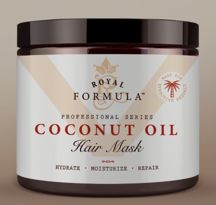
14 Responses to Option A
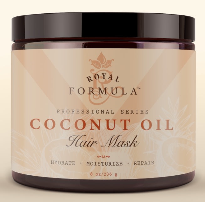
Option A is the easiest to read with the clean design and to get all the information needed. Option A also feels the most pleasing to the eye and I like that the Coconut Oil in red stands out so you immediately know what it is. I also like the little tree in the corner. Option B is very difficult to read quickly and is busy with the background.
i like option b the least since it looks like the printer ran out of ink on the label or something. I like option A the best since it is bright.
The first one looks more professional and is easier to read. I like the white and the V in the back. I also like the palm tree logo.
i really like A. The darker background helps the product in A stand out. The colors are bold but beautiful and make it look like a very premium product
I think the silver is more classic
I made my choices based on how easy things were to read.
I choose first on how well the lettering stands out the best. I do not have to search all over the label to see what it is. The second way I judged was the coloring on the label itself. The first being what looks to be more professional and less cheap and generic looking.
I felt like choice A was the easiest to read. I liked choice B for its color, but it was difficult to read (font not bold enough), so I chose option C over it.
I chose based on the product and if the color made it look more like a eco friendly product
All of this packaging is so lovely! They look really regal. I picked the one that's the easiest to read.
The light labels bring the writing on the labels out better to read them.
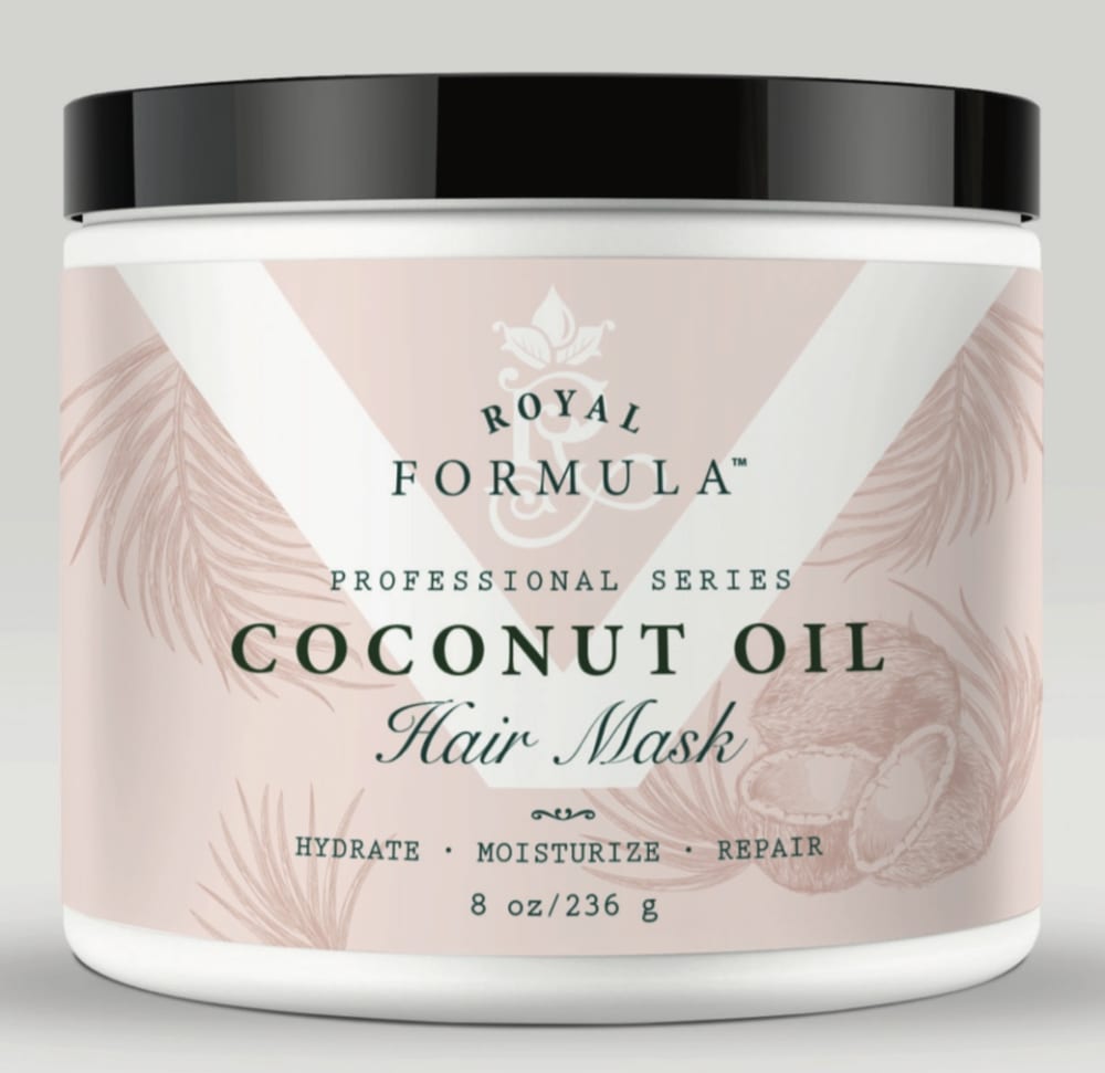
I liked Option A the best as I thought it was the most eye-catching, the text stood out the most against the background, and the colors matched the brand name "Royal" the most, as I thought the colors did indeed look regal. To me, option A looked very classy and upscale compared to the other options. Option B was also a good design, I did like the orange colors, but it looked a bit ordinary (like all the other hair masks on the shelves) compared to Option A. Option C (pink) was okay, but not my favorite, I thought it looked a bit cheap.
Not a huge fan of any of these color schemes, but Option A was easier to read. I liked the colors slightly better on C but not enough to choose it when it was harder to read. B was both hard to read and ugly.
I like the first design the best. I think that the Coconut Oil in red really pops on the white and makes it clear and easy to read. I don't mind the muted peach color in B, but I think that the background is too busy and it makes it too hard to read. I have the same issue with C, it seems the hardest to read out of all of them.
7 Responses to Option B
CHOICE A IS TOO DARK. I LIKE CHOICE B THE BEST BECAUSE THE COLOR OF THE LABELS MAKE ME FEEL LIKE IT'S A "COCO" PRODUCT, IF THAT MAKES SENSE. THE BROWN MAKES IT SEEM VERY NATURAL.
like the darker label and print
Choice B looks the most premium, like the jar is light blocking and worth the cost. Choice C has a nice soft contrast between the jar and th label, and feels luxurious. A is my least favorite, the red text stands out too much and is too harsh for me.
I honestly like them all. Coconut oil masks are the bomb
i like the dark color because it looks more serious product and trustworthy
The tone on tone looks luxurious and natural, both qualities I like in skincare products.
I like design option B the most out of the above images because the design looks very elegant to me and I love the color scheme being used. Design option A would be my second choice because I like that it's not too flashy or in my face, but it's still very classy. My third choice would be option C. What I like about option C is that it uses soft colors and still has a way of grabbing my attention gently.
29 Responses to Option C
C to me represents the product that is seen as regal in nature.
The quality of the product looks very nice in option C but a little less in the other two options.
C has the most pleasing colors and looks the most modern and indulgent. B looks old fashioned to me.
each result is more eye catching from 1-3 if at all i went to the store the #3 will interest me the most
like the over all of the choice i made. the last ones colors make the text not stand out as much . it clashes
I really like the color combinations on C. I think the pink color is very pretty and it makes me think of skincare. I like the white background on A much better than the one on B. I placed B last because I think the colors are too similar and blend together too much. I also don't find that orange color that pleasing.
I really like the gentle pink color under option C, it makes me think that the Hair mask will be really gentle and natural, i also like the red letters in option A, it makes the words Coconut Oil really stand out so it catches your attention.
Option C is elegant, modern, and looks expensive. The soft colors align with feminism and delicacy. The subtle V is a nice touch. Option B is nice, also elegant, but could appear a little cheap. Option A is nice, but seems very run of the mill. It looks like many other items and would blend in with other products.
I like the pink/warm colors the best.
C is my favorite. I think it's the prettiest, easiest to read and looks the most professional. B is hard to read with the label that color.
Option c is the brightest and looks pleasant to me
C is pretty, soothing, feminine and detailed.
I like the pink background with white bottle the best, option C. I think it eludes to be natural and pure. I chose the white label as my 2nd choice because it was just more appealing to me than option B.
The pink label makes the jar look more elegant, like it's something you get at Saks. The white jar is eye-catching but less designer appearing. Option B, the orange jar, is harder to read because its all one color. the font should have been darker in my opinion.
The creamy color of the label makes it feel like it would be conditioning and soothing for my first choice (C), the others seemed nice too but this one stuck out to me the most since it felt more unique given the coloring of the label. It also made it easier to read too.
I like the soft pink color label the best, I think it looks very girly and cute
C is my favorite because it's pink and looks the most girly which are the things that catch my eye in stores. B is a little darker and less girly but still pretty enough. A I probably wouldn't look twice at in a store because it just looks like it's meant for men.
I like design C better. They label looks better.
I like the contrast of the pink patterned background with the white V cut out. I like the colors used in the second one.
I like C the most because the images of the coconuts and leaves make it very attractive. The colors are more appealing to me as well.
option c design is so pleasant and elegant
I prefer these choices, because I like how tropical each design is. The designs perfectly capture the essence of a coconut tree and coconut products.
THE CHOICES AS I CHOSE THEM LOOK BETTER IN MY OPINION. THEY LOOK BETTER AND ARE MORE EYE CATCHING.
I like C best because the pink color is very pretty and feminine. I like option A because it is neutral and would match my bathroom decor if I stored it in there. B was my least favorite because I thought that the color was rather ugly and looked old.
This order speaks the my sensitive side which i think is what the product owners wants. It goes in order of helpping safe and trust so you will buy
I could most see myself purchasing the product with the pink label. It is soft, feminine, and modern, qualities I would like in a product.
I love the look of option C. The pink and white are very feminine and eye catching. It just looks expensive and high end. The other two options look more like drug store brands. Something I would see at Rite-Aid on sale.
All three really very nice designs. But my first pick in Choice Option C is a perfect design for the product itself.
Choice C seems to be more elegant to me comparing to the other 2 choices. I don't like the white color in choice A so B was my second favorite
Explore who answered your poll
Analyze your results with demographic reports.
Demographics
Sorry, AI highlights are currently only available for polls created after February 28th.
We're working hard to bring AI to more polls, please check back soon.

