Poll results
Save to favorites
Add this poll to your saved list for easy reference.
Which Design do you like best?
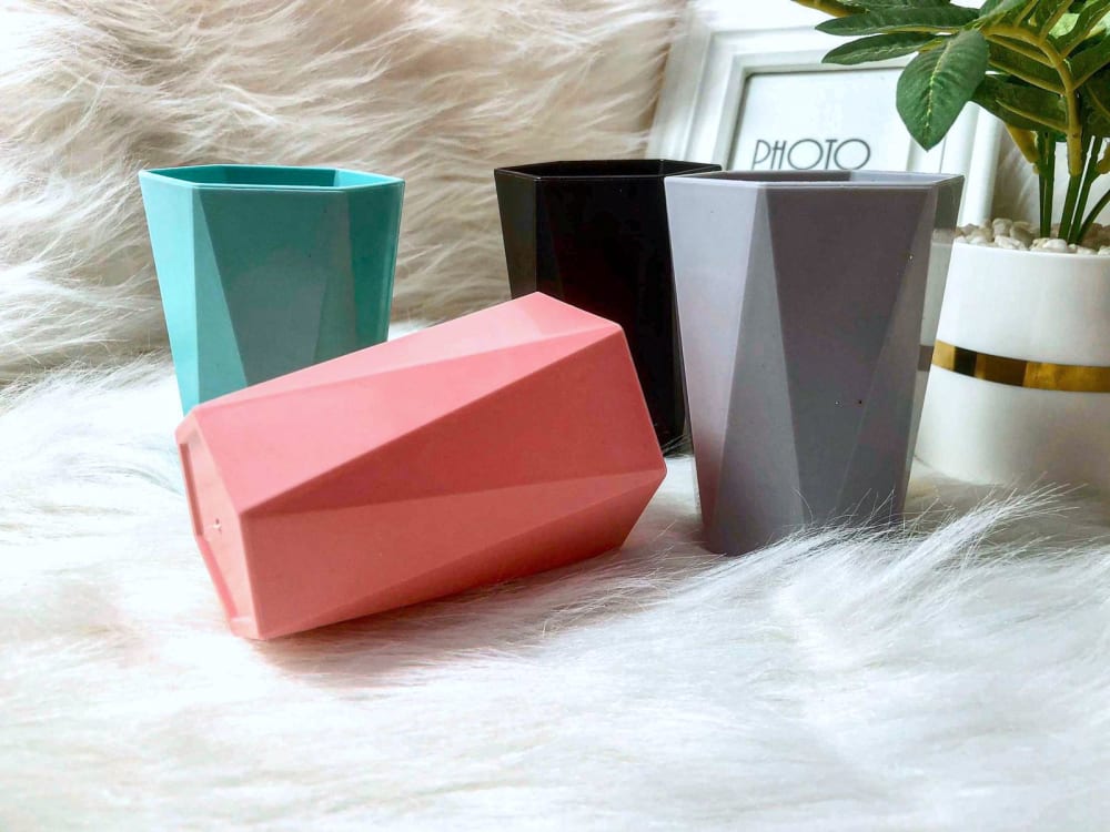
27 Responses to Option A
I picked option A because I prefer the more angular design. I love the lines and geometric feel to this product. The other options seems simple and unappealing.
The design in a is unique.
Option A looks more visually appealing and unique. Option B is too bland
The angular design of Option A really stands out here, so I like it by far the most of the two choices presented here. Option B looks like the sort of cup that might find literally anywhere, so it doesn't spark much excitement or joy.
I chose Option A because the more geometric shape versus a basic round design I feel is unique, more easy to handle and just lookers better and of a higher quality.
I guess it depends. I feel like these are really different Vibes. But that's the one I prefer
I like the design in option A more because it looks more interesting and modern. Option B looks too plain and simple for me.
I like A because I think the shape looks more attractive and unique. B looks a bit boring by comparison.
I prefer the product being photographed in a natural element. So Choice A -- the product is being showed as it actually would be used.
I pick A because I like that the design is different than a regular cup that is B. B just looks normal to me and doesn't stand out at all. A brigs a little bit extra and like that it's different.
I love the sharp angles on the cups, makes it look more futuristic.
This one not only has a cool and unique design, but the photo background is way cooler (although the generic stock photo image in the frame should be fixed).
The geometric shape gives them a lot of personality. The colors are bolder.
I like the colors and the fun shape of these cups.
The cups in a natural environment seem more realistic and appealing because it's easy for consumers to gauge scale of the items given the background image.
I strongly prefer the angular design and shape to these products much more than the smooth classic look of option b
I like the added dimension on A. There is nothing new in B. I do like the colors and texture of both.
The angular design is more unique and stands out more. It also fits in well with current trends. The round design is very basic and boring. It also looks cheaper.
I think B is bland and sees like any other product in this category. Option A is appealing and would be something I would buy. I like that it is different but looks like it could still be useful. I think the colors are good and the picture showcases the product. A stands out and I would purchase this today if given the option but I would not purchase option B.
I love how unique the triangles are on the side!
I ALWAYS PREFER DESIGNS THAT ARE JUST A BIT OFF NORMAL OR DESIGNS THAT ARE DIFFERENT. THE DESIGN FOR CHOICE A IS MORE UNIQUE AND THAT IS WHY I LIKE PREFER IT.
I picked A as my top choice as I like how the design looks very retro looking.
I like option A the best because the pots have a modern feel to them due to the unique designs.
These cups have a very cool and unique design
Option A is more unique in its geometrical shape. Perfect for when having guests over to not show you are bland.
I prefer option A due to the cool triangular design. It looks modern.
Choice A is my favorite because of more sharp edges present.
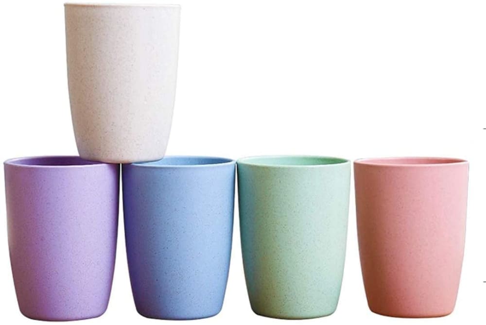
23 Responses to Option B
I like the more traditional design that I chose. The other option just doesn't look like it would be comfortable in my hands
Option A is hands down better. Those prism shapes are so much better, they look classy and artistic. I'm not sure why option B needed to stack one set of a cups but not do it symmetrically. Option A has the fur floor and the plant to accent the photograph nicely. I think Option A is the more sophisticated cup.
I chose option (B) because I like to stack our cups when not in use and it looks like the circular design is easier to stack. I also believe it will fit better in our dishwasher. As a bonus, I was really not a fan of the dog or cat fur in the picture of option (A), I would not want something I am going to drink out of lying on animal fur.
These have a smooth profile, yet a textured feel; I think this feels more natural to hold, and is a more comforting textural experience.
The standard look here is nice. I like the color scheme and the balance. The smoother spherical cup is better for the choice here. I'd go with that as the design to get with here.
I like this option much more. I think the shape is much more attractive and classic. I don't like the geometric shapes on the other planters at all, and the style is way too modern for me.
I like option B the best. The little trash cans look cuter with more rounding, smooth shape.
I like the smoother and rounder design. Plus I think these can be used for other things too.
(Assuming these are beverage cups) I prefer design B as it is classic and would stack easily in my cupboard I like the subtle colors better than the bold geometric shape colors. Option A reminds me more of a candle than a class. I'd prefer to drink from a round surface.
I like b because the shape was better to me. It just looked less strange to me and I liked it more.
I dislike the hard geometric lines that are on A since this just doesn't look attractive to me. I do like how A has a soft furry background as that looks homey, but the product color and shape is better in B
Option B looks more traditional and easier to use for a family and guests.
I think B is softer and the colors are more muted and can blend in with most of the designs in your average home. A is too angular and look like the material is too reflective; light would bounce off the items and be distracting.
The other picture is too fancy to demonstrate that these are intended to be drinking cups.
they look easier to hold on to, smooth to the touch
The other design seems like it would be a pain to drink from. It’s shaped so weird, plus they really wouldn’t go with any of my decor.
I like option B because they are just plain and simple and have a smooth shape. Option A almost looks like they are little tiny vases instead of cups.
I like the cool pastel colors of option A. The geometric shapes of option b do not appeal to me at all, especially because I have children. The colors are okay, but again I prefer the colors in A
I prefer the smooth and ceramic feel of option B which also had a softer appearance to its coloring which felt nice
A is just way too angular and it looks weird because of it. B has a clean round look to it.
I like the smooth round surface.
I like the simple smooth designs. I don't like the squares at all because I feel like it will be hard to wash. They're uglier to me as well
The smooth finish looks modern and clean looking
Explore who answered your poll
Analyze your results with demographic reports.
Demographics
Sorry, AI highlights are currently only available for polls created after February 28th.
We're working hard to bring AI to more polls, please check back soon.

