Poll results
Save to favorites
Add this poll to your saved list for easy reference.
Which design do you like more?
Age range
Amazon Prime member
Education level
Gender identity
Options
Personal income range
Racial or ethnic identity
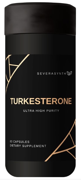
24 Responses to Option A
The overall design is more appealing. The font size and colors on the options simply pops out.
It has the label of dietary supplement whereas B does not. It also looks really sleek and modern with the goldish/orange over the turquoise color.
I choose A, Because the design really suites well with the product and color is good in black which is more attractive and more branded to look.
The font is sleek and the color scheme makes this label stand out. Option B has an good color scheme.
I prefer option A because I think that it is a more interesting, premium, and masculine design.
this product was very usedul
I don't like the way B is divided
The gold color in A looks elegant and like an expensive product
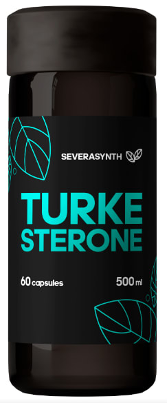
While I like the teal color more, I prefer the word/brand/name on the same line. When it's broken up it looks like 2 words, which I don't think it is?
I would choose the black design it is more attractive to the eye and looks really cool as compared to choice B which has green areas which make it to look a bit off and not that appealing.
The color and spacing and design of this option looks more professional.
Gold on a black baskdrop makes hte product look premium and elite.
I like the color of B, but the overall design looks better in A. Option A looks higher quality.
I thought this option looked nicer and sleeker
I like A more, I think it looks more clean and modern than B.
It looks more luxurious.
I like the cream colored font. It gives it more a sexy appeal to the bottle.
I don't like the name broken up but I do like the blue
I like this option most because its easier to make sense of the product title. I'm not a fan of the spider web design, but I do like the colors.
This option had a font that was a lot brighter so it stood out more to me.
I prefer option A because it looks more polished and unique to me. Option B does not look quite as intriguing to me.
I think with the wider words the label is easier to read.
The product design is catchy and trustworthy. The design is informative and approachable.
I like A better. I think that if it is all one word, then it should be all on one line. I also like the colors a little better
26 Responses to Option B
The blue color is a better looking color scheme than the other.
Bolder, more energetic, and more natural with the leaves. A looks like it has spiderwebs on it.
i like the design in option B the most because the text is easier to read
I definitely like this one better. I really like the color of the font. Light blue is my favorite color and it goes well with black. I like that it is bigger as well
I chose option B because I found the designs and colors on the bottle to be more eye catching.
I like the higher contrast of Option B. The color is really appealing, and makes me think of newer, flashier brands.
The blue design makes it pop way more on the black, and the leaf makes me feel like the product is more healthy.
The color blue goes well with the letter in the container. It's visually more appealing and easy to read. I like the subtitle in the choice A, but like the artwork on the B more. So, I will pick B.
I like the teal contrast against the black, along with the leaf graphic. Very appealing.
I like the design of option B better as the colors look more appealing.
I like the design and the colors used.
I prefer the design of the dietary supplement bottle of option B more than option A. I liked the design of the font of option B.
The font color and sizing is more eye catching and aesthetic on my top choice
I love the way the turquoise pops off of that black. I think this color combination is not as normal so it makes it even better.
I chose option B because I like the colors more.
too better design and style with unique font color
The teal color really makes it stand out more and makes it more attractive It catches the eye better, is easier to read and makes it look high quality
Green is always an association with natural and clean and if it’s a supplement it helps you know it’s made from natural ingredients
The blue font on the bottle in B appeals to me. I like that shade
The blue text on the black background of this bottle in B is an appealing way to display this product
This product in the bottle is very looking in the natural product in this turke sterone design in the beautiful color and the healthy product in this very like this captules in this energy in to the product
I really like the design with the blue because it gives off a calming impact of the font. I think the medicine or dietary supplement should give off a good vibe because it is going into your body.
I like the pop of blue for b. It would make me want to see what the product was for.
I love the light blue colors, it fits the leaf (nature) theme of the supplement better.
the colors and large font stand out more
The design in A has several drawbacks. First, the bottle is not transparent. It is not possible to examine the product without opening the cap. Second, the words in white are blurry. As a comparison, the design in B is better. The brand name uses light green is also a good choice since people commonly think green is a natural color.
Explore who answered your poll
Analyze your results with demographic reports.
Demographics
Sorry, AI highlights are currently only available for polls created after February 28th.
We're working hard to bring AI to more polls, please check back soon.

