Poll results
Save to favorites
Add this poll to your saved list for easy reference.
Which design do you like the most and why?
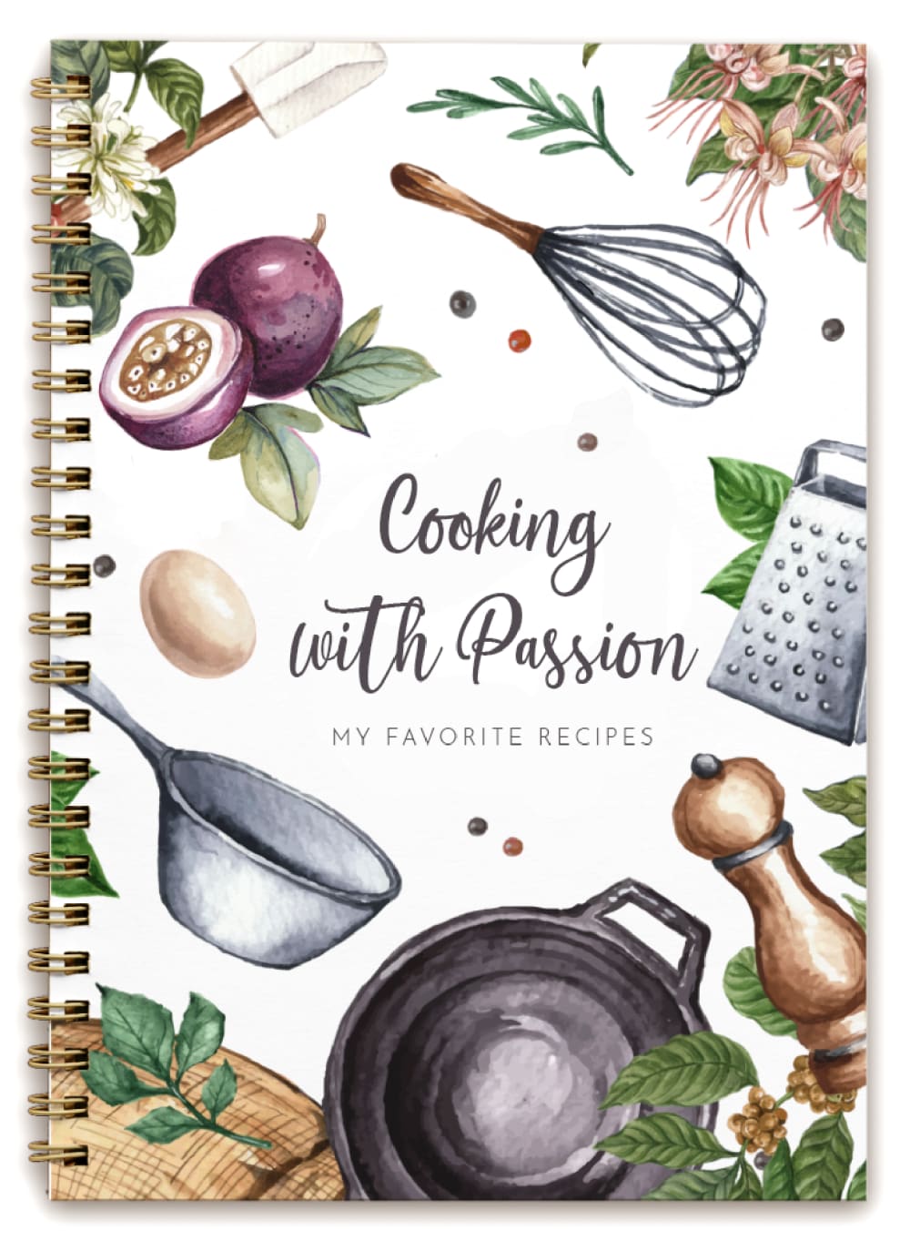
Option A won this Ranked poll with a final tally of 27 votes after 1 round of vote counting.
In a Ranked poll, respondents rank every option in order of preference. For example, when you test 6 options, each respondent orders their choices from first to sixth place.
PickFu requires a majority to win a Ranked poll. A majority winner differs from a plurality winner. A majority winner earns over 50% of the votes, whereas a plurality winner earns the most votes, regardless of winning percentage.
If an option does not earn a majority of votes, PickFu eliminates the option with the lowest number of votes. The votes from the eliminated option are reassigned based on each respondent’s next choice. This process continues in rounds until a majority winner emerges.
Scores reflect the percentage of total votes an option receives during the vote counting and indicate the relative preference of the respondents. If there is no majority winner, look to the scores to see how the options fared relative to one another.
| Option | Round 1 |
|---|---|
| A | 54% 27 votes |
| B | 24% 12 votes |
| C | 22% 11 votes |
27 Responses to Option A
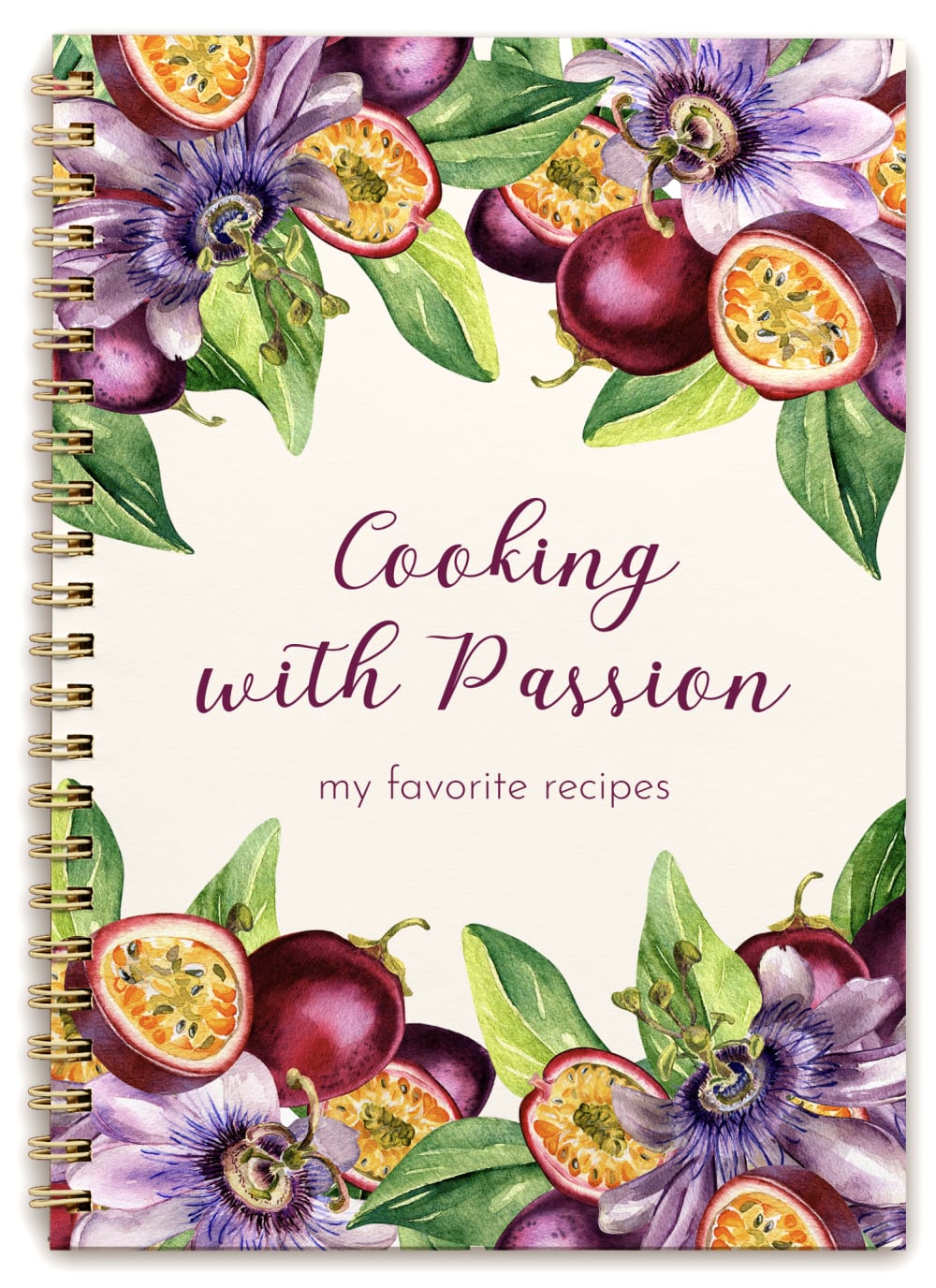
option A appeals to me more because of those raw looking kitchen essentials beautifully placed. option c cover looks colorful so its second choice
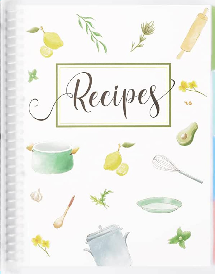
A first because I like how the images are scattered through the coverB second because in also like how the images are scattered but the colors are a bit too lightC third because there is too much going on with the design and the design is a bit too dark
I like all three covers, but A is the best looking one out of the bunch (in my opinion).
I like all three options in different ways but I like option A and C the most out of the three options. I prefer option A because I like the artwork of the kitchen utensils and cooking pots I think it's very beautiful and artfully done and is a great gift for a food enthusiast who likes to cook and keep recipes I like the colors and the patterns on this cover the most. I like option C second best because it has such beautiful colors with the flowers and ingredients. It's a very colorful cover that I think would be appreciated by a food and recipe enthusiast. I like option b third best although it is very minimal it looks very delicate and has a nice cover it makes a great gift for someone who likes the style but doesn't like a very overly done type of art. I personally would gift it to someone I knew who liked this style but it would not be my first choice for myself.
I put the designs in A, C, and B order. A is my favorite. I would buy A.
I love A and B the most because the images on the cover are relevant to cooking and the kitchen and that is something that I love and look for. From there, I love A the most because the color pops out for me and that is helpful for me and also like the brightness of it
I love option A. I think it brings in so many different elements of cooking on the cover. The design of how it is drawn is unique and beautiful. It is a recipe book I feel you could leave on your counter to show it off the design is that pretty. Option B was next, I feel the design is too light. I like the pattern just which it was brighter or darker to make it stand out more. I do like how it just says recipes. Option C was last, the design is really pretty. But just from looking at it I wouldn't be immediately sure it is for recipes or cooking which I think you can easily tell with the first two options.
I especially love the artwork of A. It pops and has a beautiful design. I would go with that one as an artistic person. B could be good if you like a simple design that's not too loud.
For recipes notebook, I have chosen A as the best choice for me. The best design and type. I like vegetables images, very cute.
I don’t really like any of these. I find them all to be old lady like and frumpy. However, I find A to be the least so.
A is very well designed, and the words on it are great as well. I also really like the design on B, if that design had the same phrase as the others it would look great!
I think that the cooking with passion on the front is very cute and makes it look very unique and I love it . Then I based on design with A I love the design C's design is okay but not great and B's is way to simple.
I dislike the font on all of them. But the design on A overall is very cute.
Option A is covered design gives off classic family heirloom Vibes that I would be more than proud to pass down to future generations. Option B and C are pretty, but they lack that homey vibe.
That first one I feel like you could just leave hanging in the kitchen and it would look good as well as be useful, The second one is also neat looking but I’m not as much of a fan, and the last one almost looks childish when compared to the first two, though I would consider it if I were getting one for one of my kids to play with.
1st-A: the text speaks what I want to write in this textbook. The design is cool with colored tools.2nd-B: it’s simple with small cute drawings3rd-C: it's too colorful
Option B seems to bland. I like option A the best but wish that said Recipes instead. Option C doesn't feel like a recipe book.
I like option A because it is simple and whimsical, but not overly busy
I love the design of the whole notebook. I can write so many things in it .
It looks really pretty and makes me want to use it.
Cover is more real. Title is more catchy & heartfelt.
This one is more southern. The others are okay. I like the second ranked one
I like the combination of flowers and tools. They look great together with this color scheme.
very vibrant, cute, lots of artistic skill
I enjoyed the one with the fruits on it but found that the one that had the cooking tools (whisk, grater, pots, etc.) more attractive and more along the lines of cooking with a passion. Option B seem pretty bland, though it would be my second choice for the cover of the item. I think that option C had just too much color on the front and I found the cover "loud".
They are simplistic but cute at the same time. I personally wouldn’t want to buy one that’s too busy.
Because from cover sheet you can understand what this notebook is about
12 Responses to Option B
I don't really like the art style used in these options, they look like the art style that's used for children's books. I like option B the most because it looks the least like a childrens' book while option C looks the most.
I like B the most because I like that it just says recipes on it. If someone was in my kitchen and wanted to find a recipe, this cover would tell them they found the right book without having to look through it.
I like option be the best because it is a light color with a minimalist design
I liked how simple b was
I personally just like a basic "recipes" cover. I like the simplicity of the illustrations in B the best.
I like B and A, however I don't like the title of A or C. I think a simple 'recipes' title is just fine.
I just like the simple "recipes" cover. Im more concerned about what is inside the book.
I like the simplicity of the art of cover B. The colors are neutral and natural. Cover C has a pretty pop of color. I like the floral designs. Cover A is nice as well. The cooking utensils are well designed.
It is simply and clean and nice to look at and overall pleasant
I liked the design a lot more than the rest of the options. It’s a lot more simple and clean.
It’s not too much but it’s just enough. I think the color choices are nice and doesn’t make you lose focus of what the book is for.
It is not really busy like the others
11 Responses to Option C
B's colors felt too dull. I liked that the colors were richer in C.
i adore the focus on the pomegrantes, the second also does but not as much the last is still cute but a little plain
I like the text not having a box around it and instead filling the space with colorful kitchen items.
I like the fruity cover the best, it looks the most fun and unique from other recipe books ive seen
I like the colors used on design C although I would have just left the title as Recipes. I like the design of choice A over B. I just like the simple recipes title on choice B, and would use that for each book.
Option C is the most aesthetically appealing. I love the color scheme it’s bright and eye catching. Option A is nice too but it it’s not as nice as option C. Option B to me is very basic and boring.
I like the bright colors, it caught my eye first and it’s very pretty.
I like the design of it including the font and the picture format.
Its bright and captures your attention. It looks like the cover would be durable.
The first one is very pretty. If I seen it in the store I would pick that one up first to look at it as it is eye chatching.
I chose option C first because the floral design is so pretty and nice to look at. It caught my eye right away. I chose option A second because I like the cooking theme design and it is playful yet to the point. I chose option B third because it is pretty but it is too simple and plain. There’s not much to look at and it doesn’t stand out to me.
Explore who answered your poll
Analyze your results with demographic reports.

