Poll results
Save to favorites
Add this poll to your saved list for easy reference.
Which design do you like the most and why?

Option C won this Ranked poll with a final tally of 28 votes after 2 rounds of votes counting.
In a Ranked poll, respondents rank every option in order of preference. For example, when you test 6 options, each respondent orders their choices from first to sixth place.
PickFu requires a majority to win a Ranked poll. A majority winner differs from a plurality winner. A majority winner earns over 50% of the votes, whereas a plurality winner earns the most votes, regardless of winning percentage.
If an option does not earn a majority of votes, PickFu eliminates the option with the lowest number of votes. The votes from the eliminated option are reassigned based on each respondent’s next choice. This process continues in rounds until a majority winner emerges.
Scores reflect the percentage of total votes an option receives during the vote counting and indicate the relative preference of the respondents. If there is no majority winner, look to the scores to see how the options fared relative to one another.
| Option | Round 1 | Round 2 |
|---|---|---|
| C | 36% 18 votes | 56% 28 votes +10 |
| A | 38% 19 votes | 44% 22 votes +3 |
| B | 26% 13 votes | Eliminated 13 votes reassigned |
Age range
Amazon Prime member
Education level
Gender identity
Household income range
Options
Personal income range
Racial or ethnic identity
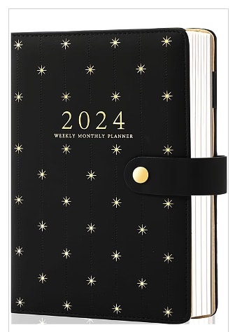
19 Responses to Option A
I like option A because I prefer black and the stars look fine, the other two options look too busy to me.
I like the simplicity of A's design.
A is the most tasteful cover, in my opinion, as it is the most restrained, and it also has the year clearly listed, which is always helpful. While C is a bit busy in design, I still greatly prefer it over B, which is far too chaotic, so C takes second place.
i much prefer the simple and minimal design as it does not seem tied to a season or anything.
B is way too busy with the print for me. I would rather have something subtle like A or C. I really like A and C, the print isn't too much and it's more neutral as a design as well.
I prefer the simple background. It makes it easier to read the text on the cover.
simplest and least easy to tire of cover
a looks the most timeless and elegant. i feel it would be very relaxing and feel very organized because of how structured the pattern is.
I like the black background and gold starry designs on the cover of option A.
I like the simplicity of A, makes it easier to read the cover and it's easier on the eyes. The design on B kind of looks cool, whereas C looks a bit outdated, like grandma's wallpaper.
I think A is the most memorable and eye catching.
It takes me some time to wrap my head around the design in my last choice. it doesn't look right for some reason? I prefer the simple design of my top choice
The simplicity of A makes it the best option. I am not a fan of the colors used in C. B looks bad because the render preview text is still there.
I prefer the most minimalists designs with planner books and ranked the options according to this criteria.
I prefer A because it looks the most fun.
I like choice A a lot because I like the simplicity of it and I think the black and star design looks very pristine and appealing as well.
I like A, I like the simpler pattern design of it. It's elegant and doesn't feel busy. It's just the right amount of a fun design on the planner for me.
I love the classic gold/black star option. It looks to be more timeless!
A and B are most simple. C is too busy.
13 Responses to Option B
I really love the design and color choice of B. A is a bit generic but i think it looks a lot better than C. I dont like Cs design.
the design in B makes it look more original due to the mix of black and gold
Option A is my choice with the added gold to the design which would attract me more often for utilization.
I like the abstract cover of B, and also like that neither B or C has the year on it. I don't want to have to be bound by the single year being embossed on the cover.
I chose option B. Some kind of mystery drew me into this cover. I like the colors and the artwork.
i like the design in option B because it is unique and calming to me
It looks the most interesting and stands out the most. Something I wouldn't forget.
I think this is the prettiest. It reminds me of something I would see in the sky at night. I like the design with all of the gold on it. It looks really creative
B. remove the watermarker and it stands out more, looks unique and different, overall better than the other ones
Options b and c are the most visually appealing.
I like the look and design of this one. It fits my needs and style.
I like the golden fractal design of Option B, and the ornate leaf design of Option C is attractive also
If I actually used a planner, I like the cover design of choice B that most.
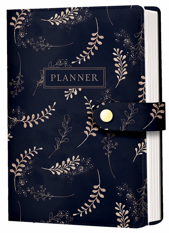
18 Responses to Option C
I like the dark blue cover and the label planner in option C.
The leaf pattern on C felt the most elegant and classy.
I like this because the pattern is more pleasing
I like C the most because of the branches design on the cover.
The blue is the most interesting visually. I don't really like the pattern and 2024 title on A. B is too loud and the background image is too busy.
I like the blue color and the plant pattern on it, plus it's easier to read the planner part with how it's centered and boxed.
I'm not actually a fan of any of these. Option C is the best of the lot but the floral seems kind of random. Option A seems too new agey. Option B seems too chaotic.
I would buy option C. I think this pattern is adorable.
I like the color and pattern on C the most here.
I like the color and design of C. A is a little too simple and B is way too busy to the point of making me feel a bit dizzy.
the look with the leaf design in C is appealing to me, I like the clean aesthetic and almost golden leaf design it gives off, the dots pattern in C is cool to me too.
B is too busy/has too much going on for me. A is ok, but kind of boring and plain. I like C the best - I like the colors and the unique design.
I love the navy blue with the tan/gold leaf color scheme. I also like that it says planner on the front of the cover.
C has a pleasant color and design that I think has a more aesthetically pleasing style
Leaves on the cover look nicer and more appealing. Option C is better designed.
I liked the design for option C the most. It looked very nice. Option A, looked cute. Option B, I liked the design the least. It just looked a bit ugly which is why I ranked it last.
I prefer option C. I like the color and the pattern of this one.
I most prefer the option C planner product design because I like the leaf illustrations and blue color design the most. I chose option B second because I like the interesting patterns shown here much more than the boring star pattern on the option A product design image.
Explore who answered your poll
Analyze your results with demographic reports.

