Poll results
Save to favorites
Add this poll to your saved list for easy reference.
Which design do you like the most and why?
Option C won this Ranked poll with a final tally of 31 votes after 1 round of vote counting.
In a Ranked poll, respondents rank every option in order of preference. For example, when you test 6 options, each respondent orders their choices from first to sixth place.
PickFu requires a majority to win a Ranked poll. A majority winner differs from a plurality winner. A majority winner earns over 50% of the votes, whereas a plurality winner earns the most votes, regardless of winning percentage.
If an option does not earn a majority of votes, PickFu eliminates the option with the lowest number of votes. The votes from the eliminated option are reassigned based on each respondent’s next choice. This process continues in rounds until a majority winner emerges.
Scores reflect the percentage of total votes an option receives during the vote counting and indicate the relative preference of the respondents. If there is no majority winner, look to the scores to see how the options fared relative to one another.
| Option | Round 1 |
|---|---|
| C | 62% 31 votes |
| B | 22% 11 votes |
| A | 16% 8 votes |
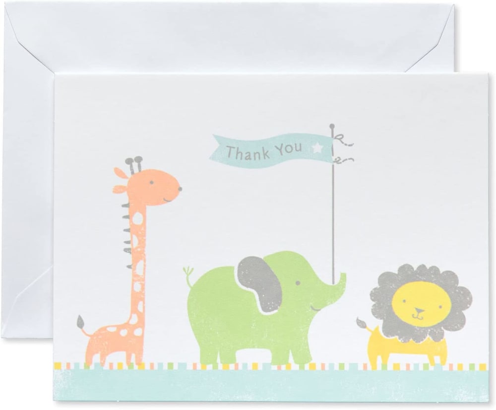
8 Responses to Option A
There is elegance in simplicity and that makes A very elegant.
I like the flag and the three animals together.
i like the design in option A the most because it's so cute and has light colors
Option A could be used for multiple occasions instead of something baby related.
I think pale colors go the best with these types of cartoons. A also has a simpler design.
There's something compelling about this simple kids image
I like the marching animals in A - it's a simple design and isn't as cluttered as the others. The ordering of the words is awkward in B - the "baby shower" floating above the "thank you" looks weird. I don't like C because the elephant's ear color is really bright (and it looks like a candy cane or something) compared to the rest of the design.
Very original, not complicated to understand and with drawings really very grateful.
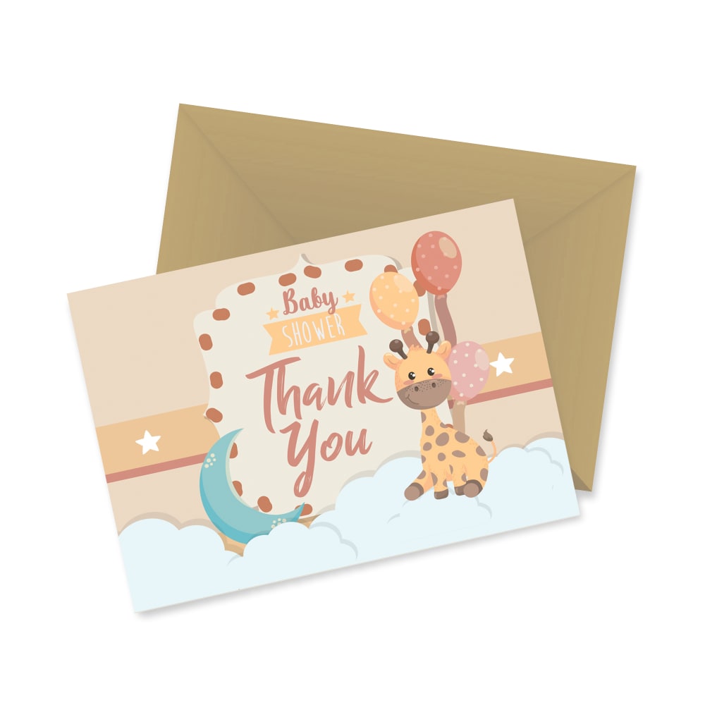
11 Responses to Option B
B and A are the same to me. The design is amazing... the colors are great. C is good too, but a bit too busy
I think all the options are very cute. If I had to pick my favorite, it would be B. I like the simplicity of the design here and how detailed the cartoon giraffe is. I think A and C are also very close when it comes to quality, and I would be happy with any of them.
B is the cutest design and has a cute envelope. C is the next cutest with more design than A.
I like the style, colors, and placement of B the most. I think its the most personal of the bunch. C is cute but there is too much white. A is also cute but i think there is too much open space.
B this just looks cute especially with the giraffe.
I like the first one. They are all very cute but I just think the B is a little more afordable.
Option B looked super cute with its design. Option C, I thought the colors looked more vibrant than option A which is why I ranked it higher
I think the animal characters in B are the cutest. I slightly prefer A over C because I like the lion character.
I think the giraffe on this one looks the best. I love how cute it is. I also love the overall color scheme of it
A is kind of plain. B has the best colors overall
B looks like the highest quality of cards, I think because of the color scheme and the color of the envelope. It’s also just a very cute design and looks very gender neutral. C is cute also, but not very gender neutral to me. It looks more masculine. A just looks very plain compared to the other two.
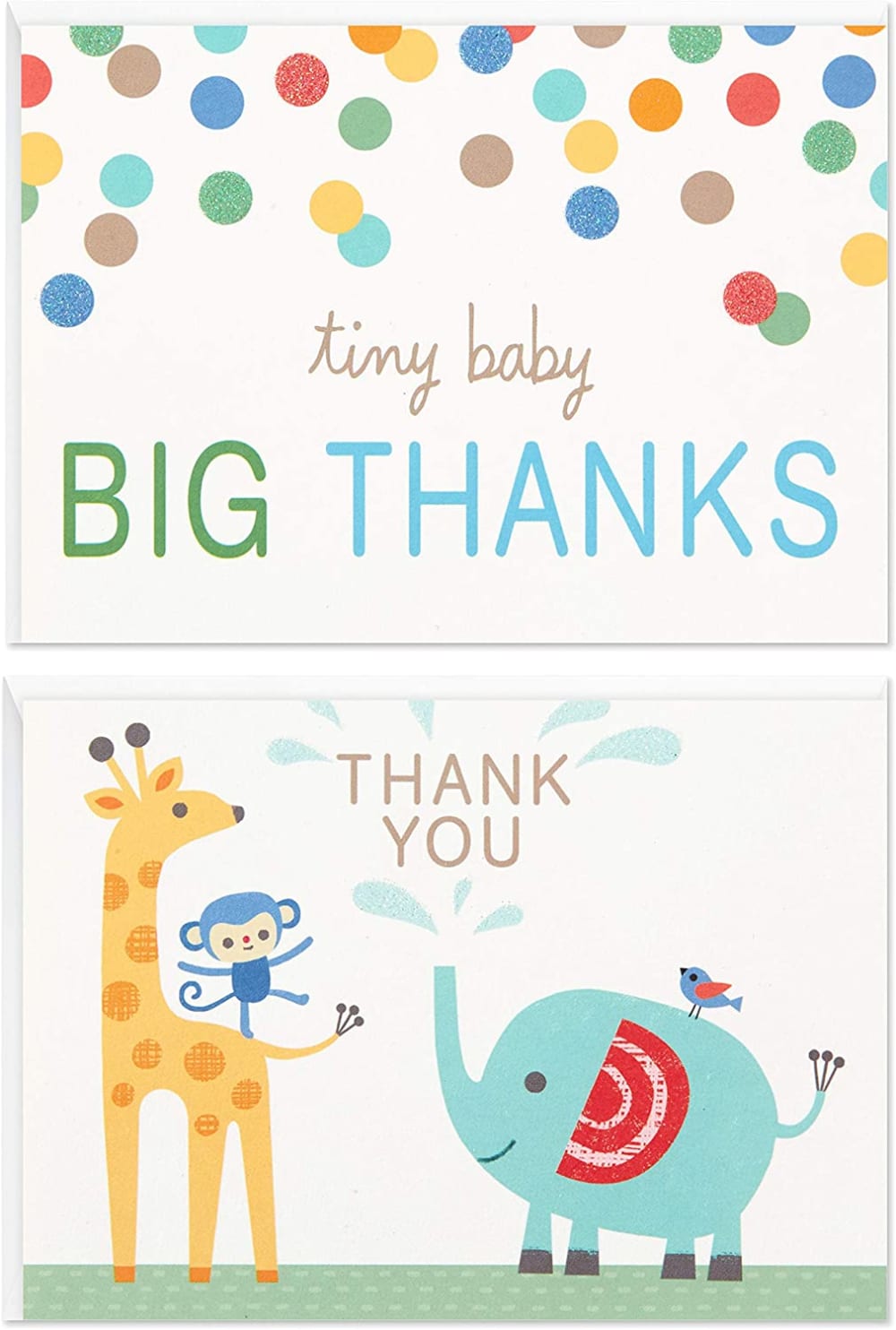
31 Responses to Option C
C has a nice colorful and fun style that I think is suitable for this type of card.
C i like the overall design and it looks pretty cute and fun looking for the most part, B is nice as well and has a very nice design and color palette and i like the giraffe as well, A is ok but seems kind of basic looking and there's really much going for it as far as visual design goes but other than that its ok
This one's color and picture of animals look nicer and more suitable for kids.
C gives you two options and they are clip art style but adorable and would fit for a few occasions. B animal is cuter than A
They are all super cute, C is the cutest so I would buy it.
I like Option C the most out of the three choices. I think Option C just has a better overall look to it compared to the other two designs.
C is showing the inside of the card too right? i like this idea, all of them should be that way. B i had to enlarge to read...the font/color on the word "shower" was tough on my old eyeballs.
The colors on B felt too dull. I liked the more vibrant hues on C.
I like C because I feel like it gives more of a thank you then B because I like that the thank you looks bigger than A.
I like "tiny baby big thanks". I like that the card is larger than a standard card. I also love the cute elephant.
Option C is more attractive , beautiful and more likable by a child. Option B's design is more cute than option A
Selection C shows more animals and the drawings are clearer. selection B is more compact and A is faint and harder to see.
For C & B, these are very colorful and bright with a lot of cute characters with personality. But A is pretty bland in color and the THANK YOU is hard to read.
Option C displays an envelope that is as decorative and illustrative as the card.
I prefer option C because this card looks more personal and makes larger statement but they are all adorable, really.
I like how big and bold and easy to read the thank you is
I like the cute animals with the the words inscribed with them. I find it more appealing.
2 is a bit too pale which seems to make the whole design muted. 3 is a bit brown looking. I like 1 because it's bright and cute with colors that stand out but not so bright it's hard to look at.
I like option C the best. I really like the playful elephant squirting water in the air and the Monkey playing with the giraffe. It is very cute
I prefer the designs with multiple animals. I think C looks the cleanest and brightest. It is the most eye catching. A looks duller in comparison. B looks too busy and tight.
I like c. Original looking and sweet.
Seems most fun and clear about being a thanks.
I think C is the cutest card.
C has better colors, looks bigger and has text
They are all very cute designs, but I like the variety and the phrasing on option C the most.
Option C is the best as both sides have something, and it is the cutest out of the designs.
Option C is preferred. Card has bright and cheerful animal characters. Envelope is engaging as well. Other cards are a bit dreary compared to it.
I liked the first one because it was clear of the purpose, the 2nd option was really cute and clear, and the last one wasn't as endearing or heartfelt.
Options C and A look the most fun and lighthearted.
Very clever wording on option c
C is the most cute, colorful and artistic
Explore who answered your poll
Analyze your results with demographic reports.
Demographics
Sorry, AI highlights are currently only available for polls created after February 28th.
We're working hard to bring AI to more polls, please check back soon.

