Poll results
Save to favorites
Add this poll to your saved list for easy reference.
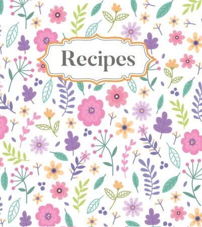
Which design do you like the most and why?
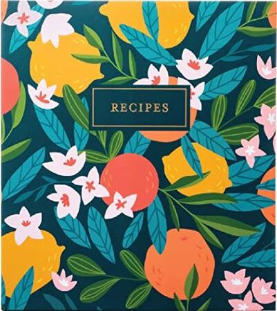

Option A won this Ranked poll with a final tally of 33 votes after 2 rounds of votes counting.
In a Ranked poll, respondents rank every option in order of preference. For example, when you test 6 options, each respondent orders their choices from first to sixth place.
PickFu requires a majority to win a Ranked poll. A majority winner differs from a plurality winner. A majority winner earns over 50% of the votes, whereas a plurality winner earns the most votes, regardless of winning percentage.
If an option does not earn a majority of votes, PickFu eliminates the option with the lowest number of votes. The votes from the eliminated option are reassigned based on each respondent’s next choice. This process continues in rounds until a majority winner emerges.
Scores reflect the percentage of total votes an option receives during the vote counting and indicate the relative preference of the respondents. If there is no majority winner, look to the scores to see how the options fared relative to one another.
| Option | Round 1 | Round 2 |
|---|---|---|
| A | 46% 23 votes | 66% 33 votes +10 |
| C | 28% 14 votes | 34% 17 votes +3 |
| B | 26% 13 votes | Eliminated 13 votes reassigned |
Age range
Amazon Prime member
Education level
Gender identity
Hobbies and interests
Options
Personal income range
Racial or ethnic identity
23 Responses to Option A
I really like the colorful fruit and blossoms on A. I also like that it's dark as it will hide dirt/stains better.
I like the darker color as I am sure at some point I will get something from my kitchen on it and the dark color will hide it. I really like the lemons and oranges, etc. in the design as it reminds me of the kitchen/recipes.
The one with the dark rich colors pops out at me the most but I would probably want to use different colors for different seasons.
I like option A the best, this is because the design is cute. But also it is a darker design than the other options, which is important for recipe books, I feel stuff gets spilled on recipes book so the darker design would hold up better. Option B was next because I really like it I feel the design has bold flower prints and it is pretty, just a bit too light. Option C was last, it is too light colored for a recipe book but also the design is too childish/young for my liking.
I like the bold dark colors and i think it would staylooking clean longer
I like Option A the most because it is so bright and colorful, it would make me excited to enter recipes into the book. The mix of fruit and plants is appealing.
I like that option A has fruit on the cover because it reminds me of fresh food which is good for a recipe book. I like that option A has the boldest colors. I think option C looks a little old-fashioned.
A - Attractive, bold, bright, fun, and inspiring.B - Pale background is unappealing.C - Too feminine and pale.
Option A has fruits on it that fits in the theme of cooking. Options B and C are nice, but floral designs are subjective to the taste of the user.
I prefer the design in option A because I think it is the most fitting given the label on the product.
I liked the darker background in A
I like that A is a bigger/bolder design and B has some of that too. The colors are more muted in C and the smaller items don't really grab the eye.
I don't like pink products. So, A is the least problematic for me. I also prefer the artwork style in A to C or B.
Because option A is very colorful and noticed immediately out of the 3 images.
Love the bold colors. The design is very good lookingThe design makes it feel like Spring
I like the richer colors over the softer and more pastel shades, so I prefer the look of A over B and C. B is still pretty good, and maybe almost as good to me as A, only a small difference between them, but A looks just slightly more solid and warm to me. Warm isn't quite the right word, at least not in a color warmth sense, but in the sense that I could really see myself having and using a recipe book like that in a warm, cozy kitchen. Plus A is the only one of the three that actually depicts food items (fruits) and that seems most appropriate.
I prefer Option A because I realfly like the design and the darker colors. I also like the way that "Recipes" is displayed with that dark background and framed. It just looks very pleasing to me. My second choice is Option B because I prefer the darker colors of this one, also, but I don't really care for the designs of the flowers or the way that the title "Recipes" is designed. My last choice is Option C because I just don't like this design as all. It's just not my style.
I like the deeper colors and especially the green in this one.
I like A the most because I prefer the dark blue background to a white background. I like B more than C because it has brighter and more diverse colors than option C.
I chose this one because of the bright, rich colors.... I chose in that order. The colors are rich and eye-catching, very bright and happy.
I like the contrast of the dark and the bright colors of A. It will also stay cleaner longer. C looks more dated.
I prefer option A Because I like brighter and bolder colors, this one stands out and looks vivid.
Choice a is cute and a design that I would purchase for myself or even my daughters
13 Responses to Option B
I like the amount of colors, and different types of plants/flowers that are in the illustration in B. I think I like it a little better than A.
i really like the more bold colors better in the choices. i think that choice B is bold but not too much and it doesnt stand out and look bad it actually looks nice.
All three are very good covers, in my opinion, but I like B the most because I own some of the plants pictured.
I would be very happy with either option B or C. I like how simple the flowers are on the covers.
I like the bold tropical patterns of B and A. C looks a little too feminine and young for my taste.
I like the bolder/larger designs in B and A best. I think B is the most eye-catching and the colors would work with my kitchen.
I actually really liked all three options a lot and would purchase any of the three. I chose option B first though because I liked the dark colors mixed in with the bright colors and the look of the flowers and fruit together.
I chose option B first because it has a good mix of masculine and feminine colors in it. I think that there is just enough empty space in between the floral design for it to look attractive and not cluttered. I chose option A second because it has a nice modern print even though it is a tad too bold for my liking. I chose option C last because I think the pastel color palette is outdated and childish looking.
I love the colors in B a lot! I think it looks so pretty and the bright colors of A stand out to me as well too.
B is the most appealing to me as the other 2 options look childish.
I love the vibrancy of B. C is too pastel for my taste.
I like the brighter, bolder hues in choice B to the pastels of choice C. I don't like the background color of choice A.
Option c is just too immature in style. It relates to a young girl to me. Option a is too bold and loud. It would stick out like a sore thumb in my kitchen. Option b is nice because it is muted and sophisticated so it would compliment my kitchen nicely.
14 Responses to Option C
The pastel flowers look the prettiest and would be a nice addition to my pantry
I picked option C first because I really like the color scheme. It won't clash with my kitchen but it will still stand out. Purple is my favorite color, so I like seeing that there. The word Recipes is larger than on the other covers and I appreciate being able to see that more easily. It stands out and the little frame around it adds an upscale touch.
I like the pastel colors and the light background.
I prefer choice C for the lighter colors.
I would choose option C because it is the most feminine and delicate.My second option would be B because the colors are striking but not so strong.And finally option A because it is too dark for a book of recipes
I prefer option C because of the large label. I like how bright the background and flowers are in option C. The item would be easy to see in a draw or a cupboard. I also like how unique the flower designs are. I liked all the options but option C stood out the most because of the white background, unique flowers and the large label.
I picked option C because I like small flowers and white background.
I prefer pastel colors, after that a deep blue can always win my choice.
Option C reminds me of a beautiful and bright spring day and all the lovely flowers that bloom for the first time of that year. I like how pretty the flower colors are, I am reminded of a garden with all the blooming flowers. The different shapes and colors appeal to me and this makes the design in option C the best choice for me
Option C I like the little bit of white background between the colors that makes the flower stand out better
I liked the lighter color tones in option C. I also liked the border for option C the most. Option A, I liked the color combos it just looked nicer than option B. Option B's design wasn't bad but I liked the other options more.
I like light, airy colors. I think they put me in a better mood
The color on A was a bit too dark and heavy. C felt more vibrant.
i like design c the best as it is pretty and colorful. i enjoy the pink and purple flowers that are girly and fun. i like the design of the word recipes and how it is centered.
Explore who answered your poll
Analyze your results with demographic reports.

