Poll results
Save to favorites
Add this poll to your saved list for easy reference.
Which Design do you like the most and why?
There was no majority winner of this Ranked poll after 4 rounds of vote counting. However, Option B and Option D had the most votes (25).
In a Ranked poll, respondents rank every option in order of preference. For example, when you test 6 options, each respondent orders their choices from first to sixth place.
PickFu requires a majority to win a Ranked poll. A majority winner differs from a plurality winner. A majority winner earns over 50% of the votes, whereas a plurality winner earns the most votes, regardless of winning percentage.
If an option does not earn a majority of votes, PickFu eliminates the option with the lowest number of votes. The votes from the eliminated option are reassigned based on each respondent’s next choice. This process continues in rounds until a majority winner emerges.
Scores reflect the percentage of total votes an option receives during the vote counting and indicate the relative preference of the respondents. If there is no majority winner, look to the scores to see how the options fared relative to one another.
| Option | Round 1 | Round 2 | Round 3 | Round 4 |
|---|---|---|---|---|
| B | 28% 14 votes | 34% 17 votes +3 | 34% 17 votes | 50% 25 votes +8 |
| D | 26% 13 votes | 30% 15 votes +2 | 38% 19 votes +4 | 50% 25 votes +6 |
| A | 18% 9 votes | 18% 9 votes | 28% 14 votes +5 | Eliminated 14 votes reassigned |
| C | 16% 8 votes | 18% 9 votes +1 | Eliminated 9 votes reassigned | |
| E | 12% 6 votes | Eliminated 6 votes reassigned |
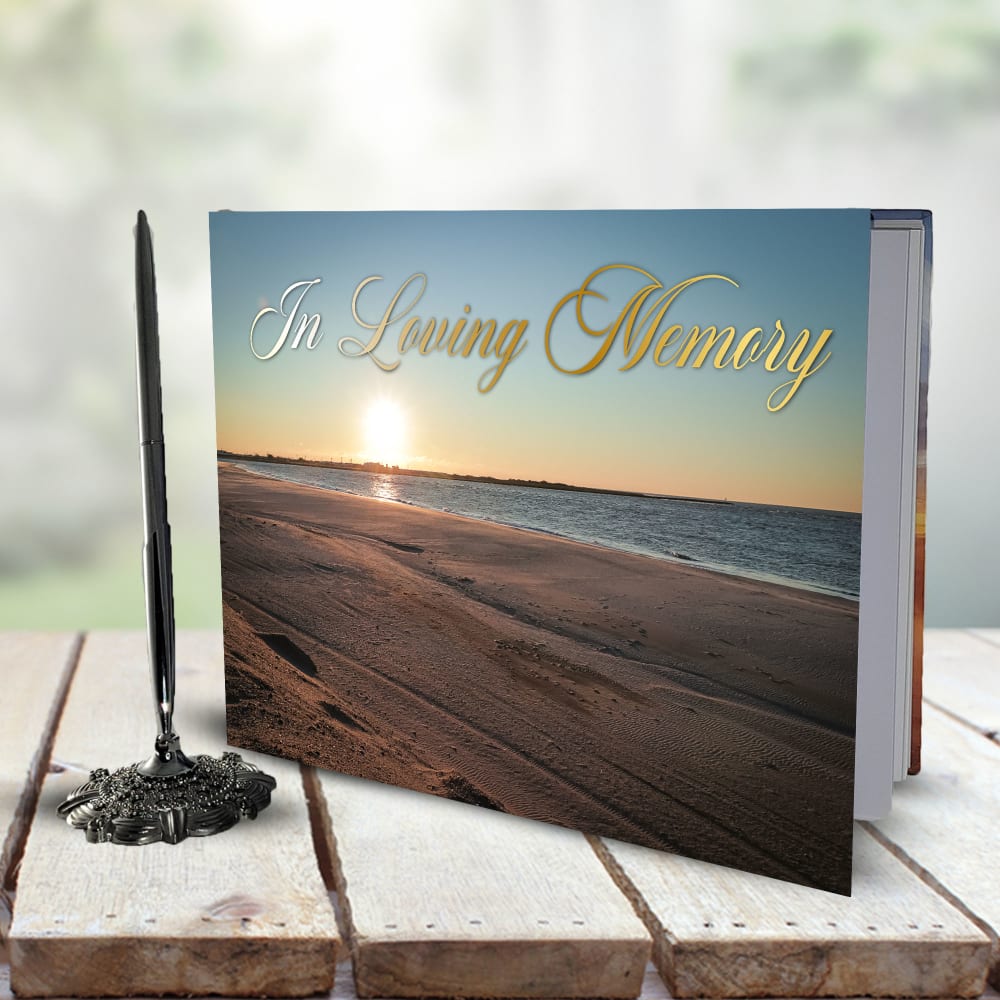
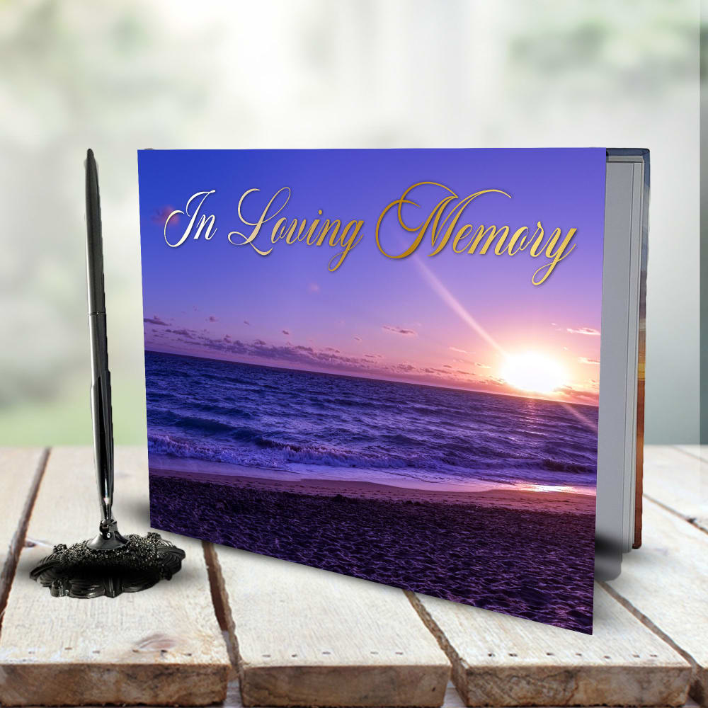
9 Responses to Option A
I don't like the way the font looks in Option D. I also don't like the colors in Option E. Option B is okay, but I think Options A and C look better.
I prefer the lighter images of A and C -- they are more uplifting for the theme.
I ranked them based on their beauty to me personally, although i liked all of them i chose in order of prettiest to least attractive in the moment.
A stands out the most with the simple and eye-catching design.
A's cover I feel is the best as it is able to flow well between the sun, water, and sand.
The top choices look most attractive and professional, high quality, have the best colors, imagery and font
To be honest, I don't love the theme of these. The text also mattered to me and I preferred 'In loving memory' compared to the other one.
I chose A because I found the scene to be both peaceful and clear. I think it conveys a sense of tranquility that is apt for the product.
I chose by options that look the most vibrant and interesting.
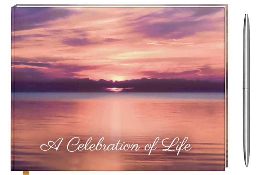
14 Responses to Option B
I prefer the sunset pictures the most, the colors are nice and represent the sentiment the most.
A celebration of life sounds nicer than in loving memory. B has the best image overall. C looks kind of plain and ugly
I like the words and the font best with Option B
The text was most readable and also prettiest on Choice B. Option A has a nice color scheme with a slightly less readable color. Options D and E have similar color schemes and I like the font better in D. Option C is really hard to read and the scenery isn't quite as nice.
"A Celebration of Life" is a better overall title. This is a fun and more positive fit to it. I would use that for the choice. Think it's best to go with that as a title and I feel it will be a better overall fit for the purpose.
I rather prefer the option B life memorial celebration book cover because I like the white color of the cursive text shown here the most and the background image looks nice. I chose option A, E and C second, third and fourth because I like how the sun setting on the left side highlights the first few letters of the cursive text more than the sun setting on the right side where it does not more than more dusty or hazy scene seen in the option C product image. I chose option D last because I do not really like the black text shown in the middle of this image as much.
My top choice has a very appealing photo used on the cover. And the text is very easy to read. Doesn't get lost in the details of the photo like the other options.
The more purple the color the better it is for the background. It is my favorite color so it looks better.
The design of B is very attractive and I strongly prefer the phrase "A Celebration of Life."
I prefer option B. I like the orange sunset with the water reflecting the same color.
I prefer option B because I like the term celebration of life better than the other and the white lettering makes it easier to read.
I like the positive message of the first, then the pretty purples of the next few, then last the more plain and generic ones.
I picked B because it come with a pen and the scenery is tranquil and relaxing, with the cursive not too overbearing on the booklet. I picked A next because the beach scene is touching and it still comes with a pen, but the gold stands out a bit too much. I pick C because the colors are a bit too bright and happy for the ambiance of the book. I pick E next to last because the colors are even brighter than the other choices and can cause eye strain. I pick D last because nothing stands it out among the other choices and it doesn't come with a free pen.
Option B is the best cover because of the way the sun is setting in the center of the book, the clouds also cover it in a very peaceful way. The text being at the bottom and in white text is also a nice touch. The white text is easy to read. The other options do not look as good.
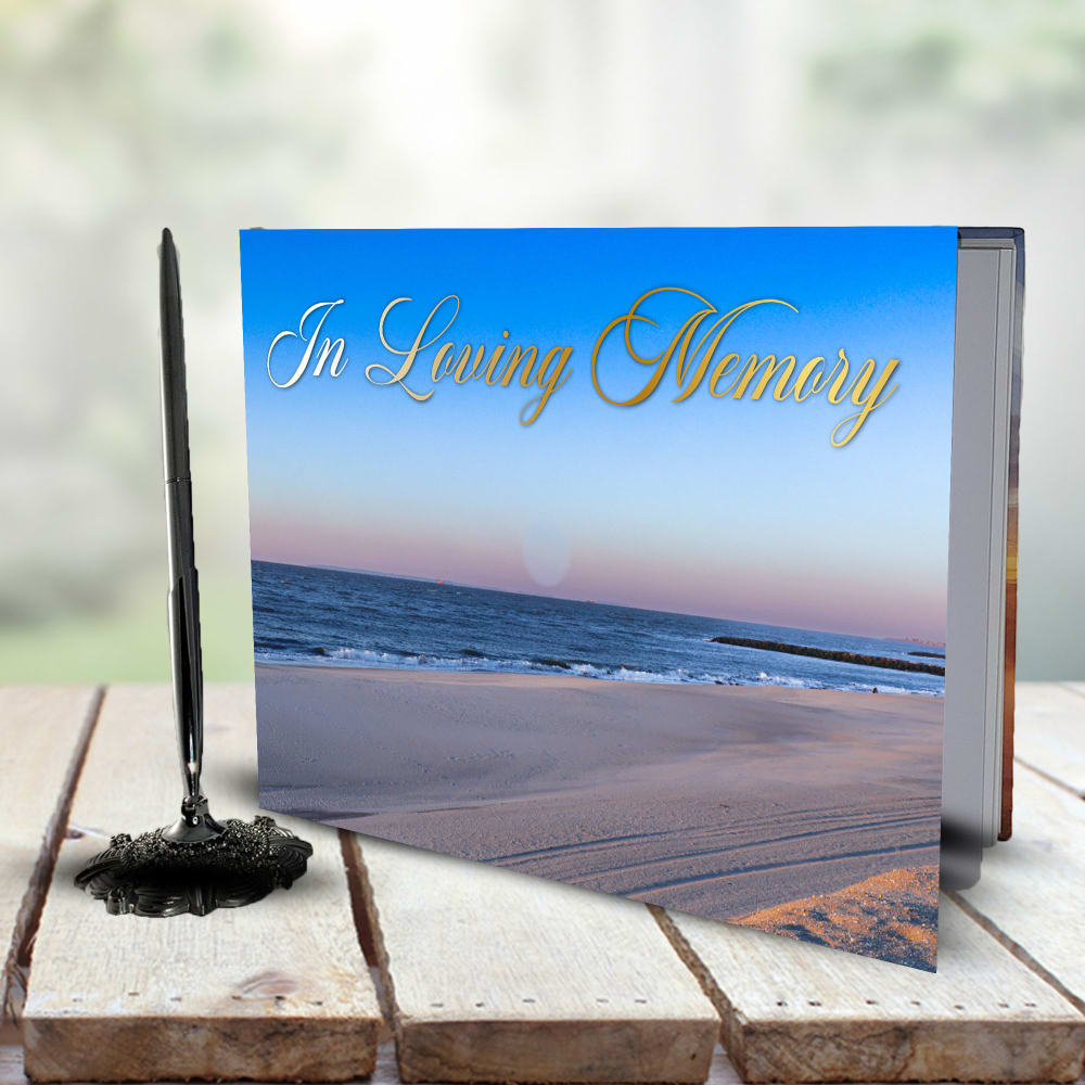
8 Responses to Option C
C, E and A are all nice, but the fonts are tacky on B and D.
I like the ones with the easiest to read fonts. They look the nicest and the most heartfelt.
The scenery is quite exquisite and I'm quite fond of the bright colors for this background. Overall, the shades are thrilling and suitable in most cases where the text is easy enough to read due to the proper contrast being utilized.
While I understand the symbolism of the setting sun over the beach, I prefer the happier image of the sunlit beach in C. It's just more positive.
I think the blue is the most positive feeling and the sunset ones are depressing
C is the only one that is not depressing with a sunset. It is bright and cheerful which is hopefully reflective of the person being celebrated.
C is the best because the color blue is very relaxing. D is the worst because it is not neatly displayed.
I chose option C. I like the different shades of blue and the gray and white which look great. This would be something I would treasure.
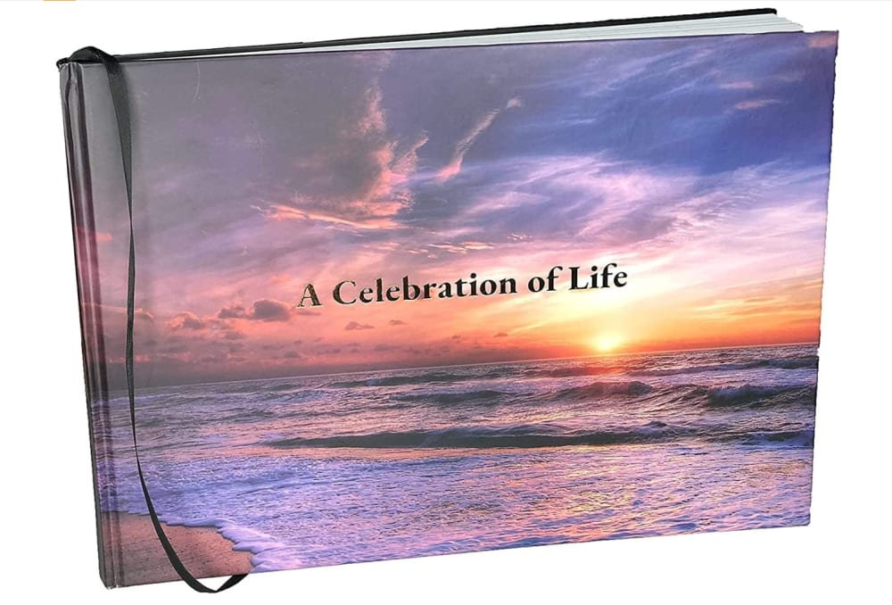
13 Responses to Option D
I like the photo being the main focus instead of the text
I looked for the best balance of light so that it was tasteful but not too dark or bright.
The light in the clouds over the water is entrancing.
I love D, E and B in that order.... I love these three because of the purple and orange colors and the "sunset" style to the photo. They are relaxing and beautiful. I especially love D, it just makes me feel calm and it's so beautiful. The colors are nice.
I like A Celebration of Life on the cover more than loving memory, but then I go with those that are more dull and less bright just as my preference.
I chose option D because it is colorful and has a fine feel of nature. I also like the sunset, it looks unique and cool. I'll stick with option D.
I like how it focuses on a light in the heavens and makes me think of being together again
i like the design in option D the most because it looks the most pleasant and comforting to me
I especially love how colorful the sunset is on option D
i like the graphic on the d and a items. i think those are the most smoothing and would be best for this occasion.
This has such a pretty background in my opinion
Option D is the best as it celebrates a loved one who has passed with an appropriate image of the sun declining over a view of the sea.Options E, B & A also are well done, with a preferential difference in wording.Option C is ok but the other options have better photos.
The more colorful the sky, the better for my tastes. D is my favorite because in addition to the colorful sky it also has stunning, shimmering waters.
6 Responses to Option E
i prefer E and C due to the purple/blue colors of the images
A's awful - it's hard ot read, the colors are bad, it's by far the worst E - contrarily, has the nicest palette of colors with the pink, magenta, purple , and the sun all the way against the right D has the second best color palette in my opinion, with B a step down, but having the third best C is acceptable, non-offensive, but uninteresting otherwise, thus ranked above A (which is ugly, as previously noted) but lower than all the others
E: Love the deep purple colorsD: beautiful sunsetB: nice warm colorsA: sunset looks decentC: blue sky is nice but rest doesn't stand out
Option E because I love the color and that picture on the front it brings me peace looking at it. it's so peaceful looking especially to go along with the purple
I like option E the best, I like how the sunset looks over the beach and the gold print looks nice against the dark background. Option B is nice too, the sunset is very pretty. Option C has a nice beach scene. Option D has a pretty sunset over the waves. I don't really like option F, there's too much sand in the photo and not enough water.
The dark purple sky captures both the sadness of loss and the beauty of a life well-lived.
Explore who answered your poll
Analyze your results with demographic reports.
Demographics
Sorry, AI highlights are currently only available for polls created after February 28th.
We're working hard to bring AI to more polls, please check back soon.

