Poll results
Save to favorites
Add this poll to your saved list for easy reference.
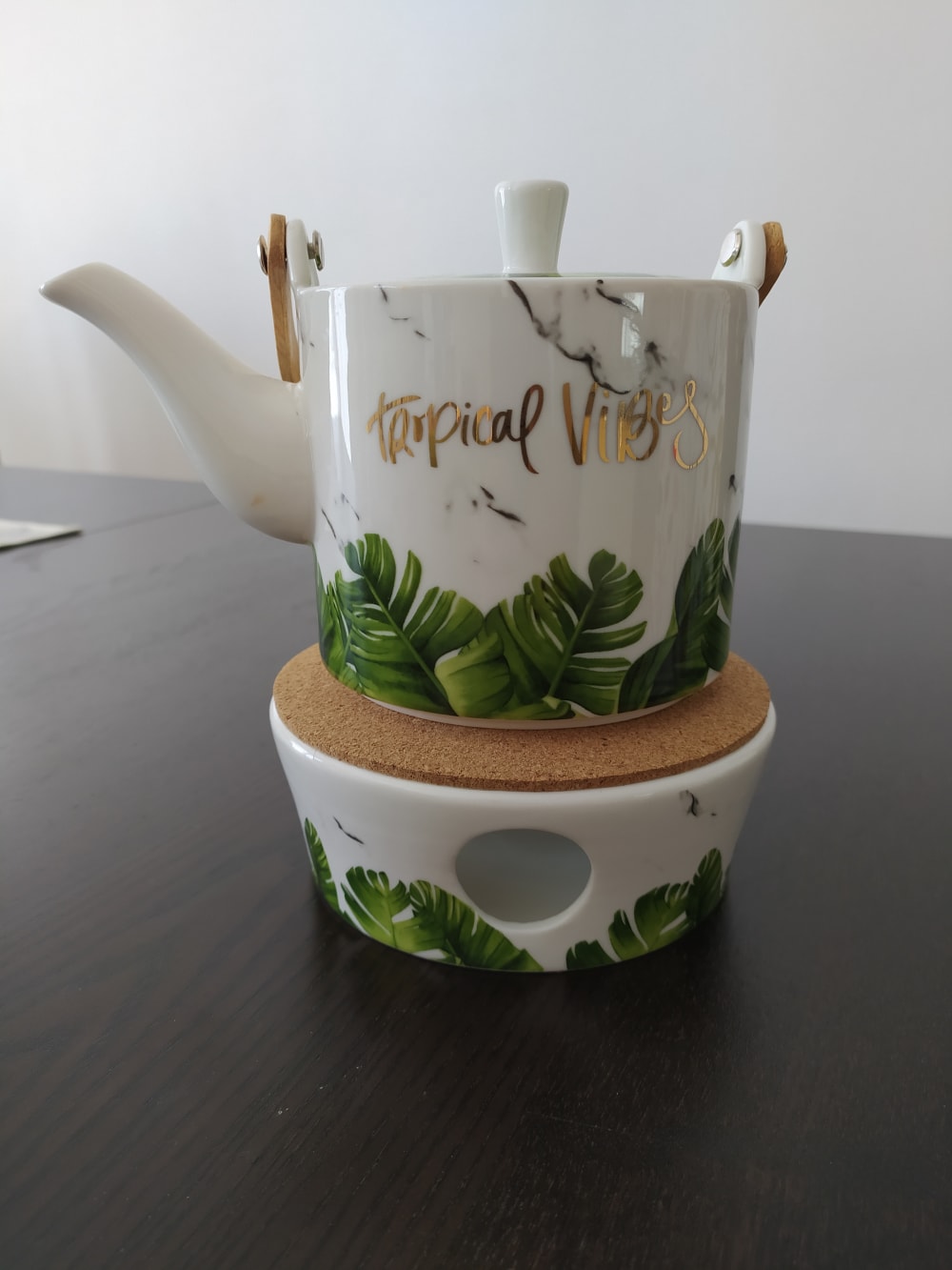
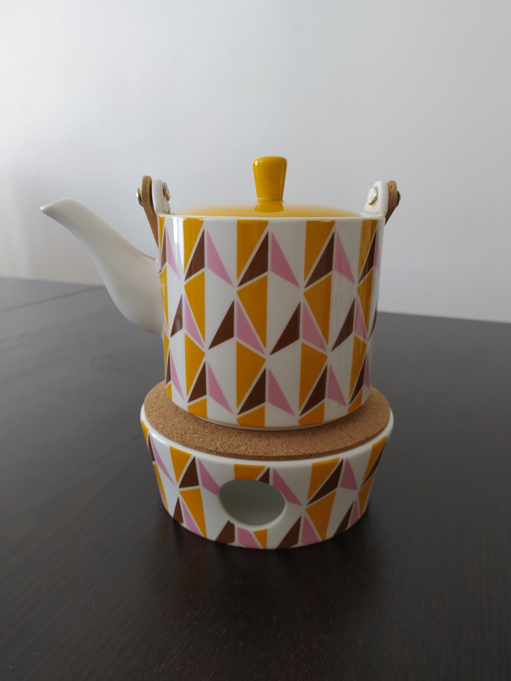
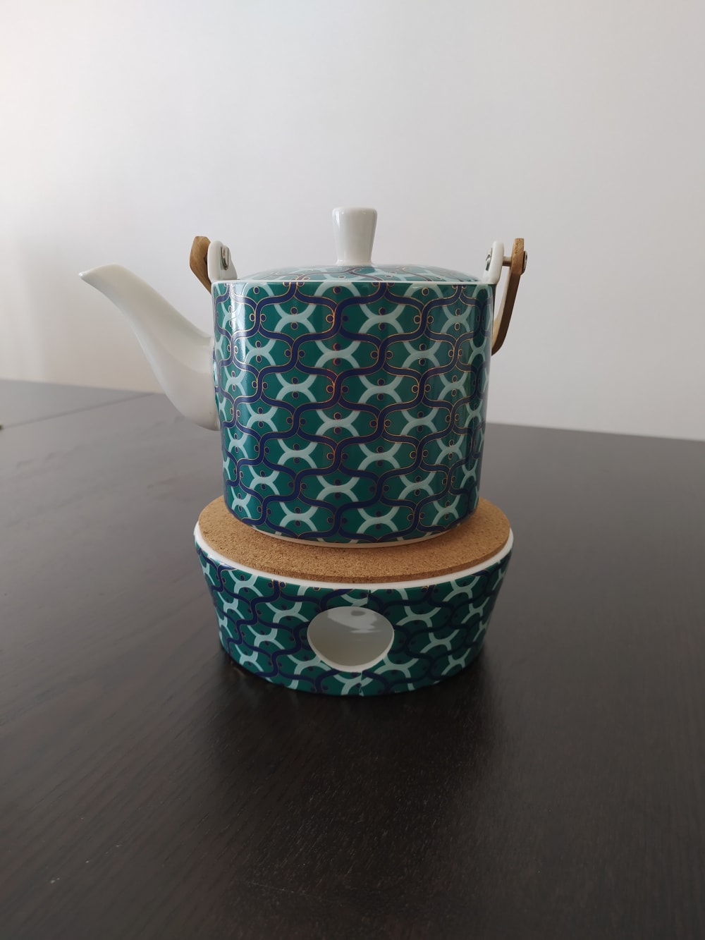
Which design do you like (would you buy) ?
There was no majority winner of this Ranked poll after 2 rounds of vote counting. However, Option A and Option C had the most votes (25).
In a Ranked poll, respondents rank every option in order of preference. For example, when you test 6 options, each respondent orders their choices from first to sixth place.
PickFu requires a majority to win a Ranked poll. A majority winner differs from a plurality winner. A majority winner earns over 50% of the votes, whereas a plurality winner earns the most votes, regardless of winning percentage.
If an option does not earn a majority of votes, PickFu eliminates the option with the lowest number of votes. The votes from the eliminated option are reassigned based on each respondent’s next choice. This process continues in rounds until a majority winner emerges.
Scores reflect the percentage of total votes an option receives during the vote counting and indicate the relative preference of the respondents. If there is no majority winner, look to the scores to see how the options fared relative to one another.
| Option | Round 1 | Round 2 |
|---|---|---|
| A | 42% 21 votes | 50% 25 votes +4 |
| C | 40% 20 votes | 50% 25 votes +5 |
| B | 18% 9 votes | Eliminated 9 votes reassigned |
21 Responses to Option A
I like the colors the best. The white and green. I like the plants.
I love nature designs, especially with trees and a lot of green. The blue pattern of option C was also cute.
in this order I like the colors and design
I love the tropics, the pattern on the 2nd one is neat but I am not a fan of the bluish grean one.
the last one looks too old fashioned. the first one is very nice though and peacdful looking.
I love going to the islands so the 'tropical vibes' makes me think of happy vacations, so i'd pick A first. I also like that it's not the same pattern all over, but rather just the leaves on the bottom. And green is my favorite color so I guess that also played into my choice. The pattern of C is too busy and just doesn't appeal to me at all.
All of them are very pretty but the first one stands out to me. i love the shade of green and the gold as well is very pleasing. its a beautiful combination and i love it. i would buy it myself.
I think option A is the best as it has a more earthy design and would fit in my kitchen better.
I like design option A the most because the colors are more natural and it's more likely to match my current decor, and I'd probably purchase that one. My second choice is option C, because I'm not really into the pattern but I do like the colors, so I probably wouldn't purchase it. Option B is my third choice because it's a little too color for me and it would be hard to match it to anything that I currently own and doesn't match the outside of my home either.
I like A the best because I like that it's unique looking. I like that it says tropical vibes with the palm leaves at the bottom. It's really attractive. B and C are okay, but a distant 2nd and 3rd for me.
They are all really cool looking
I really like the design of A with it's marble appearance with leaves. It stands out much more than the others.
Option A is most pleasant looking to me. It is not too bold and distracting it has a nice calm style.
Love the tropical theme. Even the word "tropical" makes me feel good. The second would match my decor. The third has an awful combination of colors and designs.
I think the tropical one looks the neatest, if I bought any it would be that one. I like the blue one too because I like blue.
I liked choice A because it looks the most appealing while not looking too distracting or busy. I liked seeing the plants on the design compared to the other choices which weren't as appealing since they were more like wallpaper designs.
I chose option a as my favorite because with the stay at home shelter I am missing the beach and planning vacations. Option c was my 2nd favorite because I liked those colors over option b
Picked A because the wordings "tropical vibes" reminds me the advantages of anything tropical
Option A is nice and cheery, and I like the fact that it has actual words on it.
These designs aren't really spectacular, but I think that the simplicity works better for these.
they look the best
9 Responses to Option B
i like the orange, pink, and brown pattern of B the most. I think it's a cool, unique look, and reminds me of the 70s
I chose them based out of what I would find visually appealing.
it kinda has a 70s design to it. it really stands out
I would mostly purchase Option B. I like the vibrant colors and the unique design. I think that would make a great home decoration.
I like the geometric patterns on Option B, they're modern in a way that fits with my aesthetic. Option C is good too but the pattern is a little old fashioned for me. Option A with its lame slogan and cliche bombshell font is terrible.
I like symmetrical patterns. The colors work well together. Choice A I would use after a hard day to relax. I like the patterns of C but the colors should be softer.
B is cool. Looks retro. I like retro. C is ok. A would be best, except the wording tropical vibes. I would have chosen A if it did not have words on it.
I picked B first because the pattern appeals the most to me. The shapes and colors compliment each other well and would look good in my house. C was second because the pattern didn't go as well in my house. I also think it looks too Victorian. I picked A last because the "tropical vibes" text on it makes it look gaudy. Removing that text and maybe putting the sky with the sun in its place would really increase its appeal.
I like the color scheme of B the most. I like the design of C the best. So, a combination of the color scheme and design of B and C would be my very top choice.
20 Responses to Option C
All choices were based off of color alone. Really cool tea pot overall.
I feel choice C is most complex but simple type of design as it is a repeating design. I feel it's almost minimalist-type design but it's very beautiful to look at .
OPTION A WAS MY PREFERRED CHOICE VISUALLY, BUT I DID NOT PICK IT BECAUSE OF THE WRITING ON IT. SO OPTION C BECAME MY FIRST CHOICE, I LIKED THE DESIGN AND FELT IT WOULD FIT THE MOST INTO MY HOUSE DECOR.
I love my top choice as the blue coloring looks awesome and really stands out. My next choice I like as the natural feel to it is appealing. I am not a fan of the orange colored one as it looks like it was designed for the older generation.
Not too mention on items that have captions on it as is with option A. Options C and B go perfect in a contemporary home/dining room. Like option C the best because it is not too bright of a color but does not call too much attention to it.
I am attracted to all of them. Honestly I would have l probably bought them all. I think I'm always attracted to blues and greens even though the pink and yellow is a nice combination too.
I think the blue and aqua color scheme would really fit well with my decor.
The overall blue-green pattern is more visually attractive as I'm very fond of blue or blue-green in general. The green leaf pattern is second for it's natural, soothing, green leaf pattern. The last choice is rather unappealing due to its use of orange which is among my least favorite colors.
i like the color scheme on this one
looks modern and artistic
A is not my style at all and B isn't either so no chance I would pick them. C is not great but looks the best on the cup and the most normal
Very cool first design with the vibrant green colors.
"C" has a simpler pattern and is in a color that would match the decor of my kitchen
I prefer my first choice because it is the same colors as my kitchen. I nice muted subdued color. The colors on choice B look more like colors you might see in a bathroom. I just didnt like the third choice at all.
Really nice and stands out. Unique design.
I prefer the patterns that blend well in the background or are composed of natural designs like leaves or wood. Overall, these choices of design are satisfactory.
Didn't pick option A because it is too busy, and annoying that the words are hard to read. Between B and C, I simply enjoyed the pattern of C.
All three of these have great designs. I think the design of C is the best and I would be most likely to buy it because it is most visually appealing.
I picked C as my top choice because I love the pattern on it. It could go with all kinds of decor as far as the house goes. The same with option B. It may be a little more difficult to match perfectly but it's a good safe design to go with. The third option is nice but I'm not really into big bold lettering like that.
My favorite color is teal, I like the design of the tropical one and least like the pink and orange ...yuck .
Explore who answered your poll
Analyze your results with demographic reports.
Demographics
Sorry, AI highlights are currently only available for polls created after February 28th.
We're working hard to bring AI to more polls, please check back soon.

