Poll results
Save to favorites
Add this poll to your saved list for easy reference.
Which design do you like? Would you pay for a t-shirt with this design if you were a Toxiekatt fan on Instagram?


Option C won this Ranked poll with a final tally of 32 votes after 2 rounds of votes counting.
In a Ranked poll, respondents rank every option in order of preference. For example, when you test 6 options, each respondent orders their choices from first to sixth place.
PickFu requires a majority to win a Ranked poll. A majority winner differs from a plurality winner. A majority winner earns over 50% of the votes, whereas a plurality winner earns the most votes, regardless of winning percentage.
If an option does not earn a majority of votes, PickFu eliminates the option with the lowest number of votes. The votes from the eliminated option are reassigned based on each respondent’s next choice. This process continues in rounds until a majority winner emerges.
Scores reflect the percentage of total votes an option receives during the vote counting and indicate the relative preference of the respondents. If there is no majority winner, look to the scores to see how the options fared relative to one another.
| Option | Round 1 | Round 2 |
|---|---|---|
| C | 42% 21 votes | 64% 32 votes +11 |
| A | 30% 15 votes | 36% 18 votes +3 |
| B | 28% 14 votes | Eliminated 14 votes reassigned |
Age range
Education level
Employment status
Gender identity
Options
Personal income range
Racial or ethnic identity
15 Responses to Option A
based my choice on what's most pleasing for my personal style preference.
I really liked the blue design in A. The boomerang symbol is elegant and the words are catchy. The words also make sense. C was also good because the 2 fish create a yin yang sign that gives it good symmetry and balance. I did not like B because the font gives off a chaotic feeling. The black and white is also too sharp/eyecatching.
I like the cute type and the soft looking shirts. The blue color is the nicest looking option.
I dig the style and her expression overall
I like the cute boomerang shirt the best.
I really like the boomerang design, I thought it was really cool. The koi fish and the red color was nice too.
The first is just a colorful fun t Shirt. The 3rd would be ranked 100th if I could, seriously "we demand justice" as the cities burn???
I like the no people picture more it's more original, my second choice is the mix genre,mix races picture.
Option B looks like it was meant for two people to wear together. I enjoy the colors of A more than C because the red of C is too brightly colored.
I really like the first shirt because I wear a lot of blue clothes. I like the design I chose third, but I don't often wear red. If it were offered in other colors, I would have ranked it second.
made my choices based on which designs i like the most. and yes i would pay for a shirt with these designs if i were a fan of toxiekatt on instagram
I like my design best it has a good overall look and I like the word boomerang in it
A- pretty shirt that,is also an independent statement! C- interesting and fine if you don’t know the reference, B - you have to be in on this to get it
Option A seemed the friendliest of the three T-shirt designs. Second place is the red shirt solely for the color so Option C there.
I picked A for one because it might be referencing the old TV show but I'm really not a big fan of any of these designs. B is two because the Am I Next design is timely, the name tag doesn't appeal to me at all. C is three because it's an interesting illustration but the style doesn't speak to me.
14 Responses to Option B
They all look pretty cool, but these ones stick out and would look good on me in my opinion.
So look out the clothes in that particular order in my opinion
I like to see people wearing the clothes that I am going to buy.
the first one shows both genders wearing it so i feel i can relate
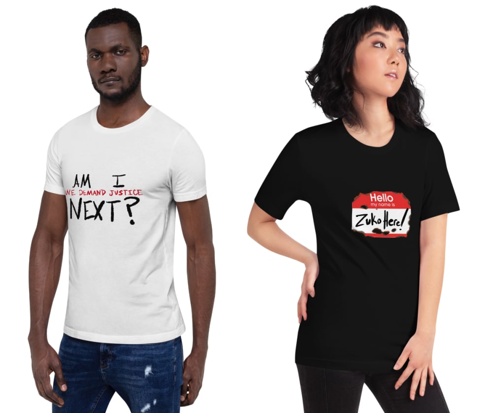
I think the social justice shirt is on point right now so I chose B. I really liked all of them though. They have really clean, expensive looking graphics and the colors are timeless. They look really high end for a tee.
I like the political shirt in option B, "Am I Next" as that is the best and most fitting for the time. I like the two fish photo as well. That seems fun too. I think the designs on these shirts are fun and they would be great in the right situation for the right person.
Option B is extremely relevant considering the unrest and protests currently happening. I could easily see a protester wearing the shirt asking "Am I Next"?
I think B is the most cute
I preferred the choice B due to the current political climate. After that I preferred the boomerang logo as it seemed to just feel like something I'd wear with a subtle joke.
I like the design plus both male and female
I really enjoy the designs in Choice B. I think the designs are fun and interesting. I would definitely considering paying for those t-shirts if I was a fan.
I liked option B and would pay for this T.Shirt when buy the product thats excellent design on it. Fabulous color with amazing design, great work.
nice coloring and graphic
B is visually the most interesting since it plays with established graphic motifs. I think A feels immature, like what you buy at a vacation resort as a kid
21 Responses to Option C
Choice C is most visually appealing to me. I like the graphic design and would be willing to make this purchase.
I don't know what Toxiekatt is, but the designs look nice. Particularly C looks good although that may be due to the smile of the model
I like the color combination and design of the first item and the overall color of the second shirt, or A in this case.
The red shirt looks better.
i like all the designs to be honest. Yes I would pay for these because I am a fan. I would like them better if they were in pastal colors because I dont like red at all
I really like those fish in the shape implying the Yin Yang. That's very aesthetic and has desirable cultural implications
I like the ying/yang design, it's very unique and different from what you normally see. A is cute, I would buy that for my girlfriend I think she'd like it. B the designs were kind of generic and I feel like I've seen similar shirts.
I like option C the best and yes, I would definitely pay for the design if I was a fan.
I like C because it's unique and reminds me of yin and yang. I would pay for the design as long as the price was reasonable. I wouldn't purchase A or B though.
I was really drawn to Option C. I liked the yin yang fish. I felt it was really creative and could start some conversations.
I like the design but I would probably change the color on the first choice.
I picked C first because I look best in red and like the fish design. Then A because I also look good in dark colors. I'd pay for the first one because I like the color and graphic.
I prefer t shirts without script on them so I liked the fish design best. I also think the fish design is very pretty and would like to wear it. However the red is my least favorite color. The shirt I would most want to buy would be the design of C in the color of A.
I like the yin yang design on option C and the color of black and white and red is very striking. Option A has interesting text with the Boomerang but the design of the boomerang graphic is confusing and I'm not sure what it is supposed to be. Option B is not something I would wear because I am very shy and those both single you out for specific attention.
Chosen in order of cuteness of models.
The koi fish Yin/Yang design looks like something out of Avatar: The Last Airbender. I think that it is the most artistic of the three shirts design-wise. The boomerang shirt is cute, but not as artsy. I would still wear it, however. The name tag shirts are neat but aren't a super original design. Text based shirts are more common in general and just don't seem as attractive as picture designs.
I probably would not pay for another short regardless as I have too many, but the red/black color scheme in "C" is by far the superior design.
I think the best pics are when the tshirt fit is shown on someone so A 3. I prefer C to A because the tshirt is more catchy (red) and the model is more appealing so C 1, B 2
I believe that I like C the most because there are minimal / no texts on the page. Overall, I think shirts with too many words have fallen a bit out of style. Therefore, the fish in the pond could go better with more types of clothing. I did find A: funny though - the boomerang was quite funny!
I just loved the design in this shirt. It is really unique with the two fish circling each other. The other shorts were okay but nothing special.
C - It is unique, I have not seen this combo of color and design before. / B - They are cute, but the shirts are very young. I can't see someone past the age of 23 wearing this. / A - The design blends into the shirt. Hard to make out.
Explore who answered your poll
Analyze your results with demographic reports.
Demographics
Sorry, AI highlights are currently only available for polls created after February 28th.
We're working hard to bring AI to more polls, please check back soon.

