Poll results
Save to favorites
Add this poll to your saved list for easy reference.
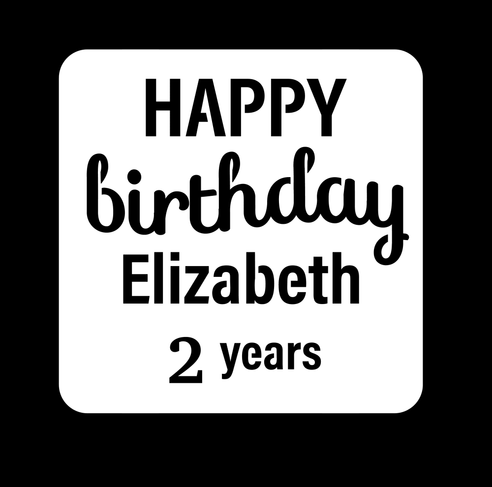
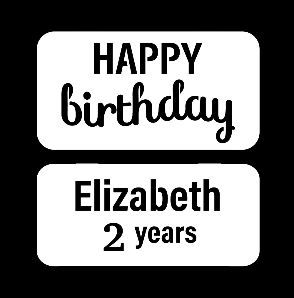
Which design do you prefer?
Age range
Amazon Prime member
Education level
Gender identity
Options
Personal income range
Racial or ethnic identity
41 Responses to Option A
This seems more like one cohesive thought rather than 2 separate ones
i like it all together
I like that in A, it is all one, instead of being split like in B
i like the one piece look better, it feels like a complete thought the other option felt like the 2nd piece was an after thought
Font A seems happier
It flows a little better, it sounds like “happy birthday Elizabeth, 2 years” rather than “happy birthday. Elizabeth, 2 years.”
I like choice A. The design just works better together and flows. I don't like choice B as much as it looks too disjointed and like the name and age were added on in the end.
With option A, the text looks like it belongs to one unit. All of the black text is encased in the white box. With option B, it looks like two very disjointed messages - the happy birthday appears separate from the text stating who it is for and her age.
Definitely all together looks better
While I went with choice A because it looks like it's a full design wishing Elizabeth a happy birthday, there are pros and cons to both images. I prefer choice A because it looks like a full design, but I don't like the spacing of the words birthday and Elizabeth, wish it was spaced a little bit more. I also would go with a different font. Choice B doesn't look like a full design, however if you were able to change the names in the bottom box, you can use the same happy birthday design above, but below just keep swapping out the names in the bottom design box. I don't like that it's not a full image design like choice A is, but if you are able to change the name below, it's saving a lot of time and money from making new designs.
I like A because I think it looks a bit more personalized to have it all on one sign. B looks like it might be two separate ones and the name was just added.
I choose Option A because using the two text boxes on B makes it look like the name is entered in separately. Option A is a more cohesive look.
I like it all together in the same logo.
The design is much more emphatic and eye catching for the viewer. More celebratory design that is much more pleasing than Option B.
I like the design of A better because it is one whole component.
I prefer the sign that is all in one block. I think that this design is better and more cohesive.
Text together is more coherent, looks more like congratulations than a statement.
I think it flows better with it all in one large box.
It doesnt look like it flows well together when it is separated into 2 different pieces.
I prefer this design because everything is on one page and I like the cleaner look of it instead of a black line being divided in the middle
I think it flows better being in one box.
I don't understand the need to split up the text!
The message is much more cohesive and flows better than when it is separated into two separate bubbles.
All together looks cohesive.
All in the white box. The card looks much more professional.
Option B looks broken and separated. Option A looks like it is whole.
I like having all of the text in one box.
I prefer option A with the label not being broken into two parts.
I think A seems to flow better and seems more visually appealing. B seems kind of disjointed.
i like this one b/c its all in one box. the second one has two boxes which it makes it ugly
choice b looks like it's 2 different statements trying to be made. choice A flows together a lot more.
I picked A because it flows better. The other one seems choppy.
I don’t get why the parts would be separated. Option A makes it clear that it’s Elizabeth’s birthday and that the whole thing is personalized for her, not just the bottom part.
I prefer it all being on one square.
It’s more integrated and birthday card like to have the birthday greetings grouped together this way instead of broken apart into two signs or sections which seem disjointed and awkward.
Option A looks more together and more cohesive. I like the look of one box with the message inside of the one box. It looks complete and like it is a well designed graphic. Option B looks disjointed and like it not well done or like it was done by an amateur who does not recognize how to do graphic design correctly
I like A better because it makes more sense to have all the text in one box rather than the 2 in choice B. When I read it, I don't pause after happy birthday so choice A makes more sense.
This one feels like more one unit and not a plug and play with any name
A has a better font
I like how this logo flows together. It does not break up the flow of the theme and picture.
If it's meant to be reused for more than 1 time, B would be better. But A looks like it was "made" for that specific person and that specific purpose.
9 Responses to Option B
This design is what I prefer. It is more readable
The separation in Option B is easier to read and less cluttered.
I like option B because for me when all of the text was in 1 box, the words all ran together
I liked option B because the design is very attractive and fabulous work
My choice would be B I like the somewhat smaller letters in B more than the larger letters in A. It would be nice to know what this product is, a card, a banner? We could make a better decision if we had that information.
This allows for customization more easily.
I like choice B the best. I think the seperation of the two sentences works the best. In choice A, the words run too much together.
I prefer the OPTION B design. The design has the informations presented separately making it possible to consider it for variety with only a little adjustment. The design B is finer and better placed. It's so creative.
Honestly I'm not crazy about either of them. I think "2 years" should be separated from the Happy Birthday Elizabeth in order for it to make more sense. It just reads a little awkwardly as one run on setence.
Explore who answered your poll
Analyze your results with demographic reports.
Demographics
Sorry, AI highlights are currently only available for polls created after February 28th.
We're working hard to bring AI to more polls, please check back soon.

