Poll results
Save to favorites
Add this poll to your saved list for easy reference.
Which design you like the most and why? What will you change?
Option A won this Ranked poll with a final tally of 26 votes after 1 round of vote counting.
In a Ranked poll, respondents rank every option in order of preference. For example, when you test 6 options, each respondent orders their choices from first to sixth place.
PickFu requires a majority to win a Ranked poll. A majority winner differs from a plurality winner. A majority winner earns over 50% of the votes, whereas a plurality winner earns the most votes, regardless of winning percentage.
If an option does not earn a majority of votes, PickFu eliminates the option with the lowest number of votes. The votes from the eliminated option are reassigned based on each respondent’s next choice. This process continues in rounds until a majority winner emerges.
Scores reflect the percentage of total votes an option receives during the vote counting and indicate the relative preference of the respondents. If there is no majority winner, look to the scores to see how the options fared relative to one another.
| Option | Round 1 |
|---|---|
| A | 52% 26 votes |
| C | 42% 21 votes |
| B | 6% 3 votes |
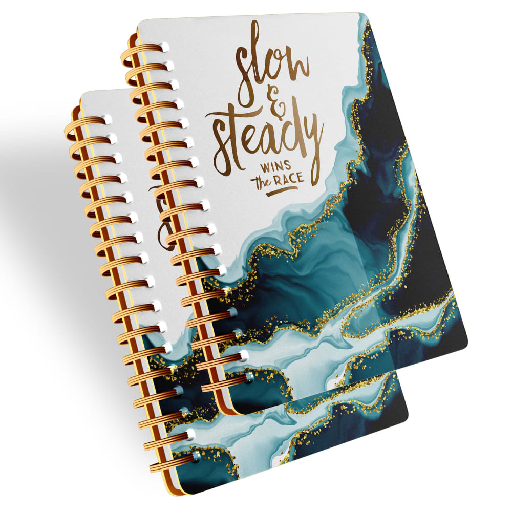
26 Responses to Option A
I liked the design for option A the most. I also liked the quote on the cover the most. Option C, I liked the slightly darker colors used for the design over the lighter washed out look of option B.
I like option A because of the motivational words "slow and steady". I also like the shade of blue rather than the pink
While I like all of these options, I think option A looks the best because I like the images and the font and words. I would not change anything
i really like the boldness of the colors in choice A. i think the blue and pink and gold all really stand out and look nice together. i think that choice B is a close second choice but i wish the colors were more distinct and stood out a little more and had the gold more divided like in in choice A
Option A, I'd rather have 2 booklets, plus I like the slow and steady quote. I don't like option B, the spiral binder is too big, it's going to get in the way.
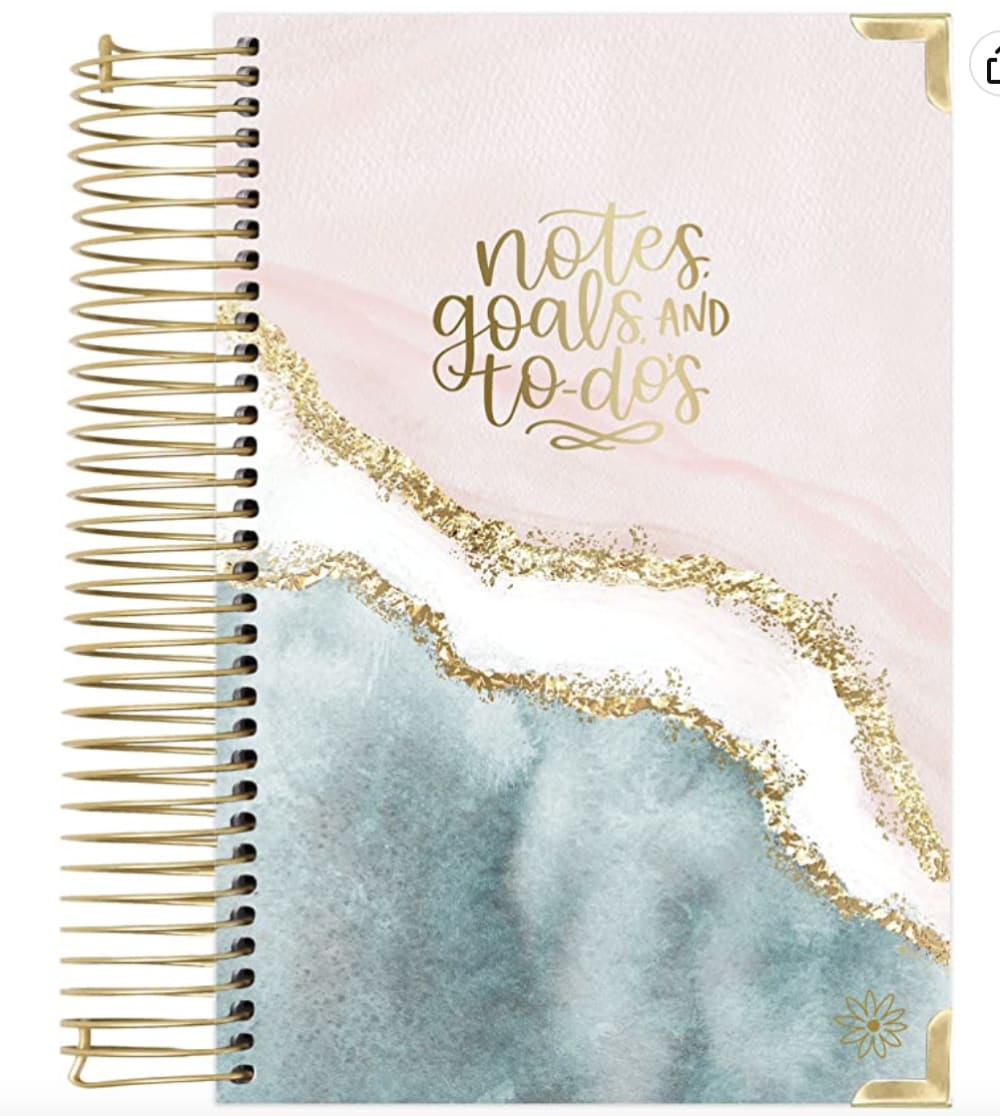
I prefer the design and the large text, but I'd prefer it if it just said "Notes."
Option A I like the gold binder rings and they inlay on the cover. Very stylish. Option B is also a good choice, with the gold sparkles it catches the eye. Option C is kind of dull and boring.
I prefer option A because I think that it is the most interesting and visually appealing notebook cover design out of the three options above. I can't think of anything that I would really want to change about it.
I like A a lot, I think the colors are very pretty and it is a great reminder to slow down a bit. B is very pretty too and I really like the handwriting/font and I like the gold metal corners quite a bit. C is nice too but, I just prefer the other 2.
I liked the color scheme of A, but also enjoyed how it looked like ocean waves.
I like this shade of blue the best on it. I think it shows off the different colors of the ocean the best. I really like the way they blend and match together.
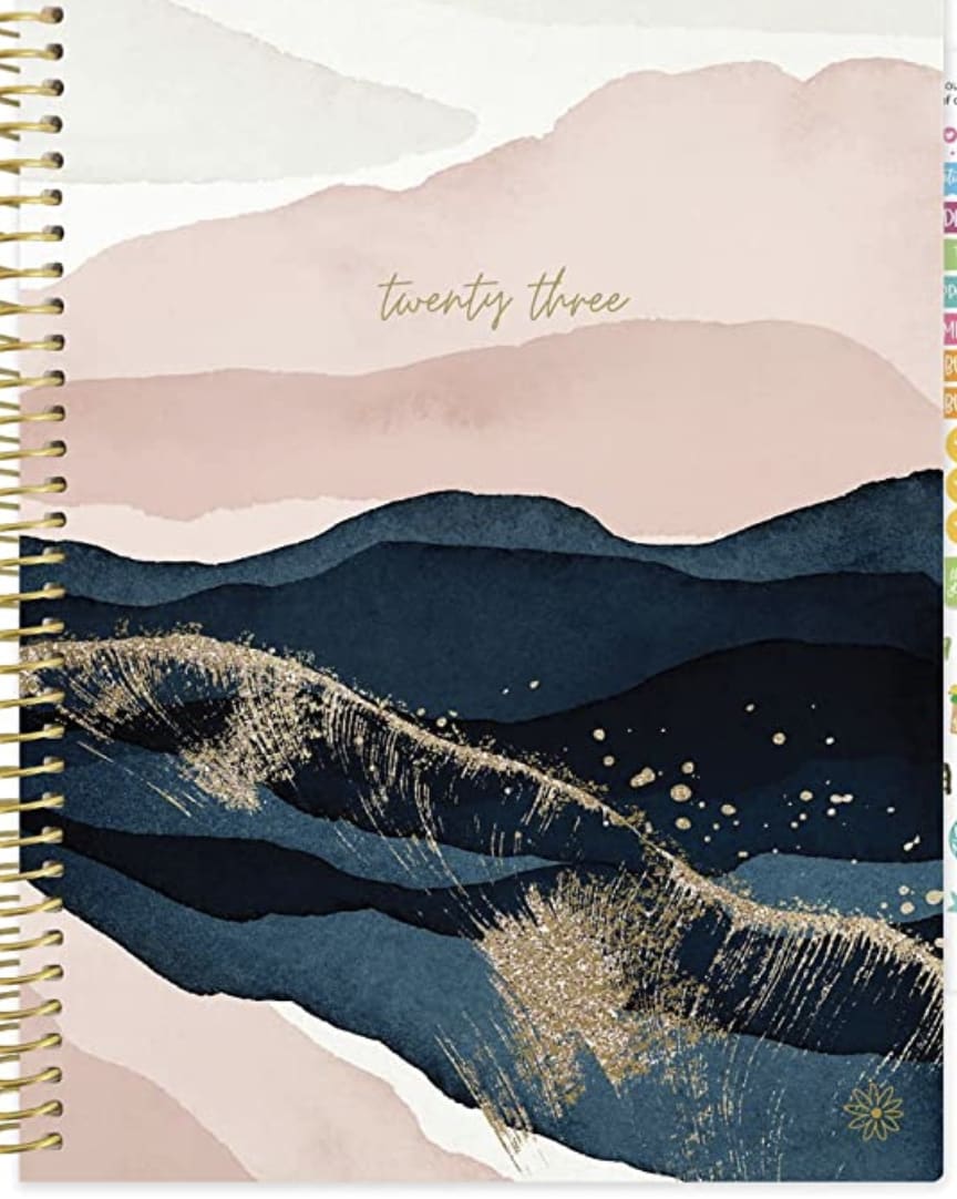
A - I like how the color on this one pops a bit more. The gold in the title stands out much more and the thick gold rings on the binder look durable.C - this is less colorful to me than A but has a bit more of the shading and some depth to it. Wish the title was a touch large but a nice calming design.B - The title on this is a good size but I am not a fan of the huge rings on this. Too bulky and flimsy. Plus I do not like the lack of bold colors and everything is too light and muted.
My last choice can only be used for this year. The other two can be bought in bulk or used for a longer time. I also prefer the white color as it just better fits my style.
I like the ones with the inspiring words on them like A and B, C looks too simple.
The excessive gold in B is very off-putting and overly flashy. C is nice, and understated, and A is a good balance if you want more "flash"
I like the design and colors of A and B the best because I love the color teal, but I prefer the simple "twenty three" print of C.
My favorite option would be A, because I can see from an angle that allows me to see more details of the notebook, plus the colors are striking.My second option would be C, although I would prefer from another angle. In addition, the spiral does not look as good quality as in option A. What does stand out from option C are the colors.Finally, option B does not stand out from the rest because it blends in with the background as it has very light colors, perhaps with a dark background it will stand out more
I like the blue waves on the cover of the notebooks in A with the different shades.
I like the overall design of the coloring and the text is easy to see and understand.
Very hard choice but a is slightly nicer then the other but they are all winners in my book.
Option A reminds me of water. I also really like the metallic gold on white. Options C and B are also really nice too, they're just not as elegant as option A.
I think option A stands out from the rest. I like the pictures and the font. I would change the binder color, it detracts from the book.
This cover looks the best, it has great detail and colors that really grab my attention. I would change the corners from the rounded edges to edges like in my second option.
design wise I like A and C best, but I like the bigger spirals on B best
I would pick choice A my preferred choice because of both the coloring/design on the cover and the wording on the cover. I find both very appealing and positive.
The look of the gold with the darker wave like look of the covers of A and C make sense to me.
3 Responses to Option B
I like the very basic text here. Would be appealing to a wide audience. The design is also very pleasant.
The text of B seems most appropriate for a notebook, although not the most imaginative. Option A may not be the mantra that appeals to a lot of people like me, I think. Any I don't understand the reference to twenty three in C.
I like the more liquid designs on Options B and A more and the way they use the gold touches. I think the message on Option B is the most universal and useful.
21 Responses to Option C
I prefer option C, the illustration reminds me of something tranquil and somber.
My top ranked choice is based on the simplicity of the cover design. The more simple and clean the higher rank
I like all three designs and would probably purchase any of them - but I do like the simply date/year on the front of C the best.
I don't love any of these choice and I would take out the gold dust. On the 3rd choice I would take out that gold lined white stripe altogether.
Option C is the best as it has the prettiest cover and very minimal text as well
I like the marble design on all of them. The simplicity of text on C with just the year is especially nice. I think the spiral binding on B might catch on something at that size and prefer the smaller ones on C/A.
I like the dark blue color on the artwork of option c. The fonts on the others make them look cheap.
I the B has the boldest colors and the best design, it looks more premium. I don't think I'd change anything.
I like C the best, because of the layers of design. I like that it seems to be a desert landscape with mountains. I feel like I see the pattern or look of B and A too often.
For C I like the really dark colors in the middle with the light colors surrounding it. For B, I like the split between the two colors using the white and gold. I like the colors used with A, but I would change the design of it personally.
I much prefer the smaller fonts on the covers. It makes the book appear more intimate and personal. The larger fonts are too loud in my opinion.
I like that the text is understated in C as well as the color palette and scenery. B's binding is a bit too big for my taste but at least the text is on point even if I don't like how prominent it is. A has very cheesy text and generally looks tacky.
I love the chic minimalism of C that is my favorite. B is okay but don't love it. and A i hate that phrase.
The dark blue color toward the middle and the overall warm feeling of Option C make it the best one for me.
C - Best colors and words, keeps the options for use open and doesn't pretend to know you.A - Dislike the white, like the other colors and word selection.B - Attractive design and font, dislike the choice of words.
I like the rich blue colors used in my top choice, which are classy and confident. Very cool for sure!
I prefer this option because it allows more of the background to shine and the font to be small and discreet.
Option C is my op choice as I like the simplicity of the design and that the cover only has the year in word form instead of a cliché phrase. Option B is next as I like the abstract design and that the text details exactly what this book is. And finally option A is last as I don't like the cheesy motivational phrase on the cover - it's cringe to me and I can't imagine reading this every time I use the notebook.
I like C the most. I love the design on this one. I also like that the font is small so that the picture can be the main focus
I like the design and color scheme of my top choice. I find it visually appealing and interesting.
I liked C the best because it had the least annoying font size/style.
Explore who answered your poll
Analyze your results with demographic reports.
Demographics
Sorry, AI highlights are currently only available for polls created after February 28th.
We're working hard to bring AI to more polls, please check back soon.

