Poll results
Save to favorites
Add this poll to your saved list for easy reference.
Which designs do you like?
Option F won this Ranked poll with a final tally of 25 votes after 7 rounds of votes counting.
In a Ranked poll, respondents rank every option in order of preference. For example, when you test 6 options, each respondent orders their choices from first to sixth place.
PickFu requires a majority to win a Ranked poll. A majority winner differs from a plurality winner. A majority winner earns over 50% of the votes, whereas a plurality winner earns the most votes, regardless of winning percentage.
If an option does not earn a majority of votes, PickFu eliminates the option with the lowest number of votes. The votes from the eliminated option are reassigned based on each respondent’s next choice. This process continues in rounds until a majority winner emerges.
Scores reflect the percentage of total votes an option receives during the vote counting and indicate the relative preference of the respondents. If there is no majority winner, look to the scores to see how the options fared relative to one another.
| Option | Round 1 | Round 2 | Round 3 | Round 4 | Round 5 | Round 6 | Round 7 |
|---|---|---|---|---|---|---|---|
| F | 16% 8 votes | 16% 8 votes | 18% 9 votes +1 | 20% 10 votes +1 | 28% 14 votes +4 | 40% 20 votes +6 | 53.19% 25 votes +5 |
| A | 14% 7 votes | 14% 7 votes | 18% 9 votes +2 | 24% 12 votes +3 | 28% 14 votes +2 | 32% 16 votes +2 | 46.81% 22 votes +6 |
| G | 16% 8 votes | 20% 10 votes +2 | 20% 10 votes | 22% 11 votes +1 | 26% 13 votes +2 | 28% 14 votes +1 | Eliminated 14 votes reassigned |
| H | 16% 8 votes | 16% 8 votes | 18% 9 votes +1 | 18% 9 votes | 18% 9 votes | Eliminated 9 votes reassigned | |
| B | 8% 4 votes | 12% 6 votes +2 | 14% 7 votes +1 | 16% 8 votes +1 | Eliminated 8 votes reassigned | ||
| E | 12% 6 votes | 12% 6 votes | 12% 6 votes | Eliminated 6 votes reassigned | |||
| C | 10% 5 votes | 10% 5 votes | Eliminated 5 votes reassigned | ||||
| D | 8% 4 votes | Eliminated 4 votes reassigned |
Age range
Education level
Gender identity
Interest in gardening
Options
Personal income range
Racial or ethnic identity
7 Responses to Option A
I picked them based on their clean, simple but cute designs
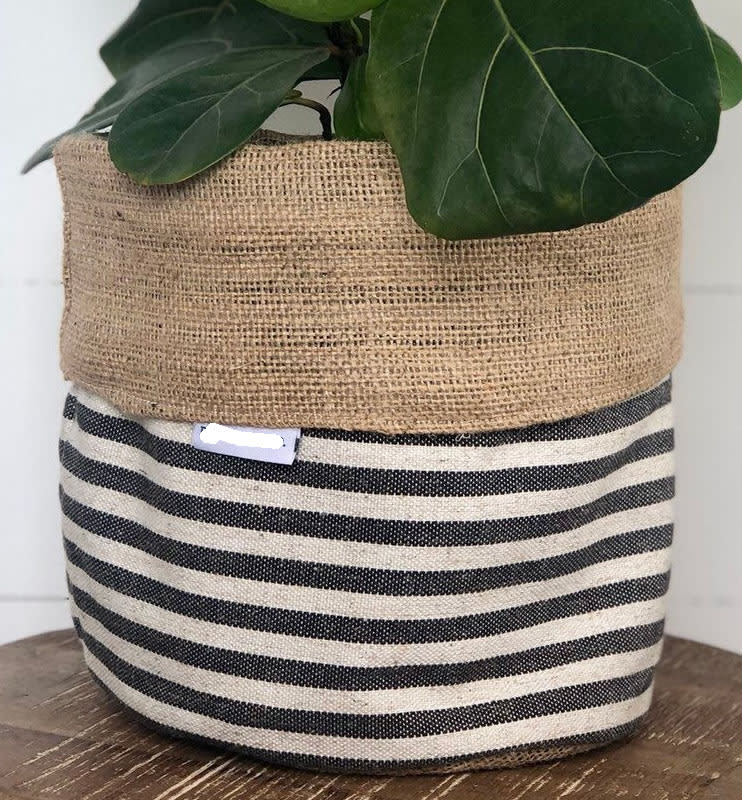
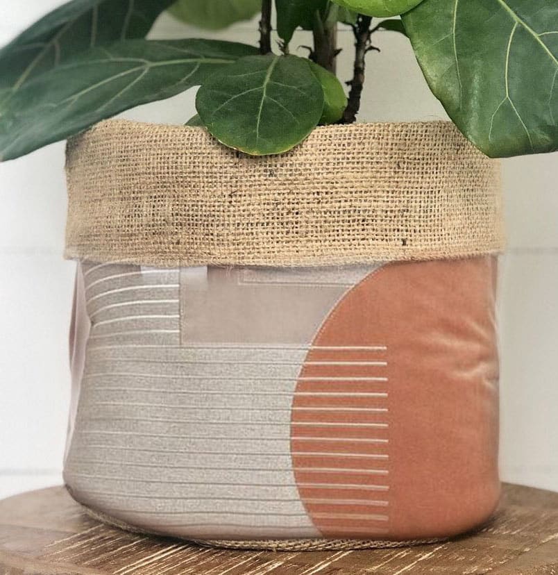
Option A would be my number one choice when it comes to the best design because the simple stripes with the neutral colors would go wonderfully with any type of decor. You can make it work for a farmhouse style, log cabin, chic, modern etc. That's why I chose option A first followed by option E which is a natural brown color with the basket portion looking to be a faux leather which can also work for any type of decor whether it be home or office. Option F was the next in line because it had the closest simplistic appeal out of the remaining options. The color is a very light pink with brown tones and even though it does have a design it's very muted so it could work well with many types of decor as well. Option C is the fourth pick for me because it has a little more going on both pattern wise as well as color wise but the tones are neutral and not really bright or overwhelming so you can make this fit many decor options. Lastly, my final choice is option B because the colors aren't bright which I like because this product is one you can dress up with other decor pieces; however, I chose it last because the pattern is somewhat busy so it would need the right decor pieces to work alongside it within the same space.
I tried to go with ones that either had the best contrast to the actual plant, or that had sort of neutral color palettes. I want a pot that doesn't clash a ton with the plant and my surroundings, since it should be showcasing the plant.
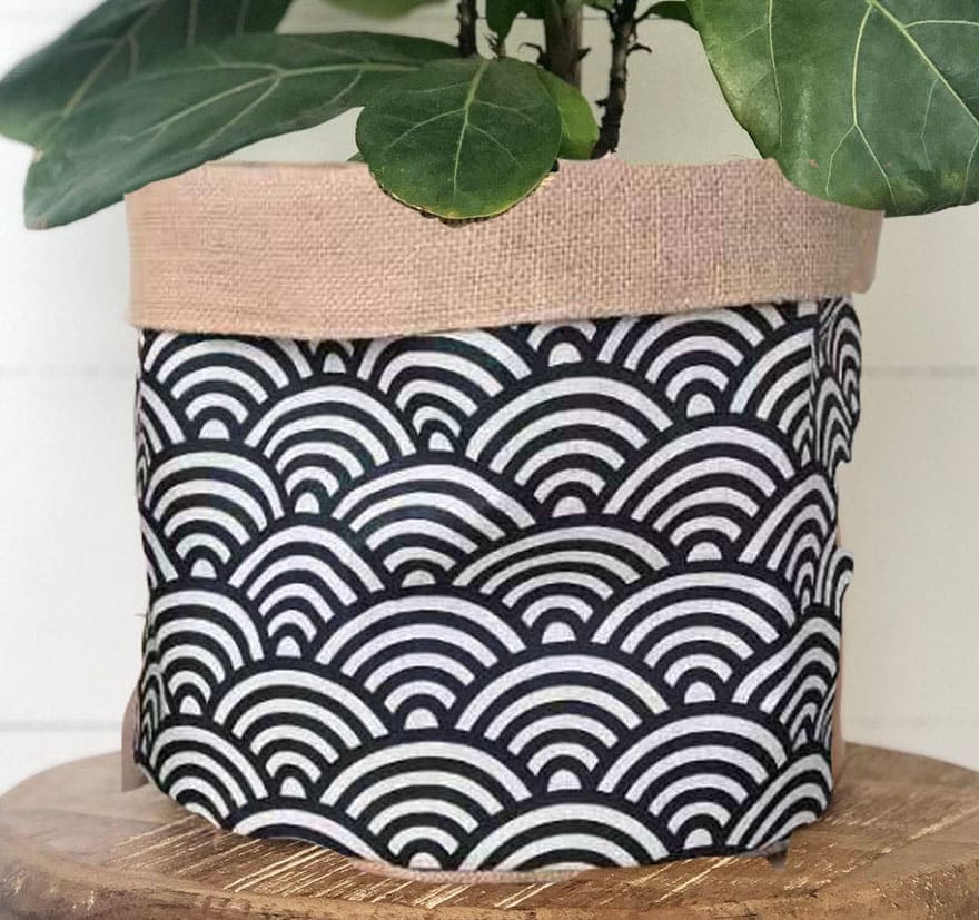
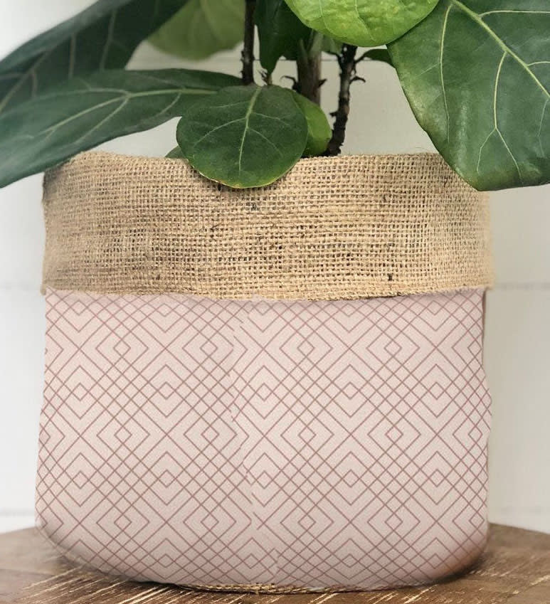
Gosh I love all of these- they would all look super cute in my modern, minimalist, boho home! How gorgeous! My favorite is option A; scrolling through this was the first one that really caught my eye and made me go "oh, I love this!". I love the combination of the modern, geometric monochrome with the natural burlap. I also love that you can still see the texture of the bag behind the black and white. This one would appeal, I think, to almost everyone. H is my next favorite. I love, love, love that pattern although I wish it were seamless. The pattern is whimsical and adorable while still looking modern. I could totally see this one in a living room or a modern nursery. I feel the same way about C but this one seems more modern and adult than H. I can't see this one being as versatile because it's more pink and I feel like my husband (and maybe other men) would be annoyed with that in the living room. but it's so modern and I love it. The pattern is super appealing. I like B 4th because it's monochrome again, but the pattern is busier than A which is a little less appealing. I still think this one would be super cute in a nursery but less so in the living room. I like E 5th because leather is sooo trendy right now and this would match a lot of leather ottomans and leather pillows. This also adds a more upscale vibe to the room which is super appealing.
i have a very neutral and basic style. i feel like my choices would/could fit in any home regardless of colors in the house
Option A is my most preferred option because I feel like the color can go with any other type of decor. That was my reason behind picking the others. I'd rather have a neutral, solid, based color before moving onto patterns that might clash with the rest of the room.
I like the ones best with stripes, those look like they could match with any type of design someone might have.
4 Responses to Option B
I like uniform color to varied designs, what I don't want is off color and random colors or things I finds bit off putting. What I want is consistency and interest and that's what I don't fine in the ones I didn't select from.
The motifs and design pattern are the attraction. The colors with the design make a vibrant and appealing aesthetics. I love the material they are made from , I believe it's a natural fiber, hence environmentally friendly. Superb!
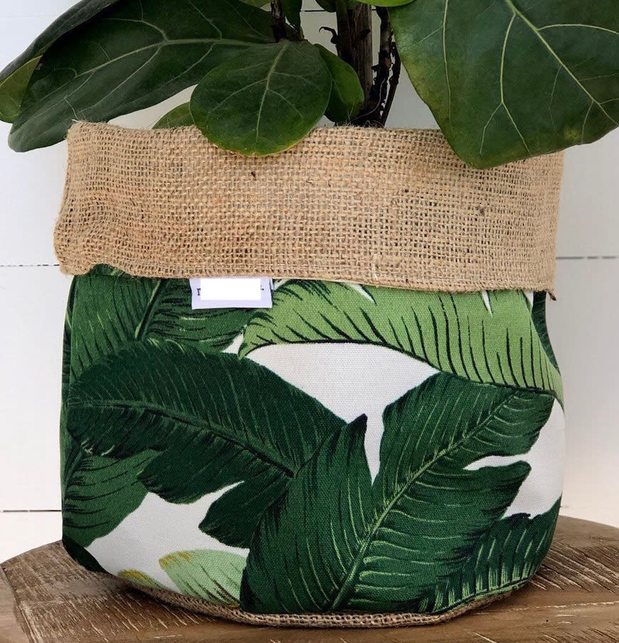
So these choices are a matter of opinion as per usual, but I was also thinking about it as the cover for a pot or a bag for a plant. My choices were based on what designed felt modern and didn't clash with the plant I might be putting. Since most plants have green or brown stems I didn't want to choose something that clashed with my house plant. Choice B was the best, because the pattern was repeating and pleasing to the eye. It seemed modern and the black/white coloring choice could fit into almost any house. I know I could buy B for myself or others and it won't be tossed aside because it didn't match. Next came G and A for this reason too, but I liked G more than A because of the leaf relief on it. Yes they are green but there is enough white space around it with differing greens to say "Hey, I am a plant, I belong with your plant, look at me!". Choices E and D were okay, not what I would really pick but of the rest of the choices more professional looking for my interior.
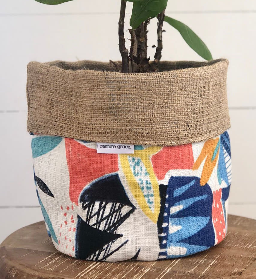
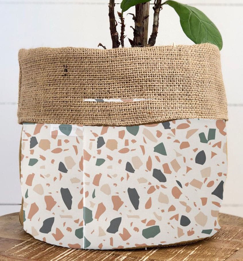
I like the designs in that order because they seem fun and original, design B is my favorite because it really makes the plant be noticed I also like the arched pattern and the colors they make the plant be the center of attention of the room then option E is nice because of its solid brown color makes you wonder about the base the plant is in then option D has nice patterns and a lot of colors I liked that option because of that, option G and H are also nice but not as nice as the previous options. I like the plant design on option G makes you get lost and its eye catching then the pattern of option H is interesting as well as its colors.
5 Responses to Option C
I like this design better because it looks like an artwork
I chose based on which patterns I saw myself having. I like unique patterns so I chose things that I thought were unique. I did not choose any patterns that were rather traditional.
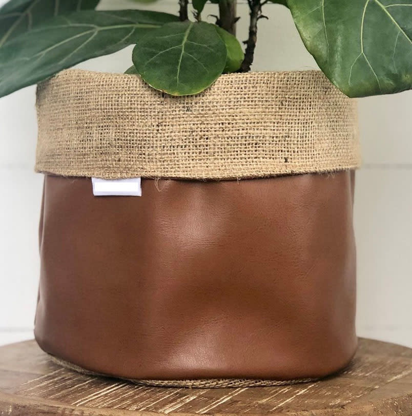
C has the most interesting design pattern in my opinion and doesn't purely repeat something over and over but does something unique. It has nice color choices and draws the eye right to left across it from the darker area to the lines in it over across those lines to the left side. It just looks beautiful. B is a fun pattern and would really stand out in most places and I like the way the pattern is layered into itself even though it's a repeating pattern, makes it a bit less typical. F has another cool pattern and the opposite effect to B. The light coloring and makes it blend into almost any scenario you could imagine. It would look natural wherever it is set down. D has such a bright and fun pattern and although it's less typically practical it would be a fun piece to brighten up any room. The abstract pattern is also very nice and pleasing to the eye. E has this leathery look I love and in the right room it'd be the best option but for my own personal home it wouldn't look good at all and that had me rank it "last" of the 5 but still ranking.
I picked the ones that would most match my decor style. C was my top choice because the design is retro-modern, which is really in right now. I also like that it appears to have mixed fabrics. H is a unique but trendy pattern--it looks like it's from the 80s or 90s, which is a good look, but it also has muted tones which I think are important for a planter. The rest were in order of my subjective preference, but accounting for what colors would match my indoor decor.
I think the first few with the solid colors and patterns look the simplest and the most eye appealing.
4 Responses to Option D
I like the more colorful designs the best, for instance Options D, G, and H.
I like the different colors on choice D. Choice G has a nice design. Choices B and H were a little too busy for my taste.
The decor in my house is pretty bland (brown leather sofas, metal/wood bookshelves, so I would look to the planters that have pops of color/ eye catching designs (D and B and A). I really gravitate towards D and B. I like the print of G, but not for a planter because I would probably have a different looking plant in there so I don't see it going very well. If I were buying a bunch, I would probably want a bold pattern in neutral colors like A or F.
I liked the designs on all the ones that I have chosen. I think they are all unique and distinctive, unlike the ones that we typically see in stores.
6 Responses to Option E
I like E because it is leather and it looks organic and reusable.
These options are really unique. I would definitely look into option E because it looks leather. They all actually look like some of my purses especially option E.
I feel like it would be best to stick to patterns that could be worked into home decor.
E is my first choice because it's simple and lacks a pattern. I don't believe plant potters should have any distractions as I want the eye to be drawn to the plant, itself. A is second because it's also somewhat simple, and I like anything that is nautical-themed. F was third because it had neutral tones even if the pattern was a little busy for my liking. G kind of blended in with the plant, itself, but felt a little tacky to me. And I didn't particularly like H, but it felt like the least distracting of the remaining options.
i chose E, A, and F as my top three favorite. E is very simplistic, I feel like the general brown color would fit in a room longer over time because it can match and adapt to more areas and styles. A and F are not bad either because their designs are very simplistic
I actually really like all of the choices, but I picked based on which ones I thought were the most neutral and would go in the most places.
8 Responses to Option F
I chose F for my first choice because I am not into flashy patterns . The colors are subtle and the pattern looks modern and dainty. Choice H is still light colors even though it has a bolder pattern it is still conservative. Choice A looks a little more trendy but simple with just the black and white stripes . Choice C Not a great pattern but the colors go together nicely and still simple. Choice E is just plain and classic . It was the only other choice I I would consider .
I like the neutral, symmetrical pattern in Option F. It's very tasteful and not so striking that it would be hard to complement with other plant covers. Meanwhile, option G would look nice below a plant and continues the greenery from above. Also, it's just an attractive cover on its own. I like the colors in Option D and H, colorful but tasteful, and I think the patterns would appeal to my female friends, who are mostly the ones who own plants to begin with. Finally, I chose the solid brown because I think it would go with almost anything, so it's universally appealing and easy to match. The remaining patterns seem outdated by a few years.
I chose Option F as my first choice because the design is subtle and not as obnoxious as I feel a lot of these designs are. If I were to purchase this product, Option F is the first one I would think about purchasing. Option C is my second choice because like Option F, the design is very low key and doesn't scream "look at me." I like that it would be subtle and fit in with the rest of my decor. Option H was my last choice because while I think the pattern is okay, it isn't something that I would normally considering adding to my home but the color scheme is really what had me choose it over the other designs that were left.
I prefer simple patterns and solid colors because I'd rather let the plant be the focal point
I literally cannot decide which one I like best, because I love them all! These are SO cute, and I need one! I love that they look like they can be used in different ways aside from a plant holder
I like the simplier, less busy look of the bag. especially that compliment the burlap color
I like the modern design of F, so I picked that first. The stripes in a is nice, and the colors make it more subtle. B is third; its design is fun and quirky, but the colors make it easy to use. C is third, the colors might not fit in every room, but I like the interesting design. E is the last choice; its a solid color, so nothing special, but it would go nicely with a lot of different design themes.
I chose these options because they aren't to simple and aren't to extravagant. They would pair well with other things i have in my house.
8 Responses to Option G
I think the brightly colored patterns look the best. They're a good contrast with the solid color of the plant.
I like the more similar designs that aren't soo busy with the patterns. I feel if there are too colorful or have bright colors and the patterns are too busy. I feel it takes the attention away from the plant itself. Plus it is easier to match with decor in your home with G,F,A specifically.
I picked minimalistic designs that are also very trendy
all of the ones that i picked were because i liked the designs, the other three options were very plain and dull an just not something that i would pick.
My first choice is G because the leaves fit in so nicely with the design and the design just fits the item so well. I like E next, because it's basic and neutral, and could fit in with any room's color scheme. I feel similarly about A and F. Finally, I chose D because I like how abstract it is, and I just really didn't like any of the other options much. I do prefer none of the designs had the tags where they are though, as they're distracting.
I really liked the bright, vibrant colors of G. I didn't really like the other ones very much though, so I ordered them according to which were the least ugly. I thought the all brown leather one was hideous, so I did not include that in any of my choices.
I like G the most becasue it gives a tropical look to the bag, the others have really innovative designs
made my choices based on the designs that I like
8 Responses to Option H
I like these designs and patterns the most. They're abstract and make the green plant stand out more.
I like the more simplistic yet cute look, I think these are cute and simple to match the tree. I don't think that color brown looks well nor the 2 harsh line designs, I like the other options I chose.
I like the more brownish and greenish designs better,feels like fall
I like the options that are high contrast and are colorful. H is my favorite that achieves this. D's pattern is a bit chaotic, but I still like it. F looks very classy and calm while still being interesting. I do not like the flat color of E. C is strange because it doesn't appear to have an actual pattern, and I do not like how the print on G looks just like the plant.
Choice H is my favorite because the design is calm and reminds me of rocks. That design seems to "go" with plants. Choice E and F are natural, plain colors that are cute, but bring attention to the plant itself. Choices A and G designs are really to attention grabbing for my taste for putting plants in that color. I want my plants to be the center of attention, not the container they are in.
All of the options have a lot of class and all a nice modern chic look. None of them stand out as outside of the realm of the other options. I like how the designs compliment each other, and would likely purchase several of them to fit together in a room.
The options I have chosen best represent my aesthetic of being simple and neutral.
I just chose based on what I would like to look at in my own home. I picked the most appealing patterns and color combinations.
Explore who answered your poll
Analyze your results with demographic reports.
Demographics
Sorry, AI highlights are currently only available for polls created after February 28th.
We're working hard to bring AI to more polls, please check back soon.

