Poll results
Save to favorites
Add this poll to your saved list for easy reference.
Which desing do you like the most and why?
Option A won this Ranked poll with a final tally of 33 votes after 2 rounds of votes counting.
In a Ranked poll, respondents rank every option in order of preference. For example, when you test 6 options, each respondent orders their choices from first to sixth place.
PickFu requires a majority to win a Ranked poll. A majority winner differs from a plurality winner. A majority winner earns over 50% of the votes, whereas a plurality winner earns the most votes, regardless of winning percentage.
If an option does not earn a majority of votes, PickFu eliminates the option with the lowest number of votes. The votes from the eliminated option are reassigned based on each respondent’s next choice. This process continues in rounds until a majority winner emerges.
Scores reflect the percentage of total votes an option receives during the vote counting and indicate the relative preference of the respondents. If there is no majority winner, look to the scores to see how the options fared relative to one another.
| Option | Round 1 | Round 2 |
|---|---|---|
| A | 44% 22 votes | 66% 33 votes +11 |
| B | 32% 16 votes | 34% 17 votes +1 |
| C | 24% 12 votes | Eliminated 12 votes reassigned |
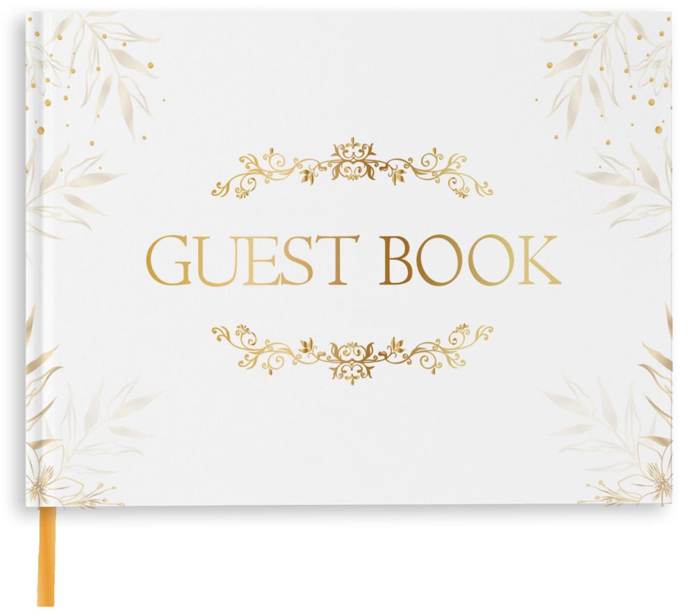
22 Responses to Option A
The one I selected if just fancy enough without being too fancy. Plus they don't teach cursive in many schools any more.
very nice looking cover that doesnt waste a lot of space
Option A is a great looking guestbook cover. It's a really nice looking design. I'd buy option A.
I would go with A first with the flowers around the guest book name and around the corners, then C for the circle flower design around the guest book name, then B for the plain guest book look.
I think that Option A has the most elegant look, so I ranked it first. Option B is too plain for my personal taste. As such, I have ranked Option B last,
I prefer option A because it has a beautiful overall design with a beautiful font and style and is better than the rest of the choices. My second choice would be option C.
I like the design of choice A as there is something on the book and not as plain and boring as choice B. I don't at all care of choice C which is why it's last.
I like the font style of the words in Option A, as well as their centered alignment on the cover. Furthermore, the balanced leaf design on each side of the cover is very appealing. My least favorite is Option B because it's rather plain looking and I'm not a fan of the words placed off to the side.
I prefer option A because the title is centered well and is easy to read with the large lettering and clear font.
I like the two with the decorative gold writing and they look more glamourous the plain one is just not for me at all
A is the most attractive design. I really like the font and the decoration around the words GUEST BOOKC is the second most visually appealing design.B is the most boring design.
Option "A": The artful border and simple font provide an elegant look while the bookmark is a nice touch for me as a buyer making this the better presentation of this product type overall.
I liked the font best on A. If it had been like that on either of the others, they might've gotten picked instead. B I liked least for the way guest book is put together as one word.
I like the elegance of A. The font is nice and overall it is very appealing. C is also nice but I am not liking the font very much. B is much too plain for my liking.
I chose them in order of what looked the best to me. Didn't like option C because of the font used
I prefer option A. I like the formal look of this guest book. I like the font used on the cover.
I chose A because I like this look best. The fringe looks good to me.
Option A is my preferred choice because the design is classic and timeless.
I like option A the best because I like the graphics, which are symmetrical and make the cover very aesthetic looking to me.
I like this one the best it looks nice and has a fresh look to it, I think it would make a great addition to a special occasion
The design looks more integrated throughout the entire book vs just the cover on C and B.
Option A has the best design because it has beautiful foliage along the border of the book with elegant font in the middle. It looks the most complete out of all the options and makes the best use of the white space. Option B is far to simple for my tastes and option C is too simple compared to option A.
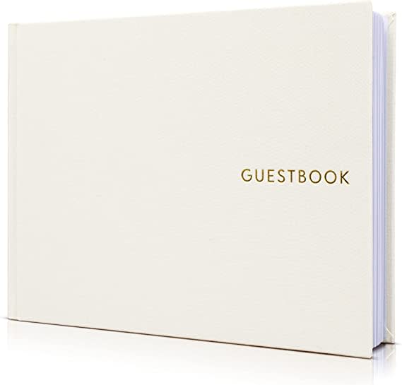
16 Responses to Option B
I prefer simplicity. B is the most simple. Next simple is C and then A is the most copmlex.
Option B is the best choice for me. It is super minimalistic and simple, at the same time the most beautiful design for me..
Simple is best. B is possibly a little too simple but it's better than the other ones which are too dated and over the top.
I liked the options that featured a more subtle and classy design.
The design in Option B is simple and classy. It suits the design of a guestbook to be simple and not too flashy. I like the golden font and the all white background.
I like the simple look of the clean white book with the simple font. This looks uncluttered and modern.
I prefer just the plain letters and plain book, I think it looks more modern and understated.
I prefer the most simple and elegant designs for the guest books and ranked the options based on this criteria.
B is more simple and elegant that the others. C is last by a lot because of the gaudy, overused font. That font is on everything these days.
B. Very elegant. No need for a lot of color on the white backgroundA and C are about the same but I like the rectangular design on A better than the oval design on C
I like B and A because their simplicity makes them look more elegant.
I like the simplicity of the cover as well as the font.
I have simple sensibilities and prefer less when it comes to visual aesthetics.
I only like B. Its simple, yet still very elegant. The others are a little cheesy.
The design of option b is so simple that it works
I like the more simple fonts. As they get curlier the less interested I am.
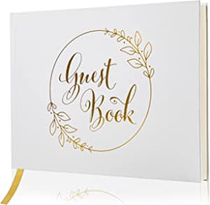
12 Responses to Option C
I really like the design with a ring around it, I think it is more symbolic for a wedding and looks better.
C and A look more classic and royal from the golden writings and the choice of a white color for me.
I like the circular design the best for choice C. Choice B's wording is too tiny and boring
Option c is very elegant without being over the top.
I like C and A over them all to be honest
I like the font script and gold of C but I don't like the circle. A I don't like the all caps it's not friendly. B looks like a computer laptop. None of the designs are favorite
Option C is preferred. Cover has just the right amount of decorative leaf graphics and script style font to make guest book special and meaningful. Option A has too much going on and Option B has just about nothing going on.
I like C because it has a very pretty font and the circle around the lettering is nice. Option A has some details but not as attractive as option C. Option B is completely plain, looks like someone just typed the word guest book with the most generic font and said they were done. Nothing special about it.
C is elegant pretty and looks inviting to open up and write in it
Option C is my preferred choice because this design strikes me as both modern and classic at the same time. Option A looks too traditional. Option B looks like something that you would find at the check in desk of a three-star hotel.
i chose option c because i prefer the rounded look best
I like the simple flower design on C most. B is simple but eye-catching. The filigree around the letters and the leaves don't go together on A.
Explore who answered your poll
Analyze your results with demographic reports.

