Poll results
Save to favorites
Add this poll to your saved list for easy reference.
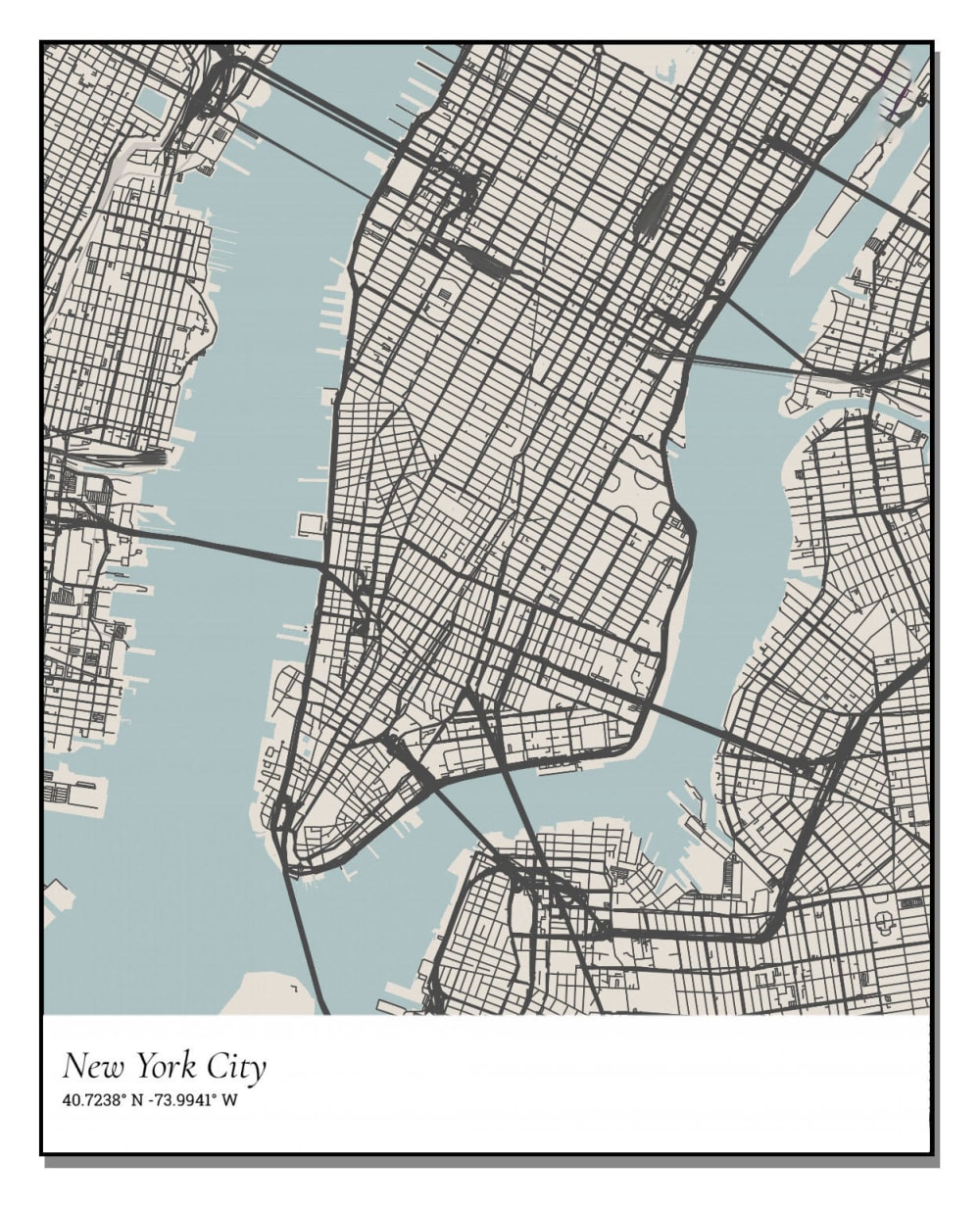
Which FONT do you prefer for this custom map poster product? (if you were to hang up in your home or as a gift)

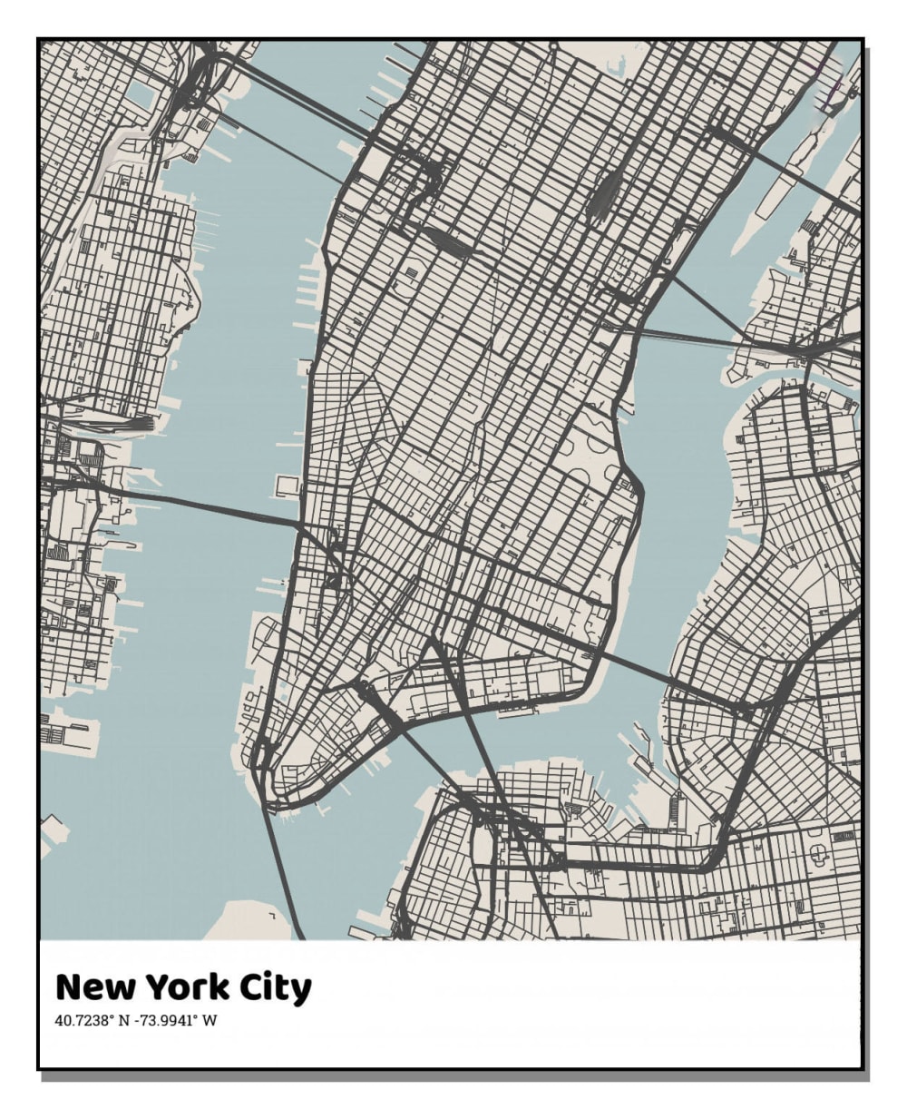


Option F won this Ranked poll with a final tally of 28 votes after 6 rounds of votes counting.
In a Ranked poll, respondents rank every option in order of preference. For example, when you test 6 options, each respondent orders their choices from first to sixth place.
PickFu requires a majority to win a Ranked poll. A majority winner differs from a plurality winner. A majority winner earns over 50% of the votes, whereas a plurality winner earns the most votes, regardless of winning percentage.
If an option does not earn a majority of votes, PickFu eliminates the option with the lowest number of votes. The votes from the eliminated option are reassigned based on each respondent’s next choice. This process continues in rounds until a majority winner emerges.
Scores reflect the percentage of total votes an option receives during the vote counting and indicate the relative preference of the respondents. If there is no majority winner, look to the scores to see how the options fared relative to one another.
| Option | Round 1 | Round 2 | Round 3 | Round 4 | Round 5 | Round 6 |
|---|---|---|---|---|---|---|
| F | 32% 16 votes | 32% 16 votes | 34% 17 votes +1 | 36% 18 votes +1 | 40% 20 votes +2 | 56% 28 votes +8 |
| B | 34% 17 votes | 34% 17 votes | 34% 17 votes | 34% 17 votes | 34% 17 votes | 44% 22 votes +5 |
| D | 10% 5 votes | 12% 6 votes +1 | 14% 7 votes +1 | 16% 8 votes +1 | 26% 13 votes +5 | Eliminated 13 votes reassigned |
| C | 6% 3 votes | 8% 4 votes +1 | 10% 5 votes +1 | 14% 7 votes +2 | Eliminated 7 votes reassigned | |
| A | 8% 4 votes | 8% 4 votes | 8% 4 votes | Eliminated 4 votes reassigned | ||
| E | 6% 3 votes | 6% 3 votes | Eliminated 3 votes reassigned | |||
| G | 4% 2 votes | Eliminated 2 votes reassigned |
4 Responses to Option A
I strongly prefer the simplest types in options A and D. There is no need to use a heavy and dark font, or a heavily ornate script. This will be large on a poster
The design is unique as well as its also easy to read and understand, I like the design of the font
I most prefer option A personally just going off of the look. This look for the font is most enticing to me and makes me feel like the map is most high quality.
I like the font in option A the best. The thinness and boldness of the font are just right which makes it look appealing with this image.
17 Responses to Option B
I like that the font is very bold and easy to read. I think that's what you want to put on your poster
I would choose B because the font is bold and easy to read, very clearly shows New York City
I like the bold look. Option B just really stands out. Option B is the one I'd want hanging on my wall.
B I love because it i bold and easy to see and read, F looks like the font from the new York times to me so feels appropriate. The rest i do not like nearly as much I feel B and F are great! I do dislike G , cursive can be hard for many people to read
stands out to me as the most appealing and it catches my attention and makes it kind of big deal
I like the clean and easy to read fonts better.
I made my ranking decisions based on whatever text was the easiest to read and font stuck out the most as appealing to look at.
I like the bolder font the best. I do not care for the cursive fonts. They do not feel very professional to me.
I prefer the fonts that are darker and easiest to read. This puts options B and F near the top. They are both large, dark and bold. Option E also fits in with the first two. Option G is the hardest to see and read, therefore, it is last. The others all fit in somewhere in the middle.
I like the bold face of Options B & F. It's legible and makes a statement. Options E & C are whimsical looking but the font is effective as well. The remaining options are either too faint or insignificant looking to make any impression at all, especially compared to the previous options.
For a gift I like the strong bolded font that when received, bring a sense of power to the place it will be hung and when friends and family come over, they will like the idea and can see where is this map of.
I would prefer something that has text that is simple and easy to read. Sometimes, the fancy text is too difficult to read.
I like for the font saying New York to stand out so I chose by ones where it was easiest to read.
I like the big and bold font. It is the easiest to see and read at a distance. I also thinks that it fits best with the bold nature of the city itself. This font is a good match with the spirit of the city.
The font style of the written words at the bottom is the difference. I prefer the thick fonts which are actually easy to notice and read.
i ranked the choices depending upon the design of the font
My choice is option B as rank 1 because of the font is in bold and easy to read so i choose this. Compare to others this only like to read others are not visible so i choose this.
3 Responses to Option C
I like this one it has more of a classy look to it
option C because it is clear enough to read and it has a touch of class and elegance to it it's not just plain block letters on top of a map.
The fancier fonts adds flair and gives it more character
5 Responses to Option D
I'm not a fan of cursive its a little hard to read overall. I like the more plain font its more inclusive
i ranked like bold FONT really good style
I thought bold, authoritative fonts would fit with the style of New York City, so I chose [D] and [F] as my top 2 here. The rest were in the middle but I chose them along the lines of bold and authoritative, according to my own perception.
I like a simple and familiar font the most - keep the attention on the map so I chose the regular italic font. Next I liked the more modern and crisp font of A. I ranted the more cursive-looking ones as last because it takes too much effort to read them.
D, I like the overall shape and flow of the font, it is clear and easy to read.F, the style looks very appealing, and is easy to read.E, the style is a little too bold, and makes it look less appealing.B, the font is tool bold and the text looks too large, it makes me less interested.G, I find the font looks light in areas and makes it harder to read, it makes it less appealing to me.A, I dislike the font, it looks like it is trying to appear fancy while also having a "fun" appearance, and it makes me less interested.C, I dislike that the font doesn't match the coordinates as well, it makes me much less interested in it.
3 Responses to Option E
I like the bold cursive style font in option E. I want something grown up looking but also modern.
I like option E the best because I like the cursive style of the font and I like the font is bold as well. I think the bold is important because it makes it look good with the bold lines within the map.
Ranks chosen based on the following attributes: how easily the font was to read, how classy the font looked, and how well the font seemed to fit in with the rest of the photo.
16 Responses to Option F
I like the simplicity of my top choice, which is effective and appealing. Very cool design for sure!
i like the font in option F because it has the most artsy feel to it while being easily readable
I like option F the most because it reminds me of the font that is in the New York Times newspaper, it adds a little inside information that only certain people would know about.
The last place choice is even hard to read with the heavily stylized cursive type letters. I always prefer a more simple font and this map poster is no different. my favorite versions include a font that is basic and easy to ready, first place choice I think is just a Times New Roman or something very similar and I like it. The second and third place choice are also good and readable, third place I do not really like that it is so much more bold.
I like the ones that have more of a strong and classic feel to them
Option F draws me in the most among the choices. The font is easy to read, but it maintains a vintage type of look that I would associate with this type of picture. It looks the most natural, and blends together well.
I prefer option F because it's simple and easy to read and reminds me of the new york magazines, or even better, a font that might have been used in the 1930's in New York to attract attention to a headline.
I only liked f and b because those phones are big, bold, and do not look handwritten
I like the simpler fonts better, they are easier to see and match better with other things I will have in my home. The more cursive the font the worse I like it, thus why I have G last. I thought the font of F was very classy and simple which is what I want.
It looks the most professional to me. It’s classy and easy to read.
F looks more like the font you would see on an actual map; the other choices besides B are all italics and I do not associate that with maps
I like the more standard fonts than the cursive, and the slightly more bold, larger fonts over the thinner or lighter ones. It makes it pop out more and is easier to read.
I prefer bold text that is easy to read. Choice F is my favorite. I don’t like fancy text.
I preferred F because The route of new York city is cleared in F
I selected the fonts that I most preferred for the maps based on my personal preference.
I love the options F E and A, I feel like they go better with the name of the city and on a poster. D is nice but it looks dull and boring. B is not an option, the bolt font does not look good. The last two options are not for posters rather than invitations to weddings or baby showers... etc.
2 Responses to Option G
Fancy, curvy, non-bold is what you should aim for. I ranked them accordingly. {G} undoubtedly the best for me because it has a great unique mix of fancy and curvy, really classy. {B} being the absolute worst, boring, common, and bold. Only people with a newspaper personality would have a newspaper font for this on their wall. Mark my words.
The font style which is more important for a brand or a product description, Which are easy to read, communicate your message, and fit well with our all product designs. A good font and how it is used is vital in all aspects of design. The fonts will deliver a particular message to readers.
Explore who answered your poll
Analyze your results with demographic reports.
Demographics
Sorry, AI highlights are currently only available for polls created after February 28th.
We're working hard to bring AI to more polls, please check back soon.

