Poll results
Save to favorites
Add this poll to your saved list for easy reference.
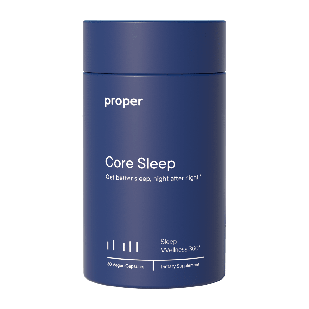
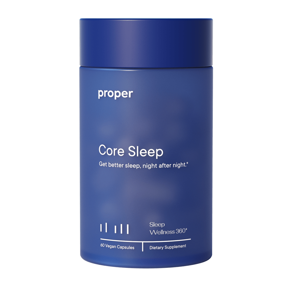
Which image do you prefer for this product?
Age range
Amazon Prime member
Education level
Gender identity
Nutritional supplement use
Options
Personal income range
Racial or ethnic identity
128 Responses to Option A
I like choice A the most because this product has a darker blue which I think looks better and it makes the product look more reputable.
The matte surface on A looks more luxurious and less cheap than the texture on B.
the other just looks a bit dirty and blurry. not sure that the background does it any favors.
I prefer the richer blue color with the plain texture, because I think it's more appropriate for a sleep aid.
A solid color gives me an impression of being effective.
The one I chose has a cleaner look to it. I feel almost like the other has been smudged by dirty hands or the look of pressing on a wet window and leaving a smudge. When you speak of a sleep product I don't want a hazy look, makes me think of blurry vision.
The solid blue is better, but only because the blotchy blue looks like somebody spilled water on the battle and faded the color.
The darker shade of the color I feel looks much better. It is slightly more pleasing to look at.
I like that A's entire color matches, darker blue is more appealing
I prefer the product where the cap and the body of the product are the same color. With the cap a different color, it looks like the took it off another product and placed it on the body. It would make me wonder if it had been tampered with.
I prefer the image in A for the product's packaging. I like the solid blue color used for the packaging, as it is a very calming color and looks clean with the white text and minimalist label style.
I like the simple blue package the best
Image A because it looks more clear and straight
The darker color makes the letters pop more
I like that the cap is the same color as the bottle.
I much prefer the solid dark blue design. I think it's more sleek and higher quality looking.
I liked choice A sine the product looks more professional and has a smooth and matte finish. Choice B looks shiny and has reflections which isn't as appealing and doesn't grab my interest.
I think the darker color looks better and it matches the cap
There is some sort of weird spotting on choice B, so I like choice A much better.
The darker blue looks more elegant and soothing
I like option A more. I prefer it because it is less confusing to look at and is easier to discern. Option B has this sort of vague, amorphous look to it that is difficult to look at and so I like option A significantly more. I also prefer option A because it is darker and more aesthetically pleasant to look at. Option A also has a consistency with respect to quality that applies to both the main area as well as the top of the product, while option B is not as consistent and that inconsistency is unpleasant to look at. I also like the darker blue as a color for Option A and the lighter color for option B does not contrast as well with the font of the text which makes it more difficult to read for me, so for a variety of reasons I prefer option A.
I picked A as my top choice as I like the dark blue color and shine on the side of the bottle.
I like A because I like the darker solid blue better. It has a sleeker more attractive look to it compared to B.
It is easier to read.
I picked A because the photo's focus was crisper and the color was full and rich without shadows or lighter sections.
The text looks a bit harder to read in choice B.
I prefer the sleek and solid blue color, it makes the item look more expensive.
I like the darker color as it looks cohesive and calming
Darker cover and more visually appealing
I much prefer the product design option A
The bottle color looks fresh and new the other looks old and worn
I thought the darker color best represents the best sleep quality.
I prefer the plainer image option - it feels more professional to me. The other option has a lot of glare or sheen, and it's a little harder to read the text as a result.
I like the solid blue slightly more than the one with a cloudy texture
I like Option A. They are almost identical except for the coloration. Option A is evenly blue all over the bottle while Option B has a clouded effect. I prefer the solid color, it looks smart and attractive.
A is powerful, dark, and strong in color.
Choice A is more appealing to the eyes
I like the image with the one color that is darker. It looks more uniform and not as cheap of a product.
I like the solid blue background color of A versus B.
I would go with A because it is a more solid color and much easier for my eyes to read.
I liked both if these. I ultimately chose A because I preferred the darker blue.
This image seems to be more refined and design than option A. The bottle is a darker color and that is a nice design to me.
The opaque package has clean lines, is easy to read, and is vaguely calming. It may just be the quality of the image, but the translucent image looks vaguely moldy, as if the contents have spoiled.
A is the best one for me because of the color blue is consistent through out the package and it makes it easier to read this label and because of that, I would click and buy this one.
I liked the solid dark blue coloration on Choice A, it looks much more sleek and professional than the "cloudy" pattern of B.
This is cleaner and clearer looking. I much prefer the solid color. It makes a greater impact.
cleaner and clearer looking.
I like Option A better, seems cleaner and less blurry. I also prefer the slightly darker and uniform blue, it makes the white text stand out a bit more.
I like the color combination on A vs B. A is more professional with all one color! B is OK but it just kind of clashes
I prefer the uniform color over the slightly different lid as it looks like that one just has the wrong lid put on it.
Option B's packaging and glare makes the product look dirty, rather than it be a lighting choice.
I chose option A because the design of the package is appealing due to the fact that it has a bold and dark one tone color scheme, it makes package stand out and it is more vibrant.
I like the clear solid choice. The coloration on the other option makes it look old or dirty, kind of like it is fading.
Option A is more classy. It's a solid navy blue. I like it more than the cloudy alternative B
I like the dark even tone of the bottle.
B looks like someone with bleachy hands accidentally touched it. It looks like it was unintentional rather than being designed to look that way.
I prefer the darker, solid color.
The label is plainer and easier to see and read, the cloud like pattern on the latter is not good for those sleep deprived to see as well.
I like A’s overall look better.
B looks like the jar is dirty
I like this one a lot more because it comes off as sleek and simple and I like how I can focus directly on the words on this bottle whereas with B, the light white looks distracting
I absolutely love the solid blue.
I like that the colors are solid in this one, it makes it look better.
I like option A the best because the darker design stands out more and grabs my attention.
The solid color of option A is more appealing to me. Option B looks like it has faded due to age.
Tne bottle appeared to be a bit darker and cleaner.
The background on the container in Option B has some lighter-colored smudges or blurs that Option A doesn't have. I think the smudges aren't visually appealing, and makes the container look a bit dirty. The container in Option A looks cleaner, and there are no smudges to distract from the product.
A looks sleek and modern, with it's uniform coloring and matte finish. The semi-translucent bottle for B leaves the pills showing through, which makes the bottle look mottled.
Colors affect your mood and the dark purple gives off a sense of relaxation and may lure you to sleep. The design for B looks a bit blotchy with the light spots in the center.
A just fits better with the same color on top and bottom, B looks like its been sitting on the shelf a long time and faded
I like the fact that the lid on A matches the container as opposed toB the lid is darker, it just gives a more uniform and consistant appearance to me which I prefer.
I like the darker color. It reminds me of night and sleeping.
I prefer option A because it is a darker flat color the other color looks weird and has bubbles in it.
I like A better because it looks like a higher quality image. I think they were trying to make it look like there were clouds on B, but it comes across poorly and looks more like blemishes in the color.
I like A. B looks hazy. I think this is an insignificant difference.
I chose Option A because I liked that the cap and bottle were the same color, it just appeared more uniform and aesthetically pleasing. Option B is fine, it's nice you can kind of see the pills through the bottle but for me that is not necessary.
I prefer choice A because the blue matte finish looks elegant and attractive.
The only difference I see is the darker color on A, which I prefer. B looks like it has "smudges" or something on it, or I guess it's designed that way? A is easier to read the text I think also.
I like the way choice A looks because the matte jar looks much better than its counterpart where it almost looks oily slick and looks unapealing.
the color scheme is a little more simple, which is appealing to me.
I really like the darker blue of option A. I think it is much more attractive and still very soothing on my eyes when I look at it.
This darker blue is more relaxing. I would buy this one.
Option A suits me just fine in the design and it looks like it would block light and protect the product more.
The darker bolder looking blue of the container looks a little better in this version, I do not like the lighter blue in the other version quite as much.
I like the solid blue color better than the mottled blue color.
I like option A because it has a solid matte color as its bottle.
I like both but I feel like option A is slightly more premium since it appears to be one shade of color
I chose A because the color is the same on the lid/body of the container. I’m sure the other choice (brighter lid) was purpose done that way to draw attention, and I did notice it but I think it looks less reliable. Because it’s the same color, but brighter I would wonder if the product was in storage for a long period of time causing part of the structure to fade. After a while of seeing it with a brighter lid every time I shopped I would trust it, but my original impression would be to try something else first. If the lid had been a different color all together I might have a different answer. In this case, I like the container that is all the same color.
The right image is clean, clear, crisp. I look at it at I read the words. The left image looks like it got dirty, and I am distracted from the message of the words by wondering what the barely visible white splotches on it are.
I prefer the darker and more cleaner looking blue color of option A.
It's more solid and easier to read.
The image in A is more solid without blobby-looking stuff in/on the container
thesolid color implies solid sleep to me
I just prefer the slightly darker color makes it more attractive
Option A seems to be a little darker so it makes the text stand out a bit more.
I think B looks dirty.
It's a clean design that doesn't look out of place. It's iconic enough that i would easily recognize it in whilst shopping. b has a weird mottled look as if its covered in something sticky.
The packages look almost identical, but Option B almost looks like it has a printing error with the cloudy images that are faded in the background. That's the main reason for selecting option A is the packaging looks intentional.
I choose Option A because I like the solid color blue better than the blue with faded white in Option B. A looks much more appealing.
much prefer this one, the other looks almost faded , like it was handled overly much.
I think the coloration of choice A is slightly better as it makes the bottle look round and sleek instead of dirty.
I like the solid coloring of image A the best. It is dark and bold.
I prefer A, the solid is soothing, and compared to option B, decisive. The picture for B looks muddled and out of focus. It sort of seems like something I'm looking at after a few days of not getting enough sleep and not wearing my glasses.
I prefer the more solid color of my top pick. I do not need a more fancy design for this.
I chose the option B because i find the product color more appealing.
I like the image of A better, but they are both pretty good.
This one looks like it will promote sleep. The other one is too bright, maybe even shiny.
Pure solid blue looks pleasant and presentable. Option B color looks kind of fade out or old .
I prefer Option A, as it is simple and doesn't add anything unnecessary to the bottle design for this important and serious product.
I am not sure if the other image on the label is meant to be like clouds or dreams or what but to me it just feels like a blurry image. Just makes it look cheap.
The other one looks like the packaging is discolored or something. I think this has a deeper, richer color of packaging.
The only difference is A has a solid color and B - has a slightly varied hue with a slight pattern. A is “stronger”
I like the solid color of A more.
The items look literally the same, the only difference that I think there is is that option A is a bit darker than the other option. If that is the case, I would go with option A because it just one plain color and not different colors like B
I'm really perplexed by the light blue transparent design on the right. It just looks blurry and like it has fingerprints on it from the thumbnail image. Also, with the white background THIS STANDS OUT. IT looks dirty, and I'm not sure why. Go with the regular dark blue bottle, Choice A
Option B looks dusty or dirty with the, what even is that supposed to be? Clouds?
I cannot choose one or the other when they are the same bottle.
I prefer the fully opaque packaging material as it makes the package look like a higher overall quality. A thin packaging material that allows for some but not complete visibility of the supplement makes it seem like they are cutting corners instead of fully utilizing the packaging material. Unless there is a clear section to see the supplement on the inside, the opaque makes it feel more sturdy and protective of the contents.
I like A because it's dark and calming.
The image in B makes the product itself look cloudy and potentially curdled. So I chose A instead.
Darker monotone background color is more sleep inducing than having white dispersed throughout.
The color its more solid
I chose A because I like the darker background color. It contrasts the white font better making it easier to read.
Choice A shows the image to be a little darker in the blue color, making it just a bit easier on the eyes to read the labeling. I like the containing all one color instead of the lid being a different color as is choice B. The two different colors on choice B make it look as if the container was not made correctly and the wrong lid was put on it.
A has a darker indigo color that I prefer.
Option B looks like a dirty package to me. Option A looks more peaceful because it does not look dirty. It is also a little darker, which makes sense when you are thinking about sleep.
I like the deeper color.
I like the darker picture, the other image looks a bit mottled
72 Responses to Option B
color looks a little bit more vivid and attractive
I prefer the lighter shade of blue most.
I would go with option "B". The color scheme looks amazing with the product. The product looks unique.
I like the color in B over the one in A.
It's a sleep aid so I prefer the dreamy clouds over the blue background!
I like Option B because I think the clouds related well to the theme of sleep.
Choice A is my top choice because it looks like a sky with clouds and this product is for sleep wellness. I think it fits the product and people it is intended for and I think it is easily recognizable.
The lighter blue color is more pleasing and interesting to look at.
I like the cloudy look of the bottle shown in option B the best. The light glare streak running from top to bottom for option A is irritating to look at.
This image is more eye catching and aesthetically pleasing.
I like the wispiness effect on this label it makes it look unique.
The label with the white, cloudy pattern is more distinctive and will stand out more on a store shelf.
I like the cloudy design of this option, which evokes a fun and whimsical feeling. The royal blue color is also appealing. Looks like a really nice product for sure!
I like the semi-transparent look, I can get a better idea of how much product is left.
The darker color is more dynamic and stands out more. It also looks more high quality.
The lighter, "cloudier" color of B makes it a little more attractive and interesting. The contrast of the dark blue of the lid and the lighter blue of the rest of the package draws the eye.
This is the image that i prefer for the product. This image best shows the product.
I dig the wispy cloud-like style the best.
I like that this one looks a bit like clouds in a sky
I think the slightly lighter color is more aesthetically appealing.
The cloudy background reminds me more of dreamy sleeping.
B is cheerful, light, pretty, and eye catching.
I like the light wispy whiteness that looks like a cloud, sort of dreamy.
The "clouds" make if appear milder and more dream like.
I like panel B. I think the blue with the white cloud like features, remind me of sleep.
I like how the top is a slightly different color in choice B.
The ambience in the background of the design adds a really nice clean touch to the design as a whole.
The colors were brighter and I liked that the background seemed to feature some clouds in the night sky.
I think the product looks more modern and the cloudy background suggests a sound sleep.
I prefer option B because I feel the font is more bold and prominent, so it brings out the best in the brand. Option A feels too bare and boring to me.
The lighter blue just evokes sleep a little better to me.
The slight difference in lid to label will make it easier to see where it opens without glasses.
I like the finish to the product to B best. I see no other differences.
I feel like choice B has the higher quality packaging and one that looks more appealing
I like the subtle contrast of the colors in the packaging
B looks more sleepy and dream like with the colors. It would make me feel calm and relaxed. I love the color of the bottle. It's nice and simple.
Seeing the pills slightly makes it more credible.
I like Option B better than Option A because it looks relaxing.
Option B is bright and attractive.
this is a label that is easier to read
I like the see through bottle so I can see how many pills I would have left.
I like option B because the design on the bottle has depth to it.
The lighting in B looks more natural, and gives a better view of the bottle's subtle cloud designs. The colors overall look richer and more varied in B.
Having a lot of the faded dots behind the "Core Sleep" middle makes my eyes draw towards them naturally, but I think I would be disappointed if the actual product did not have a faded dot background for the label.
I prefer "B" due to the fact that this jar is a lighter Blue in color. Is simply looks better to me.
B literally looks like there are clouds on the packaging. A looks bland in comparison.
I like the textured look of B. It seems more interesting.
Option B is the better choice. The slight tweak to the background makes all the difference. It makes the product look more lively, and eye catching.
B is a little lighter coloring on the bottle. I can read the description better.
I think the cloudy looks connects with the sleep idea.
I don't know if this bottle color is suppose to look like clouds in a blue sky, but that's what it looks like to me and I like the way it looks. I just like the lighter color overall.
I chose B because I like the shade of blue better. The other one was too dark. This one is dark enough for the words to pop visually without being too dark. I wouldn't want it any lighter though.
While it appears to have a glare on the product, I like the shade of blue better on option B than on option A. Option A does not have a glare which looks more professional.
The extra texture on option B makes it seem more lifelike and real, and I would be inclined to choose this one. Option A looks very smooth and sleek, to the extent that it looks too inorganic to me.
There's a bit of a weird shine on A
I feel like this particular product design brings to mind the concept of sleep and relaxation better than the other.
B looks brighter than A hence, makes it attractive and noticeable than A
B makes me feel sleepy looking at it, thinking about clouds
The cloudy bottle of choice B works. It's like a comfortable dream. The darker just does not provide the same feel
B- I like the darker lid and the see through bottle, it looks cool.
Obviously both containers are very similar. Both look easy to use and adequate for handling the supplement. I chose B because there is a slight "see-through" feature to the bottles. I like being able to look into my cabinet and "see" that it is about time to reorder. It would serve as a visual reminder for me. But I know sunlight can damage some vitamins...so either container would work adequately.
i choose B because the is more clearer and easy to understand..
I like the darker blue cap on these bottle. It helps to see the parts
the lighter bottle makes this one easier to read and it seems like it has more pep than the dark one
It's easier to see with the lighter color
I slightly prefer Option B. I find the appearance of the packaging of Option B to be more restful & relaxing than Option A - it appears (at least on my monitor) to resemble a dark blue sky with clouds. The packaging color for Option A has a more flat, clinical look. Since the item seems to be a sleep aid, I prefer the packaging with the more relaxing appearance.
The lighter colour is a bit more calming than the other colour.
not sure why but those light bubbles on the package draw my eyes
I like the brighter blue and white writing. The color makes the white pop and it is easy to read.
This one is bright and more dreamy. The other one is too plain.
Option B has more subtle light variations reflecting off of the jar's surface, and the colors are better- I like the contrast with the lid's darker blue.
I like the slightly lighter blue. It looks a little shinier. It seems like the text is easier to read because it compliments the color more instead of contrasting with it.
Explore who answered your poll
Analyze your results with demographic reports.
Demographics
Sorry, AI highlights are currently only available for polls created after February 28th.
We're working hard to bring AI to more polls, please check back soon.

