Poll results
Save to favorites
Add this poll to your saved list for easy reference.
Which label design do you like the most for a Natural Skin Treatment Brand for Pets that uses thyme tincture as a main ingredient?
Option C won this Ranked poll with a final tally of 26 votes after 5 rounds of votes counting.
In a Ranked poll, respondents rank every option in order of preference. For example, when you test 6 options, each respondent orders their choices from first to sixth place.
PickFu requires a majority to win a Ranked poll. A majority winner differs from a plurality winner. A majority winner earns over 50% of the votes, whereas a plurality winner earns the most votes, regardless of winning percentage.
If an option does not earn a majority of votes, PickFu eliminates the option with the lowest number of votes. The votes from the eliminated option are reassigned based on each respondent’s next choice. This process continues in rounds until a majority winner emerges.
Scores reflect the percentage of total votes an option receives during the vote counting and indicate the relative preference of the respondents. If there is no majority winner, look to the scores to see how the options fared relative to one another.
| Option | Round 1 | Round 2 | Round 3 | Round 4 | Round 5 |
|---|---|---|---|---|---|
| C | 30% 15 votes | 30% 15 votes | 36% 18 votes +3 | 42% 21 votes +3 | 52% 26 votes +5 |
| F | 22% 11 votes | 22% 11 votes | 22% 11 votes | 34% 17 votes +6 | 48% 24 votes +7 |
| E | 12% 6 votes | 16% 8 votes +2 | 22% 11 votes +3 | 24% 12 votes +1 | Eliminated 12 votes reassigned |
| A | 20% 10 votes | 20% 10 votes | 20% 10 votes | Eliminated 10 votes reassigned | |
| D | 12% 6 votes | 12% 6 votes | Eliminated 6 votes reassigned | ||
| B | 4% 2 votes | Eliminated 2 votes reassigned |
Age range
Education level
Gender identity
Household income range
Options
Personal income range
Racial or ethnic identity
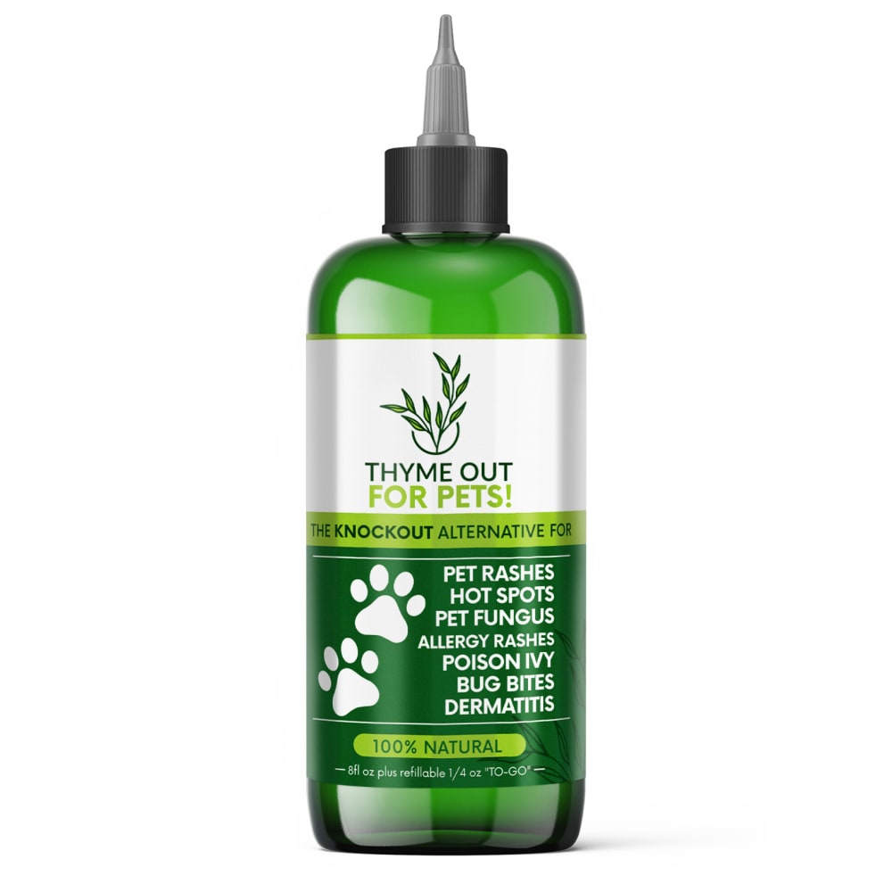
10 Responses to Option A
I think showing the paws on the label works best because at a glance I know it's for pets.
All very close but I chose A. I like the paw prints .. and the white makes it stand out. The others B through C are all ok, but A gets the edge.
I like the white and green designs with the paw prints more. This immediately makes me think of something for my pets to use. The other image is hard to make out what it is.
I prefer the options with the white lettering the best of all and the paw print and logo on this option is my favorite
I liked the simplistic design on the first choice i made. i feel it better represented the product as a whole compared to the other choices.
I chose A because this design is most attractive how it incorporates each color in the design well and does not look busy.
A stands out more to me as a pet product.
I like the paw prints because it makes it more obvious to me right away that it's a product for dogs. The white stands out and the green, though seeming more naturalistic, is uglier.
I ranked these options on what bottles look the most appealing and are easier to understand
I like the label on option A better than the other designs shown above. I like that they used the paws of the dog instead of the actual dog image. Another part I like is the illustration of the thyme sprig displayed in the upper part of the design.
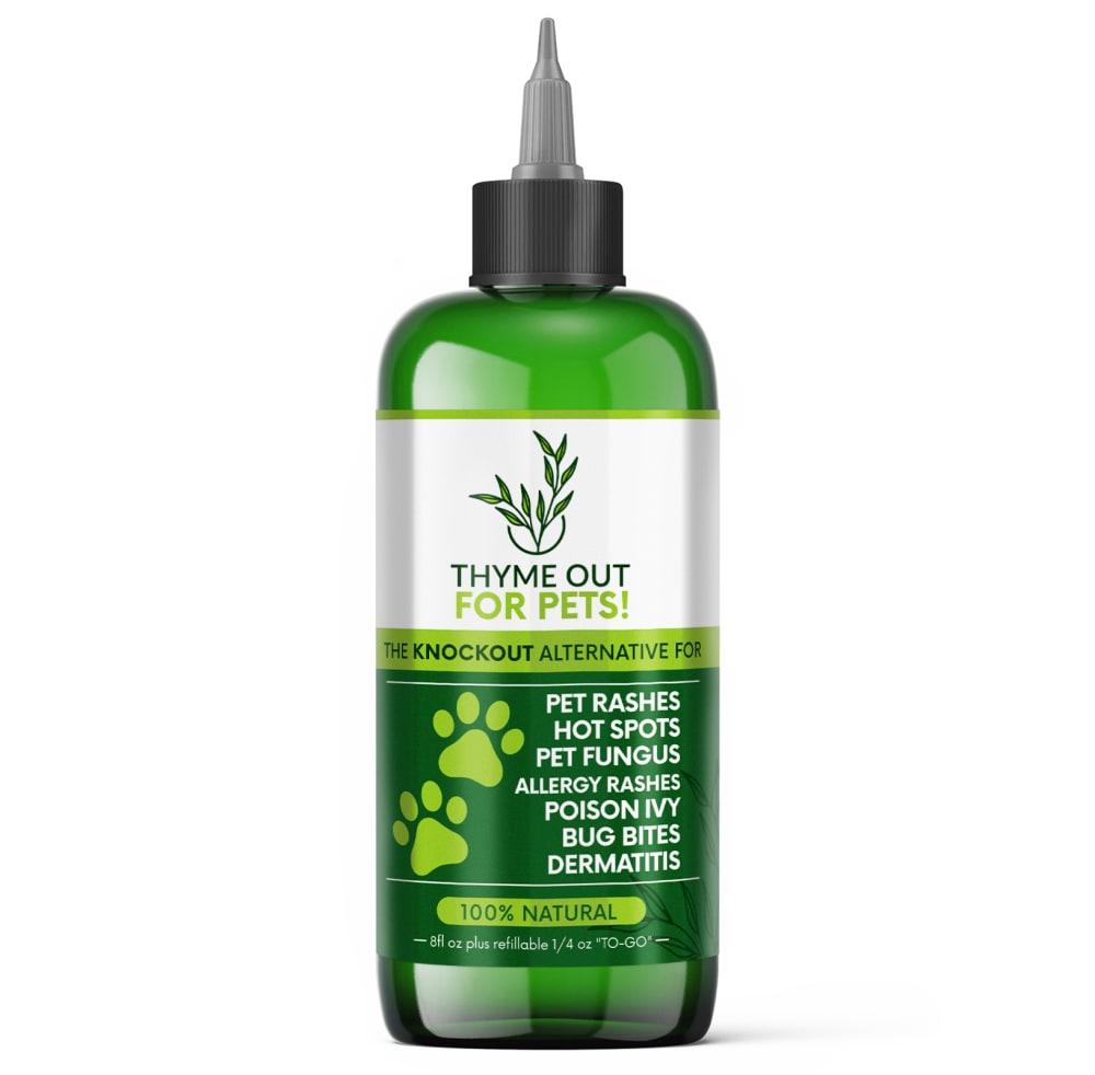
2 Responses to Option B
I vote for Option B label because I like the sprig of thyme on the top and green animal hooves, both features fitting the product perfectly. Other options follow in the mentioned order.
Something about the paw prints being more subtly presented makes me like B most
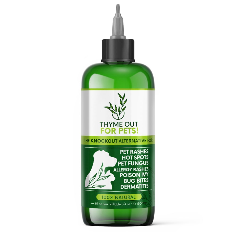
15 Responses to Option C
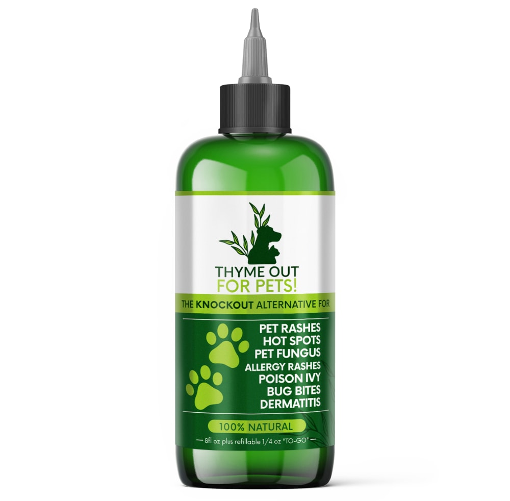
I like the logos with the dogs on them more than the ones with the paws.
I like the cat and dog design of C and D. A and F are fine with the white paws. E and B are worse with the green paws.
I like this option the most because the different color greens, and the picture on the bottle grab my attention the most.
I like this bottle because you get to see both the dog and the cat on there. I also like it because that image of the dog and the cat is in white. That white pops a lot better off of that darker green.
They are all not bad, but I prefer C the most. I do like the silhouette of the dog and cat with the leaves.
The animals on the product would let me know what type of animals that the product was intended for more than the paws would.
This is the most creative and interesting design for this type of product.
The leaf design is the most attractive and it makes me think the product is more natural and healthy
I like the contrasting white on green of option CF&A. My favorite is option C because of the dog and cat picture with the leaves running through it.
I chose Option C as my favorite for several reasons. The first reason is the text is easy to read, and it's not distracting like E and F - the dog outline is distracting to my eyes, and takes away from the product. The second reason it's my favorite is the white outline of the dog and cat on the bottom. The white provides a very good contrast (unlike the green on green of B,D, and E.) I prefer the outline of the dog and cat to the pet paws because it's clear to me that it's safe to use on both dogs and cats. The paws appear to be dog, so it would not be clear to me that it's also safe for cats. My older eyes prefer definitive contrasts, like the white on green, versus green on green. I also find the pet superimposed over the leaf motif at the top distracting, the leaf motif is much simpler and pleasing to me.
The application of white color in the design of the bottom part of the labels is a factor in deciding the ranks.
I like the ones with the shape of the dog because I feel like they stand out more than the paws. I also chose the ones with the lime green color first because I think it stands out more as well.
I would choose choice , F and A first because of the design of the bottles and the background color of the bottle which makes it really nice and easy to read the wordings of the bottle then the next choice will be D and B which has a nice design and the color of the bottle and the font of the writings are nice to read according to me then the last option will be E which has a dull background color which makes it hard to read the writings on the bottle which makes it hard to read.
I like the images of the cat and dog on the label. I find it more visually appealing and includes both pet owners.
I chose by designs that get my attention and also make the product look versatile.
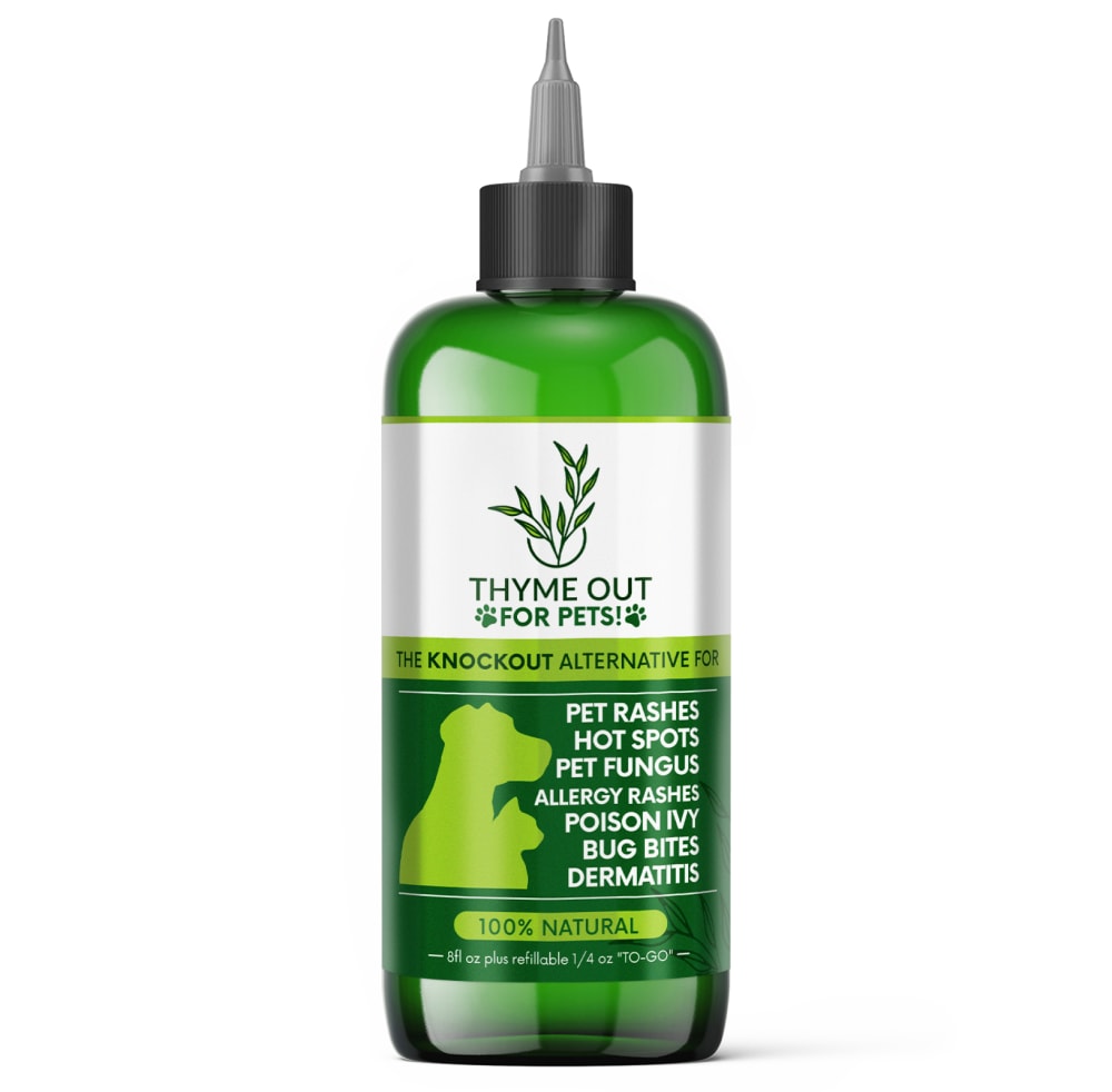
6 Responses to Option D
I picked D, B and C as my top choices as they tell me that it's made for dogs.
I preferred the options with light and bright green colors as opposed to the options with sterile white colors. The paws felt cute and whimsical.
I like the labels that have the pictures of the dogs on them.
I strongly prefer the option D thyme out product image because I prefer the green dog illustration the most. I chose options E and B second and third because I prefer the darker green product label more than the lighter green product label with the paws. I chose options C and F fourth and fifth because I prefer the dog illustration more than the paw illustration on this product label shown here. I chose option A last because I do not like the paw print illustration on the lighter green product label as much as the other product image options.
I definitely prefer the artwork on D. It really does make for a nicer looking design.
I prefer the electric green colors mixed with the dark green label rather than the two tone white and green
6 Responses to Option E
I like that option E has a cute photo of a little dog on the front of the label.
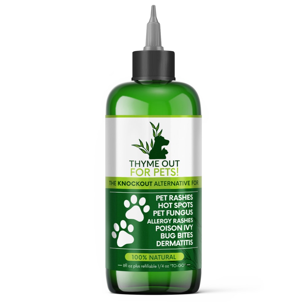
I like all of these and find them quite similar, but Options E and B are my two favorites because I like the green paw prints.
I really like this logo with the product label and name
Details easy to read and understand best in this order.
Options E,D,B are my better than C,F,A because they have a dog and paw graphic that is similar in color to the dark green background. This makes the benefits listed in white stand out more and more legible.
I prefer option E because I think that it is the most interesting, eye-catching, and visually appealing label design out of the six options.
11 Responses to Option F
I made my ranking decisions based on which bottle design made it clear that it was for pets at first glace. I found the most eye catching part of the bottle was the top banner so I put the bottles with pets in the top banner first.
I like the pet logo and how the paw prints pop out.
option F has the perfect combination of great images of natural plants and cute doggy paws.
I chose F because I like seeing the white paw prints because it stands out as a pet product.
I like the design of option F the best. I like the white paw prints as it creates an appealing contrast with the surrounding green color. I also like the dog and cat silhouette in the logo.
I LIKE THE PAW PRINTS ON OPTION F AND I ALSO LIKE ALL OF THE INFORMATION GIVEN ON THE BOTTLE. I WOULD BUY THIS FOR MY DOG
I definitely like the image of paw prints over the silhouette of the dog (as the main image). The paw prints are immediately recognizable as being for animals. I don't really have a strong preference over the paw prints labels. I think they are all attractive and look to be natural and high quality. I think I like Option F the most, though, because I see the paw prints right away, and then the small image of the dog next to the leaves and unique and makes me feel this company really cares about pets.
Option F. I really like the setup with how the pawprints. The colors used are also ideal. overall eye catching.
Made my choices based on which label design I like and prefer. The label design I like and prefer is the one in F. The label design in F is appealing,looks neat,and stands out
F I feel has the best design to it that meshes well overall and gives it the best flow.
I think the white little paws at the bottom of the label stand out the most and draw your attention in, and in option F, the logo in the top also having the little dog outline is a cute little added touch.
Explore who answered your poll
Analyze your results with demographic reports.
Demographics
Sorry, AI highlights are currently only available for polls created after February 28th.
We're working hard to bring AI to more polls, please check back soon.

