Poll results
Save to favorites
Add this poll to your saved list for easy reference.
Which label design do you like the most for a Natural Skin Treatment Brand that uses thyme tincture as a main ingredient?
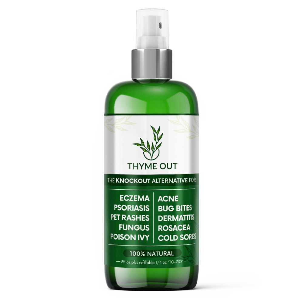
Option A won this Ranked poll with a final tally of 26 votes after 2 rounds of votes counting.
In a Ranked poll, respondents rank every option in order of preference. For example, when you test 6 options, each respondent orders their choices from first to sixth place.
PickFu requires a majority to win a Ranked poll. A majority winner differs from a plurality winner. A majority winner earns over 50% of the votes, whereas a plurality winner earns the most votes, regardless of winning percentage.
If an option does not earn a majority of votes, PickFu eliminates the option with the lowest number of votes. The votes from the eliminated option are reassigned based on each respondent’s next choice. This process continues in rounds until a majority winner emerges.
Scores reflect the percentage of total votes an option receives during the vote counting and indicate the relative preference of the respondents. If there is no majority winner, look to the scores to see how the options fared relative to one another.
| Option | Round 1 | Round 2 |
|---|---|---|
| A | 46% 23 votes | 52% 26 votes +3 |
| C | 28% 14 votes | 48% 24 votes +10 |
| B | 26% 13 votes | Eliminated 13 votes reassigned |
Age range
Education level
Gender identity
Household income range
Options
Personal income range
Racial or ethnic identity
23 Responses to Option A
I prefer the darker green designs as these as they look more like the color of thyme.
A is the easiest label to read so I would choose that.
I liked the colors for option A the most. Option c looked okay. Option B, I wasn't a big fan of the light green look.
I like the use of the darker green. I find it more visually appealing and enticing.
Made my choices based on which label design I like and prefer most. The one I like most and prefer is the one in A. The label design in A is appealing,stands out.
C and B have too many contrasting colors on the label. A is simple and attractive because it's straightforward.
Option A is the best because the dark green looks more natural. The lime/pickle green color is off putting and isn't pleasing to my eyes.
This was a really tough choice. B is the worst, however, because the lighter green works better as an accent color. A is the best because the colors are striking and interesting. And C is pretty much equal becasue of the mix of colors
I like all three options, but ultimately, I chose option A as my favorite because the color scheme is the best. It looks very high quality, and it is the one I would purchase if shown the three choices.
Dark Green theme looks solid here. Green is the color of nature so there is a natural feel to the product. White labeling on the dark green color of bottle makes the text clear to read so this will stand out in the isle from the distance.
A because I like the darker label it makes it look more legit, then I like B because the light green label makes the attributes stand out more.
I like the darker bottles on A and C because they look very sleek and professional and B also looks very unique
I love option A the most because the shade of green on the bottle is darker making it look more natural.
The way the words are listed are the best. The colors are also very nice. C is okay but the wording doesn’t appeal to me. B has strange colors to me.
My favorite is Option A label design because of its intensive green that fits the product perfectly. Other options follow in the mentioned order.
I think the darker green label looks classier, so I would select A or C.
I like the darker green as I feel that it looks much better having the entire bottle brung this color to me.
This bottle grabs my attention the best and also is the easiest for me to read
I think that the white type is easier to ready than the black type. Option A looks nice and sleek while using just black and white on top of the green liquid.
Option A has the easiest to read label without enlarging the image and then enlarging the image. Option A with the white letters against the green background is the easiest to read.Option C is okay to read... clearly visible but not as clear as Option A.Option B is the hardest to read. The green letters against the green background is not easy to read...and... worst yet... if you are color blind this label would be impossible to read. The white letters of Option A is the best choice for the consumer.
These label designs appeal to me the most in terms of general appearance
Choice A was the easiest to read and the cleanest. C was similar but A was better by a bit. C was ranked 3rd because it was hard to read and it didn't look good.
Option A stands out the most and draws the eye immediately. Option B's green is too contrast and makes the label look odd.
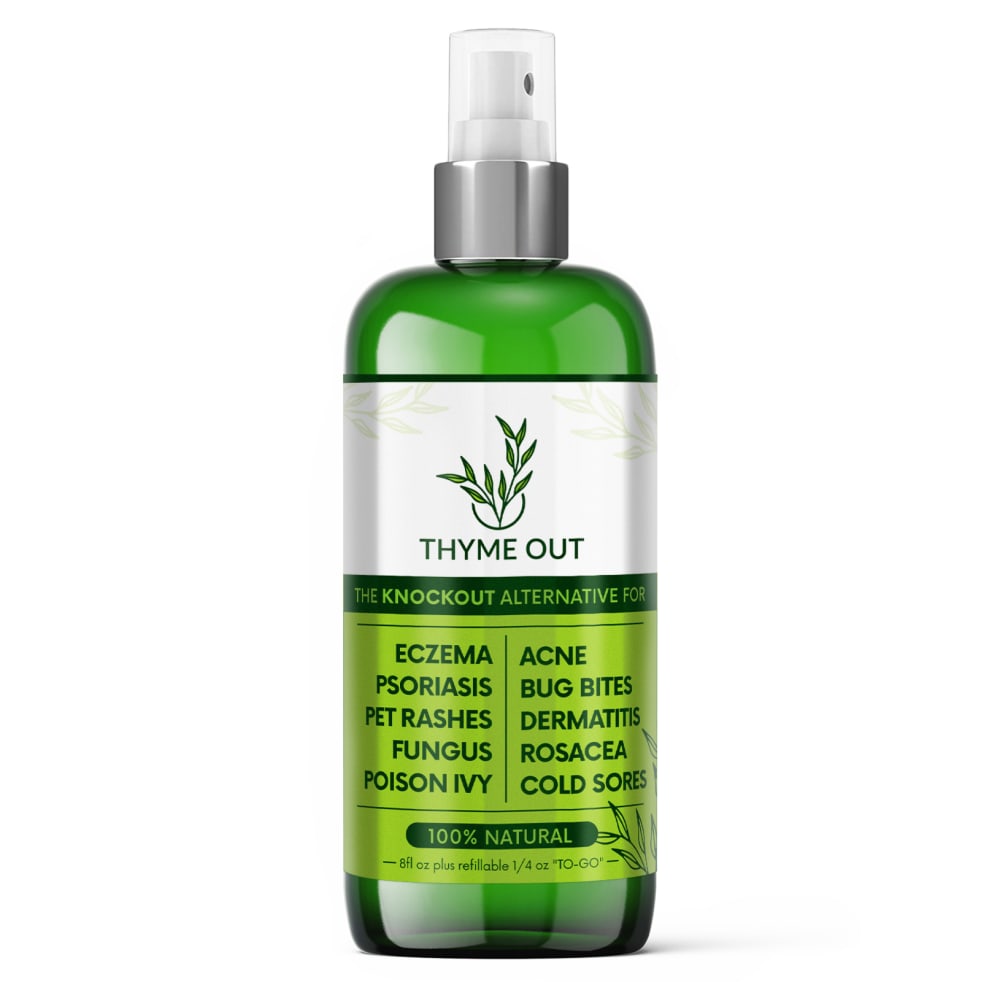
13 Responses to Option B
I like the incorporation of the lighter green in B and C! It's more eye-catching.
The bottle in choice B is the best looking of the 3 choices.
I liked that B featured a bright green label that was very refreshing. A was too dark and depressing.
Option B is the easiest to read, because of the lighter green background. Option C is my second pick because of the lighter green as well. It helps to bolden the text. That is why option A would be my last pick: the dark green makes it difficult to read text.
I would choose choice B which is nice and the background color which makes it easy to read the details of the package and the next option will be C and A which is nice from the design but the color choice is not good because the words are not easy to read.
They are all great options but I somewhat prefer the lighter green color of option B, which feels more suitable for this kind of product.
I really love B a lot because I love how bright the green is and how it just pops out for me. I like when the green is a bit brighter as it feels fun and like it will work.
I like option B since it is shiny and bright.
I picked B and C as my top choices as the different tones of the greens tell me that it's very organic to use.
Option B has a lighter green background that makes the benefits more legible to read. Option C has small lighter green background to highlight that it is natural which is good. Option A does not feel like it is easily readable due to the dark green background which blurs the whole label.
I liked the lighter theme of B most because of the association with healing. Otherwise I thought A was more consistent and coherent than C with its color choices.
Label B is pretty nice. It definitely has more of a premium look, versus the other label choices.
The shiny color of the bottle attracts me to B over the others.
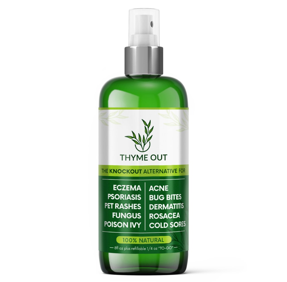
14 Responses to Option C
C's color scheme I like strongly. B's I dislike strongly.A's I'm kind of indifferent to - it could use another shade of green.
I like the label design of option C the best. The two shades of green compliment each other well with this layout.
C and B and have nice shades of green. A uses darker colors.
I like the different shades of green with the darker one more pronounced.
I like the different color greens and also like the white font on the green is easier to read on the label.
I chose C . They are all quite similar, but C has the best color scheme.
I like this product bottle the best becuase the different color greens really grab my attention and I find it the most appealing.
In my opinion the products that have the best labels are the ones shown in options C and B because they have the better combination of colors that really highlights the importance of the products and makes them more appealing for the public, on the other the product shown in option A seems very bland with the same color in all the label making it hard to understand and not appealing at all.
I think Option C looks the most natural. I am not familiar with this product at all but Option C does capture my attention right away. I like Option A just as much. I feel Option B doesn't look as natural with that shade of green behind the text.
I chose option C as my first choice because I like the color scheme used on this label more than the other two options. I think the white lettering on the green part of the label stands put more and is easier to see. I also think the use of the lighter shade of green is more eye catching too.
My first choice looks clean and modern and it also easy to read. My last choice is a color that is harder to read.
I strongly prefer the option C thyme out product image because I prefer how the dark green background color on the product label uses the lighter spring green text highlight to highlight the one hundred percent all natural text on this product label the most. I chose the option A product image second because I prefer use of the darker green background color because it makes the text easier to read. I chose option B last because I do not really like how the bright green color is used for the background on this product label because it makes the text more difficult to read.
I like the label in option C the most because the colors flows well. It feels calming and relaxing
I like option C the best, it has just enough of the bright green color to make the label look a little different, but not too much, like option B and it doesn't look too plain, like option A.
Explore who answered your poll
Analyze your results with demographic reports.
Demographics
Sorry, AI highlights are currently only available for polls created after February 28th.
We're working hard to bring AI to more polls, please check back soon.

