Poll results
Save to favorites
Add this poll to your saved list for easy reference.
Which logo design will more likely make you Buy a $150 Soft Cooler Bag?
Option C won this Ranked poll with a final tally of 104 votes after 2 rounds of votes counting.
In a Ranked poll, respondents rank every option in order of preference. For example, when you test 6 options, each respondent orders their choices from first to sixth place.
PickFu requires a majority to win a Ranked poll. A majority winner differs from a plurality winner. A majority winner earns over 50% of the votes, whereas a plurality winner earns the most votes, regardless of winning percentage.
If an option does not earn a majority of votes, PickFu eliminates the option with the lowest number of votes. The votes from the eliminated option are reassigned based on each respondent’s next choice. This process continues in rounds until a majority winner emerges.
Scores reflect the percentage of total votes an option receives during the vote counting and indicate the relative preference of the respondents. If there is no majority winner, look to the scores to see how the options fared relative to one another.
| Option | Round 1 | Round 2 |
|---|---|---|
| C | 32.5% 65 votes | 52% 104 votes +39 |
| B | 40.5% 81 votes | 48% 96 votes +15 |
| A | 27% 54 votes | Eliminated 54 votes reassigned |
Age range
Education level
Gender identity
Household income range
Options
Personal income range
Racial or ethnic identity
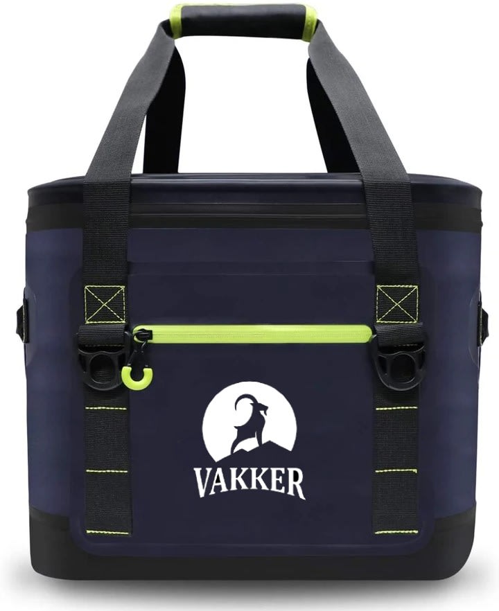
54 Responses to Option A
B is a bit too minimalistic; it's a bit hard to see. A really stands out and looks great on the bag. C is almost as good, but I don't like the stylized spelling on the company am (especially the E).
I chose option A because I like the rounded lower font lettering for the brand name. The goat standing atop of a mountain in front of the moon (or sun) is memorable and perfect.
I think the shades of white make the logo stand out more and look more high-end. Therefore B that doesn't have white is 3. Between A and C, I prefer A. I think the shadow of the moon behind looks really classy so A 1 and C 2
I like the moon in the background, in general, I think using a bit more white makes the logo stand out nicely against the darker background
A) I love how the goat looks against the full moon. B) I like how the goat stands out against the background C) Just an out line of a goat? Boring....
Option A is the most dramatic. I like the use of the moon with the animal in dark relief. Option C portrays a strong brand through the ram's pose. Option B is too plain.
A has the best logo that stands out the most and is the most attractive.
I like the design A the most because I like the white moon outline. I then like option C the next best because I like the filled in white outline. I thought in option C that the logo really disappeared into the background of the bag.
I liked choice A and how the goat is surrounded by the white moon which accentuates the look and design. The goat is the central focus of choice A and grabs my interest right away.
I like A as it is the most noticeable.
I really like the silhouette against the moon look. This logo catches my attention the most and would make me proud to own the bag.
i like the way the animals stand out more on the coolers in choice A and C. i feel like they are more eye catching.
A Is my favorite. I love the addition of the moon on this one. This logo stands out the most to me./ C is a close second for me. I love the coloring of the mountain. It is unique and also stands out./ B is my lease favorite. It is plain and easily forgettable.
The cut out with the moon behind the wolf looks more expensive then the other to logos
The moon behind the silhouetted animal is definitely my favorite. It looks cool and feels very outdoorsy.
PREFER THE LOGO ON A
I prefer choice A the most, but I like choice C somewhat as well. I think that the moon behind the ram on the logo sets it apart from the others and gives it a distinctive look. The font also has a classic but rugged style without overdoing it.
I feel like the logos in the order I chose were more prestigious looking. The first one has more white and stands out. The second one is more simple but was visually more appealing to me than my third choice.
Option A has a logo that stands out. Option C is also eye catching but A looks better than C. Option B is too simple or bland.
I rank option C in the 3rd place because the fonts of the texts are not my favorite. Some texts are not easy to identify. For the other two options, I rank option A in the first place. I like the white background of the logo. It makes the logo easier to understand.
I like that option A has the full moon behind the goat on a mountain. I then liked option C, followed by option B.
I like the design of the moon in the background more than the other designs.
That is a lot of money to spend on a cooler bag, so I'm thinking it has to be the design that makes the company appear to be the most high level. To be, that is A. I like the moon in the background and also the font is easy to read.
I like choice A the best. I love the moon behind the animal. I like choice C second best because I like the shadow on the mountain. I chose choice B last, because it's not my favorite
Now to be real, I'm not going to buy a $150 cooler bag no matter what the logo looks like. But I like the goat in A because he looks like he's in nature, so it would match if I'm going camping. C is in nature too but I don't like the font, if you don't look at it right it kind of looks like the word "wanker." I really don't like B because it's more of an abstract line drawing which doesn't go with a low tech cooler at all.
I prefer the logo and font on bag A the most. While I dont love the font on bag B, I like the image since it is similar to A. Nothing positive to say about bag C.
I went with the ABC option. All of these are good. I like option A because it reminds me of Nightmare before Christmas with Jack standing on the hill in front of the moon. I would not ever take this out at night, but I like it. Option B with just the outline is interesting and not as garish as the other two, and i like it. i am so glad option C does not have a wolf on it. I would never have bought it if it had a wolf on it! I like the mountain goat or ram or what ever that is on there. I would ask my husband what he liked, but he wouldn't care. He would just want to know if the cooler kept the stuff cold as promised and would ask me if I got a good deal on it. I have 3 soft sided coolers right now and probably since I have those, this really doesn't interest me at all.
I like the ram on the mountain and with the white moon it looks really cool.
I like A the best because it has the moon in the background that adds a lot of contrast and makes it stand out. C looks good too still with a good amount of contrast. I picked B last because it blends in the most with the bag and you can't see it as well.
I like the contrast with the animal inside of the white circle
The first design looks more clean and elegant.
Since all the bags look the same to me, I went with the best looking logo on the bag in my opinion. A - with the white background and bolder larger font it makes the logo stand out and it makes the bag look the best, C - With the solid white animal it makes the logo stand out in the bag and makes the bag 2nd best. B - The logo is the least visible of the 3 (smallest font too) and would be my 3rd choice of the 3 bags.
I ordered these based on how quality they appear
I like the white background of a. B is a close second.
Logos dont affect my buying decision as they provide nothing to the function of the product. However, for the basis of aesthetics, I still like the moon background that I choice with my first ranked selection (A). My second selection (b) gets 2nd place by default, as the negatives of my 3rd selection bring option C to last. I really dislike the font used for VAKKER on option 3. I dont care for the (what I am assuming ) are mountains on it.. and it just looks too 'busy' for me.
I chose which ones I preferred in order
I like the logo with a defined negative space. It seems more creative and outdoorsy.
I like the moonlit silhouette of option A the best. It is a simple but effective design that has a sharp contrast. Option B is too plain and doesn’t convey a premium brand to me. While option C is much closer to A, with a higher quality image.
I like the imagery against either the sun or the moon (it's open to interpretation, and can give you lots of ideas on how to use the cooler). For B, I like the simplicity of the logo. It's clean and unobtrusive despite being clearly visible. Option C is just a bit too hard around the edges. I don't like the detail on the mountain.
I like the looks of the icon in the 1st choice the best.
i do not like A's word image, but the picture is the best C and B is similar but C's logo and word looks better than B
The frist one I like the look of the moon in the background.
Choice A was the best, because the logo with the moonlight in the background really stood out and made the bag unique. Choice B was my least favorite, because it lacked visual appeal and was to simple and plain.
I like the solid white background the best, then the simple outline. There's a few thing I dislike about C - the shading and the missing elements from the A and E in the logo.
The bold colors seem stronger and stand out much better.
I like A the best because the font is bigger so you can see the logo better. I also think that the curved letters imply strength, so that maybe the bag would last longer. I also think the moon looks cool! I dislike C the most because of the three lines that are supposed to be the E. That looks terrible. Option B is just okay. If the letters were bigger, that would definitely be a better option.
I really liked the moon on the logo, and with the simple bag I think a little more detail in the logo goes a long ways. A had the most detail so I ranked it first, C had the second most detail, and B had the least detail.
The layout of design A is,classic, clean and is put together well and fits the idea of a cooler and outdoor gear. I feel the same with Design C with the exception that it is more modern. Design B is just plain and bring,
Option B looks somewhat strong, but it lacks the defining background dimension of the other 2 options. Option C has more strength and looks like it's at the top of it's competition, but the "E" in the logo is overdone and can be somewhat confusing. Option A has clear strength above the competition, the logo is clear, bold, and strong. Option A demands that it be admired as it's at the center of your focus.
I like the logo with the moon and mountain the best. I think it gives it an outdoorsy vibe. 2nd best is the one with the mountain but no moon. Last is the plainer logo.
A is the best design.
The first choice has an eye catching circle around the ram. This circle draws you eye to the bag and may entice someone to take a closer look.
The reason for my choices is that I feel the first choice was most eye catchy then the other two. All three would make a good choice but the one I choose as #1 is the best:)
I like the contrast of the moon and the animal and mountains. Looks more high end.
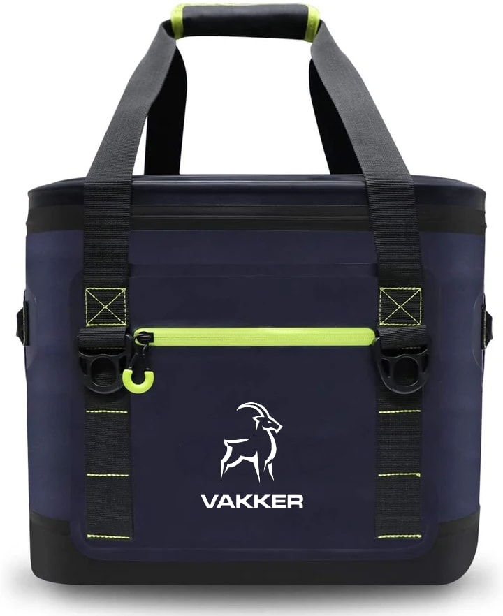
81 Responses to Option B
I would choose B. If I buy something like this, it is because of the function/use of the product. I don't intend to advertise for the company--if I like it, I will tell people about it.
I like B the most I think that it’s logo makes the bag the most appealing, and C’s logo also makes it look really good thought B is better. I think that A is by far the worst. I would very much prefer B and C, B the most.
I like the more minimalist versions that take better advantage of the product.
I really like the bold looking logo that is option B. I think it is very unique and stands out with that white outline. I think Option C is pretty good too, but it is slightly more difficult to read the company name.
I like Option B the best, its almost like the moose is transparent. Looks really cool!
Definitely dig the more subtle look.
I really prefer the minimalism of B - it's more modern, less cluttered, and looks cool as hell. The other two look more dated, but of the two, option C looks decidedly more modern than A, which to me, looks like a logo from the early aughts.
I prefer option B because it has the most simple design. I don't care for the price tag though.
I chose Option B because I like how clean, modern and strong the logo looks. I chose option C second because while it's not as modern, I like the strength the logo shows. In Option A, the logo gets a little lost and the text seems a bit dated.
B is more modern and minimalist. The one with the circle looks the worst. It looks old and hokey
The first one is the most discreet and looks the classiest, followed by a lesser discreet and the last one is a bit too loud for an expensive bag.
Choice B is simple and a little mysterious. I think people would ask where you got it and wonder why they didn't know the brand. I like both C and A, but the font on C is much better than on A. You might want to consider trying choice C with the font of A.
I like that choice B has a great design logo.
I like B the best because the animal and the text are simple, easy to read, and not too large.I like C next because the logo is larger, but the text is still easy to read and looks modern.I dislike A because the text looks old/not modern and I don't like the silhouette of the animal.
I like a minimalist design...and the white logo usually flakes off, so I would like some minimal design. I do like the font on B as well since it's not as prominent.
I like the subtlety of the logo the best in Option B; it doesn't detract from the blue of the bag, and the white animal looks the best. My second choice is A because I prefer the font that is used, and the whiteness of the background behind the animal. I do not like option C because of both the font and the grey that is used in addition to the white of the logo.
The smaller the footprint of this logo, the more I like it. First, it is the look of the logo, it is leaner, more compact, and attractive. Second, the larger these logos are on items like this, the more they crack and deteriorate. Particularly in the one Item A with the large moon or whitespace. Large areas like this crack and split relatively soon and make the item look ragged even if the rest of the bag is still in good condition. Yes the rest of the logo will crack too but it won't look nearly as bad as the large area doing it.
I liked B the most because it conveyed a spirit of minimalism and ruggedness that I thought nicely matched the product. I liked C the second most because the logo was aesthetic and not too over the top. In contrast, A was my least favorite because it seemed too busy with too much white.
I like the more minimal logos, I am not too fond of obnoxious branding. The more subtle the better.
I strongly prefer B over the other because it is a little less assuming. I think if you are going to spend that much money on a cooler you don't need to be flashy about it.
It looks sleek and modern
I Like option B, with one color and the flat-looking logo. Option A looks like a company branded bags with their logos as gifts or something. Logo B looks the like thr brand of the bag.
I like the simpler logo of B, with the less area of white as it somewhat clashes with the bag itself.
B has the most modern and attractive looking logo
I like choice B because it is more subtle. Many times people do not want a bold, large logo on their items. C is also nice because it isn't as bold and white as option A
I thought option “B” was the most straight forward and provocative font. Option “C” is too long (height wise) and Option “A” is generally too big.
I like the overall design of b.
Option B is my favorite logo design for this cooler bag. I think that this logo is the most high end looking. I think that it looks sleek.
Love Choice B. The logo really pops against the black. It is more subtle. The font is really streamlined and cool looking. I think Choice C is also solid, though too much white in it.
The light silhouette outlet of the animal looks the most attractive on option B. Option A is also attractive due to the moon included, but it is a bit too standout. I personally prefer designs that are much more subtle than standout.
Option B is very memorable for a branding logo relative to the rest. The others have too much going on. Option A appears more like an etch than anything else.
Ranked in order of how conspicuous the logo is - the lesser the better
B is simple but elegant.
It blends better with the color of the cooler.
If I am going to spend $150 on a cooler bag, I don't want to be a walking advertisement for the company. I chose the logs in descending order of their obviousness. The more understated the logo, the better.
I really like the logos with the least amount of white. I think this makes them appear more sleek and does not interrupt the overall look of the bag.
B has a fancy, artistic design that look nice and I would want to use it often. A looks amusing and cute, a bit cartoon logo like so it is nice. C is good for having what looks like a classic design.
I like choice B the best the other options look obnoxious and are ugly
Prefer the first one since it has the most simple design. The last one looks like it's for hunting and bullets
To me, my first choice looks the most like a high end label. It has the most classic and classy look to it.
I liked B best because I felt that the design was simple and clean. I picked A second because I preferred its font over C’s font.
My favorite is definitely option B for the clean lines and bold font. I like when the logo is more of a bold impression rather than super defined. I went with C second for the font used for the brand name. The logo is nice; my favorite part is actually the crag below the ram. I'm not a fan of option A because of how much space the background circle takes up.
Choice B of the logo designs would definitely make me more likely to buy a $150 soft cooler bag. The logo on choice B is simple and clean and clear and most importantly, easy to read. Option C was close but it had too many unnecessary elements and I actually had the thought that all of that white mountain area of the bag might get dirty easier (if you were using the cooler on a boat or for family activities). Option C was much harder to immediately read than option B. Option A was definitely not even in the running as it seemed to be putting a full moon behind the logo which suggested only using the cooler at night and not for family, or other daytime activities.
I like the minimalist logo design.
This image is classic and unobtrusive. I prefer branding that is less "in your face."
b-looks professionala-not as professional lookingc-looks too cartoonish
B - i like the minimalist aesthetic and feel more "now"A - I like it, feels cartoonish - like a movie studio logoC - on the screen anyway, it looks 3d. while this is the more elaborate design - it feels more cheap to me and borderline cartoon.
My top two choices are a little more subtle but still recognizable enough to turn heads of envious people.
I like the black animal the best by itself as in B. I like A second best. C is just okay.
I like the lines of the #1 goat. I don't like the font of #3. With #2 there isn't anything I really like or dislike about it, hence it is in the middle. But @ does look more like the gosat is on an iceberg rather than a mountain.
I like B better because it looks cleaner. C was a good 2nd because I liked the 2 tone scheme. 3 was my lease favorite as it seems to look to bulky.
I preferred the smaller more artistic logo. The logo I put in 3rd place had a generic look to it such that it didn't really fit with the product. Plus it was too conspicuous.
I like the one that is smaller and less bright .
For rank B - I like the logo that uses the negative space to show the animal. The edge/outline looks like elegant brushstrokes, and the font is a simple, straightforward, nicely spaced font. Overall, I think it has a lot going for it. The logo itself isn't overbearing on the side of the cooler, well proportioned.C is second because the text is still pretty straightforward. It is a little more artsy, but fairly modern. The mountains above and below the text add to it, and while the goat is rather dated as a design, and somewhat large and blocky in white, it is still pretty simple and easy a logo.I put A as third because the moon is overbearing. it takes up too much space, is too white, and too much. The negative space for the goat is nice, but the moon overrides that. The font is old with the serif, and kind of dated compared to the others.
I like B because the logo is small and doesn't take up as much space. C is my next choice for the same reason. I don't like A because the logo is too large. If I am paying that much for a cooler, I don't care about the logo. I just want the bag to be functional.
I like the designs which aren't as "out there". The ranks I chose reflect this presence.
I don't love big logos. B seems the least obvious, followed by A, and then C is just too bold.
I like more subtle and sleek designs. My preference is that the logo be noticable but not overpowering, therefore I ranked them based on how small and less white they had.
option B is the best because the logo doesn’t stand out too much and isn’t ostentatious enough to monopolize the attention of the consumer. subtle is best for this type of product. option A almost comes off as though it is glorified swag as a freebee from a convention or something. option C is the second best logo( it’s a bit too modernized, trying too hard to be “cool.”
The silhouette outline looks nicer and is sharply done. The one with the moon background is too big of a logo.
the design of the animal is better
B was my favorite as the logo looks crisp, clean and modern. C was my 2nd choice as I do like the bigger logo, and the font used in VAKKER. A was my least favorite as I did not like the white background nor logo on the bag.
I like the logo in choice B the best. The like combination of the block lettering and the stenciled logo. I like that the logo looks like an incomplete outline of a goat. I think it stands out and looks different from the style of other logos. I'll be honest though. A logo is not going to impact my buy decision to buy a $150 cooler. That would be based on the features and reviews of the cooler. The logo would be a nice extra.
I like the image of the ram so I prefer the more simplistic look over options C and A that have more details.
I liked the first one because the image seemed clearer - less busy and more professional. The second one reminded me of camping and seeing the moon which you normally can't always do from the city. The one I ranked third i did not like as the wording was not very clear
I like the simpler design of "B" better. And then "C" is pretty good. The "A" choice looks like the design from Disney's the Nightmare Before Christmas so you shouldn't use that one.
B was the best combination of visually striking yet minimalist. I liked the different color tones of C but it was a little busy compared with B. A has too much white and I feel it would be prone to more discoloration over time.
i like the minimal look of option B the most it look sleeker and more thought out, option C looks really good as well it stands out option A is ok nothing special about it
I like that it's simple but the animal is still well defined. It has some contrast in color with the background so it is easy to see. I like that the logo lines aren't connected but you can still identify the animal.
I really don't think I would spend $150 on a cooler bag, and the logo would be the smallest determining factor.
The lines on option B are nice and clean cut and it is the smallest and least noticeable. (Preferably, I would go with a cooler bag with no logo, so as close as I can get to that is best.) So in tandem with that, option A is the "loudest" and most noticable and therefore the one I would least want to pick.
I prefer minimalist logo designs on my product, and the smaller the logo the better. I put B first because of how simple the logo looks. I put C last because it looks so much larger and distracting than the other two logos do.
For a cooler bag, I'm looking for something simpler, and easy to read. I found the font choice in option C to be a bit difficult to make out quickly, which moved it rapidly to the bottom of my list. Between the other two, I found the simplistic nature of B to be a bit more sophisticated and adult than A, which is also nice, but a bit more general/childlike.
I like how simple and classic the logo looks on B. C is also nice but has more white, which takes your eye away from the bag itself. A just seems to be too much logo on the bag.
I like simple logos the best
I like B because it looks similar to Yeti font which I relate to a great quality product. Option C has nice lines and has a clean look. I like A the least because of the white background which overwhelms the dark blue background of the bag.
The logo here is simpler, sleeker and better looking, it also feels high quality. I would prefer "B" since it looks more higher-end.
More modern look
I am not in the market for a $150 cooler bag, but if I were to spend that kind of money I would prefer a modern and sleek-looking logo. The choice I ranked third looks like a cooler you can buy for less.
B Bag looks more now and trendy, whereas option C and A look like another brand to me though I can't recall the name. The logo looks interesting.
I like Option B because it has the least amount of white on the bag. It looks more elegant and simple. After that, I would choose Option A because it is slightly more visually appealing that Option C, but I strongly prefer Option B over the other two.
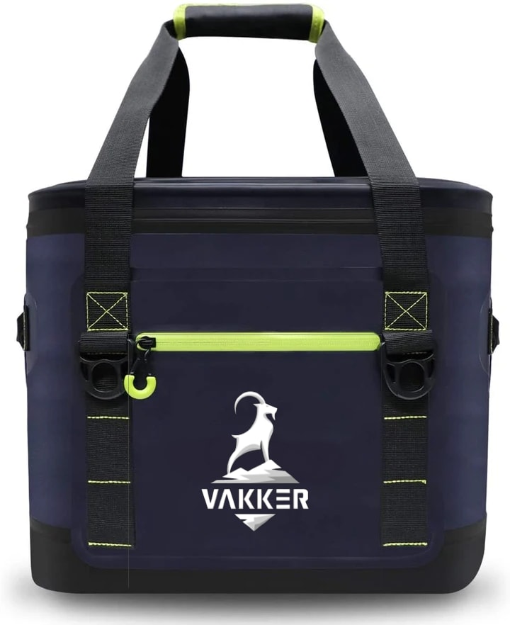
65 Responses to Option C
I like how the animal is more expressed in option C. The font looks the nicest too. Makes me think I’m in the outdoors.
I liked C the best (really like the ram on the rock), and I found B too plain, so A ended up in the middle because of that.
Option B just looks like a mountain goat that hasn't achieved anything. I don't like the moon behind teh boat in option A, but the goat looks powerful as he is at the top of a mountain. I really like the white picture against the dark background in C. It is very eye catching
Option A looks a odd because you never see a mountain goat silhouetted by the moon. I dislike option B because it looks like a cartoon. Option C is simple and shows the image without being busy.
Option C has the most contrast and stands out the most from the background. The "mountain/rock" is more clearly defined, which indicates outdoor and rugged. It's the most interesting graphic. Option A is a close second, and I like that it uses negative space instead. The typeface says "old Hollywood" to me- like a movie company, but the white circle around the goat is really nice. Option B isn't bad, I just think the other two are much stronger. It's simpler, but doesn't stand out from the material it is printed on enough.
Looks most prominent of all the logos.
I'm not a fan of the last one all that much. I think the first one looks the classiest. I really like that one with the second one fairly close behind
Number 1 looks more premium which is what I would expect from a $150 bag
Option c is my first choice-i like the realism of the logo, the company name is easy to read and see. Option A is my next choice, i like the image and font of the wording. Still easy to read and see actual name. Option B is is my last choice, the image is more cartoonish than the other 2, the font is nothing special or memorable.
I think that logo stands out more and it says that it’s worth that price. The size avd the design says so.
The first one looks like it would be better made than the other ones.
Sorted according to the logos from best to the worst.
Number one seems the most original without being weird. The third ranked reminds me of a cheap knockoff
I chose C as the top choice because of the eye catching lettering and the 3D look of the logo itself. For me it looks the most expensive and attractive. My last choice A I do not like the large white circle and the lettering looks cheap.
Option C is different than any other logos.
I chose option 1 because I liked how then Ram is perched on the mountain with a hint of silver color. I also like the way the font stands out in the name. Rather rich looking.
I find that the white on black fleshed out design would make me want to buy it more because the logo itself feels defined to me compared to the other choices.
C looks like it could be stitched on and a higher quality. I do not like how on A there is a large moon
I chose C because I think it looks the most majestic. It's singularly focused on the animal logo, and the brand name is prominent but not overdone. It looks professional, and the simplicity of the font looks professional and not cartoonish. It's memorable, and the animal standing upward on a peak seems regal or proud; it brings good associations to the brand. I chose B second because the simplicity is very memorable and instantly recognizable. It doesn't feel as substantial as C, but there is a minimalist appeal to it that seems high level and designer. I chose A last because the moon backdrop makes it look too cartoonish, like it's on the cover of a children's story about Halloween or something. It's just overdone, and the graphic image distracts from the brand name. The curve of the font in the brand name also makes it look like an amateur graphic designer was trying to use his whole bag of tricks on one simple logo.
Very like the bag is very good look.
Option C looks to be the almost 3D in effect, but like the text on option B the best
Option A looks like a Halloween display item. Option B looks weak and ill defined. Option C looks strong and well designed, like it's rugged.
Option C looks very classy. Option A looks adequate, but nothing special. Option B is very unmemorable.
C is my favorite because of the simplicity of the design of the logo.
My first choice looks very premium and expensive. My second choice looks fashionable, the logo looks good.
I think the logo on Option C looks the most sophisticated out of the 3 choices. However, no matter how good the logo looks, I'm not spending $150 on a soft cooler.
I like the logo C best because the goat on a mountain top makes it look strong and durable. B choice is next best just seems basic. A choice does not catch my eye and looks cheap.
I love the look of the ram on the mountain in choice C. It makes me think of adventure and courage. It's also a clean and clear design, although I like the font on choice B better. I DON'T like the moon behind the silhouette of the ram in choice A, nor do I like the shape of the text on A.
Usually I would want the logo to be the smallest possible, but in this case I really like how the hill is part of the picture and makes it look strong. With the writing being bolder, it makes you think strong. I have a sense that the cooler would be long lasting. I didn't like either of the other choices. I wish that "B" was bolder with thicker writing and lining. In "A", the animal is small and it takes away from the logo.
I like the gradient on the first design, as well as the prominence of the ram in the logo. The second one is also good, but looks a little too clip-arty.
I prefer Option C (the version of the Vakker logo that is white on a black background) because the font looks futuristic, while the version of the ram presented is the most aesthetically appealing. Option A is nice as well, but I prefer Option C because I feel the white/black contrast works better with the ram and mountain being filled in with white, rather than with the ram and mountain being the silhouetted side. Option B is okay, but I can't help but feel that the outline and font used in that one is a bit generic.
I like the more subtle lettering, and the less detailed goat.
C looks embroidered which makes me choose that immediately. B is a very nice minimalist design. A is my least favorite - I think it would be better if it was smaller.
C is my favorite choice because I like the logo the best - the mountains are thicker and the goat on the top looks more like a better quality logo - A is okay too because the moon in the background is nice. B is okay but pretty boring compared to the other two
I really like the goat on the mountain. That's how I picture them a lot of the time anyway, so this just looks great.By the way, ALL of those bags look fantastic, regardless of the logo!
The design logo is the reason for my ranking. I don't think this item warrants a $150 price tag.
Option C makes me think the most of getting outdoors and climbing a mountain. Option B the least.
The all look good, I prefer choice C
Some of the designs look cheap.
I like this contrast of colors in Option C the best. I feel like this one is more visualizing appealing. I think the logo in Option A is also nice especially the moon in the background. The logo in Option B seem kind of plain.
The logo I picked looked more luxurious to me. The font is unique and the entire logo looks like it is a relief. Logo B it since and simple. Logo A feels too old fashioned.
I really like the two-tone logo on C. A is my second favorite; I like the use of negative space. I think the styling of B looks very generic.
I prefer option C first because I like the log. It portrays confidence, independence and sure of oneself. I choose option A next because of the same reasons but it seems the logo is being outshined by the white background behind it. and option B is last becaule the logo is too bland and unassuming
I like the stark contrast of the white against the navy blue.
The first option is most eye catchy for me. The animal silhouette looks cool.
I feel like Choice C has a very unique logo with its unique font. Also the logo has some depth to it. Choice A is okay, I do like the moon shadow and the bright white is a contrast to the dark bag. I don't like Choice B because it's too simple and the font is seen in other products, it's not unique.
I really like Option C's logo the best. I think it looks very professional and it's intricate design immediately caught my attention over the others.
C is a strong design. It stands out but not too much. It makes me think of strength. A stands out as a logo but it's a bit too big and overwhelming. B just isnt eye catching. Nothing that would stand out from other brands.
The option I chose first has hard lines and edges, and I like the crispness of the design. It's very catchy and appealing to my eyes. I chose Option B second because it's less cartoonish than Option A, and it takes itself seriously. The last option (A) would be a good design for a sticker or cartoon (as previously stated) but not for a luxury brand.
Really nice layout and shape. I like how it has some shading on it. Doesn't look tacky and makes it look more expensive.
I like the image with a mountain goat standing on top of the mountain. It gives it a good strong vibe and look to the bag
C was the best layout because it looks clean and stylishB was very simple and doesn't dominate the entire bagA is interesting, but I wouldn't buy it at all.
I greatly prefer the design of logo C. I like the font type and the design of the ram positioned on the mountain. It looks rugged and adventurous. The design of B is good too but I think it looks a little cartoon-ish. I do not like the white background or font type of A very much.
The image on C makes the bag look more expensive. I think the image on A is hard to make out what it is.
I like C better because it looks like it will hold up the best and not ware out.
I like C the best because it looks like the fanciest logo. And then I like A because of the goat inside the full moon.
option c looks the best
I think C looks the most noble while I like the minimalist look of B. A is fine, but feels like every other logo like this.
C really stands out against the darker background.
I like C the best. The design looks like some thought and detail was put into it. The second option is okay. It just seems a little plain. The last logo doesn't give me a high end feel as compared to what the bag is being sold for.
I seem to prefer the white goat design on cooler because It seems more fitting on it. I almost made the 2nd choice one of favorite but it's lacking in some areas. Nothing's wrong with 3rd choice but it's one of least favorite in 3 choices that I pick.
Honestly I wouldn't pay that much for such a product but for the sake of the survey I made my decisions on what I found most attractive.
I like choice C the best as the brand logo looks the most modern and sleek. The other two look slightly outdated.
That is a lot of money to spend on a cooler bag and the logo on bag C looks the most sophisticated with the white mountain. The lettering also looks more exclusive. I chose B next because A looks too much like Halloween with the giant moon on it. B is more simple than C so it doesn't seem worth as much.
The detail in C really draws attention to it. Option B has a simplistic design which I tend to like not seeing logos on products.
Explore who answered your poll
Analyze your results with demographic reports.
Demographics
Sorry, AI highlights are currently only available for polls created after February 28th.
We're working hard to bring AI to more polls, please check back soon.

