Poll results
Save to favorites
Add this poll to your saved list for easy reference.
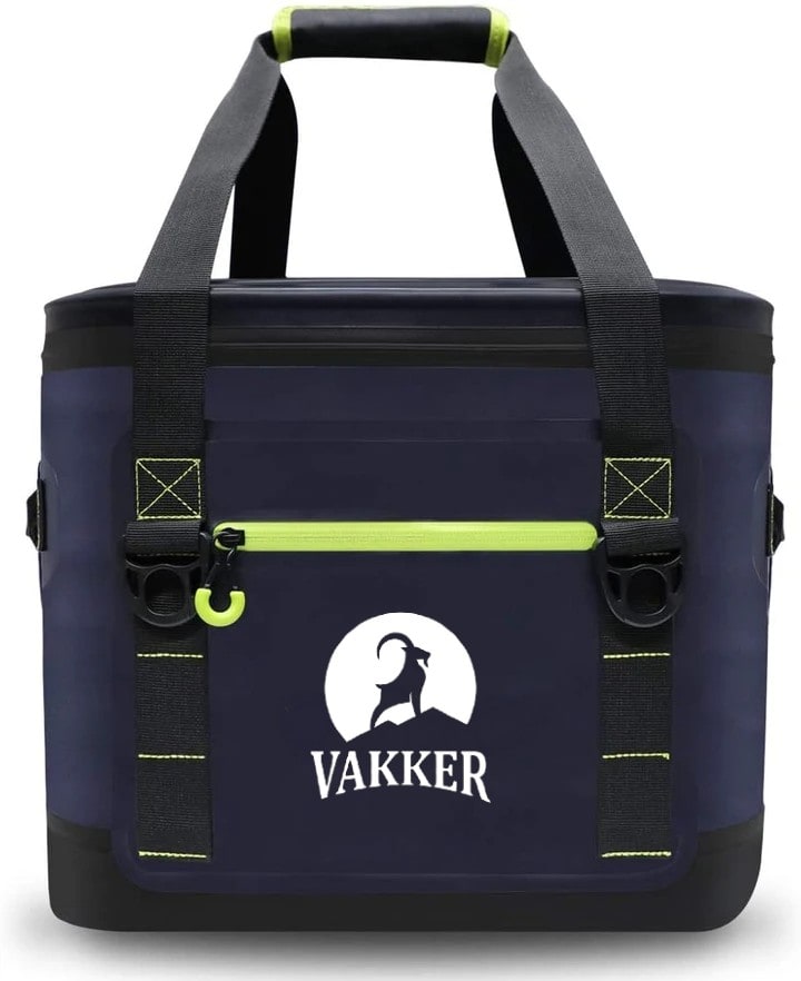
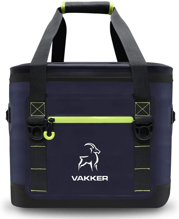
Which logo design will more likely make you Buy a $150 Soft Cooler Bag?
Age range
Education level
Gender identity
Household income range
Interest in hiking
Options
Personal income range
Racial or ethnic identity
78 Responses to Option A
I learn more towards choice A because of the logo being larger and of a greater design.
I really like choice A the best because I feel like the white moon in the background makes the animal stand out more.
I definitely prefer A. I think the white background makes the design of the animal really stand out and makes the bag look more high end as well
Well, I don't think there's much a logo can do by itself to make me buy a $150 cooler bag, but nevertheless I like A better. B looks like a knockoff logo of that deer hunting brand I see decals of on pickup trucks.
The logo in A is easier to identify. The additional white-color background is a plus. In addition, the texts used in the logo of A are consistent with the circular design.
While a logo is probably the LEAST defining characteristic as to why I would chose a bag. I like the additional white space used in choice A with the added moon. It looks nicer all around I believe.
It looks more professional and like there was more effort put into it than the other one.
I would probably not purchase a cooler bag this expensive, but if I did I prefer the option with the logo of the animal in front of the moon. It makes it stand out more.
For such an expensive bag you better give the superior logo
I really love having the moon and silhouette in the logo. It's so cool.
I think the white backsplash makes the logo not only pop out better, represent the brand better.
I like this icon design more. The full moon behind the goat looks epic.
I chose option A because I like how the Vakker name is written in a style where it looks like the name has a inward rounded look to it. I also love the goat silhouette against the full moon (or sun) logo.
Looks like a better logo colorway
I like A better. I am a fan of the moon and the mountain. B seems pretty simple and plain.
The moon silhouette is striking, it has a great contrast with the dark background of the tote. Choice A is better because of that. I find Choice B to have just a plain logo. It doesn't distinguish itself. It's boring.
The logo is larger and more prominent, making it seem more genuine, on a bag product.
I like option A a little more because I think the circle around the goat really grabs my attention.
I think this is a cool design. I think it would sell easily just based on the design itself very original.
Much more unique and better designed.
I like choice A the best. I like the moon in the background and the clipart pops out more on the choice A bag.
The logo stands out more. It's very eye catching.
I think the "moon" in the background adds some style to the logo. The other design looks rather plain.
I like the logo on A better I think it stands out more
Choice a looks great. The graphic on it stick out against the background. By doing so it catches my attention and makes me want to choose it more. The color scheme is remarkable.
I think this icon looks a little classier and makes the bag seem a bit more expensive
The logo in choice A is more prominent, attention grabbing and easily seen as it has a different color scheme.
I liked choice A and how the logo is the central focus and is highlighted by the white looking moon for the background. The white moon and the goat look appealing and catch my interest right away.
I picked this option because I like the way the white is shown behind the animal. it makes it stand out more and makes it look more outdoorsy.
It looks more prominent with the large white background and would make me feels prestigeous
I like the logo better because you get more detail of the ram and he is standing over a mountain range.
This is the best design.
I prefer the white background and the position of the ram on the mountain
This logo stood out to me more. The ram is mightier on the hill. The white background makes the logo pop and the title is large and grabs more attention.
The ram on the top of the mountain, standing strong conveys a brand with a higher sense of quality and vision. Which hopefully means a better product. The top of the mountain conveys both the cold of the climate as well as the ram being able to handle and even thrive in it. The context of the ram conveys so much more to me than a ram by itself.
I like the curved logo print from the bottom. It fits well with the contrast of the animal in a white background which stands out more than option B
Oh gosh a $150 soft cooler? That's outrageous. I don't think any logo could get me to do that. That being said, I do think the one with the moon and the negative space being the goat looks way cooler, but that may just be because this is a dark color bag? I wonder if the other one would actually be better looking without the dark color behind it.
I think the logo design is better. I like the white around the animal
Option A has a better defined image. The moon in the background showing the animal on the mountain makes it feel more rugged. Also, the logo is easier to read in the bigger format
I like both designs very much, but the mountain that is depicted in (A) indicates a stronger sense of outdoor and adventure.
I prefer the silhoutte. I think it is more eye catching than the outline.
I like both logos, but I prefer this one over choice B. I like the moon framing the goat on the logo, it gives it a unique look while still being contemporary. The font for the logo on choice B looks similar to other logos I have seen for other products.
this is a well balanced logo, and I like the moon behind the ram
I actually like both logos and it was hard to choose. However, the silhouette in front of the moon is more of an eye catching design. It makes me think of being outdoors, which goes along with the product's purpose.
I think the white background and the curved letters are more attractive. I am, however, very unlikely to buy a $150 cooler.
The logo design that would inspire me to pay $150 for a soft cooler bag is option A. I feel the moonlight backdrop adds depth to the logo and therefore a more premium branding than option B. Additionally, the pose of the bearded goat is in a truly majestic stance that I would be proud to show off.
It is more contrast to see the goat. It catches the eye.
Option A is more eye catching. I like that it draws you into seeing the animal.
I chose A because it looks stronger and looks like it will last longer. I also like the curved font and large letters.
A is just much more attractive to me. I like the white moon so that the animal can still be navy, but stand out so much more
I love the font on A and how dramatic it is
The moon makes it a more crisp logo
This logo looks more inviting
The moon in the background acts that extra pop to the logo that will grab people's attention
Option A has a much stronger looking logo. It seems to convey that it's capable of conquering whatever obstacle it might encounter. Option B looks somewhat strong, but Option A is clearly at the top of the hill.
The logo stands out more and looks more outdoorsy.
I like the moon in A.
better contrast, easier to identify the brand, less generic.
Option A stands out better and catches my attention compared to option B.
I like the goat silloutte better
I like the white logo background
I chose A because there's more contrast and the logo stands out more. I like that you can see it better.
I think A is better it has more design and stands out.
I feel like A is more attractive, more original, and would appeal to a wider variety.
I think the logo on choice A warrants a high price tag more so than choice B. I think the Larger letters in the word Vakker and the larger deisgn (that is the animal looks larger because of the full moon behind it) are reason to support Choice a.
I really don't like big logos but I like the moon on option A. It reminds me of Jack Skelington of Nightmare before Christmas. The ram thing looks like it is standing taller and prouder and that this would be a durable purchase. I like the lettering better of option A how it curves. Option B is plain and looks like one of the 3 soft sided coolers that I own right now. Option A is my choice.
I like the moon behind the ram because it makes me think of night, like the cooler is going to keep food as cold as it is in the high mountains at night. The font also looks better on A, both because of the little arch in the bottom of the letters and because the text is less blocky.
I just think the Ram on top of the mountain, makes you feel like being outdoor and reaching for new ventures and goals.
Both designs are appealing. I ultimately chose option A as my first choice because the white background around the ram makes the animal stand out more. The logo itself is well-placed on the bag and the contrast of additional white makes the whole design catch my eye more than the logo in option B. The dramatic pose of the ram on the mountain looks both powerful and majestic. I also prefer the font used in option A, with the curve in the bottom of the lettering, which I see as a more classic style of lettering. Overall the bag is very appealing in navy with green accents, and looks like an excellent choice for a sturdy cooler bag.
A looks familiar. I just like the design better.
I like the font used in the company name "Vakker", especially that it curves along the bottom and is wider on the left side and the right side. It catches my attention and is very clear and legible. I also really like the outline of the mountain goat, especially its curved horns and how they match the curvature of the sun (or even moon) in the background. This curvature is similar to the curve I mentioned earlier in the company name. All of this is aesthetically pleasing to me and meshes well together. I especially like the mountains, however, as this tells me this brand/item is designed with people who go hiking/camping/etc. in mind.
They look exactly the same to me 路♀️
I feel that the design of option A stands out more to me in a few ways. The font choice and use of a background really make it appealing. Option B is okay, but option A really grabs my attention because of that. I believe the logo in option A also contributes more to the brand in terms of an identity, where as option B seems a bit generic while option A appears more like an outdoors type of look and feel.
The outline of the moon on A really makes the ram stick out. The logo overall on A is a much cooler design with the contrast. B is a nice logo also, but doesn't have the "premium" feel that A has. I would definitely buy A.
I prefer the larger-seeming logo. The moon silhouette looks cool.
With having what looks like a moon behind the animal I think this makes it stand out more. I like the way it looks brighter and catches your attention more.
The logos contrast draws more attention to the bag without being too overt. Additionally, the position and stature of the ram looks more confident, stoic, and strong in Choice A. I also think the serif font on Choice A gives the bag a vintage, outdoorsy feel.
I like seeing it on the mountain
117 Responses to Option B
B is bold and memorable.
I like how this one incorporates the bag better into the logo. It looks cooler and fits better.
I like the more subtle look.
Branding of B looks like it's fashionable with justify the cost of $150.
I prefer B as the disign is more minimalistic and detracts from the color scheme of the cooler itself
Option B looks more powerful and attractive and modern. The other option is antiquated looking. Also, too much white for Option A. Option B "fits" the design better.
I prefer the more minimalistic feel which makes the bag look cleaner and higher quality
I thought that B looked more assertive and fit better with the overall flow of the product. In contrast, A had too much white color and was distracting.
This option makes it look more classy and sleek, not as bulky of a design.
Definately B. A looks like the DeerPark logo and looks more like a logo of another company printed on the bag and not the brand of the bag.
I like the design in option B more. It's easier to see the ram and that is more defined. I feel the logo is nicer because of that. I'd stick to that as the better choice here.
The logo is more sleek and modern
This one looks more professional
looks more prestigious
It looks modern and sleek
I like the cleaner use of space and how your eye is drawn to the logo
This one looks more stylish.
I like the minimalist design...and the white would flake off over time.
B is my favorite because I like the simpler logo.
I chose B because the logo looks more elegant and understated. A’s logo was larger with all the white and I felt that made it look cheaper and less appealing.
the minimalist loge is more appealing it looks stream lined and more high end
I like B more because it reminds me of nature more than the commercial look of the logo on A. I like the design of both bags.
I chose B because the simplicity looks more dignified. The font looks more serious and regal and less cartoonish. The outline of the animal looks minimalist, which looks classier, less jumbled, and easier to remember. It's simple, and it leaves a stamp in your brain. The logo in A seems more like a painting or something way more complex. It seems like less of a logo and more of an ad or something.
Both are employing negative space, where the animal is in the blue of the material not filled in. But between the two, I like the elegance of the outline strokes over the moon's backdrop. The strokes are almost more kanji, reminding me of brushstrokes. The moon background of A is more plain, a bit more dull.I also think the moon backdrop is a bit too much in terms of a block of color.I also enjoy the sans-serif font in B over the font in A, for the name of the brand.
The design is more minimalist and modern looking
The simple logo without the moon is not only easier to absorb and understand, it's easier to recall when they see it again. When you design a logo you want it to stick with the customer and know exactly what brand it is for. You also want it to be different and stand out against competition.
I think option B has a more bold logo design which I really like and think it would be popular.
I would buy B. I think that B is the better bag because I like the design a lot more. I think that the design looks way better than logo on A. I think B looks more professional too.
To be clear I really dislike Option A and would not buy an item with that logo on it. The logo comes across as too big and bold. The option that I voted for, option B has a much softer and less gaudy logo that I could tolerate. I worry that this choice of logo is too close to the backcountry.com logo though.
I prefer minimalist designs, and I like the use of negative space in B. But even more so, I prefer simple, sans serif fonts which B has as well. A looks great, but it strikes me as dates, like early aughts. B seems like a 2020's design.
Under no circumstances am I spending $150 on a cooler bag. Nevertheless, I preferred the logo in B. My brain interpreted it quicker. It took me a second to figure out was A was. I initially saw the white moon as the foreground, rather than the background, which was confusing
I like B because it is a little more unassuming. I think if I'm going to spend that much money on a cooler I don't want it to be too flashy.
The minimalism style of B looks better. Too much white in A
B has clean, simple lines and I like the font for the brand name
The logo and text go together better than A. The simple design of the logo and the sharp edges of the text feel like a cohesive unit.
It looks nicer and the logo is not so commercial looking
This one is a simple understated logo. I get a really nice bag without feeling like it screams the company name as I try to use it.
The logo wouldn't get as dirty
more drawn to logos that are subtle. Choice A is quite garish and stands out a lot. its size is pretty big, taking up a lot of space on the product. the negative space of Choice B is more subtle and appears smaller in size. the logo doesn't draw too much attention to itself.
More discreet and more professional looking.
I think the symbol in B stands out more and is easier on the eyes than the mostly white symbol in option A
The design of choice B looks much more modern and sleek.
the logo is less noticeable. quality over show.
I like B because it's simple and appealing. The logo in A is too large and takes away from the beauty of a bag.
Very good the quality.
Cleaner lines and image is more appealing with a simpler design.
This one looks sleeker and more toned down. I like it.
I like logo B because it seems more sophisticated. I don't know that it would get me to buy a cooler for $150, but it definitely seems more high end.
Choice B bag aesthetically looks good because not too much white on the background of black.Also the stag looks better .
I find the while outline on dark background very appealing. It's simple and clean. I find it much easier to identify the animal when it is outlined in white than when it is completely filled in dark within the white moon.
The logo in option B is more rugged and appealing. The one in Option A isn't bad, but it looks more cartoonish.
The logo looks more professional. Without the white backdrop of a, b looks like it has had more time spent on making it. It looks like more care and effort has gone into it. A looks like someone just slapped an everyday sticker on it whereas b looks like someone took the time to make it for this product specifically.
I think this logo looks more sleek and does not interrupt the overall color of the bag as much.
I can honestly say I am unlikely to buy a $150 soft cooler bag; however, I like the option B logo best. It's more appealing to the eye
I like the sleekness of this design over the other option.
I prefer subtle logos on products that I buy.
I prefer the logo in B as it looks cleaner and would actually stay clean as it isnt as large of a white logo on the bag. It also seemed like a logo people would buy as stickers and put on their cars, cups, and laptops.
Simpler and nicer. Isn't so bold and in your face. Looks good.
I chose B because the logo is more detailed and looks cleaner with less silk screening. Although I like the Font on A better.
I think B is more subtle. I don't prefer large graphics, especially on a bag this expensive, so I would for sure choose the more simple, smaller logo.
I prefer this logo because it is a little more subtle. I don't buy products to advertise for the company, I buy them for their functionability.
I prefer this one. The other one has too much white.
I like the font better and I think the logo is bolder without the moon in the background. Ideally, I'd want B with the mountaintop drawn in.
Looks more modern. I like that there is less white, makes the logo more subtle.
Option B looks more modern, implies to me it is better made.
The logo on the B bag is clearer to me and stands out, looks a bit more unique I think. Would make me look again.
I prefer the logo in option B. I think that the smaller logo looks better in the space. It also looks more high end.
The sleeker drawing in the logo makes is seem more higher-end. I think the goat on "B" is better looking and more visually pleasing.
B has greater use of negative space that makes for a more striking design. The font is also a nice modern choice.
I feel like the white silhouette against the darker background symbolizes colder to me. I like how the definition of the drawing shows up in the white.
I prefer this logo all over the other one it has more of a minimalistic look which I tend to go for I like just a little bit of something there but not too bold. And nothing overwhelming.
the white outline logo of B seems to be more sutble and masculine.
is more subtle does not scream at you gives appearance of practical
I prefer the more subtle logo. It's there but it's not shouting at you.
I like the sleek and simpler design of this logo image. I feel like the large moon on the other one is too much logo for me.
I like the simplistic style of B more than A. I also prefer the font type of B more than A. It looks more modern and sleek to me.
Logo more streamlined
I liked the logo plain on the bag. Made for a cleaner look
Like the design of this logo more and is less complicated
I like the design on the bag. It looks artistic and cute. It looks like something I could use for just about anything.
I prefer the more simply styling of this logo. I like the outlined image and simple, clean font too.
First design looks more clean and elegant.
I like the dark background, it’s not as noticeable.
The image is clear. it is simple and it is visually appealing. it isn't too busy or gaudy that you'd not want to bring it with or be concerned about others seeing it.
I like this simpler one better of Choice B. The Choice A looks like Disney's the Nightmare before Christmas Logo and it doesn't make so much sense I don't think goats hang out that much at night.
The less obtrusive logo with no background color looks a lot better.
I like how this logo blends into the bag more. A brings the eye to focus on the moon, more than the cool mountain goat. The name looks much cleaner being straight across as well.
I like the simplistic design of B.
I think B is the better logo design for a cooler bag. As this seems to be a more high-end cooler bag, I feel like this logo is more slick and contemporary. It is very simple and fits well.
It looks more sleek and modern. The other option looks like a sports team or freebie giveaway from a company.
I like the more basic logo. The other one takes up too much real estate.
I liked option "B" due to the subtle design of the logo.
I prefer the dark outline as I’m not a showy person. The black logo also complements the bag better.
This one in my opinion looks more elegant and stronger. I like this one better and would be happy to use it. I think it’s sleeker
I like bags with very small logos and little detail
The login is simple and not glaring
Logo option B is more likely to make me want to purchase the cooler bag for the suggested price because it looks more professional and memorable than logo option A.
I chose B because I feel like the logo is much more bold and modern.
I chose B because it's a bit more lowkey and discreet over the white background one.
B looks much more clean and a bit less bulky of a logo in my opinion. I like the disconnected lines of the logo.
Choice B is more discreet and the logo gives a higher quality appearance.
I prefer the logo design on B. There is more black showing and I think the animal is easier to see and make out and overall is more eye appealing.
I think this one is less prominate and more classy.
I really like the nonchalant logo. I feel that the outline of the animal helps it stand out against the dark background better than the dark colored animal with a white background. I also think that the text on choice B looks a little more straightforward and professional. I feel that typically, expensive and high quality brands aren't showy. They don't need to have flowery logos that stand out. They have a certain professional weight to them and that's what choice B makes me feel.
It looks more premium and less like a beer label. It stands out on the cooler but doesn't distract from the overall design and truly complements it.
I like the simplicity of this design, and it matches my personal style better. I am not a fan of large logoson my items.
I like this bag logo much better its less prominent
The goat in B looks more athletic and confident with the varied line widths of the graphic. The other logo looks weird, like the goat is in front of the moon (could be the sun, but I think moon) which is confusing and distracting because what we're used to seeing silhouetted against the moon is a wolf or other nocturnal creature. Anyway for premium pricing this would have to be more of a luxury kind of brand and the simplicity and athleticism of the logo in B is more appropriate.
Choice B is superior because it features a sleeker design. Choice A looks too animated (like it's the logo of some movie studio). Since this product is $150, it is a premium product. Choice B is more consistent with what a premium product should look like (sleek, not tacky).
The logo in Option B is much more understated and I prefer the logos on all of my gear to be understated.
The design is simpler. I see the white on logo A getting dirty and looking bad after a few treks outside. I can also see it cracking. Logo B would just hold up better and looks more expensive. Expensive, quality things do not need logos that shout at you.
I prefer the cleanness of choice B with no white logo or moon around the animal. I just looks sleeker to me to have that view. I think the white draws too much attention.
the white stands out too out. it needs to blend in
I would prefer choice B because the white on blue looks much cleaner in a simpler design compared to the increase in white of A.
The logo of B is cleaner with the darker background. It makes the image stand out in a better way.
i like the decal looks sleeker and avoid the giant white moon that will inevidably fade
It is a bit more subtle and classier
Explore who answered your poll
Analyze your results with demographic reports.
Demographics
Sorry, AI highlights are currently only available for polls created after February 28th.
We're working hard to bring AI to more polls, please check back soon.

