Poll results
Save to favorites
Add this poll to your saved list for easy reference.
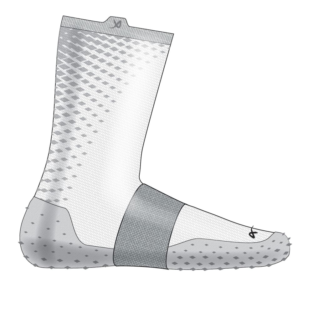
Which of these soccer socks would you rather buy?
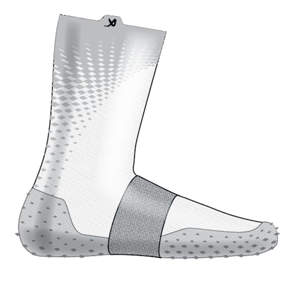
30 Responses to Option A
I chose option A because I like that the X mark at the top is black and stands out more on the white sock.
I thought the design of A seemed sharper and I liked the greater amount of shading it would use.
I prefer to buy option A because thesoccer socks is simple and neat.
A looks clean and comfortable. B with the small black thing is confusing.
I like the design of the grey dots better.
In my opinion the logo isn't needed at the toe. It's enough to have it at the top of the cuff.
I think the design is more interesting overall, particularly the way it makes a sort of starburst pattern on the upper left hand side.
I don't wear soccer socks, but I do wear running socks, and I am going on what I like. I am choosing option A. I think if my kids played soccer like their friends, then they would want exciting looking socks like option A. It looks like the compression is bursting out the energy back to wear you need it in your legs and muscles and just looks like something all of the neighborhood boys would be wearing. I like option a.
I think they both look good, but A stands out a little more to me and looks more interesting.
I like the design coming down the sock in option A.
I prefer the option A sock design because the logo is not on the toes like in the option B sock design, which is important because this option B sock design logo would scratch my toes if it was stitched on at the tip of the socks.
I like it better as it turns more solid at the top. I like gray and white as a combination so I want to see more of the gray instead of just having little dots the whole way up
I prefer the logo on the side and not on the foot.
I like this image better. B has a black thing on the front of it.
Choice A has the best pattern on the top of the sock
Option A, the design looks like is stronger and more protective
I don't want anything on the "toe" of the foot. I think it's distracting and I probably wouldn't purchase due to this factor alone.
Id rather go for the socks here because it looks more fascinating to me.
i prefer the type in A, with the faded gray on top, it has a more sleek look.
I prefer the way the design blends into the top on Option A.
I prefer the sunburst pattern of A a bit more than the dots of B.
The logo doesnt add anything for me because I dont recognize it
Liking the better design used in A it looks more complete and modern.
The design flows better here. The little strip at the top of the ankle does not "interrupt" the design
I like the solid top of the sock in option A just a bit better than the other option.
I like the bolder design on the upper heel and ankle of the sock.
No need for a logo on the toe. About the only real difference I could tell. If I was out for socks it wouldn’t be a determining factor.
I voted Option a as it's got the darker x at the top and none on the toe.
Option A is fine. I don't need another logo in the toe box area.
I like the design of the back of this sock option a lot better than the other choice
20 Responses to Option B
i would rather buy the soccer socks in option B because they look more fancy, aesthetically
I like the more minimal concept of the stripe that goes up the back of the sock
I like the design of Option B better. I like how it has a defined band across the top of the sock. I also feel like the band across the foot of the sock blends in better with the rest of the sock.
I like the little extra logo on the toe. It shows that you get a higher quality item
I prefer the option where the bold logo is more concealed.
I chose b because for some reason the pattern looks more male
I think the design of b is less flashy and more plain which I like.
I like the border used at the very top of it more in Option B, as it looks sleeker.
The top band will look very good and break up the sock design well. I also like the consistent design all the way to the top
I prefer the soccer socks shown in B. I like a more minimalist style, so wearing socks with minimal branding is preferable to me. Here, I like that the darker logo is on the foot rather than the cuff of the sock.
B's lighter pattern on the calf is more interesting to me, and makes for more contrast. It would work for a lot of uniform color schemes.
They look like they would work better
I like the band at the top of B. It makes me think they will stay up. I would buy them.
I like the stripe/color block at the top, I think the grey on grey logo looks a lot better too.
Seems more well put together in the graphic
I don't like the top of the other sock where the logo is. Personal preference.
The little logo on the toe looks nice and stands out to me
I like to placement of the logo at the calf and at the toe areas.
I find B more pleasing to the eye. I like that it has more white in it.
i like how the logo on the calf is more muted - not as apparent and in your face. this is how i prefer designs be.
Explore who answered your poll
Analyze your results with demographic reports.
Demographics
Sorry, AI highlights are currently only available for polls created after February 28th.
We're working hard to bring AI to more polls, please check back soon.

