Poll results
Save to favorites
Add this poll to your saved list for easy reference.
Which packaging and branding design to you prefer?
Option C won this Ranked poll with a final tally of 26 votes after 3 rounds of votes counting.
In a Ranked poll, respondents rank every option in order of preference. For example, when you test 6 options, each respondent orders their choices from first to sixth place.
PickFu requires a majority to win a Ranked poll. A majority winner differs from a plurality winner. A majority winner earns over 50% of the votes, whereas a plurality winner earns the most votes, regardless of winning percentage.
If an option does not earn a majority of votes, PickFu eliminates the option with the lowest number of votes. The votes from the eliminated option are reassigned based on each respondent’s next choice. This process continues in rounds until a majority winner emerges.
Scores reflect the percentage of total votes an option receives during the vote counting and indicate the relative preference of the respondents. If there is no majority winner, look to the scores to see how the options fared relative to one another.
| Option | Round 1 | Round 2 | Round 3 |
|---|---|---|---|
| C | 42% 21 votes | 46% 23 votes +2 | 52% 26 votes +3 |
| B | 32% 16 votes | 38% 19 votes +3 | 48% 24 votes +5 |
| D | 14% 7 votes | 16% 8 votes +1 | Eliminated 8 votes reassigned |
| A | 12% 6 votes | Eliminated 6 votes reassigned |
6 Responses to Option A
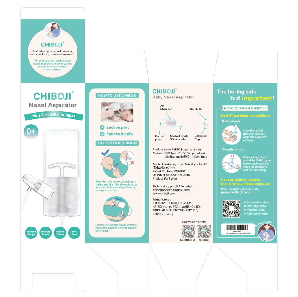
I like how A uses more realistic images. It also does a good job of explaining and showing how the device works. D is my least favorite - it looks a bit too crowded.
When I'm looking at purchasing medicine or any health product the color really doesn't matter to me with the packaging it's how much information and what kind of information is presented on the outside because when it comes to health and medicine you want to be able to read as much as you can about the product that you're putting in your body or your child's body.
I chose A first because I like the pumped design but the nasal piece on this looks the nicest and easiest to use. I found all of the packaging appealing but D is the least nice looking packaging. I chose C second because the nasal part on it also looked really nice. B and D had worse looking nose pieces. They are smaller and not as sleek looking. This makes me think that they would be harder to use.
I ranked in the order that I feel that the packaging gives me the largest amount of information in the shortest amount of time and additional research.
Option A and B look identical to me but I like the packaging the most. It is very descriptive on everything you need to know before opening the box. Option C seemed close to the A & B as well.
Its easy on the eyes. Focuses on the product instead of throwing in caricatures. The colors are neutral. Makes it seem like the product is easy to use.
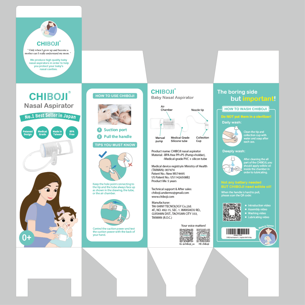
16 Responses to Option B
I don't love any of these packages because it's not appealing on the eyes. Choices B and C, I do like the animation of the mom and baby, I would lean towards looking at these packages on the shelves, but probably would just walk pass and do more research on the product and have the package be a second thought. Sometimes it's more about the product then the packaging that would lean me to purchase a product.
I think the colors of B/ A are the best option. It is very gender neutral. I personally don't care but I know some people see pink or blue and think it is only for boys/girls. I also like the design of option B the best, showing the mom using it on the baby is nice to be able to see it even if it is a cartoon. Option A was my next favorite, I think the information is great but I think missing the cartoon of it being used makes it not as good. Option C was next because it has the good design. Option D was last I don't think the design is as informative as the other options.
Option B is the most visually appealing and grabs your attention more right off the bat. It is much easier to read and you are able to get a better understanding of what it is and what it has to offer. It has a more professional and advanced look to it that gives you more confidence that it is high quality and would be more beneficial to the user. It has a more gender and age neutral look to it that makes you think it would be more appropriate for a wider array of children. Option B would appeal to more people and would make them more likely to check deeper into what it has to offer.
B and C have the right idea with the animation of the mom and baby. I think it's important to include that. The design for B just also looks very clean and make sense for a baby product. A looks too technical. and D has no personality and looks too unfamiliar.
i like option B best b/c i like how it is mostly made up from a cartoon. i like how the information about the product is presented on the packaging as well and i like the coloring scheme. then option A b/c i like the coloring scheme, and i like the cartoon diagrams. next option C b/c i like the cartoons and the way the information is presented. option D last b/c i l don't care for the human models, i like the cartoons better
B - Best appearanceD - Unattractive imageA - Gender neutralC - Too feminine
Choice B looks the best out of all of them. It looks clean has the perfect amount of graphics to explain the product and how to use it. The colors are nice and fresh.
The choices with the mother on the label make me feel this brand understands who needs this product the most.
I prefer the white/plain background over the pink. white feels cleaner and more sterile. I like the cartoon/stylized parent and child more than the realistic photo, or the option without any people.
I like the contrast between the blue and the white, it catches my eye
I picked B because I liked the drawing of the mom and baby on the box, it looks friendly. I also liked that it is upright, like I imagine the product sits and is a pleasing light green color. I chose A next because it’s the same pleasing green color, sits upright and has a helpful photo of the product. I chose C next because I like the picture of the mom and baby, that it sits upright, but I don’t like the bright pink color, it makes it look off brand and cheap. I chose D next because I think it’s odd that the box is sideways.
The white on teal colors make the packaging clear to read and understand. The pictures are good visuals.
Option B and A have a s’more subtle And light color that is pleasant on the eyes and seems less crowded with letters. The remaining two Options are too detailed and I don’t enjoy the pink or blueish color
I prefer this packaging because it seems more suitable to parents
Some had graphics that were just too busy and not laid out well that took away from the information and overall product.
Appealing to the eyes. Makes moms be more likely to use
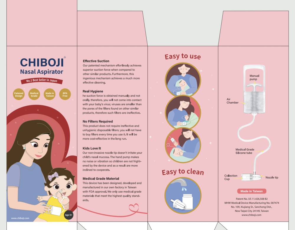
21 Responses to Option C
Option C is the best choice for me. I liked this pink packaging design, with beautiful and very cute anime figures. I liked it a lot, very stylish.
I prefer option C because it is pink and I love pink
in accordance of how appealing they are to attract a consumer
Pink looks unique compared to other three, so ranked first. The package design of D is different and catchy so ranked second. The background in B makes image visually clear, so ranked B third.
I prefer option C because it is easy to read. I also love the color and design of the packaging. The pink color really stands out draws my attention. The packaging is informative and very easy to understand.
C is bold, D is a clean design, A is cute and I like the colors on B.
brighter vivid colors catch my eye and this instruction set seems intuitive for me
I wanted to keep scrolling with the blues and the teals, I was drawn much more to the pink one. It is standing out more and the picture of the women on the dark red background stands out well.
I would be more attracted to the ones that are simplistic and easy to read.
I like C best because it is the most original, where the other options are either generic or look like copies of other reputable brands, which seems devious and dishonest.
The animated pictures look more appealing to me rather than the ones with regular pictures.
I feel option C makes it easier to read and understand.
i like choice c the best. i like the lovely pink coloring. i like the design and graphics on this choice. i enjoy everything unique about this
C and B were simple, straightforward and professional. They were easy to read and understand. A and D were overly detailed and overwhelming.
I found option C to have the best packaging design. I like the image of the mom and her child and the easy to use and easy to clean imagery was really helpful to see and all the instructions really pop against the dark pink background. I found this design the easiest to consume and understand.
I like C and D, but I especially like the pink one (C) because it looks gentle, friendly and warm. it just makes me feel better seeing the pink color, like it's a gentle product and a mother-family- friendly company by seeing the drawings of the mother and baby.
C has the most relevant information shown on the packaging. It is well organized and makes it easy to understand the benefits of the product and how to properly use it with the illustrations provided. B, A, D is ranked according to how clear the information is presented.
This one is best, because the Four Round Pictures in the middle - is easy to see and understand, at a glance
Option C: It is brightly colored and eye catching. The drawing of mom and baby makes it look less medical and more reassuring.
My favorite one is option C. It captures my attention because of the colors they used. It’s pretty and bold.
The reason is because the ones with larger visuals is easier to see and understand how to use product. The ones with more words and less visuals is harder to see and the larger visuals makes it easier without having to do too much reading
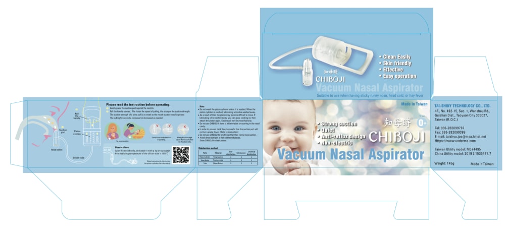
7 Responses to Option D
B's colors felt a bit dull to me. I liked the lighter and more vibrant hues of D and A.
Seeing the real baby on the front reminds me of my children. The all blue packaging is also most calming.
Having a cute kid on the design with instructional video is something i find interesting
I like that this options uses a real model for the design. It makes me think that they took more pride and effort to create the product and it’s packaging
i like the colors in all of the choices and i like the way things are laid out in choice D and B. i think choice D just catches the eye more and really stands out among the other choices.
I like it better than cartoon pics . The second is clear too.
The one with the real baby is always gonna get more support I think. My next choices because they show how to use the product.
Explore who answered your poll
Analyze your results with demographic reports.

