Poll results
Save to favorites
Add this poll to your saved list for easy reference.
Which packaging design do you prefer for a Keurig Co|ee Machine Descaling Solution?

There was no majority winner of this Ranked poll after 4 rounds of vote counting. However, Option C and Option A had the most votes (25).
In a Ranked poll, respondents rank every option in order of preference. For example, when you test 6 options, each respondent orders their choices from first to sixth place.
PickFu requires a majority to win a Ranked poll. A majority winner differs from a plurality winner. A majority winner earns over 50% of the votes, whereas a plurality winner earns the most votes, regardless of winning percentage.
If an option does not earn a majority of votes, PickFu eliminates the option with the lowest number of votes. The votes from the eliminated option are reassigned based on each respondent’s next choice. This process continues in rounds until a majority winner emerges.
Scores reflect the percentage of total votes an option receives during the vote counting and indicate the relative preference of the respondents. If there is no majority winner, look to the scores to see how the options fared relative to one another.
| Option | Round 1 | Round 2 | Round 3 | Round 4 |
|---|---|---|---|---|
| A | 46% 23 votes | 46% 23 votes | 46% 23 votes | 50% 25 votes +2 |
| C | 20% 10 votes | 24% 12 votes +2 | 30% 15 votes +3 | 50% 25 votes +10 |
| D | 20% 10 votes | 22% 11 votes +1 | 24% 12 votes +1 | Eliminated 12 votes reassigned |
| B | 8% 4 votes | 8% 4 votes | Eliminated 4 votes reassigned | |
| E | 6% 3 votes | Eliminated 3 votes reassigned |
Age range
Amazon Prime member
Coffee drinker
Education level
Gender identity
Household income range
Options
Personal income range
Racial or ethnic identity
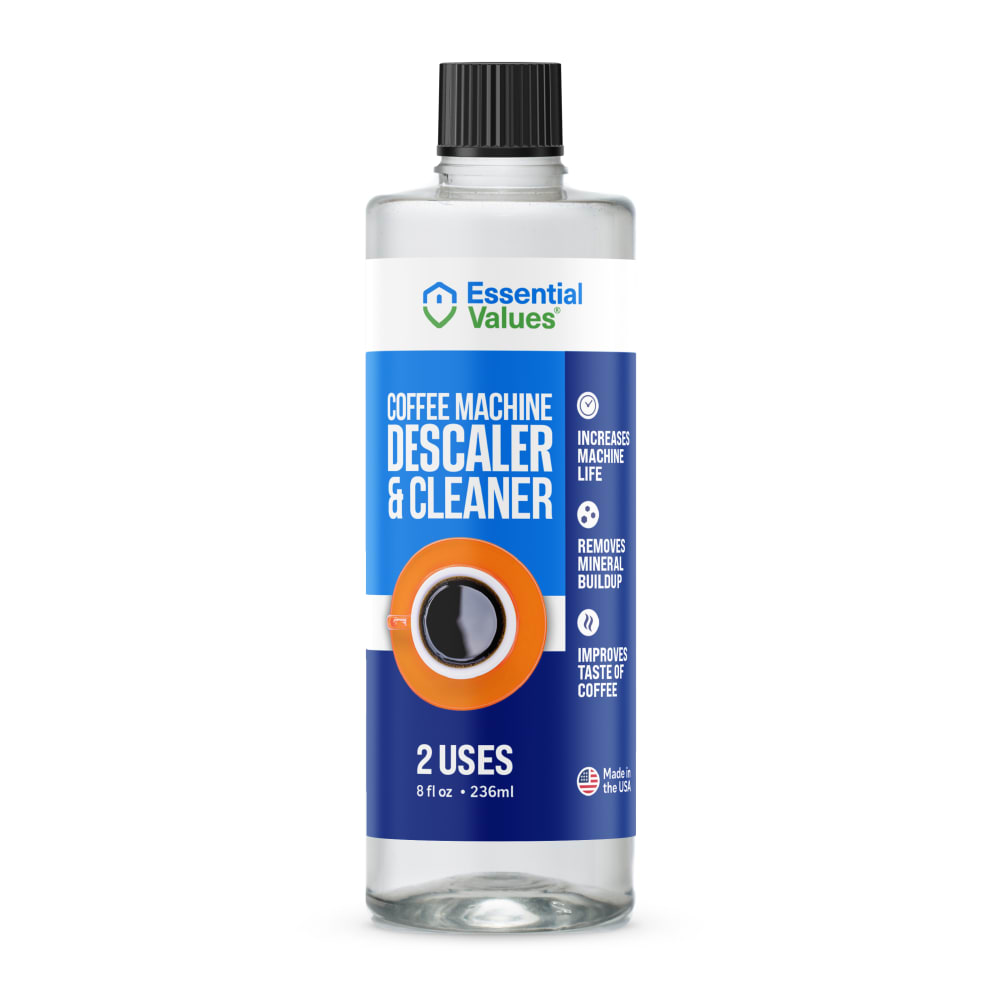
23 Responses to Option A
I picked A and B first because dark coffee drives the point home better than coffee with cream.
I like having the green on the label and the dynamic coffee image. The images with the coffee cup looking straight down are difficult to understand as a cup of coffee.
I like the green sidebar in Option A best. It helps it stick out more than the rest. Both descaler & cleaner are but capitalized and easy to see. It's kind of hard to tell thats a cup of coffee in Options E & B
I like the bottle colors of A with the picture of D.
The green panel on the side of A looks very nice and complementary to the design of the bottle. C, D, E, and B are almost indistinguishable from one another and not particularly attention grabbing.
A is the one I prefer because the green makes it stand out and makes the text easier to read and more interesting.
I prefer Option A packing design for keurig coffee machine descaling solution.
I'm thinking black coffee for this product because that's what would be griming up the inside of the coffee machine. I like the spilling motion, gives the label a dynamic feel as well.
I chose by options that look most original and most clearly have an image of coffee on them. I like to be able to quickly tell the products apart.
I like it more because the fruit
I like option A, it's modern, clean and easy to read. I like the use of green to call out specific information.
not really a fan of 4 or 5 as you cant tell its a coffee cup. I like the green idea of 1 but i also like the coffee cup of 2
All the graphics are captivating, but the dramatic unbalanced splash of option A immediately gets my attention and makes me start reading its label first.
The green color really makes me think of new and fresh. Due to this color, this is my top pick
The red coffee cup in A really stands out from all the rest. I don't get the point of the circles in E and B.
I liked that A featured a refreshing light blue and green color tone as this was cleansing. I disliked that many of the options I ranked lower had such dull coffee cups, either in the form of a dirty red color or a dull orange.
But it has a coffee cup with spilled coffee in it. I think it makes the label really stand out
The product label design is interesting and thought provoking. The dynamic design is memorable and approachable.
I like the green on A although C has a nicer design with the coffee cup. If the6 can b3 combined excellent if not, A wins out.
Option A, with the splashed coffee cup got my attention first. I have coffee stains all over my kitchen and on the kitchen pot. I need help keeping my coffee pot clean (inside & out), this image did it for me and I would buy it. The other choices, showing a nice cup of coffee, didn't grab my attention. Choice B did not look like a coffee cup, it looked like a solid black dot. I had to look at it a bit to figure it out.
very goo and interesting
I like the design of the label and the use of the green on this one which makes it more appealing to me.
I prefer the label that has more color changes than the labels that are all solid one color.
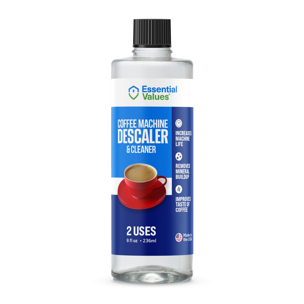
4 Responses to Option B
I like how the coffee cup is represented on the label here. The top down view gives it more of a look like an icon that can be used to represent the brand instead of just a picture of coffee in a cup.
I prefer B because it has a layout that is incredibly light and has a strongly detailed format. I also like how the uses are better demonstrated on the whole.
I like B the image of the black coffee is like saying use this and get back to the originalBasic delicious coffee.
I like option B, the label is larger and easier to see, it would grab my attention if I saw it on a shelf
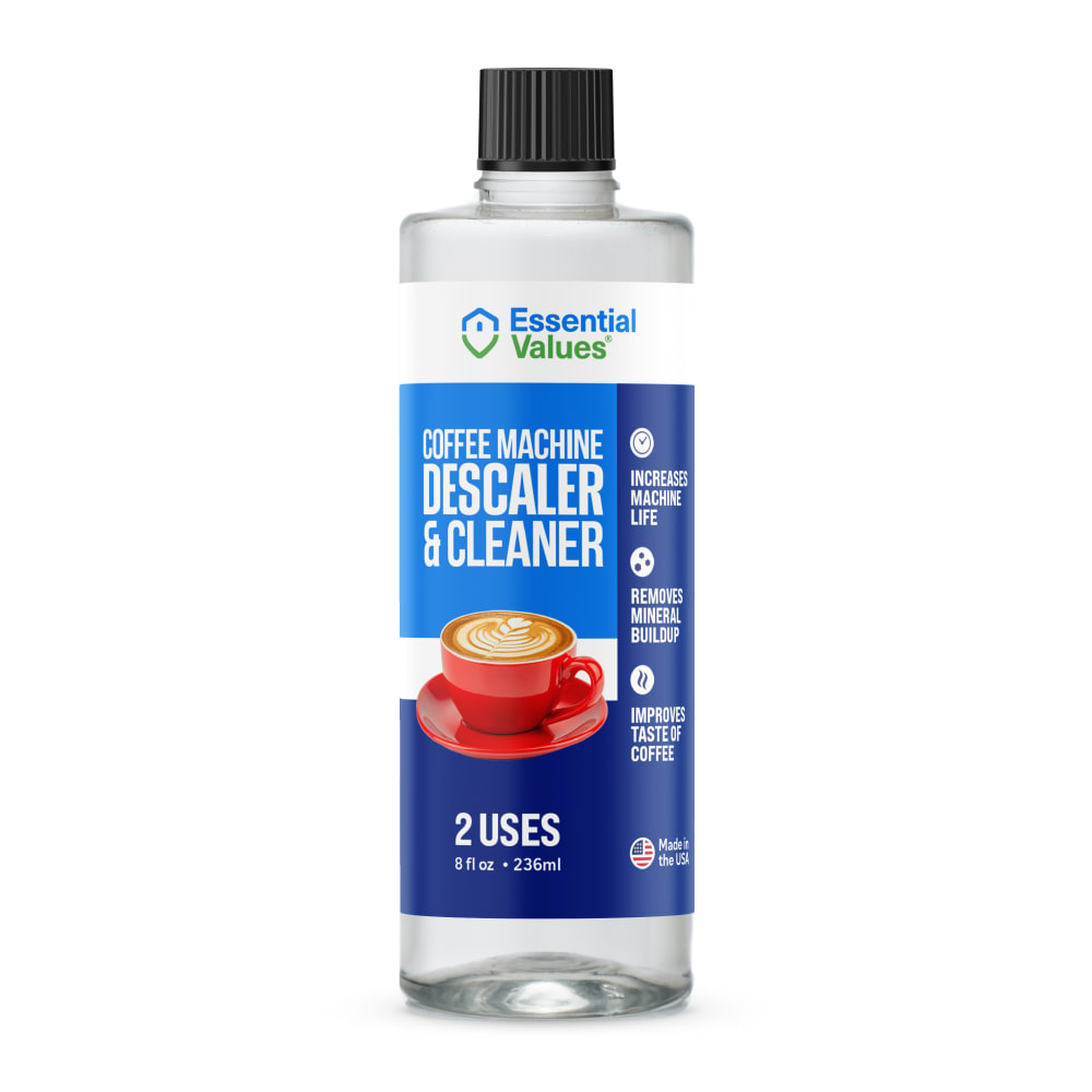
10 Responses to Option C
I feel that choice C looks most professional with a coffee cup in front of the label and blue on blue.
Any of these with the red plate and coffee would be fine.
The picture of the coffee on C looks very clean and appealing. A also has a clean image but the colors are not as appealing. B's overall picture is clean but not as nice as C and A. D looks good but the color of the drink isnt as appealing. The bird's eye isnt as good with the color of E's drink.
I like the ones with the photos of the coffee cup best
I like the image of the coffee cup in option C. I think it looks much more realistic and authentic which helps me relate.
Option C, the package and label are easier to understand what is for and the image is more appealing
This feels the most approachable and tells me in an easy to process manner what exactly it is to be used for
I prefer the design of C and D and think the coffee cup image is most relevant.
Options C & E were my first choices. They gave a breezy, clean feel to them. The colors, font and graphics look fresh and attractive. The remaining options are just okay, some look a little overdone and awkward. The splashing coffee cup is not great and neither is the aerial view of the coffee in Option B.
I like C the best because of the angle of the cup. It looks the most attractive. The rest are okay and the only one I don't really care for at all is B because the angle of the cup looks odd.
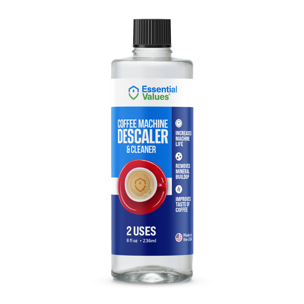
10 Responses to Option D
I like option D the best because I like the design that is shown in the coffee that is in the cup. I think that really makes the whole label really stand out.
The coffee on this one looks fun and pretty. Its well put together and matches my taste in coffee. This helps me to identify with the brand.
Options D and C, in that order, are my preferred choices because the labels are easier to read and to understand the benefits and features.
I prefer the blue colors. I also like looking at the side of the coffee cup - not a view from the top.
I like option D the best because it has the pretty coffee in the picture. We all want our coffee to look that pretty.
I prefer the orange cup over the red. The red cup is too bold and doesn't look right
I like to choose option D.Because the picture in the image is perfect. All product are same.but my choice is option D.
I like D the most here with the swirled foam on the top of the coffee cup. C&E were my next picks with more basic looking coffee cups. I did not like A very much because the coffee was splashing all over. B was boring with an orange cup of black coffee.
The design of this option looks better, the whole image has a clear concept, the layout looks cohesive and the image of the coffee cup describe what the product is for without having to read too much. Option A looks great, the coffee cup image has movement but would be better suited for another type of product. Option C seems a bit stiff, the image is not appealing. Options E and B are difficult to understand, the placement of the coffee cup image feels strange.
Option d is rhe easiest to understand that it's meant for coffee but also with rhe best image.
3 Responses to Option E
All the five images of the product are good quality, these product are reasonable price to buy the product. These product are high rates and packing design are good and attractive.
I like seeing the Keurig sample image on the packaging versus cup of coffee. Then an axial view is best.
E and C a better logo to catch my attention and I like coffee so I ranked accordingly
Explore who answered your poll
Analyze your results with demographic reports.
Demographics
Sorry, AI highlights are currently only available for polls created after February 28th.
We're working hard to bring AI to more polls, please check back soon.

