Poll results
Save to favorites
Add this poll to your saved list for easy reference.
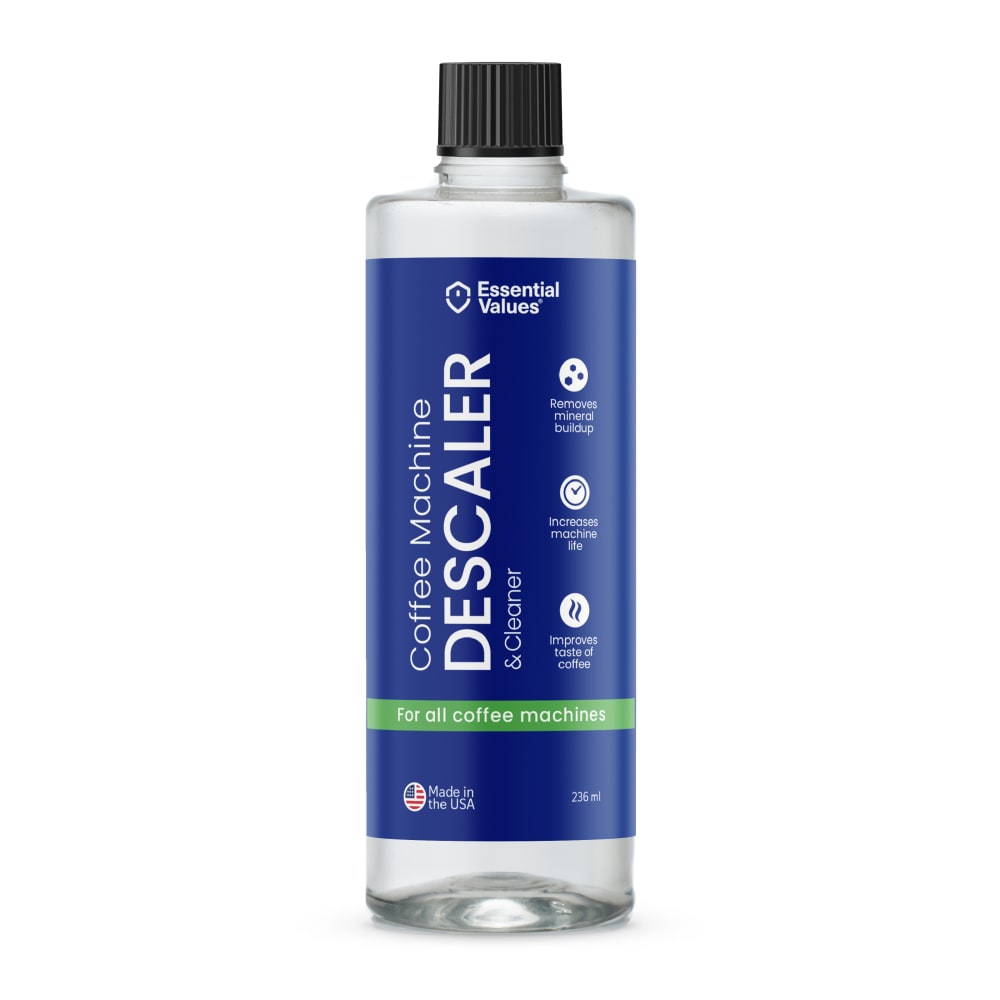
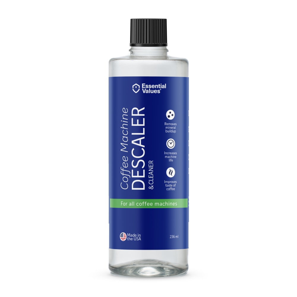
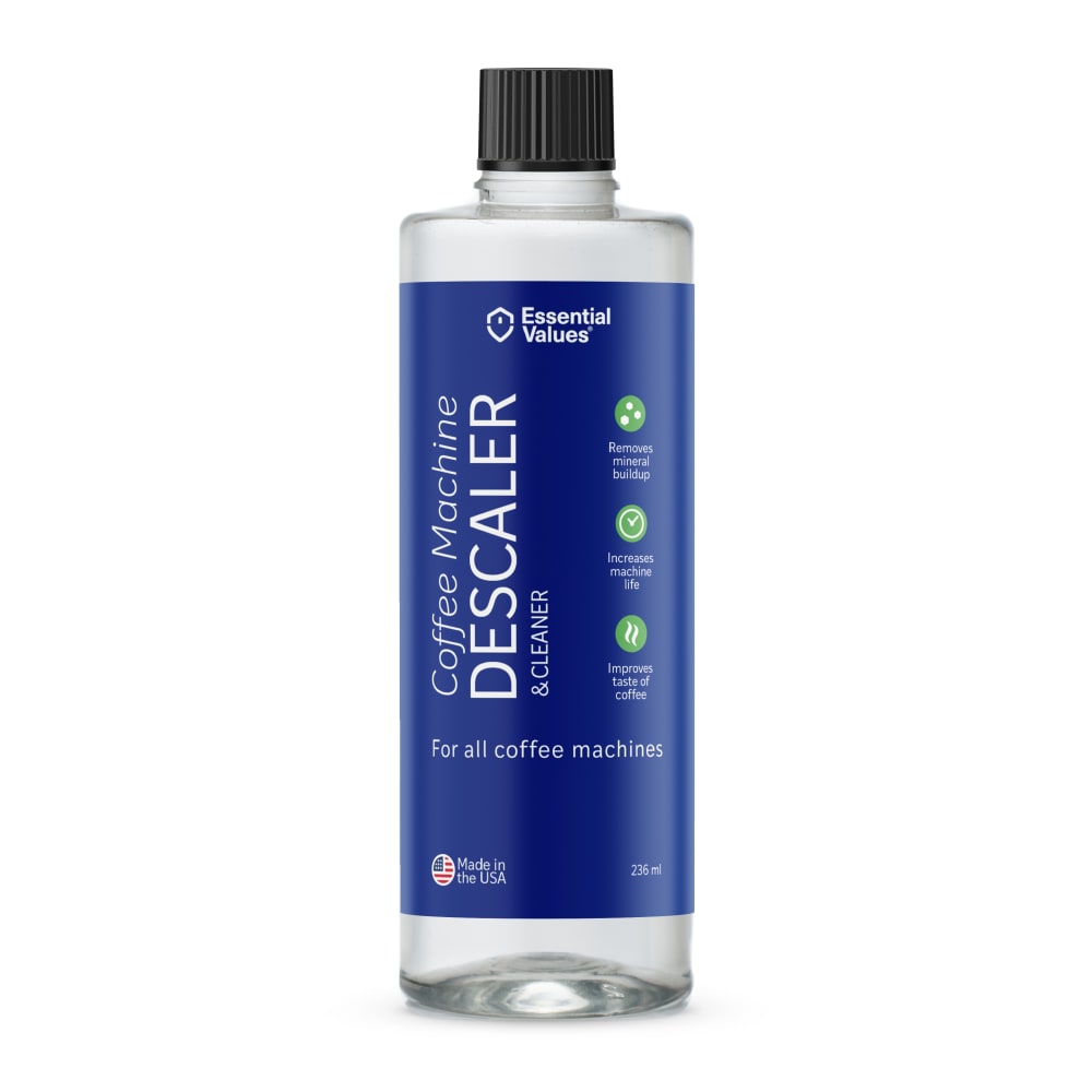
Which packaging design do you prefer for a Keurig Coffee Machine Descaling Solution?

There was no majority winner of this Ranked poll after 3 rounds of vote counting. However, Option D and Option A had the most votes (25).
In a Ranked poll, respondents rank every option in order of preference. For example, when you test 6 options, each respondent orders their choices from first to sixth place.
PickFu requires a majority to win a Ranked poll. A majority winner differs from a plurality winner. A majority winner earns over 50% of the votes, whereas a plurality winner earns the most votes, regardless of winning percentage.
If an option does not earn a majority of votes, PickFu eliminates the option with the lowest number of votes. The votes from the eliminated option are reassigned based on each respondent’s next choice. This process continues in rounds until a majority winner emerges.
Scores reflect the percentage of total votes an option receives during the vote counting and indicate the relative preference of the respondents. If there is no majority winner, look to the scores to see how the options fared relative to one another.
| Option | Round 1 | Round 2 | Round 3 |
|---|---|---|---|
| A | 30% 15 votes | 38% 19 votes +4 | 50% 25 votes +6 |
| D | 44% 22 votes | 48% 24 votes +2 | 50% 25 votes +1 |
| B | 14% 7 votes | 14% 7 votes | Eliminated 7 votes reassigned |
| C | 12% 6 votes | Eliminated 6 votes reassigned |
Age range
Amazon Prime member
Coffee drinker
Education level
Gender identity
Household income range
Options
Personal income range
Racial or ethnic identity
15 Responses to Option A
I like how choice A and B look more professional with the green line as it contrasts with the blue label.
I picked the first two A and B because the green bar at the bottom makes it look better.
The coffee cup on Option D is hard to recognize as a cup of coffee.
A has the most pleasant look to me. This is a more aesthetically pleasing label, it has a nice clean and balanced look.
I like the "for all coffee machines" in the green bar at the bottom best
This one looks professional and clean. The label is clear and easy to read.
I like the dark blue background color of the label and the way it contrasts with the large white font being used. The green band gives the appearance that this is a natural or organic product which is environmentally friendly.
Option A is my preferred choice because the label is easier to read and to understand the benefits and features.
I chose by labels with text I find easiest to read so I can be sure I am telling this product apart from other things I have for cleaning, etc.
Chose A (#1) because of the green highlighted "For all coffee machines" and larger text above it. Chose B as #2 because the text above the green highlight is not as large. Chose D as #3 because of the coffee cup logo, did not rate higher because the logo is not enough to compensate for lack of green highlight and larger text. Chose C as #4 because it lacks all the mentioned pluses of the preceding.
I prefer option A. I like the green band around the product where it says "for all coffee machines." This is an attractive way to highlight that important detail.
I really like option A, it's simple, clear and east to read. I like the green banner as a callout to important information.
I really like option A the best. The font seems to be a little bigger so it's easier to read. You want to be able to read the label as easy and quick as possible.
Clean and simple with easy to read fonts is best. I don't really like the italics.
I prefer the labels without the image. A is the most readable.
7 Responses to Option B
B and A look pretty similar but I like the italics of B. C looks pretty standard with nothing standing out. I dont like the coffee graphic of D.
There's so little difference between one of the women who are number 2 that really doesn't matter but I don't like the big Orange dot on number 4. 3 is okay but i do like the green dots
I prefer green with the lighter blue. Both colors make me think of fresh and clean
I like the clear bottles and on B I like the green strip to highlight it’s for all coffee makers.
The green strip is very eye appealing. It catches my attention and provides a feel the product is safe.
very goo and interesting
The bottles with information on the lighter line stand out more. I'd be more likely to read it.
6 Responses to Option C
All the four images are about the product are good and reasonable price to buy the product. These product are high rates in online site and everyone like it and used of it.
The color scheme of C is the best without the coffee on the label.
The red cup on D was visually distracting. I liked C best since it was the cleanest and didn’t have a lot of clutter on the label which was perfect for a descaling solution.
I prefer Options C & D as my first choices. They both look sharp and attractive with a fresh, clean appearance. The three small green circles sets it off nicely and makes them look appealing and effective.
I like C because it looks sleek with a clean uncluttered look. I think A and B are okay but I don't really care for D because the coffee cup on it looks odd.
I like the design of the label and the use of the green on this one which makes it more appealing to me.
22 Responses to Option D
The bottle with the red "coffee cup" logo, by far..that bottle grabs your attention.
C works and has a clean look but it is just not very memorable. A and B are really close and each provide roughly equal experience, the green line at the bottom is attention getting and is a clear improvement over the plain label in C. I much prefer the coffee pictured in D over the rest.
I like seeing the Keurig Cup image on the bottle and the green symbols.
Option D packing design is very suitable for Keurig coffee machine descaling solution.
D is good because of the image of the coffee cup that communicates to the buyer what the product is for without reading. A and B are both fine, the green stripe with the blurb on it fits well with the design of the bottle. C looks too plain.
I like option D the best because I like the 3 green colored bullet point logos and I like the cup of coffee sitting on the red plate with the logo in the coffee shown at the bottom part of the label.
I like the coffee decal the most on the label, but I do prefer the text style of A a little more I think. But the picture is a nice way to set the label out from others.
I really like option D as it had a picture of a coffee cup. I think that is informative and intuitive what the product is.
Option D, the label looks better with the coffee cup on it
I like the red mark
This design and image is the most easy to process and clear label that tells me right away what it can be used for
I think the mind processes pictures before it decodes text. One glance at option D tells me it is a cleaner for a coffee maker. Also the red cup seen from above looks like a target and as such immediately draws the eye.
overall i like option D fo having a more appealing design
I like that D has a very interesting layout and a understanding of the product.
I think the more color the better. I picked D first because of the red circle. It gives it something interesting to look at.
I chose option D first, and I believe that is because of the red keruig cup on the label that looks a little like a strange sort of medieval wax stamp. It is eye catching though. Option B was chosen next because of the italicized lettering, I think that that difference in script is needed to help it stand out, as does the green along the bottom. I would prefer option B first if my eye didn't keep being drawn to the red of D. I chose option A next hesitantly because of the green along the bottom, that green outweighed the italicization of the lettering in option C which I chose last because of the blue and white only coloring.
I think having a little cup of coffee on the labels will sell the product. No I also know what you're buying and what it's for
The design is preferable and contrasts well. The product look is likeable and modern.
I Like to choose option D.It increases the machine life.It improves coffee taste.
Choice D showing the cup of coffee is a better design and helps sell the product. Options A and B was no difference for me, however, I liked the green band better than having it removed in Option C. Overall, reading the font on the side was not good for me; I had to turn my head to read it and found it annoying. I would make the font horizontal and using an image of coffee splashing to put on the front of the bottle.
I like D here with the red highlight and the cup of coffee, which grabs my attention. I prefer A&B next with their featured green bars. My least favorite was C which featured no highlights and no green bars.
I like the coffee logo and then I do like the marked in green description
Explore who answered your poll
Analyze your results with demographic reports.
Demographics
Sorry, AI highlights are currently only available for polls created after February 28th.
We're working hard to bring AI to more polls, please check back soon.

