Poll results
Save to favorites
Add this poll to your saved list for easy reference.
Which packaging design to you prefer?


Option B won this Ranked poll with a final tally of 30 votes after 3 rounds of votes counting.
In a Ranked poll, respondents rank every option in order of preference. For example, when you test 6 options, each respondent orders their choices from first to sixth place.
PickFu requires a majority to win a Ranked poll. A majority winner differs from a plurality winner. A majority winner earns over 50% of the votes, whereas a plurality winner earns the most votes, regardless of winning percentage.
If an option does not earn a majority of votes, PickFu eliminates the option with the lowest number of votes. The votes from the eliminated option are reassigned based on each respondent’s next choice. This process continues in rounds until a majority winner emerges.
Scores reflect the percentage of total votes an option receives during the vote counting and indicate the relative preference of the respondents. If there is no majority winner, look to the scores to see how the options fared relative to one another.
| Option | Round 1 | Round 2 | Round 3 |
|---|---|---|---|
| B | 34% 17 votes | 38% 19 votes +2 | 60% 30 votes +11 |
| C | 22% 11 votes | 34% 17 votes +6 | 40% 20 votes +3 |
| A | 26% 13 votes | 28% 14 votes +1 | Eliminated 14 votes reassigned |
| D | 18% 9 votes | Eliminated 9 votes reassigned |
Age range
Dietary habits
Exercise frequency
Gender identity
Nutritional supplement use
Options
13 Responses to Option A
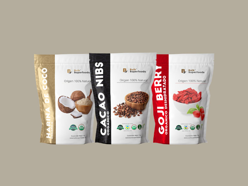
A's packaging is the most eye-catching.
The options with the lighter and brighter colors felt more refreshing. The options with duller and darker colors didn't feel as healthful.
I prefer A because it's the boldest with the most obvious label, followed by B and C. D is too bland and doesn't really grab my attention.
I like the ones that don't say BULK as large and i like the two tone colors
I ranked in the order that I feel the packaging gives me the most information about the product in the easiest way to process.
I chose, and would buy, option A overall because I like the design of the package. I like the title/label being in big bold letters on the left and placed sideways unlike the others. It makes it very easy to read. I chose B next because I like the contrasting colors and use of white on the design of the bag. It makes the information stand out more than C or D.
I prefer option A because this packaging design clearly shows what is inside and also clearly spells it.
I think the nice bold lines of the bag sides make the product pop out so much easier than the others.
Makes it look healthier / fancy packaging / I like th pics / It's ok
I ranked them based on color, how appealing they were, how much they stood out, and how visible was the text.
I prefer option A because the packaging colors and text stand out and catch my attention the most. I also like the real pictures used on the front
option a is my top choice because the white label highlights the product details well and it looks like expensive product. option b is second choice packing design is good but the white label is not covering the product name. option c label looks colorful and will appeal more to children than adults.
A I like the packaging the best. The white makes it pop and makes you want to look at the product more.
17 Responses to Option B
Option B's design looked the most interesting. Option C, looked more eye-catching than option A. Option D's design looked a bit plain and boring which is why I ranked it last.
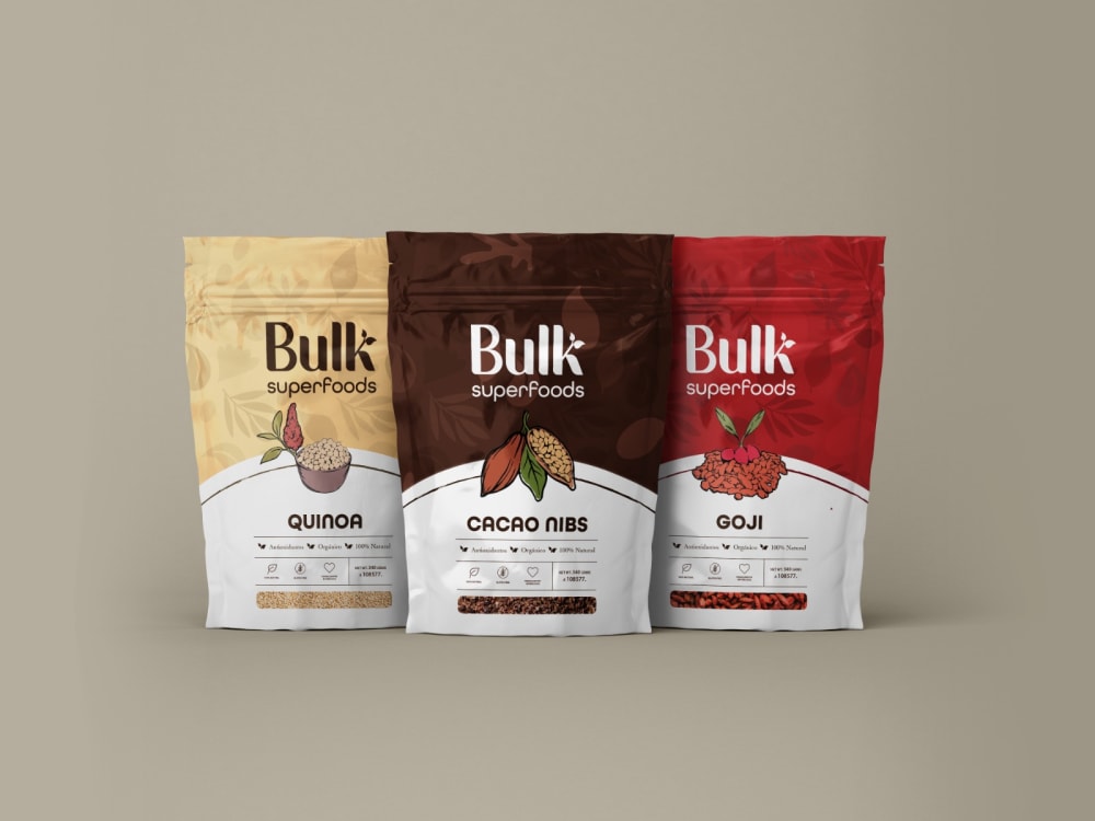
B first because I like the contrasting colors. The colors goes well with the imagesA second because I like how it’s very descriptive and the images are clearC third because I don’t like how the images are blended in the backgroundD last because it is the least appealing
I think B is a good combination of light and dark. I like the three that have the pictures of the flavors on them so it's easy to choose what you're looking for, which is why D is last because it doesn't have that. A is a little too light and under designed and C is a bit too dark.
B is the easiest to read ingredients and flavors and I like the white bottom in the design.
I would buy Option B. The white on the packaging really makes it stand out. It feels fresh and I can easily read the text.
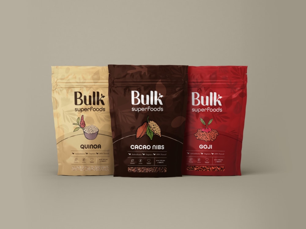
D feels very generic. C feels elegant but fades a bit into the background. I love the energy and contrast in B. The contrast in A also stands out.
Made my choices based on which packaging design I prefer and like. The packaging design that I like and order the most is the one in B. The one in B stands out,appeals to me and grabs my attention
My top choice has the whites at the bottom and I like that because it is contrasting to the darker color on the top and it allows me to read the worrying, much better and makes the wording pop
The colors and division in Option B are more appealing. It draws my eyes to what they are, e.g. quinoa vs others.
I like the packages that are equally white and colorful. It draws the attention while still setting the products apart from one another.
Option D is really hard to read. C isn't very easy to read from a distance. A is easiest to read, but I think the design of B looks a little better, and B is still easy enough to read.
I like all of them. I like B the most because it feels premium and high quality. It's something I would expect from a high quality brand.
B and D really caught my attention. B was more eye grabbing, but D's packaging is so unique and different with compared to other products on the market.
I believe that option B looks like the most inviting option because of the blend of colors and including white. I chose option A as the second because even though I don't really like the design, the use of white is also nice. I chose option C as third because design is the same as option B but did not include the color white prominently. Option D is last because it looks too serious and I wouldn't want it.
I chose based on the design that had the larger fonts and more easier to read
Option B grabs my attention the most and makes me want to eat what is inside. I chose option A last because it looks cheaper and of lower quality.
I like the package design of option B. The layout is pleasing to the eyes.
11 Responses to Option C
C first, I like the solid color packaging and the big bold lettering. D second, I like the solid color packaging but I don't like the small lettering. B third, I don't like the white on the packaging. A last, I don't like all of the white on the packaging.
Choice C has the most appealing packaging and draws my attention
I prefer options C and D with the whole bag being a solid color; I find this easier to identify the product choices.
i think choice c is very bold and eye catching.
I actually do like the little screen at the bottom, so I can see what the product itself looks like, but I like the packaging being entirely all one color. It helps me tell the difference between each flavors quite easily.
There’s something bold and even sultry about the darker packaging in c and d. I also like the shadowed/opaque graphics. A and B don’t seem quite as exotic or indulgent. Like off brand products.
I put the product images in C, B, D, and A order. I really like C. C is my favorite. I would definitely buy C. C is my favorite packaging.
I really like the solid color packaging and design on option C the best. I think that it is the most attractive and eye catching. It looks unique.
I like the full color/no gradient option the best, but the ones with the clear window at the bottom are fine. Of the windowed options, I like the color gradient option better than the half-color-half-white option. I don't really like the white background colored side stripe packaging - it feels too visually stark.
I prefer the solid and gradient colors to options B and A. They look like they have more value, quality, and professionalism.
I would definitely want a design with the transparent screen, and I think that C & D look like the highest quality product.
9 Responses to Option D
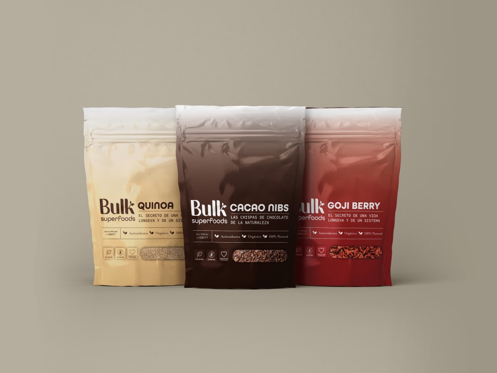
Option D has the best placement of the transparent screen. I prefer those options with the transparent screen but option D has the best one.
Option D is my first pick because I think the window to view the product is the largest and I think that's such a cool and helpful feature. Option C was my last pick because there's no way to see the product and I think that the label being one solid color isn't as eye catching. Option B and Option A were the middle picks because Option B's viewing window is smaller than Option D and Option A doesn't have a viewing window, but the packaging is more attractive and easier to read than Option C.
I really liked D and C. I think they both look great! I love the bold colors.
I liked choices D and C much better than in B and A. I liked that design D had an ombre effect and made the package pop.
I love D that has a window to actually see the product. I like the full colored packages, with no white. I also prefer a picture of the real product instead of a drawing.
I LOVE D! I think this is the best one, it looks more "rich" and classy-- the solid color hombre fade type design looks beautiful and I love the richness of the solid colors fading like that. The other ones just look like every other product, but these look special to me.
I like the all over color of options D and C and the more minimalist design of option D.
D has a nice color to it and I like the design. A,C and B are a bit bland and boring to me.
i like the see the actual product. i think its more helpful to get a better idea what you are getting and it just makes you feel better about your purchase.
Explore who answered your poll
Analyze your results with demographic reports.

