Poll results
Save to favorites
Add this poll to your saved list for easy reference.
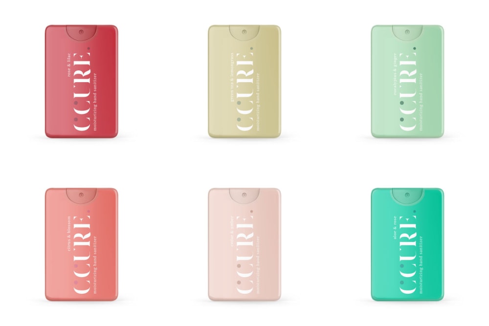
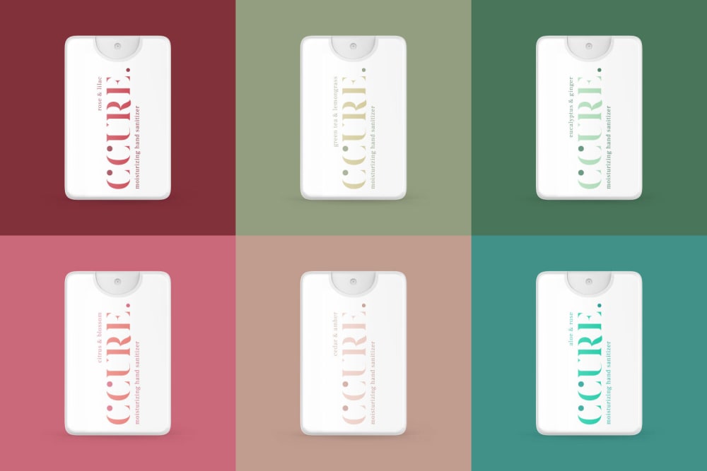
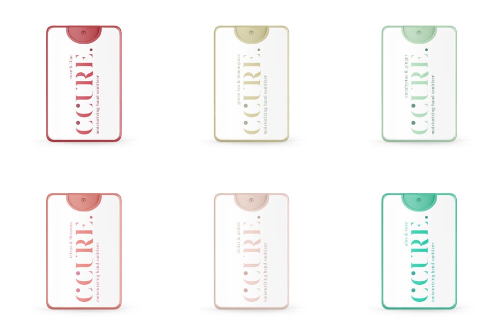
Which packaging do you prefer for hand sanitizer bottle?
Option A won this Ranked poll with a final tally of 33 votes after 1 round of vote counting.
In a Ranked poll, respondents rank every option in order of preference. For example, when you test 6 options, each respondent orders their choices from first to sixth place.
PickFu requires a majority to win a Ranked poll. A majority winner differs from a plurality winner. A majority winner earns over 50% of the votes, whereas a plurality winner earns the most votes, regardless of winning percentage.
If an option does not earn a majority of votes, PickFu eliminates the option with the lowest number of votes. The votes from the eliminated option are reassigned based on each respondent’s next choice. This process continues in rounds until a majority winner emerges.
Scores reflect the percentage of total votes an option receives during the vote counting and indicate the relative preference of the respondents. If there is no majority winner, look to the scores to see how the options fared relative to one another.
| Option | Round 1 |
|---|---|
| A | 66% 33 votes |
| B | 18% 9 votes |
| C | 16% 8 votes |
Age range
Education level
Gender identity
Options
Personal income range
Racial or ethnic identity
33 Responses to Option A
A has a good layout and a smart design.
I like the more colorful ones. They stand out a lot more to me. I like them a lot. White doesn't stand out enough.
I like the bold colors which would be easier to find in your bag
I really like the bright colors, they make the sanitizer more fun and less like a depressing duty.
The first option is very pleasing to the eyes. All of the colors are well balanced. The second option looks nice but doesn't stand out as much. The last option is ok.
A has the most vibrant and colorful packaging; it stands out the most from the rest. C is above B because I like the outer ring of color.
The packaging that I would most prefer is Option A because the colors are cute and vibrant. It will be easy to spot in the bottom of a handbag or backpack. It will stand out and it looks super cute.
The more colorful packaging makes it easier to distinguish between them.
I like the colored ones. I think more color makes the bottles more attractive.
The colors are more interesting and eye catching. B has more color. C seems al ittle lackluster
LOVE the design for product A, it stands out from all the sanitizer products out there! the white background feels like its done all the time.
This is a nicer design and overall color scheme
I like the solid background and white text. I find it easy to read.
I prefer this design because option b looks too busy and this one looks simple and concise.
A is bold, bright, and cheerful. It really pops against the white background. C is a clean presentation. B is busy and cluttered with the colorful background.
I like the colorful bottles the most out of the 3 options. They would be easier for remembering on reorders.
I definitely prefer A the most out of these options. I like the color use and how the packaging is a bit more bold than what is typical of hand sanitizers. It give it a bit of personality.
I like how colorful the ones in A is, I would like to carry one of them in my purse. I also like the accents of color in C. It looks very interesting. A is the most boring and generic looking.
I prefer Option A because it is the most striking and the easiest to wrap my head around.
I strongly prefer A because I think the packaging is attention-catching, but still modern and sleek looking. It is cute.
I much prefer the brighter colors, for every product I use.
A is by far the best because I absolutely love seeing the solid colors on the bottles. It's not something you see all the time for hand santitizer because usually it's a clear color!
I chose by which options appear colorful and bold.
I like the colorful ones best. They are nice, I could see family members each having their own color.
I like the brighter full color packaging. Let's make hand sanitizer as fun as possible.
I like the colorful containers
I like them all, but I like A most because the colors are interesting and classy, so full color looks nice. Then I like C because I think the border gives it a nice appeal, and then I picked B (but B is still a good option). I'd buy any of them.
i really like the colorful options. they are fun and attractive
I like the designs in image A the best because I think they look the most modern.
I like A because I like the different colors being solid., You don't really see many like this, and I think it's different. Plus, my family could keep track of who's bottle is who's easier if I gave each kid and my husband a different color. I like A, the most. C and B are ok, but I think solid colors are great for the reasons I already mentioned.
I picked A because I like the bright colors and dirt would not show up as much as the white bottles.
I prefer option A best. I think its looks very original and modern
I like choice A the best. I like the colors of it.
9 Responses to Option B
The more colorful the image, the more I like it!
I feel clear bottle is easier to see how much is left inside. so B is the best, then C.
All are lovely but I chose the most eye-catching color combos
The more color the better and B is the most colorful
I chose the packaging that I liked best for the hand sanitizing bottles, based on the designs offered.
B:For sanitizer i prefer clear looks which gives that clean feeling.C: Clear look with color border is still looks good.A:I dont like colorful on sanitizing bottle,i prefer clear see through container.
I'm assuming these are little square spray bottles? It looks like ones that I have. I like Option B the best because I like the solid white background color. I like Option A next because I like the solid monochrome color next. But I would like any of them, really.
I would prefer option B looks very nice and eye catching
Color is everything so B is my favorite because the color is vivid and all-encompassing. Great option!
8 Responses to Option C
Although I do like the colored ones, in order to make it good for both genders I chose the white with color accents. Assuming that the colors represent different scents, I think it is important to see the color. I think C is a happy medium between all white and all color because it's a little of both.
Sanitizer should be light and refreshing since it's supposed to be a cleaning product. It shouldn't feel dark and heavy. The whiter, cleaner options looked more refreshing.
Option C is my favorite because I really like how the accent colors work with the mostly white packaging. It really pops and appeals to me the most here.
option C: I really like the simplistic aesthetics. makes me think of a luxury item. I Like that the highlighted parts are of the logo and nothing more, bringing attention to what truly matters. option B: thought I do not like the bottle being fully colored, overall its still pleasant to look at. option B: too chaotic, even if the bottle follows the aesthetics that I like the most with the background being colored, after looking at it for a while looks muddle, too much going on.
I like option C because it's clear and simple. The images look pleasing and would work great.
I think option seen looked clean and sleek, option a is well with nice clean and sleek. I thought option B background yeah made it look not as cute to have.
First option looks clean. Second option too but the third option is bad.
I ranked my options based on the color scheme of the bottles. The lighter bottles look more like their sanitizer, which is usually clear. I wouldn't want my small child mistaken the darker bottle for candy, lotion or something other than what it suppose to be.
Explore who answered your poll
Analyze your results with demographic reports.
Demographics
Sorry, AI highlights are currently only available for polls created after February 28th.
We're working hard to bring AI to more polls, please check back soon.

