Poll results
Save to favorites
Add this poll to your saved list for easy reference.
Which packaging option is the best for men's watch? The target customers are bikers, men who listen rock/heavy metal, or in general men who like and wear items with skull motif.
Option A won this Ranked poll with a final tally of 29 votes after 1 round of vote counting.
In a Ranked poll, respondents rank every option in order of preference. For example, when you test 6 options, each respondent orders their choices from first to sixth place.
PickFu requires a majority to win a Ranked poll. A majority winner differs from a plurality winner. A majority winner earns over 50% of the votes, whereas a plurality winner earns the most votes, regardless of winning percentage.
If an option does not earn a majority of votes, PickFu eliminates the option with the lowest number of votes. The votes from the eliminated option are reassigned based on each respondent’s next choice. This process continues in rounds until a majority winner emerges.
Scores reflect the percentage of total votes an option receives during the vote counting and indicate the relative preference of the respondents. If there is no majority winner, look to the scores to see how the options fared relative to one another.
| Option | Round 1 |
|---|---|
| A | 58% 29 votes |
| C | 22% 11 votes |
| B | 20% 10 votes |
29 Responses to Option A
I like the all black version easily the best, but then I gotta admit I quite like the box just opening in the middle like something out of a movie. It's so novel that you would remember it. The last one is just a rather standard box that isn't very impressive.
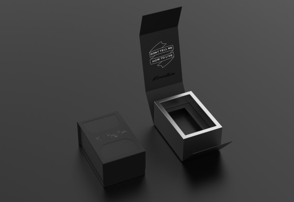
i only like A because it's completely black which makes it look more premium
The simple, all black is by far my favorite choice. I think its more subtle and looks cooler.
i like option A the best because it is very simple and looks really neat to the other pictures. The other images just got to much going on in them.
This sort of opening from the from here with choice A looks the cleanest approach here
These men won't want to foll with lots of cute boxes. This is in order of simple packaging.
Option A is my favorite. I could really see my husband enjoying just opening the package because he loves all things black and I can see him actually keeping the packaging for the watch. Options B and C are nice but they are not as spot on as option A.
I like the completely solid box colors the best
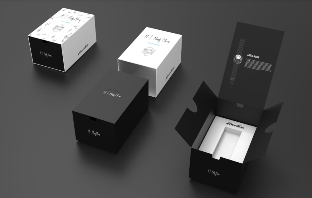
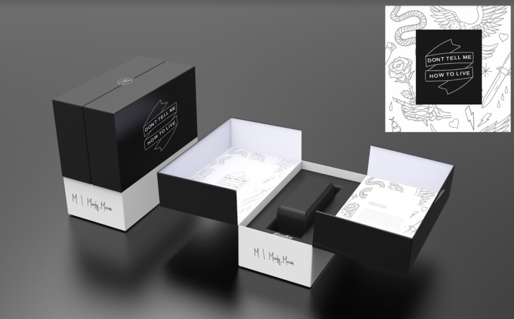
I choose option A first since the design is both simple and easy to use yet has a certain level of class to it I feel that males would enjoy thisI choose option B next as the setup seems pretty complicated and more remminesent of iphone unpakcing then watch unpackingI choose option C last as it is unessary to have designs on the inside of the packaging. that is more reminasent of PR packaging for makeup then for manly watches.
I think the simple metal-like interior feels more like what bikers and heavy metal fans would like. It's not trying too hard. Just feels very masculine.
I think that Option A has the cleanest most simple packaging that the target audience might appreciate the most.
Like hte all blac, something differe.tn each option is uniqe and i would buy
This is for a manly man they don't need a frilly wrapper for a skull watch.
It picked the ones with the most black coloring first.
A is darker...more typical of rock and it has a metallic looking ring around it. Option B looks more typical of men's watches than option c
Less packaging fits the product target better I believe, and the all black styling of A looks most suitable for a skull motif.
Option A is simple and easy to open. The other 2 I would get frustrated with and rip the box.
I would say simple is best with the box. C is too fancy and not needed in my opinion. A is simple and probably what would appeal most to the demographic
I like simpler the better - the options get more complex from A to C to B. To me, I want a simple and elegant box. Open it up and that's it
I think A looks more simplistic and nice to just keep it simple with a great elegant look, B is also a cool look,but lots of boxes to go through, C just tries too hard to be like a lamborghini.
As a product that is for men that like wearing skull motifs, a darker and simpler packaging will likely be more preferable than a lighter and more complicated or ornate packaging. Option A is the simplest and darkest, followed by Option B, and last Option C which is the least dark and has the most complicated packaging.
I thought A was the best because of the pure black color scheme and modern design in how it opened up. I thought C was the second best, it seemed to have a nice appearance but not really for the intended audience. I think B was the worst fit.
The bikers and those men who listen to rock/ heavy metal tend to like packaging option with more dull colours (black) which looks more Gothic and metallic compared to the other packaging ways with more brighter colour (white) that may not be so appealing to such group of people
I chose option A as my first choice as I feel this look is sleek and bold. I think that when making a design for men you can never go wrong using black. I feel this design is simple yet inviting. It does not have too many bells and whistles but is still an appealing design. My second option was c because I like the way it closes from each side. I feel this makes the product seem specialized and is different than what you typically see.
A - Simple, doesn't look like a puzzle. C - similar to A but just don't like the white. B - design looks a bit complicated.
A is the best, it looks sleek and elegant so A 1. B and C are quite similar but B is more minimalist so B 2 and C 3
I like choice A the best. The image is very simple and clean, and I love the slogan on the inside of the box as well.
I like option A the best because it seems the most simple. I think men prefer something simple and easy.
I think the simple and dark packaging will appeal to these customers the most.
10 Responses to Option B
It does not to be too fancy. Just enough to stand out to make the watch look nice.
I like B because it is still simplistic but stylish and shows the product in its entirety.
B is easily opened and easy to tell what is in the box. This would be what bikers would like. The A and C boxes are less user-friendly and more hidden. Bikers would be less likely to like these.
I picked B as my top choice as it tells me more on what's included in the deal. I picked A as my least favorite as it doesn't tell me much.
i think option B looks the most appealing
They are all good looking but B stands out slightly better to me.
Just like the layout better on that one the most
Options B and A seem to be the most simple out of the three, while Option C is a bit too complex for what it is.
I like the order of B, A, and then C because I feel that the simplest design is B followed by B, and then C. I think the target audience would appreciate a simpler box.
Option B, because it is more manly
11 Responses to Option C
I ranked it in the most unique packaging ideas. Men who listen to a lot of rock definitely like different things than typically offered. So, uniqueness factored heavily into my decisions.
I think it looks the most stylish and the way the boxes open up is good as well. The second choice has too many parts and the third is too minimalist.
Option C was first because it is flashy, and that is what I associate with the "bikers". Option A was 2nd because it is clean and smooth, which is always a good sexy choice. Option B looks like a dulled down version of C and just has a bunch of extra packaging over A.
C is the best because it is the most unique and makes the watch seem higher quality. B and A are more basic. B is a bit more complex than A.
Option C is the most dynamic and exciting, whereas Option A appears too homogenous and bland.
For what i'm being asked in term of the clientele it's catered to C is the only one with the design of what appears to be a snake, eagle and dagger among others so that goes in first place. The reason A got second is black is a tough color which makes it beat out number three, B.
Option C. The motto is front and center on the packaging and box and will appeal to bikers and skull jewelry wearers. I ride a bike and wear a skull ring and that is the box that I would want..
I picked C first because it shows a close up of the logo in the upper right hand corner. The packaging also looks well done. Then I picked A because it looks sleek and manly. The last one I picked was B. I picked this last because the various parts were too spaced out. The image doesn't look like a cohesive product.
"C" Is the coolest of the lot! Go with that!
My first choice is C because it has more compartments and would be easy to locate later when needed.My second choice is B because it appear smaller and can be located at a later date because it has some white.My third choice is A because it small and most bikers would not be able to find it later and can easily be misplaced.
I like choice C for a packaging because of how cool it opens up to reveal the product.
Explore who answered your poll
Analyze your results with demographic reports.
Demographics
Sorry, AI highlights are currently only available for polls created after February 28th.
We're working hard to bring AI to more polls, please check back soon.

