Poll results
Save to favorites
Add this poll to your saved list for easy reference.
Which pattern looks better to print on a women's Beauty Product (Plastic Exfoliating Brush)? --- Color suggestions are welcome :) ---
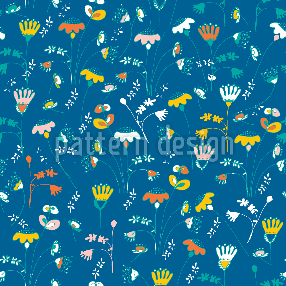
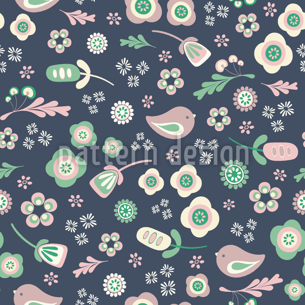
Option D won this Ranked poll with a final tally of 24 votes after 5 rounds of votes counting.
In a Ranked poll, respondents rank every option in order of preference. For example, when you test 6 options, each respondent orders their choices from first to sixth place.
PickFu requires a majority to win a Ranked poll. A majority winner differs from a plurality winner. A majority winner earns over 50% of the votes, whereas a plurality winner earns the most votes, regardless of winning percentage.
If an option does not earn a majority of votes, PickFu eliminates the option with the lowest number of votes. The votes from the eliminated option are reassigned based on each respondent’s next choice. This process continues in rounds until a majority winner emerges.
Scores reflect the percentage of total votes an option receives during the vote counting and indicate the relative preference of the respondents. If there is no majority winner, look to the scores to see how the options fared relative to one another.
| Option | Round 1 | Round 2 | Round 3 | Round 4 | Round 5 |
|---|---|---|---|---|---|
| D | 18% 9 votes | 24% 12 votes +3 | 34% 17 votes +5 | 40% 20 votes +3 | 51.06% 24 votes +4 |
| C | 18% 9 votes | 22% 11 votes +2 | 24% 12 votes +1 | 34% 17 votes +5 | 48.94% 23 votes +6 |
| B | 18% 9 votes | 20% 10 votes +1 | 22% 11 votes +1 | 26% 13 votes +2 | Eliminated 13 votes reassigned |
| A | 18% 9 votes | 18% 9 votes | 20% 10 votes +1 | Eliminated 10 votes reassigned | |
| F | 14% 7 votes | 16% 8 votes +1 | Eliminated 8 votes reassigned | ||
| E | 14% 7 votes | Eliminated 7 votes reassigned |
9 Responses to Option A
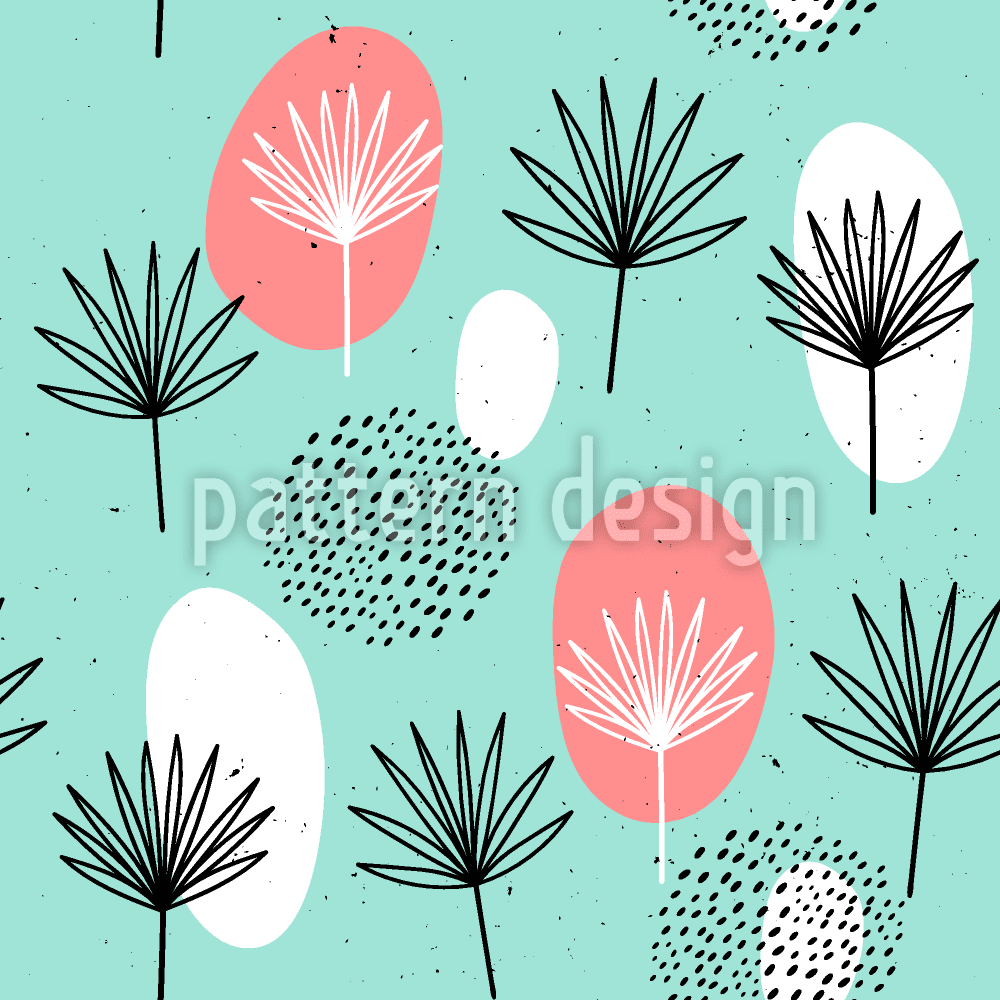
I liked the patterns with the lighter colors and with a design that flowed more.
I very much like the simplicity of A. I like the lighter green/blue colors. I think B looks good as well.
I like the darker colors and less busy
Picked based on the patterns and colors I liked.
On choices F and D, simply didn't like the color combinations on those. They seemed non-conventional in a bad way.
good colors and somewhat resembles product
"A": the graphic suggests a brush, and I like the color combination of mint green, white and pink--eye-catching.
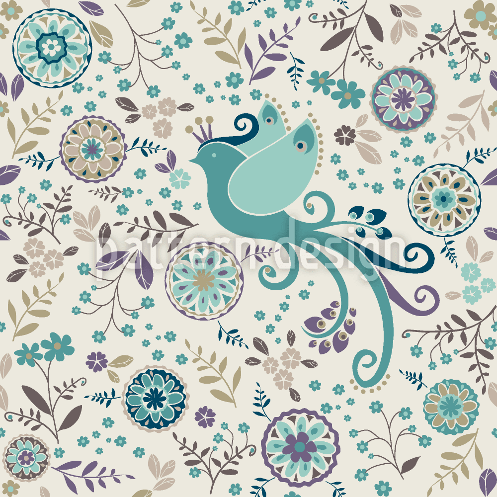
I don't really prefer the birds in C, but I like the cool colors in A and E.
The teal color with pinks and whites always work best for a woman's beauty product. It gives it that beachy, boho feel and is bold with the bright teal that makes it catch your attention. The second patter is okay because it has that antique feeling that the creamy offwhite color and antique accent colors. Those catch my attention the most.
9 Responses to Option B
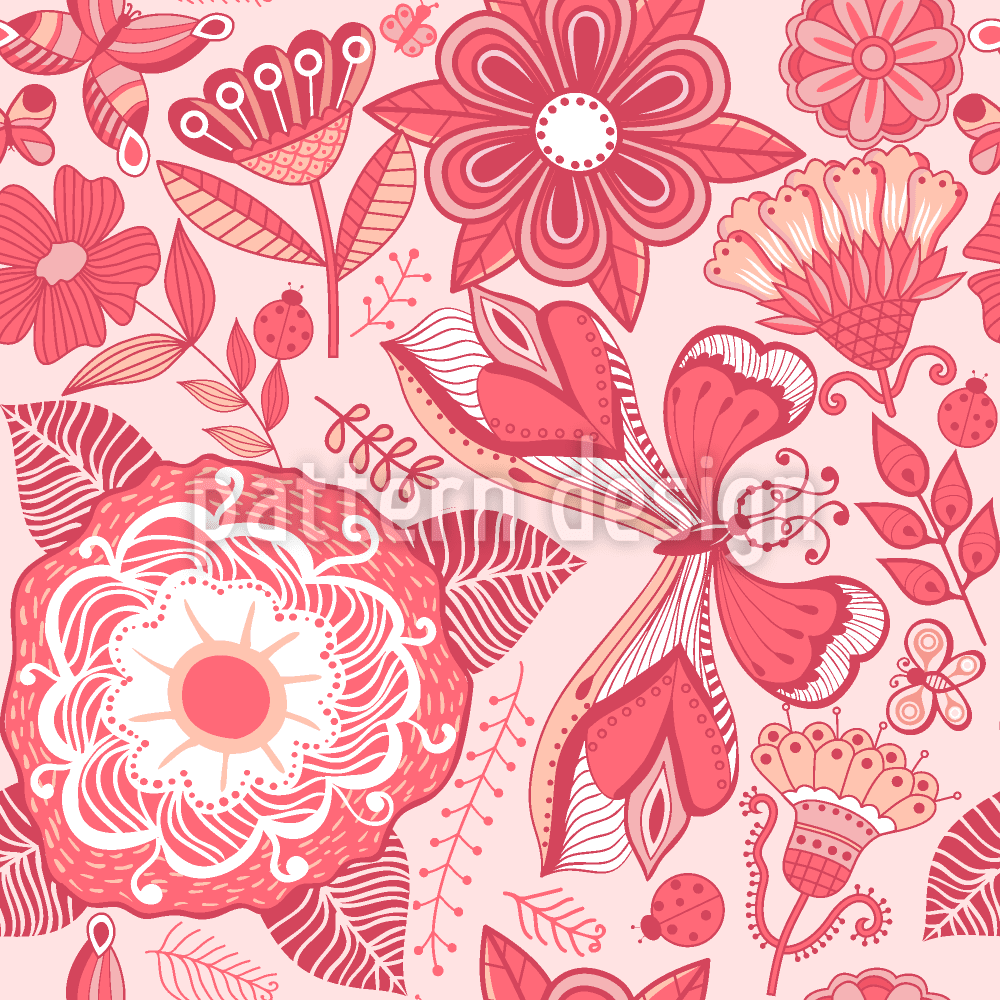
i love the warm colors in B, the reds and the pinks, go with that!
The coloring and design of Option B is absolutely beautiful in style.
The pink & rose pattern is the prettiest.
I like the pink color best and peace related theme was a determining factor also.
I picked the options that was most colorful and stuck out to me.
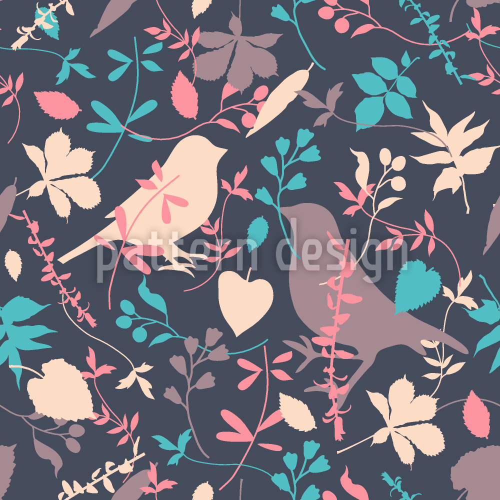
B was my first choice because I reference pink to girlish. The design is also very feminine. C as my second choice because the bird can reflect relaxation and calm. A was my third choice because it is simple and the I really like the way the colors compliment themselves. And the design is simple. D I selected last because of the design with the birds. However, the color scheme is not to my liking.
I love B because it reminds me of summer, C spring, F reminds me of fall, D winter
I chose B as my top choice because I think this design would look great on a plastic exfoliating brush. It is flowery and feminine and what I would expect to find on a woman's bath product. It's also a pretty design. I would use a product with this design on it.
I preferred the brighter, more vivid color palettes.
9 Responses to Option C
I picked the designs that seemed the most feminine and my top choice was the one I considered the most attention-grabbing.
The bird design in C is very attractive and artistic. The background color can be made little brighter. B has good design but the color is very gaudy. A design is very simple but the color combination is good. D also has a decent design but the color is very dull
Honestly, I just really like little birds! I like how feminine these patterns are, and I'd personally be more likely to buy something if there were little birds on it
I chose patterns that I thought would be fairly relative to the product. They are also pretty designs, and appeal to me very much, in the descending order I placed them. They felt warm to me.
i like C the best because i like the colors that are in it. i feel like it isnt dark but it definitely stands out. the other options i choose i really like too but the last one option E would need a different background color. i think the blue should be a little lighter or a different color all together, maybe a light green?
the color of the bird really makes it stick out.
I like the more subtle colors
None of them really pop- I would love to see some navy and fuschia. I like the medalions on C but wonder how well you would be able to see the birds of C and D on a curved surface like a brush. The florals on B and E are pretty but E looks pretty retro while B looks modern.
I like the more colorful ones the most. Go with something like those
9 Responses to Option D
i when with the brightest colors that looked good
The colors of my top choices stand out more. They are feminine and attention getting.
I chose the ones that looked more feminine. I tried to avoid the ones that clash with more things around them.
I really loved D and E. They have a spark of happiness and joy in them. They would make me what to just look at the brush and use it.
I am a fan of larger prints vs smaller prints, especially on products
I preferred the patterns and colors of the ones I chose. More appealing and easier to see the patterns, color contract was pleasant
These are my favorites in order of visual appeal.
I chose the answers D E A F based on how feminine I thought they looked and how well they would catch someone's attention when purchasing similar products.
i choose d, f, b, c because all of them have differrent colors that can be really good for people and certain skin tones for the beauty product
7 Responses to Option E
Fun and stand out. Not overly feminine.
The cornflower blue colour on choice E is unusual, but striking. The small flowers on it are pretty without being distracting. The pinkish on choice B is much more traditional. Choice D reminds me of Vera Bradley purses. Choice F is cute.
I like E the best because it is more eye catching
The blue background for E is relaxing, and the images are colorful and fun. C is more muted in color, but that is very appealing to a lot of people. A also has a nice background color and the shapes and designs are fun. F is good for someone who likes darker background while still having good color and fun shapes. The birds are nice too.
I have concerns about the larger prints and how they would look on the brush. I really like them and would have chosen them first but thought it would look odd with the large icons
The first design I chose caught my attention first. I enjoyed that one more, and feel that it should be used.
brighter and interesting designs
7 Responses to Option F
I think almost any of these prints would be pretty and appealing. I like the florals and birds.
F i like more this colors look better, D i like this design and colors, C i like more the F and the D option, A i don't like it
I liked the color patterns of my choices. I thought they stood out more.
My top 3 choices were made because I feel like an exfoliating brush should be a darker color. It's typically used while removing other makeup, and a lighter color would stain easily. I enjoyed the smaller pattern of F, and the large birds in D. E wasn't quite as dark as I would prefer, but the small flower pattern was nice. Option C has the nicest pattern out of the lighter colors, so even with it having the lightest background I would prefer it over B and A.
I chose F and D first, love the cute birds on it and the smaller print, chose B next like the color, nice and bight and pretty heart and flowers, lastly chose A, again love the colors the print is pretty nice, but E and C the prints were kind of small and too "busy"
I like the darker backgrounds best
This look looks a lot better than the others
Explore who answered your poll
Analyze your results with demographic reports.
Demographics
Sorry, AI highlights are currently only available for polls created after February 28th.
We're working hard to bring AI to more polls, please check back soon.

