Poll results
Save to favorites
Add this poll to your saved list for easy reference.
Which product would you buy?
Option A won this Ranked poll with a final tally of 31 votes after 3 rounds of votes counting.
In a Ranked poll, respondents rank every option in order of preference. For example, when you test 6 options, each respondent orders their choices from first to sixth place.
PickFu requires a majority to win a Ranked poll. A majority winner differs from a plurality winner. A majority winner earns over 50% of the votes, whereas a plurality winner earns the most votes, regardless of winning percentage.
If an option does not earn a majority of votes, PickFu eliminates the option with the lowest number of votes. The votes from the eliminated option are reassigned based on each respondent’s next choice. This process continues in rounds until a majority winner emerges.
Scores reflect the percentage of total votes an option receives during the vote counting and indicate the relative preference of the respondents. If there is no majority winner, look to the scores to see how the options fared relative to one another.
| Option | Round 1 | Round 2 | Round 3 |
|---|---|---|---|
| A | 42% 21 votes | 44% 22 votes +1 | 62% 31 votes +9 |
| C | 22% 11 votes | 30% 15 votes +4 | 38% 19 votes +4 |
| D | 26% 13 votes | 26% 13 votes | Eliminated 13 votes reassigned |
| B | 10% 5 votes | Eliminated 5 votes reassigned |
Age range
Amazon Prime member
Education level
Gender identity
Options
Personal income range
Racial or ethnic identity
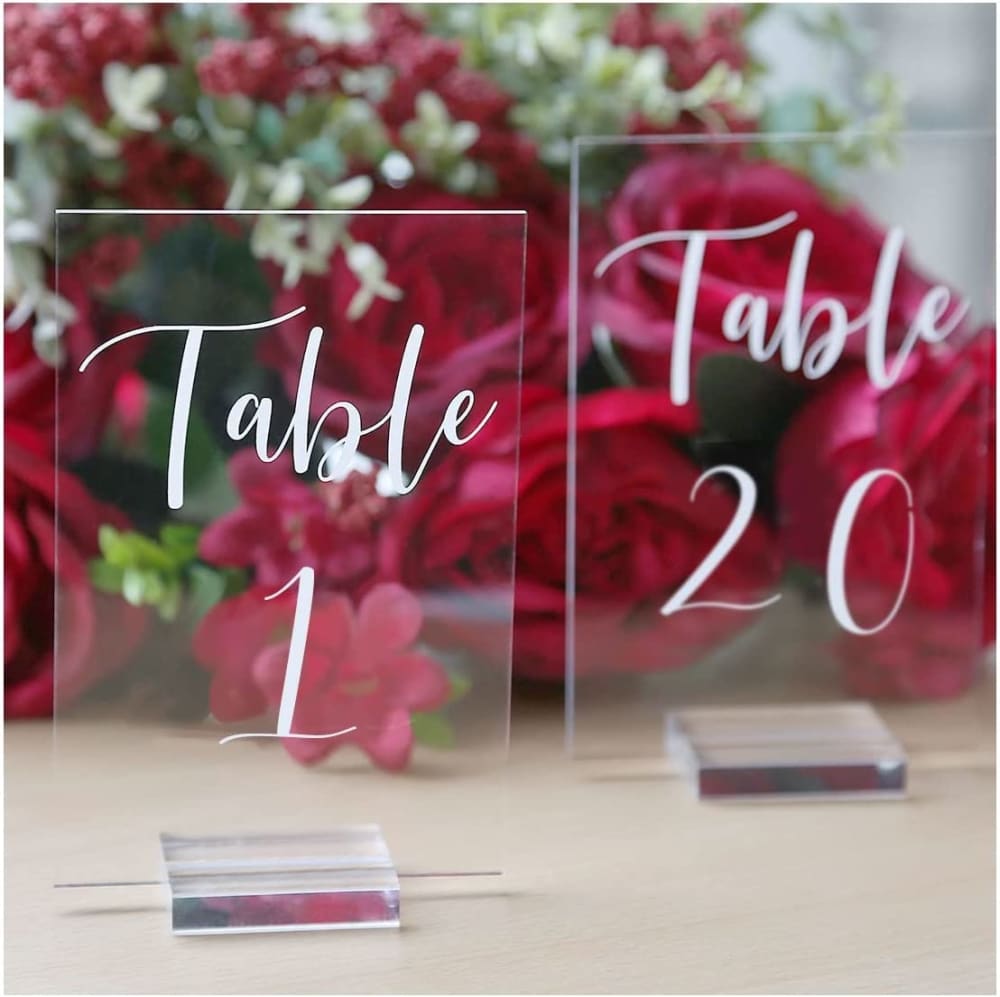
21 Responses to Option A
I like the clear, transparent stands used in A and D.
I like the simplicity of Option A, and the rectangular shape is overall nicer.
My top choice has the easiest visible from a distance font while still maintaining a nice , wedding flair
B's background makes it hard to tell it is see-through. D reminds me of a tombstone. A and C by far look the best aesthetically
I like A because it looks almost see through like the letters are floating, then D because it seems the easiest to read and looks simple, then B and C last because I feel like they are a little hard to read.
I'm going for the pic with the bright red flowers..they add a really bold touch.
I like the fancier fonts. I like a the best because it is a little more thick and easier to see than C. I also like the way the background shows it off
I would choose choices A, C and B first because I love the italic font of the writings on the glass which makes it much pleasing to me as compared to choice D which has a straight up writings which are less attractive to me.
I pick A because I like how it has both the number one and number 20 by each other. I like how they are all crystal clear and how they are written in white cursive writing.
Option A has a wonderful font to it and you can read it well. I would purchase this selection for an event.
A looks pretty cool and fancy looking and i like the font used and the scene its set in helps make it stand out, D looks pretty standard and good looking as well in my opinion but i think the scene could be better to help it stand out more but other than that it's fine, C while i like the overall design i don't really like the font used as it's a bit too overly stylized to me but other than that i think the scene helps it stand out, B is ok but i don't really like the font used and the way the picture it setup doesn't really help it stand out that well in my opinion
I prefer the cursive fonts on A & C the most. D feels too bland.
I'm not sure the difference between B and C, but I think the font for Table is hard to read so they were last. I think the word Table is too small in D. I like the some look of A and the font is fine.
The cursive fonts looks much better than just plain bold.
D looked too dull and B was too stark. I liked the warmth of the rose colored florals in the background for A.
The red seen in the background in option A makes it more appealing to me than the others
The bold and cursive font both fit together so perfectly in Option A.
I like being able to see through it in A. Same with C, but I like the silver base best like in A.
I would rather buy option A because I like that everything is the same color. I like the font used as well
I really like the font in option A, I can actually read it and I think the style is really cool. I think the design in option D is too industrial looking.
looks the most elegant and stylish that i would like in my house as well the design stands out to me the most
5 Responses to Option B
I like the chunky stands on the bottom and I really like when they are made of wood.
I really enjoy the look of B and C I like the font and the woord.
Choices B and A both look really nice and clean overall, Their both sleek and modern choices
I like the frosted look with the wooden base shown in option B the best. I think it has a classy rustic look to it due to that wooden base.
Ranked based on the ability to easily reach the text in each image.
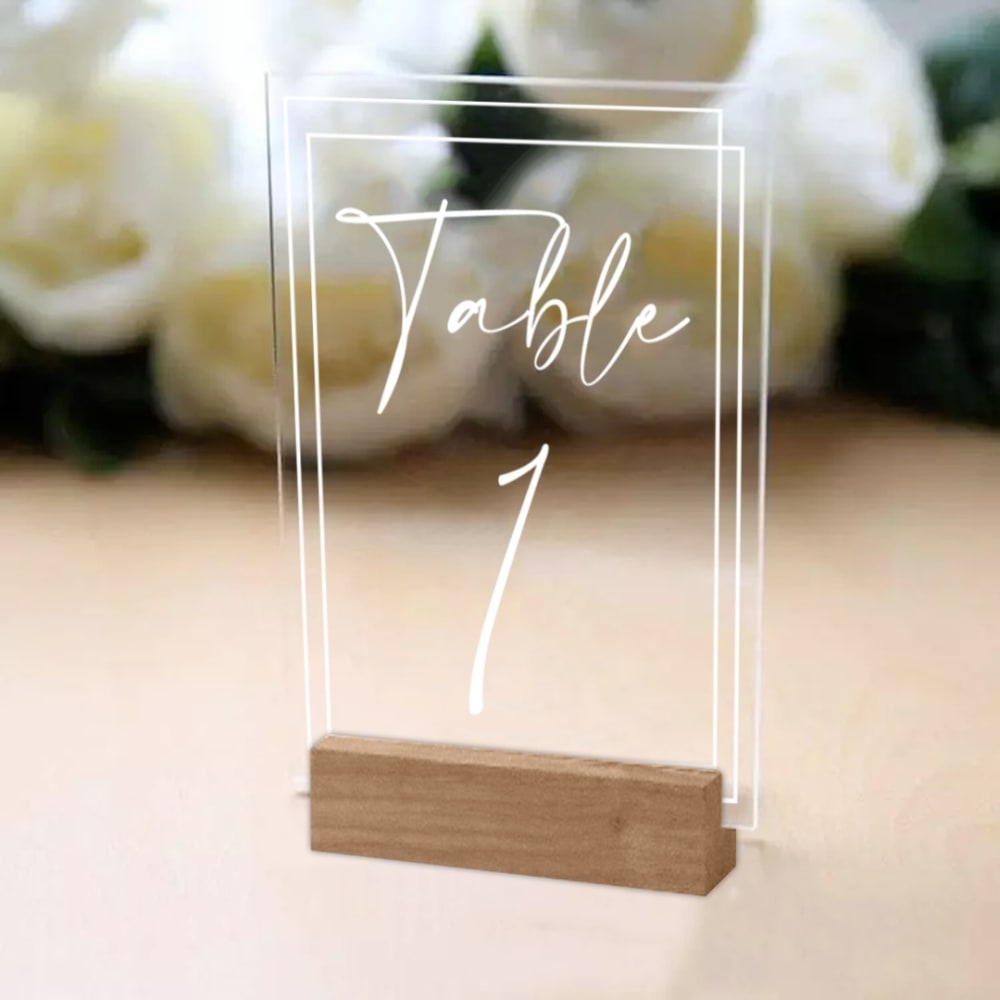
11 Responses to Option C
I like the square ones that have a background to them so I get a good sense of the product.
I liked the look of option C the most. Option A looked nice too. Option B looked okay. Option D, I wasn't a big fan of the shape/arch look.
Beautiful use of natural wood and glass that helps bring this product to another level. The additional background really drives home how great this product is.
I would want simple designs that were easy to read so my guests would know which table they were assign to.
I would buy the ones with the wooden bases.
I would rather buy option C because I think that it has the most interesting, premium, and visually appealing product design out of the four options.
I like the font and the background of C. B has the same font. I like the cursive of A. D is too clunky.
I like C the most since it shows you what the numbers will look like when they are out on the table
It looks more unique and like a higher end piece.
I like the options with more color in them than the more beige and white options
I like option C because to me it looks the most polished and extravagant. Option A and B look quite decent as well. Option D feels too basic and simple for me.
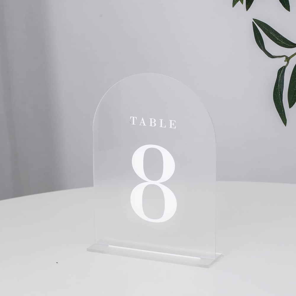
13 Responses to Option D
D seems the least likely to be knocked over by a child and get broken, so I would go with that one.
I'm really not a fan of the typeface used on options C, A, and B. Option A looks the most sophisticated.
I like the clearer font face instead of the elegant, cursive selections.
I went with option D because I enjoyed the arch top of the product. It made it feel different and unique.
The font of D is the easiest to read among the rest and would be easy to see from far away at a gathering
I like the frosted glass look of D the most, and it's also the clearest and easiest to read.
I prefer option D because the rounded top shape looks more inviting and not as dangerous to have in my home.
I think D is easiest to read and prefer the block letters to cursive on something like this. Of the others the photograph for C is the most eye-catching and I slightly prefer the more intricate design of B over A.
I would go with product D, it makes it easy to read and the font doesn't look messy. If there were used for an event such as a wedding they would make finding your seat effortless.
I definitely prefer the simple and elegant design of D over the other more complicated options.
I like the simplicity of my top pick and the bold font.
I actually really love D the best. It's the only choice I actually like. I love the arched design. It's so unique compared to squared or rectangular table signs.
The transparent options are nice, and I like the simple font on D the best. C is a little thin to be seen clearly on a transparent background.
Explore who answered your poll
Analyze your results with demographic reports.
Demographics
Sorry, AI highlights are currently only available for polls created after February 28th.
We're working hard to bring AI to more polls, please check back soon.

