Poll results
Save to favorites
Add this poll to your saved list for easy reference.
Which product would you buy?
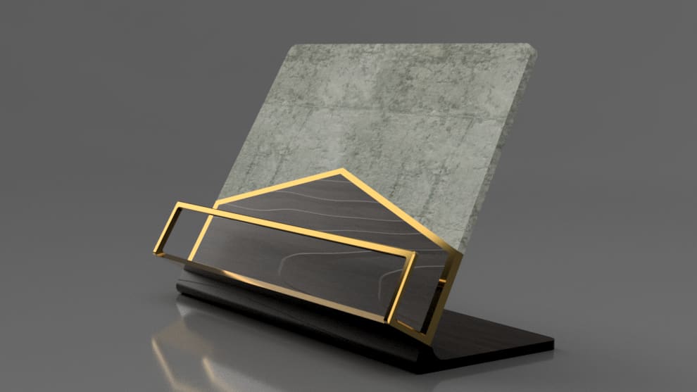
24 Responses to Option A
I like the color better in A.
It has a deeper more texture look in there for looks like it's better quality for some reason
The color and overall look of this one stick out and make the product seem higher quality in my opinion.
The design was very attractive especially the black color triangle design was very professional.
I really like the black and grey look it looks like a piece of art. I like the sleakness and gold touch of it
I would buy A. The design seems more appealing and interesting, and just more harmonious overall with how the brass parts are positioned on the product. I also like the colors of A better.
The black on this stand feels classier. It's much more appealing to my eye and for me is a no brainer selection.
I like the colors of A better-I like that the triangular center gold line goes up higher than B's. I think it would also look better in my living space.
I would buy option A because the picture is better and clearer. I like the color in that one better as well
The darker - with the black - looks much more contemporary and sleek. It fits my style.
I would purchase choice A because the backplate looks nicer than choice B.
I went with the option because of the color scheme of this option. I like the gray,gold and black coloring on this quite a bit. Option A stands out more to me and immediately draws my attention to it.
I like the darker stain of the wood and the details really pop and make this an ideal design for the office.
i like more how this one looks because looks more nice then the other one
I enjoy the darker color option more.
The dark colors will contrast whatever you have on this product nicely, seeing as whatever you have on here will presumably be white or close to white.
B is too plain. A looks impressive, marble looks more expensive than wood
I love that darker tone of A.
I like the lectern green slate here. This feels more academic and I just think it's a bit different which is cool. I would go with that as the better choice here. Both look great in the right setting but personally, I prefer option A here.
I chose A because the products appear to be ceramic tiles, and both its color, variable shading and appearance of rougher texture are more on-trend for building design.
I chose option A because I love the way that it looks! I like the black and gold combo.
I like the darker shade
I like the contrast of the black, gold, and grey of option a.
I like the stone look better.
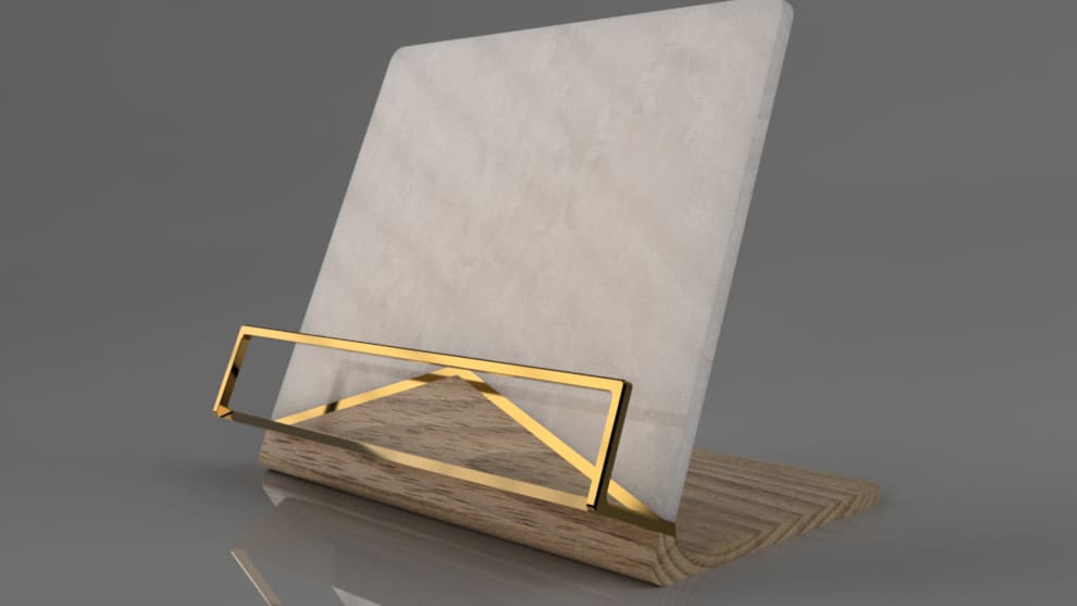
26 Responses to Option B
I like the wade the wood flows. Very well done.
It's easier to distinguish that that triangular part is not part of the product
I love the clear lines and color of B. It makes it look very high class and is something that would fit in my home. It is not very clear to me what option A is.
I like option B because it is simple yet looks pretty good with the marble backdrop.
B looks like it's made out of more natural materials. It looks more understated and pleasant. A looks too industrial and artificial.
I prefer lighter products, so I would pick Option B.
I am more drawn to this design, it has a better aesthetic and goes well with my decor
I prefer the lighter and more neutral colored version as opposed to the darker and green tinged version because the darker colors seem more somber and down beat while the first choice is more light and airy or uplifting.
Like the design of B a little better.
I like the more classic post modern look of option B. Option A has more of a dated 80s feel with the black and gold.
The wood and the marble plaque have more natural looking. The triangle part is just the right size while it looks weird on item A. If it is to put on a grave A would actually look better but if it is a book holder B is much more appropriate.
i think the lighter colors are just much easier on the eyes. it goes nicely with the gold, making it all kind of blend together nicely. the darkness of the other one makes it a bit harsh on the eyes and stands out a bit too much.
Option b is much more classy and upscale looking. The gold contrasts the off white brilliantly and it is beautiful. I love the creamy white color against the brassy gold. It looks so expensive and upscale
I love the softness of the rose color. It pairs so well with the bronze/gold. This looks feiminine and I would love to have this in my office.
i did not like the black base bottom, it looks cheap and just too much i preferred the lighter wood grain version, classic and trendy looking.
i like the colors in option b better
I like A a lot more because the board looks new and clean while for A, it just looks old and dirty because of the design
I like that this color is more neutral
I usually go for grey rather than color, so like choice B best. I also like the lighter wood better on this one.
B because I do not like the color mixture on A.
The true answer is neither, as the combination of stone, metal and wood does not work for me at all - especially the gold metal - needs to be more silver/nickle/grey. I chose B as the lighter color was less oppressive - the black and green looks so 70s CEO office.
the black forms a more appealing contrast with the gold trim
I prefer Option B because Option A looks too much like 1980's decor which I equate with flashy items. Option A looks more timeless and would go with more decor options.
I am not totally sure what this is, but the darker gray looks kind of dingy while the lighter one looks bright and clean
I would pick choice B as I like the opal-like backing of the stand and I think it looks high class.
Option B is light and airy in color.
Explore who answered your poll
Analyze your results with demographic reports.
Demographics
Sorry, AI highlights are currently only available for polls created after February 28th.
We're working hard to bring AI to more polls, please check back soon.

