Poll results
Save to favorites
Add this poll to your saved list for easy reference.
Which style of image would be more appealing to you as a buyer?
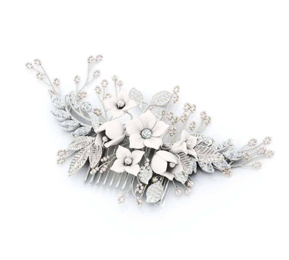
31 Responses to Option A
A seems more substantial and vibrant; B looks washed out and sparse.
I REALLY LIKE THE SILVER WITH THE WHITE IN THIS OPTION. I ALSO THINK THIS OPTION LOOKS LIKE IT MIGHT HOLD UP A LITTLE BETTER THAN OPTION B
My choice is option A because of the product design and the floral design is very unique and perfect match for my style .So i choose this.
Choice A has the angle that gives shadow and life to the hair piece. There are more details seen in this image than Choice B that shows detail but because the background is so white it is hard to get an idea of how it will actually look as a hair piece.
I think A not only gives me a better understanding of what the product is, but the positioning, angle, and lighting of the product makes it appear a lot more prestigious and elegant in a way that I would perceive A to have a higher value than B.
I can more easily tell what the product is in A and thus imagine using it better than with B. It is quite pretty.
A by a mile. It's modern and classy. B looks like something a very old person would wear.
I slightly prefer A, because I like that you can see more of the finer details in that design and it stands out more to me.
I can see the details more clearly with this option.
This looks like it would stand out more in a hairstyle and looks more sturdy.
The higher contrast in A makes the item stand out more. The flowers in B seem to disappear in the background.
I picked A because I prefer more neutral white tones over the pink tones of B.
Image seems clearer and I can see more details of the hair piece.
I prefer option A for the design.
I chose option A because it's fuller looking with more flowers etc.
A is much more intricate and detailed with less bare spots
you can see the depth and more detail
you can better see the product because of the shadows
I like because it's more attractive and it has more depth to it than B.
The dark contrast on choice A is stunning and I can clearly make out the details, I would definitely pick choice A.
Definitely A, the design has more details and is more elegant
I chose A because the pure white image seems more shiny, eye catching and inviting.
I prefer the colors of A.
This one is presented more attractively. It seems fuller and has more personality.
I like the more crisp, silver color of choice A.
Option B looks a little sparse and it's harder to see the details. A looks more robust.
I like the design in choice A because it's a bit thicker closer together and fuller than choice B. My head tends to be small and I don't have as much hair as people with very thick hair. I need smaller hair items. I like that the leaves seems to stand out more than the looser look of choice B, making it look more elegant and less flyaway.
A looks like a higher quality
The style image of option A would definitely be most appealing to me as a buyer because it has a more high quality look to it overall and looks to be better made.
It’s more well lit which I like. It shows a good amount of detail.
I like the design of the flowers in option A the best. I also like how the silver stands out more in this design.
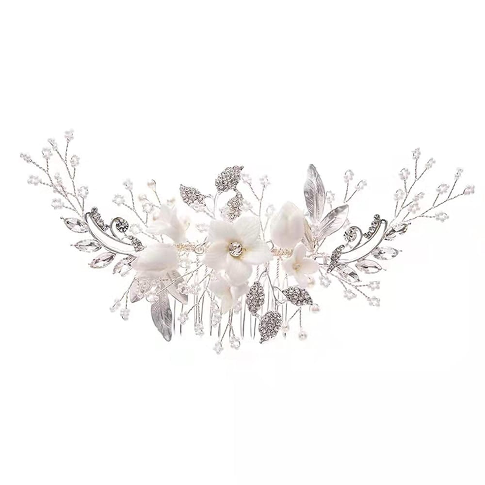
19 Responses to Option B
Pink is a nice color and livens up the picture.
This clip has more contrast in its neutral colors than the other clip. This would like nice for every day use or for weddings, communions, etc.
I like the softer look of B because it seems to pick up a pastel coloring that us light and airy.
I like this one it stands out to be more detail and has a mix of different color to it
I actually like both of them quite a bit for different reasons. I like Option B a little more than Option A because I feel like this particular style would cover more of the hair. I also think you can see a little bit more detail because the jewels and flowers are spread further apart.
I really love B. It is very elegant and reminds me of something a bride would have at a wedding.
Option A is too busy. Option A is simple, elegant, and has a hint of color.
Option b has more sprinkles
This one looks real and I like the hint of color. The other one looks like a fake image because of the flat, washed-out gray scale color.
This was a really hard decision, but I went with B because it looks more delicate and that gives the impression of greater craftsmanship, which is super appealing and admirable and would make me more inclined to click on B, or at least click on B first.
This looks beautiful with soft, beautiful pale hints of color. The other photo looks a little harsh and doesn't show any kind of warmth or color about the piece.
I like the flower colors more in B.
This option is more attractive and catches the eye better than the other option. It has a broader color scheme that makes it stand out when compared to the other option
I voted for B because it looks more delicated, but both of them are stunning.
The looks of each item are similar but option B looks more dainty, delicate and full of craftsmanship. Option A looks cheap and mass produced and bland in color. while option B has a variety of hues included and has dimension.
A looks cluttered and heavy. The color is stark. B looks to be a comfortable product and the color is beautiful. It has a richer looking design and hue to it.
I liked the contrasting silver and white pieces which gave the hair clip depth and made the arrangement more eye-catching.
I find it is more visually appealing and the colors are very pretty
It's so fancy and wild looking at the same time! It's also giving me VERY classy ROYAL-TYPE vibes. It looks higher in quality than the other option, for sure.
Explore who answered your poll
Analyze your results with demographic reports.
Demographics
Sorry, AI highlights are currently only available for polls created after February 28th.
We're working hard to bring AI to more polls, please check back soon.

