Poll results
Save to favorites
Add this poll to your saved list for easy reference.
Which style would you prefer to have for your project and why? The vendor sells letter patches
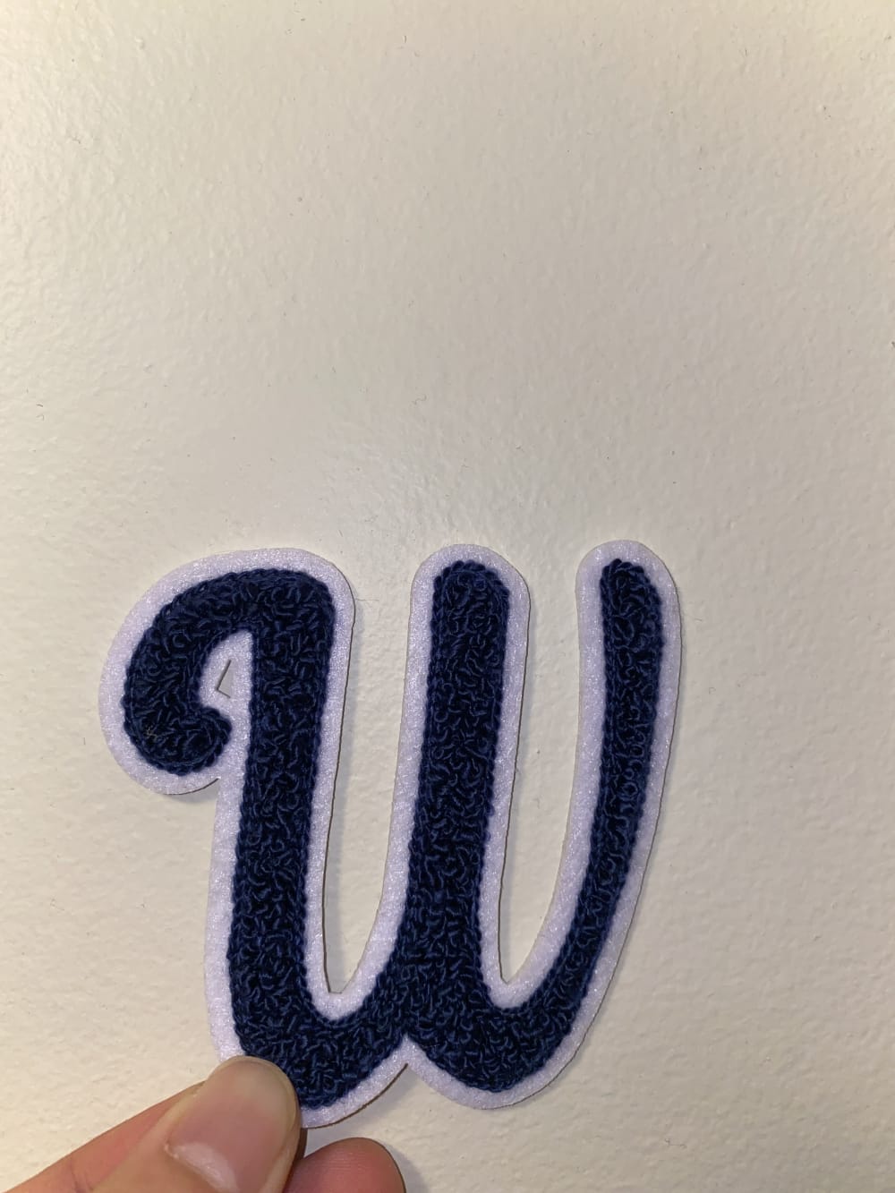
26 Responses to Option A
Choice A looks more modern and new
The script lettering looks more attractive and stylish.
I would buy Option A. I can think of more uses and designs with this font style.
I like the cursive styling letter better than the more tradition varsity look. But both are of acceptable looks that depending on the person, either would fit the bill.
I like the casual style of A
The W in option A is a lot more stylish and clean looking than option B, so I would choose option A.
Option A looks like the vendor took a lot of time to clean up the appearance of the letter compared to option B it looks more presentable.
I like that it looks more like handwriting instead of a logo for a team. The other option looks fine for a letterman jacket.
I like the font style a lot better. It feels more unique. B is like college lettering or sports lettering.
I chose option A because I like the cursive "w".
i chose A because of the awesome front used for the letter patches design it makes it look outstanding and it will come out well by adding great value to my job when been used for my project.
This option looks more fun and playful than the other, which is appealing. Very cool design for sure!
I chose option a because the italic script would be easier to read in a title or sentence.
These letters look more like script writing. I think they flow better. They also don't look like they came directly off the football field.
I strongly prefer the manuscript letter as it is a dying art these days. . It shows special treatment of the person wearing that letter as only some care to know how to read using this type of writing.
Well, I like both. I chose A because I am a bit older now and it is a little fancier. B is a classic varsity jacket style and although popular, not for me.
I like that this one looks neater and smoother. B reminds me of a Peterman jacket. It could be great for some projects, but I like the font of A better.
I love the font used here and how it flows a bit more easily than the other
I chose a because I think it looks more unique and B looks a little messy.
Option A looks nicer. It is more modern, easier to read, and less clunky.
Option "A": This is a more stylistic and elegant font choice for the patch to me; it is familar and classic in appeal.
I like the curvy letter better... it's more my style.
I like option A because the letter looks so fancy and elegant
I like how A looks more delicate and a little more feminine over B.
I think cursive letters looks better and timeless.
The font for B is too much like sports letters, where as the script font of A is unique and more visually appealing
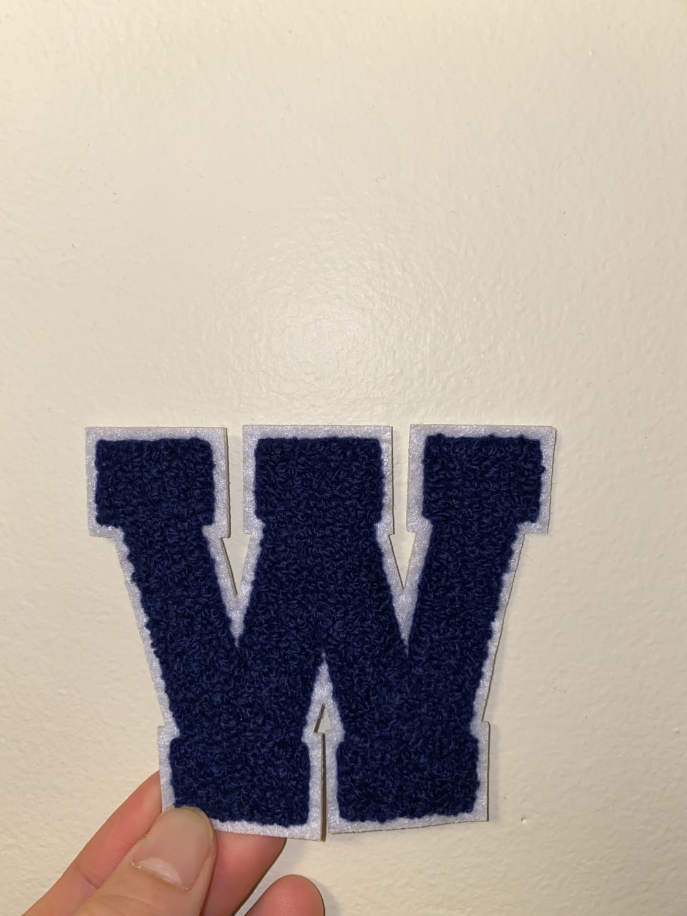
24 Responses to Option B
I like both designs but since the letter in B is block style verses script, there is more material to work with so I feel that would make the project easier and I like the block style look better.
I love the chunky looks over the cursives
I think it would depend on what it's for, but B I could see being used in sports or something. I'm not sure in what scenario I would use A.
This font was a bit more classic and stately.
I chose option B because I love the way varsity letters look.
I prefer the patch shown in choice B, it reminds me of a patch for a high school letter jacket, and it also looks well made and sturdy.
option B i just like it sharp looking
I liked "B" as it seems to be more bold making an obvious noticeable statement
It looks a lot like the W for Washington Huskies, my home team.
My first impression is that I like option B more. I like option B more because it is less ambiguous with respect to clarity. The round squares and straight edges effectively demonstrate what the letter is. Option A has some ambiguity and less clarity overall with respect to the letter that is presented, and it's because the round ends and the overall presentation is less clear. I prefer option B as well because it would be easier to present, and it would look nicer aesthetically when presenting the letter patch on a piece of clothing. I think that it has a more consistent design with respect to the quality of the presentation, and I like the overall style more because it looks more artistic. Option A also looks more uneven with respect to the middle section and the ends of the letter because there's less consistency with respect to symmetry. That lack of consistency affects the overall presentation with respect to which of the options I think looks nicer and more even and so that's why I prefer the style of option B more than the style of option A.
B is more classic and would be more adaptable/appropriate for different uses.
B reminds me of old school, varsity lettering, and I would like that for a project.
I like the letter presentation for B because it is easier to attach pins to it.
The other one looks like the Washington Capitals logo and this 1 is more generic with a wider array of applications I think
I love the bold Capital W, this really stands out between them. I could see this being used for many personal projects. good material and good color. 5 stars
This has a bolder and more classic looking style
I personally like Option B better because it speaks more, it's bold and confident. Thank you.
I would pick B, that athletic style font is exactly what I think of when I think of these loopy embroidered patches. It's very classic.
This one looks easier to use upside-down as an M as well as W. So, Two for 1
B was more bold in it's shape and gave a strong solid image to represent the people and groups the letter would be assigned to.
Option B is just more prominent and readable, making it my go to choice out of the two options.
It is bolder and stands out more. The other is to scripty.
Kind of a hard decision, but ultimately I think I would go with B because it has kind of a retro letterman's jacket style to it that's pretty cute.
Hear look like lettermen jacket letters. Option A always seem nicer and unique to me. Option 2 has been used for many years as the basic letter but I think A is a refreshing difference.
Explore who answered your poll
Analyze your results with demographic reports.
Demographics
Sorry, AI highlights are currently only available for polls created after February 28th.
We're working hard to bring AI to more polls, please check back soon.

