Poll results
Save to favorites
Add this poll to your saved list for easy reference.
Which wall art canvas design would you choose? Are the entrepreneur quotes inspiring?

17 Responses to Option A
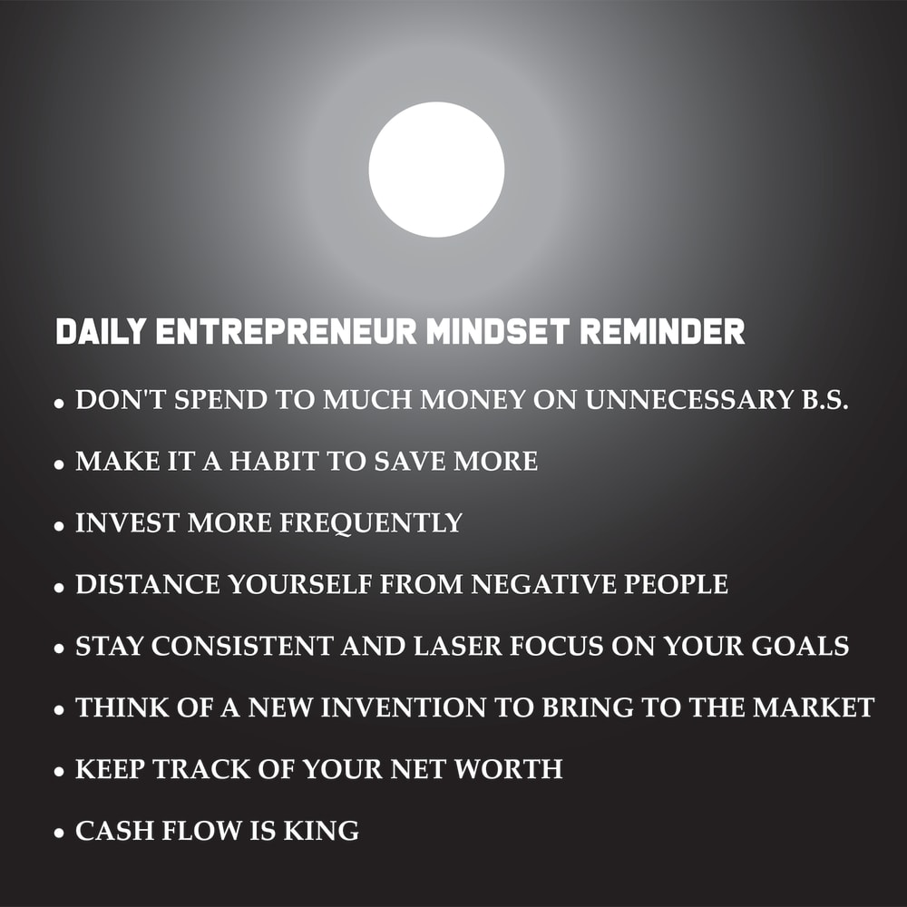
THE BLACK BACKGROUND IN A MAKES THE INFORMATION EASIER TO SEE AND READ
I think choice A looks more inpsiring to people who are looking for an inspirational quote that has to do with entrepreneurs. I think the darkness makes the canvas more mysterious.
It is odd but my attention kept being pulled to the black one, A more than B.
I would choose option A wall artwork because of the way option A is been designed. Option A is well titled and well arranged, the quote of option A is more inspiring.
I think Option A is better simply because it's easier to read. The bright background of Option B makes it sort of obnoxious to look at.
Choice A encourages an entrepreneur to see things as black and white. To stay within budget, to watch where your money goes and to see it more easily in their mind during the day. The yellow of Choice B just interacts and cancels out the sun which makes this poster look easier to ignore. The entrepreneur quotes are very good and will keep a certain mindset throughout the day and week and year to keep focus on what is important to keep in business.
I like option A the best because I love the quotes and I like the night time background with the moon showing because a motivated entrepreneur gets up before the sun rises and the moon is still out. The background is perfect for that.
Prefer the black and white colors in tones. Matches the depiction
The yellow background is much too bright and distracting. The black background works much better and is easier on your eyes.
I would choose this one because the color theme is easier to read.
I find that the black background just simply makes it all easier to read. The white font is popping better and feels more clear than the black font on the yellow. The yellow attracts my eye first but the black is more appealing and the one I am more inclined to read through.
I like the quotes a lot in A and I find the color more appealing as well.
Option A because the snarkiness matches the cool slick silver background better than the generic sun yellow in option B
The quotes are good to follow and inspiring. I think the darker background makes things easier to read.
I like the darker background with the more distinct bright light at the top.
I like the dark one. I also would get it with the entrepreneurial quotes. A great thing to wake up to
I think the orange is just too bright of a color this message it looks better on black
33 Responses to Option B
I chose option B because visually it was more appealing the Orange makes it feel bright and light versus the black which makes it seem kind of dark and mildly depressing. I thought the feedback or quotes for entrepreneurs are interesting but there were way too many of them.
I chose option B because of the choice for the background, it is very bright and appealing, it makes the wall canvas attractive and make it more readable.
I like this design better the text is easier to read and the orange is more uplifting.
I chose option B because the orange is lighter and appears more positive which goes along with the mindset the all art is trying to convey. It gives the feel of sunlight and starting the day off right, whereas the other option is dark and reminds me of moonlight which contradicts trying to set the mindset during the day.
I enjoy the image in Option B - the sun. As for the quotes, they are OK, but I would not call them inspiring.
I would select option B because I like the brighter color. I do not find the quotes inspiring.
The brighter color is much more uplifting and goes with the quotes
I think the orange background matches the rising sun image more than the black background of option A.
I would vote for B because of the brighter colors. Bright colors inspire me as well as the quotes given on the piece. I think combining the quotes with the brighter colors would inspire people more who looked and and read the piece.
I chose B because it reminds me of daytime or sunrise, which evokes excitement. A looks like a night time scene with the moon. This is not traditionally associated with innovation and inspiration.
This is easier to read and looks more professional
I choose B as it is much more "invigorating" with its orangish color. The black background in A doesn't do much for me whereas in B I feel more stimulated and "alive".
Color is more inspiring and awakening, however the words and quotes are just okay, not great
I'd chose this one because it looks more appealing and interesting to look at, I like the color.
This option looks more helpful and easy to read to me
Love the brightest to the ad... More positive looking.
Usually I prefer the darker colors but in this case they just don't look great and are not as easy to see as this version. The bulleted points are solid, they are actually more meaningful that the usual crap motivational poster that says nothing.
The brighter is better for inspirational messages I feel.
The words are just ok. Yes they are good things to remember but not a!l of them are for morale. They need to be more inspiring to the soul. I don't have any but that is my input. How about, make sure that you are responsible for everything you do and try to inspire others to be a better person than they were the day before. And b is just more lively. Not like it was a print. Also, too is spelled wrong in the first line
Choice b stands out more and it’s easier to see he quotes. They do inspire
Brighter colors are more inspirational to me than black. I think the mindsets are very good summer inspiring other ones are creators of stress for example think of a new invention to bring to the market it's not a very attainable goal on a daily basis as more of a long-term goal. I would say something like that would bring some pressure to a person when they feel like they have to do it every day and a day goes by and they didn't accomplish that goal everything was good otherwise.
Orange reminds me of the sun. Bright and cheery. The black and white one is sort of dull and depressing. Like a cloudy day.
I would choose option B because it makes me feel much more upbeat. I also found the quotes to be very motivating and inspiring.
The orange makes the words stand out and gives a more positive impression
the black print is easier to read than the black background
Option "B": I found this color more positive/inspirational by comparison like a sunny day vs. a dark night but either would benefit more by the quotes if it is known by whom they were originally attributed. Otherwise, it is a meaningless platituce and/or borderline plagiaristic.
The print is just easier to read with this color background. Your quotes are okay but they could be better (more inspiirng). As is they just look like facts.
Option B is better because the color is more uplifting the quote is meh because it’s pretty long maybe shorten it up a bit
I like the orange background because it reminds me of a sunset. The listing is not inspiring because it is all common sense.
Option B's color scheme is brighter and more inviting to look at than option A; it is definitely my preference here. The quotes are a bit generic and I would expect to read things that are both more specific and more inspiring.
I chose Option B because of the background color. The wall art messaging is positive and the black color of Option A does not fit with the messaging. The brighter color implies a more hopeful image.
This color is more inspiring. The black one looks depressing.
The text looks terrible on both, but the orange and yellow in B attract me more. This is supposed to be inspirational. The black and grey looks like a dreary, depressing day. I don’t think A captures the mood you are looking for.
Explore who answered your poll
Analyze your results with demographic reports.
Demographics
Sorry, AI highlights are currently only available for polls created after February 28th.
We're working hard to bring AI to more polls, please check back soon.

