Poll results
Save to favorites
Add this poll to your saved list for easy reference.
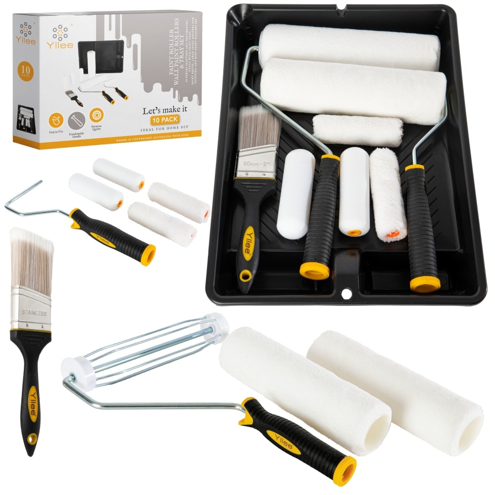
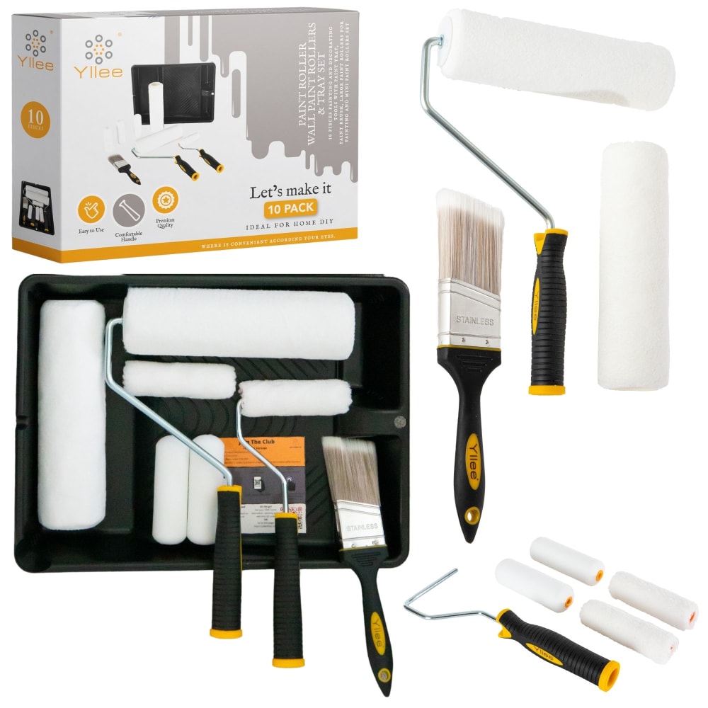
As you are an Amazon customer, which one would you prefer as an main image? Which one catches your eyes the most?
Option B won this Ranked poll with a final tally of 28 votes after 3 rounds of votes counting.
In a Ranked poll, respondents rank every option in order of preference. For example, when you test 6 options, each respondent orders their choices from first to sixth place.
PickFu requires a majority to win a Ranked poll. A majority winner differs from a plurality winner. A majority winner earns over 50% of the votes, whereas a plurality winner earns the most votes, regardless of winning percentage.
If an option does not earn a majority of votes, PickFu eliminates the option with the lowest number of votes. The votes from the eliminated option are reassigned based on each respondent’s next choice. This process continues in rounds until a majority winner emerges.
Scores reflect the percentage of total votes an option receives during the vote counting and indicate the relative preference of the respondents. If there is no majority winner, look to the scores to see how the options fared relative to one another.
| Option | Round 1 | Round 2 | Round 3 |
|---|---|---|---|
| B | 38% 19 votes | 40% 20 votes +1 | 56% 28 votes +8 |
| A | 22% 11 votes | 30% 15 votes +4 | 44% 22 votes +7 |
| C | 26% 13 votes | 30% 15 votes +2 | Eliminated 15 votes reassigned |
| D | 14% 7 votes | Eliminated 7 votes reassigned |
11 Responses to Option A
B felt a bit too distant as it didn’t provide a large enough view to be clear. D however had the opposite issue as it was too much of a closeup. A and C struck the right balance between showing detail and showing it at the right degree of closeness.
I made my choices this way because I felt that being able to see the whole product made it very easy for me to imagine using the product. I felt that being able to see the whole product laid out was very important as it made it easy to imagine using the product and how it would look
i like "A" most because of the overall layout of the tools. it had a pleasing appearance. "C" is almost as good. i like "B" as well but things are a little bit too close to each other' it's a subtle type of thing. "D" is by far my least favorite; it has an empty type of look especially compared to the others
I like A and C because they make it seem like a great value by having everything on display both in and out of the box. A looks nicer to me because the packaged version of the tools is larger and more prominent. B is alright in terms of showing lots of stuff, but it's very bland and a bit sparse. D is the most plain and doesn't look nearly as much of a great value as the other photos that show everything multiple times.
Option A Looks very cool and eye catching. The arrangement made was so nice i will buy it
I like option A the best because it shows the items both inside and out of the box in the image.
I tried to choose based off my initial reactions only as online shopping can swing your attention quickly, I ranked the images based off clarity, seeing the products in different angles and specifically for number one i chose it because of how much more appealing it was to have the tools fit in the box vertically rather than hang off the edge horizontally.
This is the most professional looking set up complete with showing me the quality and everything in this kit, but it's also very appealing visually
I prefer this option. I like how I can clearly see the box and it's contents clearly and I can see how many rollers are included and their size.
I like the total layout on option a. All the paint rollers in the trey are nice, and the way the box is displayed shows me what I got.
I think being able to see how the product fits in the box for future storage is handy, but I would also want to see the individual products to the side and how they assemble together.
19 Responses to Option B
the best design to choose this option
I really like D, but B lets me know that I'm getting it from a reputable company in a box. The other two aren't great because they make it seem like I'm getting more than I actually am.
I chose option B first because the setup was less cluttered than options C and A, and I liked how the box was on the left side and easy to read and raw your attention to the mechanical parts. I chose option C second because it was similar to option A but it was a little more cluttered. I chose option A third because the box was little smaller and the setup had more things in the picture. I chose option D last because there was no box and I was not sure what brand of tools made it or what it was to be used for.
My choices were based upon which images I felt best displayed the individual pieces of the product without duplication.
Choice B is the best because its picture is laid out in a more professional way and is most pleasing to the eye the way all the objects are laid out. It shows all the included objects in the most professionally arranged way compared to the others.
I would rank them in this order. I prefer choice B because it gives the best unobstructed view of the contents included when you purchased the box.x.
the only one I have strong feels about is D, it doesnt show me many accessories at all
Option B catches my eye best as it shows clearly what items are included in package (and shows the box it comes in). On options A and C, it takes a moment to realize what they are showing as the items that are included. Option D is just too mundane of an arrangement (and no box shown).
Option B looks the most professional and appealing. Options C and A are cluttered and option D doesn't look professional at all.
B's products are neatly organized, in a way I can easily see everything that's included. The other 3 are a little bit "messy" if that makes sense. Everything is just kind o thrown together in the other 3, just not appealing at first glance.
I would prefer B. It caught my eye immediately. I think the brushes are well organized in this image. They aren't laying at weird angles and they look very neat.
There is a lot going on in all of these images but option B seems to be the most organized in terms of what is included. Option D is next, everything in one tray makes it simple. Option C is a bit confusing if you get all of the rollers and handles, and option A seems to be scattered with stuff
Options A and C are confusing as to what actually comes with the product, and Option D is a little too bland and generic. Option B is really clear as to what I'm getting, and the product packaging is visible making it look more trustworthy.
option B has the items angled a certain way which catches your eye and seems professional. A shows the items all together and up close making it clear to see what you'll be receiving. C looks somewhat professional but a little cluttered. last is D because it is difficult to see the white items (brushes and paint rollers) on a white background
B shows off everything the best. A and C shows everything twice which could confuse some people. D doesn't have the box.
D is last because seeing it laid out like this isn't the most enticing for me personally and it just comes off as a bit plain personally. From there, I like B and C over A as A seems a bit messy whereas B and C are coming off as professional for me. I love B in particular because the angle is easier on my eyes
The presentation/lay out of options B and D is really well done and looks great, these two options definitely grab my attention. Options A and C are good, but the presentation could use some work.
The layout of B makes it easiest to see all the included pieces. I find the layouts of C and A overwhelming. I like that D only shows what's in the pan. C and A have too much going on.
Option A is the best because the image shows a organized and clean layout of the painting instruments and tools.
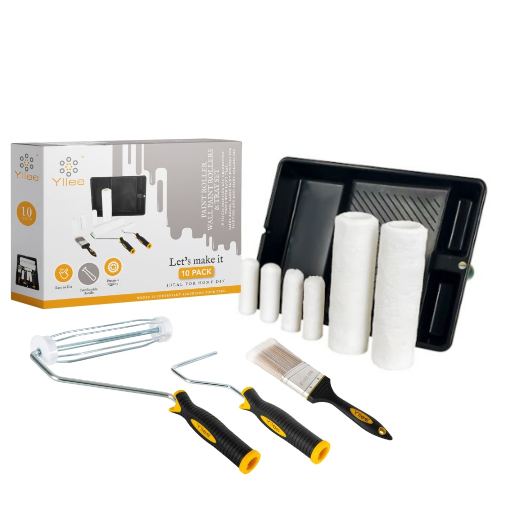
13 Responses to Option C
C I feel does the best job to show off everything and with the way the items are displayed flows well.
its good to see the products close up, all together so that you can see what youre getting. most of these angles are really nice
C captures my attention the most and is what I would want as a main image. That's because it clearly shows all of the components of the paint brush set in the most orderly way. D's image is a bit plain, even though it's zoomed in. It doesn't show the other components like the first three options do.
The product and packaging listing is professional and an ideal layout. The product look is fresh and likeable.
I like the ones that show how it looks out of the container
I like it when the objects are more spaced apart. On Option A and especially Option D the objects are too clumped together and that bothers me and there is too much black.
I went with the ones that displayed them the best. The last one feels like everything is just crammed in there for the photo.
It seems like an insignificant detail but I like seeing the box being the actual size with the product so you can see at a glance that is how the product is packaged. Also It is nice to see all the products laid out to make it look like you get as much as possible
Option c has the components layer out in an attractive display. Feel like I'm getting more than just leaving everything in the tray.
I choose C why the image just is so bright and you can see the product like your right their with the product so this why I A over the others
HOw interesting that I was planning on repainting a few rooms in the near future. C definitely caught my eye first before the others did.
It is definitely Option C, with Option A following, because it`s very descriptive and informative. Other options follow in the mentioned order.
Presentation is nice. I like how it's all laid out. I like how you could see the box in the left corner. Overall it's a good picture
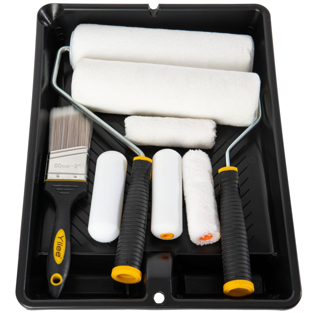
7 Responses to Option D
I like the close up view of the products.
What I'm mostly looking for is a good bit of contrast and a visual that shows me what I'm getting - and as far as I'm concerned Option D is the best in fulfilling these criteria. Options A and C are fairly close to each other as far as I'm concerned, with A edging this one out since the prefer the diagonal orientation of the tools to the more typical vertical setup. I feel that the tray is too far and 'hidden' in the image in B to provide some much needed contrast, so this is clearly my least favorite of the lot.
D because other options look redudant
I ranked in order of what I thought looked the best.
D catches my eye the most, because I'm attracted to the neatly organized tools in the tray. A shows this too, but I think the image of the box detracts from this a little. C doesn't show it quite as well, because of the more abstract and unrealistic image of some of the tools. B doesn't convey organization nearly as clearly as the other images.
The product images showing detail and close-up shots are the most inviting. A majority of these are suitable and are quite pleasing to the eyes overall.
I dread painting, so all of the options that show a plethora of different parts put me off with their complicated renderings. Option D is the most direct and simplest-looking, and is most likely to get me off the couch.
Explore who answered your poll
Analyze your results with demographic reports.
Demographics
Sorry, AI highlights are currently only available for polls created after February 28th.
We're working hard to bring AI to more polls, please check back soon.

