Poll results
Save to favorites
Add this poll to your saved list for easy reference.
Based of these photos, which image will make you more likely to purchase this broom holder?
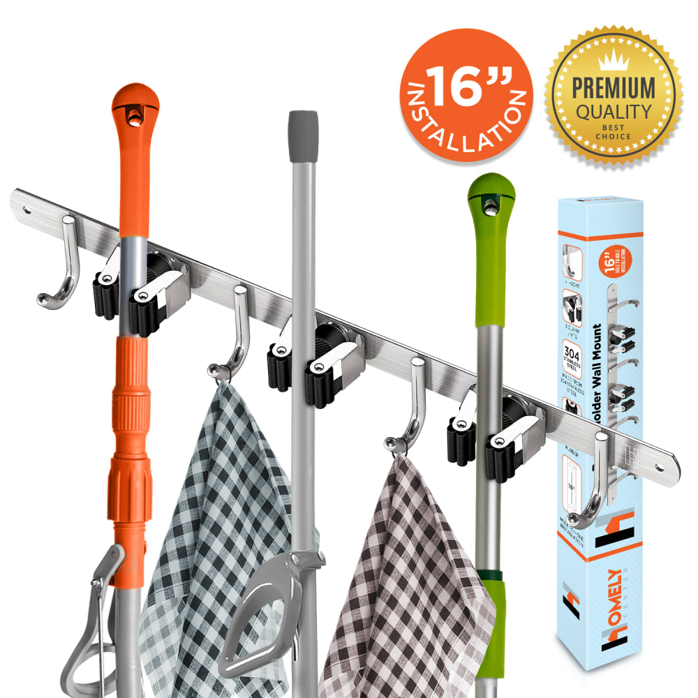
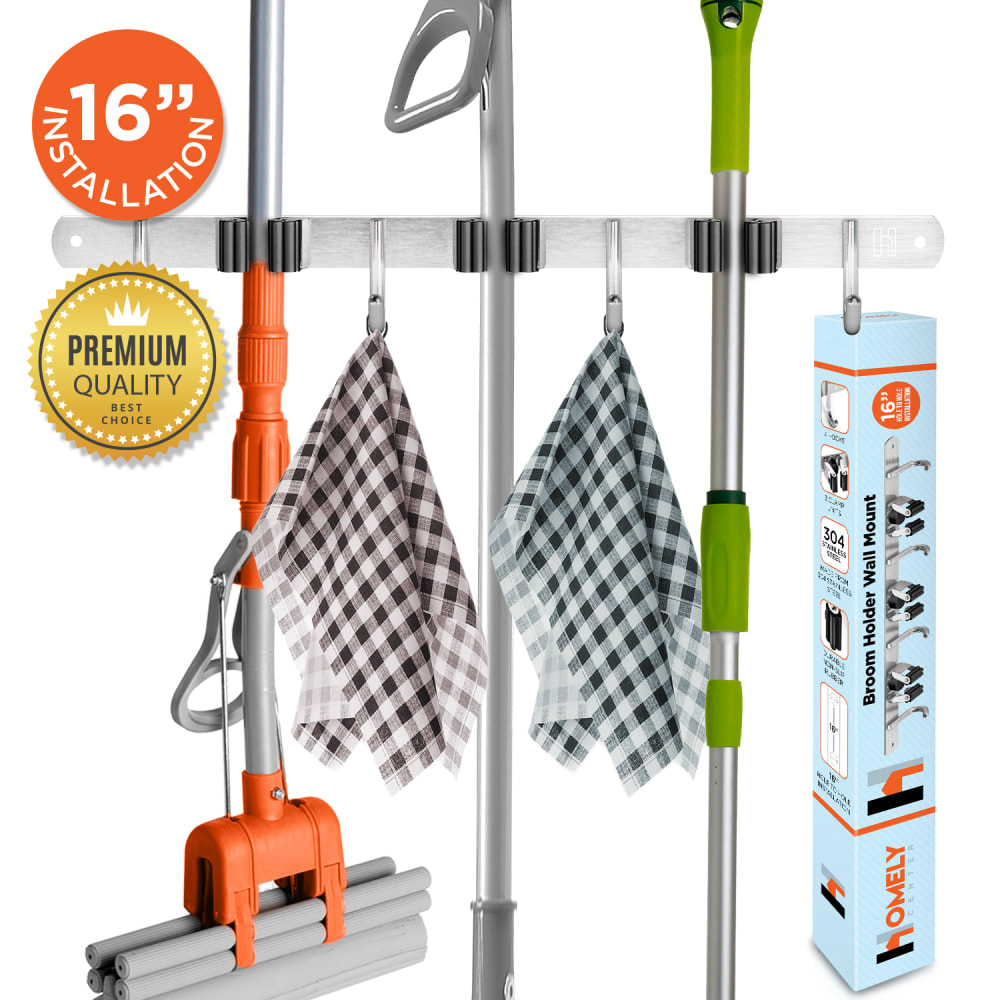
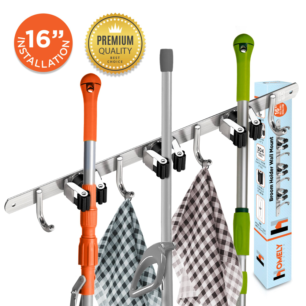
Option B won this Ranked poll with a final tally of 26 votes after 1 round of vote counting.
In a Ranked poll, respondents rank every option in order of preference. For example, when you test 6 options, each respondent orders their choices from first to sixth place.
PickFu requires a majority to win a Ranked poll. A majority winner differs from a plurality winner. A majority winner earns over 50% of the votes, whereas a plurality winner earns the most votes, regardless of winning percentage.
If an option does not earn a majority of votes, PickFu eliminates the option with the lowest number of votes. The votes from the eliminated option are reassigned based on each respondent’s next choice. This process continues in rounds until a majority winner emerges.
Scores reflect the percentage of total votes an option receives during the vote counting and indicate the relative preference of the respondents. If there is no majority winner, look to the scores to see how the options fared relative to one another.
| Option | Round 1 |
|---|---|
| B | 52% 26 votes |
| A | 28% 14 votes |
| C | 20% 10 votes |
14 Responses to Option A
I like the angle and placement of the circles in A
I speak English, I read left to right.Option B looks weird because the focus is the middle of the rack.
Option A is more interesting to look at than Option B and less crowded than Option C.
The diagonal representations of the product are more dynamic and favorable in my opinion. Would rather have the slope downward from left to right in my opinion as well.
I really like the angled photos, they show the details of the clips better and it makes it easier for me to visualize using it.
I thought that option C looked like its going in the wrong direction, slanted down towards the right seems to be the right way. I preferred the slant over the straight on pic. I like that you can see how it grips the broom and mop handles as you can get a better view from the top.
I like both A and C, more asthetically pleasing to see the holder at and angle, I prefer the diagonal of A over B, but they are close. Also you can tell how high above the holder the handles stick up. I think B is too straight on, less noticable.
The angle is everything for this product. Option A looks slightly bigger than the other two (I realize it isn't but it is all about perception). Also, the two circle information bubbles are easy to see in both A and C (Option B's is awkward I feel).
I chose A first because I liked the angle of it and how it was set up.
I like the way A looks because the color is clear and the graphic is better. The other ones are chosen in order of the quality of the pictures.
Most natural able, at least for Americans, would be in option A. It seems fitting and natural for the eyes to go left to right here. Having the angle here is better than in option C for visual reasons. Option B just doesn't give the product any depth. Option A for the best image.
I like option A. The way the things hang off the hoots and the clamps are very good and more visible than B.
I strongly prefer the angle of A and C. Between those two I don't really have a preference.
I like the angle of the picture and closer to the holder, shows it off better
26 Responses to Option B
I like seeing the full mop and the other products to show the hooks for the bar
While I usually don't like straight pictures, for this instance it makes sense so you can see all of the products that it can hold. You can see that two are rags and the orange thingy is a squeegee-type product that's medium length. Having that view shows more.
I really don't have any preference between the three, the only differences I see are placement, which matters not to me.
This one makes the product look the best
Option B would definitely make me more likely to purchase because you can actually see every thing when in other options you don't have great visibility.
B is the best option because it shows the rack in a horizontal position. This looks the most attractive and shows the benefit of the rack to its best potential. A looks like the second best because it shows the badges on the right side which appears more visually attractive than C with the badges on the left.
I like B the best because I think the image gives you the best idea of how the product would work in your home. C and A are okay, but the angle doesn't really give a good example of what the product looks like in reality.
Indiscernable differences
All are good photos and should all be on the listing but I think B should be the main photo as you can quickly and easily see what the product's function is.
I chose B as my first choice because it draws my eyes and has a cleaner look. A was my second choice because I liked the placement of the installation sticker and premium quality sticker better than C. I did not care much for the placement of the installation and premium quality stickers.
B is simpler to see an comprehend
B is the best for me because I can see how it looks holding the brooms and mops and how long the mops and brooms are so that it looks ok being in this holder. I would buy this one because of this layout and I can see the product much better for me.
I don't really care for the angles for the images from choice options C and A at all. I only really like Choice B; that image is neat and clean and it makes sense for the product. I would buy option B.
I like B best because you can see more of what the holder does. You can see the bottom of the orange item and more of the others. C and A are very close and I don't have much of a opinion for one vs the other. I think showing more of the holder and what it does is more beneficial than close up shots like C and A.
This was a hard choice, but I chose B because I personally like the front view of the holder. For some reason, with it being on a 'slant' it's somewhat hard to focus on what the product actually is.
Option B is the best because I can see all of the objects that not only fit in the product but how they fit. The angle is good, whereas the angles of the other two make it look very cropped and cut off.
Choice B shows the product in the best light. It is well photographed and all items are clear.
All seem a bit too large, but "B" fits most of the stuff in the frame.
I like option B the most I feel like it shows the full height of how it would hang in my home if I were to pay this . Option A & C are to cut of at the bottom of the picture
In my opinion the first image is the most clearest
I like the straight on view better because it gives a more realistic idea of the size
Nice and clear representations of what to expect.
I picked A as #1 because it shows the whole product not just the handle like B and C.
The first pick is the best one and the one I would purchase because of the display of the product being so easy to see.
Option B is presented better/ neater than A or C
I would choose Option B. You can see the whole box very good with this option and you can read the entire box. The other two options are pretty similar where you cannot read the entire box. I think it's helpful to be able to read the box.
10 Responses to Option C
OPtion C was my first choice because I liked how the photo was laid out the best. It was easiest to interpret.
Seeing the product at an angle offers a better look at the quality and seeing it tilting upward is more aesthetically pleasing to me.
I like the image with the aerial view
The pictures that are angled down from the top are better because it shows the construction of the clips and how large the hooks are.
I like C and A better than B because of the side view. The front view makes it hard to see what the hooks look like. I prefer C's angle better than A's.
I like option C best because the tops of the broom are showing and it seems to pull me in to the picture more. I like that it has a left to right feeling when viewing it. This is different than Option A and is a result of the emblem and informational orange circle being on the top left. One thing I did like about Option A was the box was higher than the rack. If the box in Option C was moved over to the left side of the photo I think it might become even more appealing. Option B is acceptable and the only thing two things I disliked were the top of the handles being cut off and that the emblem was below the orange circle and touching the rack. I think it would be better if the emblem was on one side and the orange circle on the other as well as the handles being visible in the picture.
The angle on C comes across a lot better, feels more like reading right to left- also think it highlights the circles more.
I prefer C because you can see the clamps and judge the size of the hooks. I would choose that for an image that appears on the left side of a page (such as on Amazon), but I would go with A if the picture is intended to be on the right next to the product description. I like B the least because you can't see the clamps and hooks very well and the two logos/stickers make the image feel crowded.
I think the first two options are equally the best because they are displayed very nicely. I don't like the third option because it seems very disorganized.
I like the angled pictures better because you can see the top section where it grasps, and you can't see that on the straight ahead image
Explore who answered your poll
Analyze your results with demographic reports.
Demographics
Sorry, AI highlights are currently only available for polls created after February 28th.
We're working hard to bring AI to more polls, please check back soon.

