Poll results
Save to favorites
Add this poll to your saved list for easy reference.
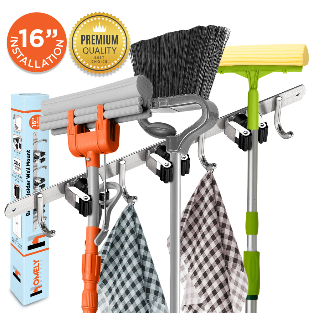
Based off these photos, which main image will make you more likely to purchase this broom holder?
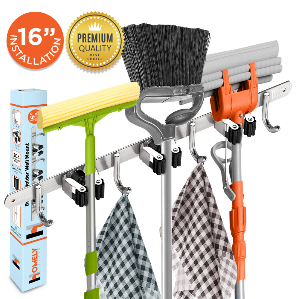
32 Responses to Option A
Having the brighter colored mop in the front grabbed my attention.
I like the way the products are positioned on the rack better in Option A.
This picture is more aesthetically pleasing. I prefer seeing more of the yellow thing than the grey thing. Why? I dunno, just a gut reaciton.
The photos are very similar--It took me a second to actually recognize the difference. In my opinion, either photo will work out fine.
all the brooms and stuff are facing the correct direction
A seems more clean and less cluttered.
Both images are very good but I would choose the one I did because it looks slightly clearer
I prefer this arrangement here.
I like how A shows them all lined up. Makes me imagine it in my home since they couldn't go sideways when mounted to a wall like B.
I would choose A because the mops and brooms are facing the right direction. If they were facing the direction in choice B the rack wouldn't be on the wall. I don't really like photo shopped photos when I am purchasing stuff online and in this case option B really brings attention to it because it looks wrong.
So close it doesn't matter but the orange broom on the right looks slightly better.
The broom and mops are parallel to the bar and it seems more visually pleasing.
I prefer everything facing to the side as it is in option A. It looks tidier, neater and better displayed. Option B looks like if I went into the closet to get a broom or a mop that I would hit my head on the top of the mop as it sticks out way too much. Option A also looks like there is more room for products since the items are turned sideways it shows just how large the item is and that makes it easier for the buyer to gauge what they are purchasing
I prefer Option A because it shows the squeegees and broom in the manner that they would be stored. This allows you too see that you can easily fit multiple brooms/etc. on the holder. However, I dislike how the Premium Quality logo is overlapping the broom on Option A although I do like the placement in the top left corner. I would like to see what it looks like with both logos shrunk slightly so the Premium Quality label can be moved over slightly. Also, might just be me but when I see a checkered cloth my mind doesn't make the leap to cleaning. A microfiber cloth or another type of cleaning tool might look better hanging from the hook. They are both close but Option A makes me want to pull the trigger on a purchase just a little bit more for the above mentioned reasons.
Not sure why, but the orientation in A feels more natural and balanced to me
I prefer this angle because it seems to show more detail and display the products in a more natural way.
Displayed much more neatly.
It is in a more appealing order
Option A looks more realistic. The way the mops and broom are lined up in B makes it look distorted and as if the items are photo shopped in and not actually being held by the broom holder. Plus, there wouldn't be room for the broom and mops to face sideways and still fit against the wall.
They look slightly more neatly hung in A.
I prefer A because it shows how much space there is between the different holders. I like both of them, it is a nice broom holder.
it's brighter and sticks out more
It shows the broom clearer and I like that it is faced more forward.
The way they are facing seems more natural.
I think that the tools look way better in this position and not as cluttered as Image B.
like the arrangement better
I simply think the layout is much more clean and unique looking with choice A. It looks very aesthetically pleasing.
I think B is the better product photo for a broom holder. I think the way the brooms are laid out is better as there is a flow to it, with the orange and the aluminum color and then the green. I think that the chunky broom being first makes a nice visual.
I picked A because of the angle of the Mops and Broom in the broom holder. It looks Natural where as the other picture the angle of the mops and broom looks strange to the eye.
The spacing really shows up with the brooms and mops are all the way they are. Gives me a good idea i it will to be large enough or to large for my needs.
Choice A better shows how much space the product would save.
B looks odd and awkward, because there's no way the tools could hang that direction if the hanger was attached to a wall, as it would be in use. Even if I didn't consciously realize why it looked awkward I'd still be much more likely to click on A.
18 Responses to Option B
I believe the angle they are on in B is much more eye catching. For some reason to me it makes it seem larger and more prominent
This shows how compact they can be
This product presentation and the items are perfectly displayed in the right order and this is why I would purchase it.
more dynamic and aimed better
The placement of the items in choice B is how I would place it if I had the item.
I chose B. I like the way the items are hung by the side. I really like the clips and the hooks.
I would definitely choose option B because it seems to be more high quality.
I like them both but I think the balance of the products in B is more appealing than A. It just catches my eye more even though they are both appealing to some extent.
Option B is more dynamic and Option A is more flat. On Option B they seem to be closer. On Option A they also seem too pressed together.
The brooms/mops displayed at an angle implies there is more room and less clutter that the holder can provide.
They look more natural facing this direction - but both images look nice!
i honestly like the layout of the second one better. the placement of the gray mop and the yellow mop just look better in my opinion, and the placement of the turning of the brooms also looks better. it's a more dynamic position, as opposed to the other one that is boring and flat in comparison.
The differences are so minimal, but I like this one more, even though it's just the colors and the angle, for some reason I like this one. I wish I could say more of why, but it's just an instinct and intuition on which one I'm drawn to. I like seeing the orange one up close because it's unique and I wanted a closer look at it.
The arrangement of the products makes them all easier to see. The gold seal overlapping the broom slightly makes it standout more.
I chose option B because the brooms being slanted makes it easier to see the size.
It shows the various mops and broom a bit better, which gives me a better idea of how they would fit. In A it doesn't look like they fit properly, too cluttered together. Having them at a sideways angle looks better.
B gives you better view of how much it can hold.
I actually find the two images similar enough that either would get about the same response from me. I liked the look of option b slightly better. It felt like the items on the rack were a little less distracting.
Explore who answered your poll
Analyze your results with demographic reports.
Demographics
Sorry, AI highlights are currently only available for polls created after February 28th.
We're working hard to bring AI to more polls, please check back soon.

