Poll results
Save to favorites
Add this poll to your saved list for easy reference.
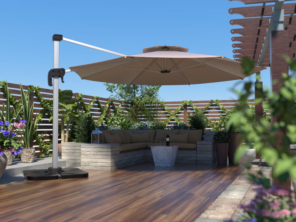
Based on the below images, which color of umbrella ribs do you prefer?
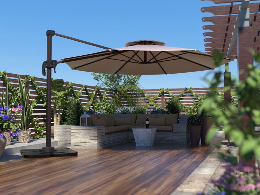

Option A won this Ranked poll with a final tally of 312 votes after 1 round of vote counting.
In a Ranked poll, respondents rank every option in order of preference. For example, when you test 6 options, each respondent orders their choices from first to sixth place.
PickFu requires a majority to win a Ranked poll. A majority winner differs from a plurality winner. A majority winner earns over 50% of the votes, whereas a plurality winner earns the most votes, regardless of winning percentage.
If an option does not earn a majority of votes, PickFu eliminates the option with the lowest number of votes. The votes from the eliminated option are reassigned based on each respondent’s next choice. This process continues in rounds until a majority winner emerges.
Scores reflect the percentage of total votes an option receives during the vote counting and indicate the relative preference of the respondents. If there is no majority winner, look to the scores to see how the options fared relative to one another.
| Option | Round 1 |
|---|---|
| A | 62.4% 312 votes |
| C | 24.4% 122 votes |
| B | 13.2% 66 votes |
Age range
Amazon Prime member
Education level
Gender identity
Options
Personal income range
Racial or ethnic identity
312 Responses to Option A
I strongly prefer the darker colored ribs. It looks much better and modern. The lighter ribs, especially the white ones, remind me of something by grandparents would have. It is an outdated color and design.
It actually matters a lot because when it's open and you're sitting there that's what you will see and I really want the darkest ones.
The black color in my top choice stands out and is very striking. It looks strong and dominant, which is an appealing feeling to invoke. Looks like a very nice product for sure!
It is my belief that the darker that the umbrella ribs are, the more elegant and refined the umbrella looks. For that reason, option A is my first choice, followed by option B and then option C. It may make the umbrella ribs warmer to the touch on hot days, but the darker tone gives the structure a stronger look; the lighter colors make it look less substantial.
I prefer option A because I like the color better. It rains and snows out here, so I have a feeling it would rust, but you wouldn't be able to see the rust as well in option A as in Option B and C. I think the umbrella ribs also go better with the umbrella.
The contrast looks much better. The darkest ribs were the best.
I really like the contrast of the thicker, black frame with a light umbrella. It looks more modern. Also looks best with the pole being a single color.
The darker black looks better. Looks like it adds more visual goodness to the unbrella
Based on what colors would match my existing outside setup
I like the darker colors more. I think that t the ribs make a nice addition and is nice to see them. In both pictures 1 amd 2
This was tough. I almost don't feel like there is a bad choice here. I naturally seemed to default to the classic look of dark brown ribs to match the base. I could see an argument for a lighter (less distracting) shade, but the classic dark shade appeals to me the most. The lightest one was not bad either, but I don't think I would choose it. It looks somewhat cheaper than the others, maybe less durable looking.
I like the more pronounced contrasting colors. I think it looks best on an umbrella. It is easy to see that it is supported and doesn’t just blend in with the fabric
I like the darker ribs I guess they are what I would expect.
I prefer A the dark colored ribs because it adds some visual details to the umbrella.
The stark contrast is nice and noticeable in option A gives the item a high quality look
I find the darker contrast most appealing
Thats too funny I actually own an umbrella identical to that on my deck. I love the dark black spokes. I feel like the lighter ones look odd to me since I am so used to staring up at the dark ones.
I like the darker color of option A. I think it stands out more.
prefer A I like the darker support poles
Option A seemed to present the canopy/umbrella more clearly than pictures B or C. The colors stand out a little more against the slightly-blurry backdrop, making it easier to see the product as the main subject of the composition. Option B was my second choice as it still looks better than option C, but I find myself trying to squint to see the umbrella more clearly against the blurry angle of the backdrop. It seems to trick my eyes into trying to figure out what's in focus and what is not. Option C has much lighter colors and it makes the entire composition seem blurry, including the umbrella, and almost hurts my eyes to try to focus on any one part of the picture.
I like that the dark brown of the stand and metal support offset the tan of the fabric.
I prefer this one because it appears to be durable and made of high quality materials.
I like a contrast between the umbrella tarp and the frame-skeleton underneath. CHoice A has the strongest contrast, so I liked it best. Choice C had barely any, so it I was my least favorite
I prefer darker colors as compared to other colors
a and B stand out more. The black makes the product eye catching and classy.
I like option A because I like the darker black color. They are more bold and stand out and make it look classy and original.
With choice A, I love the dark color of the umbrella ribs is very eye catching and looks like it's making a statement. Choice C is light in color which almost makes look like there are none, which I like. I want it to make a statement or nothing. I feel choice B, they are noticeable but they don't really give me the strong sturdy vibe.
I like A best because it looks light and airy, yet sturdiest of all three. I'm guessing that is an optical illusion by the color scheme, but it works. B looks second sturdiest and C looks flimsy. And A, somehow, matches the decor better.
The darker blend in better with the scene provided
I prefer darker colors, so Option A has the umbrella "ribs" the I prefer aesthetically. Option B is the next preferred while Option C is the least preferred for the white "ribs". I'm just not a big fan of lighter colors so this is completely my preference here.
I like the strong contrast between the tan color and the black of the support arms. It is more visually appealling and interesting compared to the options where the metal parts blend in.
A lot of it would depend on the rest of the decor, I suppose. I like the dark brown pole and braces to go along with the wood flooring in the picture. In a different setting, I might like one of the others better. I don't think it would hurt to offer all three options, or at least A and C and maybe not worry about the in-between offering.
I like the darker bases
Option A's dark ribs look more high end than those of the other two choices. Option C's ribs look somewhat cheap in that they blend in with the fabric.
I like the darker to lightest. The contrast between teh umbrella and the ribs is what I like
option A looks the most steady and stable. then B, then C.
Black makes whole picture pop , gives good definition.-- Blends vary well if looking for the muted look.-- Nice but would want a black stripe down pole to contrast.
I prefer the darker supports and poles.
I love the black contrast on the tan fabric, it does look a little busy but I think the thick, black lines really make the product stand out and feel more modern.
I picked A as the best because I like how sleek the Black base is and it matched the inside of the umbrella and really pairs well together. I think C is the worst as the base is silver and do not think the color meshes well with the Tan Umbrella.
I really like A the most because I like the contrast of the dark on the light. I also think it would high dirt and stains better than the lighter ribs.
When I think Umbrella, I like to think dark and relaxing, just like the dark grained wood one. On a deck like this the dark goes better. To me, the lighter stuff should be reserved for the beach.
i like the contrast of a dark rib on the light umbrella better than the light ribs on a light umbrella.
I definitely like the darker one, it helps it to blen in with it's surrounding area.
I like the contrast of colors that appear in A the most. B looks nice as well but not as prominent as A. C is too plain.
I really like the severe contrast compared to a blend in.
I think the darker poles go better with the umbrella and look higher quality.
I like the contrasting color of Option A. It looks good from a distance.
option A looks the best and it appears to be a high quality product. Option B is similar. I chose option A over B just because I like the color better. I do not like option C as much as the silver makes it look like low quality.
Ranked by darkness because I think it provides better contrast with surroundings.
I think A looks the nicest with all black, then you can still see some black in B. I just don't like the all white of C.
It had a more homely feeling to it. I enjoyed the appearance more in A, although they were all pretty nice.
I like the darker colors, so Option A is my favorite, then B, then C.
I prefer A. I really like the black on tan. It stands out a lot more and makes the umbrella more appealing.
I will choose the OPTION A. I love its design. It's so attractive and it appeals better to me.
I like the black, it blends in better with the wall in the back. The white (C) is the most obvious.
I prefer the dark color of A because it compliments the color of the shade better.
I like the dark contrast of the umbrella ribs. A is first because they are the darkest. Then B is next. I do not like C because there is no contrast
Normally I like things to blend in like option C, but in this case I like the contrast between the ribs and the umbrella. Also, I think the darker base stands out more and would make it easier to see and be less of a trip hazard.
I think the darker color matches everything much better and just looks more classy.
Choice A has the dark umbrella ribs showing which give an aspect of strength and support out in the outdoor setting. The support stand and arms for the umbrella are also dark which gives a better aesthetic to the deck and sitting area. Choice B has a lighter color but the umbrella ribs do stand out a little. The overall look is a little cheaper as the support pole and bar do not match the umbrella arms in the image. Choice C has the umbrella rims the same color as the umbrella material which is a light color. Birds would not be easier to be seen in this open umbrella on outdoor deck which might pose a problem to those using the deck area. The support arm and pole really make the umbrella look cheaper than the other two examples.
i like the ribs on option A the most of these
A stood out The last choice was practically invisible
A looks the most sturdy
considering wood in this case looks much better and even stands out compared to others
I have to admit that I like the dark ones in A. They look very nice and provide great contrast with the umbrella itself.
I think the more contrast you can have with the ribs the better, it's not something to be ashamed of or try to hide
I like Option A best. The darker colored ribs AND pole really give the umbrella a better "outdoor" feel to it. I think the silver/grey pole looks too industrial for the outdoors. That said, I'd rather the pole and ribs match so I ranked Option C above Option B.
I like the black of A best. It's the least shiny and looks nicer. B is a bit brighter, but still not too loud. and then C is my least favorite due to the shiny nature of it.
I like A the best because they provide the most contrast with the darkest color. C is my least favorite because I have found the light color ribs become discolored or dirty and don’t look as nice over time.
Gotta go with the black on this one. I don't want to say it's a universally good fit, but it's pretty close. Winter is coming, so I'm not shopping for an outdoor umbrella, but come spring, you can be sure I will be out shopping for choice A.
I like the dark rib of choice A because I feel that the product looks better and more high class than the others. I feel the others look a bit flimsy with its light colored ribs
A is the beat because its the most catching its deep amd vibrant b is also good but not as profound as a and c is too light in my opinion kind of makes it look cheap.
I prefer Option A because it makes the umbrella look more distinct and high end. Options B is also good, that would be my second choice. I don't care for Option C that much, it looks kind of like a lampshade to me.
A:Darkest brown stand goes well with the surrounding design B: Darker shade stand is better than silver stand for the interior/exterior of the surrounding. C:Silver color look little out of place for the brown outdoor design.
I prefer the darker colors. It brings definition to the different panels. I feel that if I hung lights on the darker ribs, the contrast would be much prettier. I made my choices from darkest to lightest.
I prefer the color black better. At least it goes better with the furniture/decor in the picture.
The darker stand in A goes well with the wood deck and fencing, and contrasts interestingly with the umbrella fabric material. C's lighter stand clashes a little with the surroundings, but it complements the umbrella material well so that it's less visually distracting if you're actually under the umbrella. B gets the downsides of both - it's not dark enough to complement the woodwork surroundings, and it's not light enough to go with the umbrella material, so it all kind of stands out without being particularly great at either blending in or being visually interesting.
I like option A the best because the pole leading up to the umbrella ribs is black and so are the ribs. I like that the pole matches the ribs. I think having them be the same color is much more cohesive. I also think that the black looks better than the silver. I do prefer option C to B because I like that the pole matches the umbrella ribs color. I don't like that option B has a silver pole and black umbrella ribs. I'd prefer things looking more cohesive.
It actually looks a lot better when the umbrella has the darker color ribs underneath. The darker the better, so my first choice is the darkest almost black color. The lighter nearly white color I do not like.
The darker the better I have found with umbrellas: lighter colors don't block the sun as well.
I chose Option A as my first choice because I think the darker umbrella and the darker pole better emphasize the wood flooring. Option B with the darker umbrella, but the metallic colored pole are just not as good a combination, but they are better than Option C, which is the ligher umbrella and the lighter pole.
Option A is the most visually pleasing to me. It blends in well with the umbrella and looks more natural to me. Option B is a close seond, it blends in a bit and is a neutral color. Option C is too much of a contrast and doesn't look nice, in my opinion.
I didn't even know what umbrella ribs meant until I realized it was the stuff underneath. I like the darker ones the most.
i chose option a first because it has a darker color. i think this would blend in nicer with my yard and landscapes.
Option A is the most visually appealing and grabs your attention more right off the bat. It has a more unique and interesting look to it. It also looks more modern and like something different. I think people like them to stand out more and Option A does that. It also has a more sturdy look to it that would give people confidence it could stand up to the elements. Option A would appeal to a wider audience of people and would make them more likely to check deeper into what it has to offer.
I like the umbrellia with the dark colored ribs. They really contrast on the white canopy and really look good. i would buy this umbrella it would look great on my deck . I also like the dark color base. it doesn't stick out
Option "A": This color comes off more of an accent color that complements the canopy beautifully than the other choices; I'd purchase this one based on the color when choosing and would be my first choice to seek out further purchase details.
I will prefer Option A color of umbrella ribs it looks good and sturdy
The darker ribs make the umbrella look more expensive to me.
Choice a seems like it casts more shade since the canvas is darker
I like the color that stands out the most because it makes the design look more interesting.
I def like the darker ribs as I think they should stand out and be part of the umbrella and not hidden or camouflaged
I like the dark contrast of the ribs with the light contrast of the umbrella. Makes it pop.
I chose A because I like the darkest because they are easiest to see.
I like the darker ones better. I think they make the umbrella look a lot better than the white does.
I prefer Option A image umbrella ribs
I like the color in option A as the black doesn't stand out much. Kind of makes it seem that the cover is floated. Option C, the white is very noticeable.
I liked choice A the best since the color is black or a dark grey. Choice A has the same colors on the outside of the umbrella and the inside which makes it look much more appealing. Choice B and C look too light and are distracting to the product.
I prefer the darker handle, it will show less dirt and dust. It looks really attractive with the tan umbrella, and it makes it look high quality.
I like the black ones they really look good with the tan it kind of offsets the color it makes it look better it looks really nice with this color the others arent bad but this black looks so much better.
I like option A better - rank 1. It has dark black ribs. It fits completely to surrounding things and floor. Actually I have an umbrella with exactly same black ribs. Second my choice and rank 2 has option B. It looks slightly worse than option A because ribs are not so dark as I like. Option C I like the least. White ribs don't look nicely IMHO. I prefer dark ribs.
I think the darker umbrella ribs blend in with the back yard better. They don't stand out and look more natural with the wood and plants. The white umbrella rib is the first thing that catches my eye when I look at it and I wouldn't want that to be the focal point of my garden.
I like them to be all one color or the other not a mix. I prefer the dark over the light as then it matches the base and the other mechanisms and looks like one piece
I prefer the darker, more natural looking color - I live it the woods and would match more.
I prefer the darker base on the umbrella before the stainless steel ones. The dark base looks more upscale to me
Option A deserves the best score. Black color looks much better and also better hiding the dust on it in the garden.
I chose based on how visable the umbrella holder was. I feel like A blended in the best, so I liked that one the most. B blended in well also. C stood out very much and have the appearance of being bulky
I think the darker the stand, the more it blends in, which is what I would prefer. I would want matte, non shiny, dark stands.
The dark base and details makes the top choice more desirable and overall more attractive.
I feel like this option gives the product more definition and looks a bit studier than the others.
The darker the better. I like the way it contrasts with the tan canopy.
I actually like the darker brown/black ribs the best because I think the contrast between the dark lines and the light colored canvas fabric makes it more visually appealing. It makes the umbrella into a statement piece in addition to being functional.
I like the darker ones that stand out from the umbrella, they give an added texture to the look and it helps to make the umbrella stand out.
I like the darker because it shows strength and structure.
I prefer A, black, because it seems to blend in the most and not stand out. I also think it will not look dirty like the lighter colors might.
The dark accents look really nice for contrast.
A was my first choice because I generally prefer darker colors. A was the darkest umbrella rib option, followed by B, which was dark but a bit thinner. C was my last choice because it was light and I didn’t care much for it.
color of ribs are good and attractive and visible properly
Option A really pops and gives good contrast
I like the darker pole it looks better with the umbrella being a lighter white/cream color.
A really makes it pop and show up well.B looks normal cely made and very detailedC just looks kind of cheap and plain
A and C look the best color wise. B is ok but A would be my best choice.
i like the darker color of option A
I like the darker brown in A best because it matches most wood decks, which is where an umbrella like this would typically be used. B next because the brown is a little lighter and probably wouldn't match as well. The silver in C is out of place so I rated it last.
To me the black stands out the best. It gives you a hood color contrast with the tan color. It makes everything pop.
I chose a as number one because th color looked like it went well with the area. It looked like it wouldn't have stood out too much in other places
I like the darker color of Option A for 2 reasons. The contrast between the lighter colored umbrella and the darker, brown ribs looks nice to me. Also, it would go better with my home since it has brown trim. Option B was my second choice as it still has some of the contrast. Option C is just too light for me and everything just blends together.
I prefer the ribs in option A the most, followed by option B....the ones shown in image A provide an excellent contrast to the tan/beige color of the umbrella itself, and really make the color of the umbrella stand it, as well as being thicker and more sturdy looking.
I like A because I like the black. I think it makes the pole look better and I like the contrast it gives the umbrella. B and C are attractive too but I don't think the lighter colors are as attractive as A.
The dark just feels more in style while the silver feels outdated and cheap
I think the darker colors are a nicer look here. Option A in particular--with the brown--works well being on a wooden deck, as featured in the picture. The grey option is also modern-looking and nice. The white option is the least appealing--I imagine that this is the default color for most umbrellas like this, leading me to feel it is the least special / visually interesting.
The darker ribbed umbrella really stands out to me over the others.
I love the nice black color. It looks so refreshing. I love this umbrella and think it looks great.
I ranked them A, B, C in order of darkest to lightest. The darker color adds a demonsion to the look of the umbrella that is appealing.
I prefer the rubbed bronze look on my metals. Matches the rest of my decor too.
I like Option A best. The bold ribs look solid and structural and it would be easy to see if the deployment was incomplete. I can understand not wanting to look at the ribs so much, so Option C would be my second choice. Option B is fine, but it doesn't make a big statement nor does it get out of the way completely, so it seems too compromised.
I like the darker one best because lighter colors tend to get dirty quickly.
I prefer the black ribs and the black stand of A. The black ribs of B look good too but the silver stand makes it look cheap. C is all silver and is the worst.
I chose panel A. I have an umbrella just like this, even is the same color. I like the darker pole.
back or any darker color should hide rust and wear and tear longer
A looks very good and it looks like it'd be less likely to be damaged by wind or rain.
The darker colors go with the other stuff in the picture. The white post and ribs are the worst, it looks terrible with that khaki colored umbrella fabric
I chose A first because of the three it was the nicest looking and the sturdier looking of the three. B next, the umbrella itself looks good but do not cate for the silver pole. C was last because of the three it does not look as good as the first two.
I generally like the darker color ribs better, they contrast better with the color of the umbrella. So A is my first choice, then B, then C.
I think the bolder colors really make the contrasting colors seem more vibrant and interesting.
The darker ones are the best because the blend into the umbrella and scenery. The metal stands out like a sore thumb. I personally would buy the black, with the dark grey as my second option. The silver would be only if I couldn't get the others.
I prefer the darker kinds because they give the umbrella an island type of look.
I like the color variety more on A and B and feel like they make the product look stronger than C does.
These ribs look like an intentional design element rather than something that is just holding up the umbrella
The darker colors are less likely to reflect the sunlight and cause a glare
a is 1st i like the boldness of the darker color, b is 2nd because you can still see the ribs but not as well, c is last because you cant see them at all
I ranked them in order of how high quality I think they look. Choice A, the darkest one, looks to me like you'd see it on a patio at a fine dining restaurant. Choice B looks a little less fancy, but the metal is still a nice dark tone. I could see it on a patio at home. Choice C just looks cheap and reminds me of PVC pipe.
i chose option a as my first choice because i like the dark color of the ribs. i like to be able to see the ribs. option b was my second choice because it is very similar to option a in the color. option c was my last option because i don't like the white/light color of the ribs as much as the darker colors.
A is my choice because I feel it matches up best with it's surroundings.
Choice A is much easier to see. The thicker and bolder ribs make them stand out much more than the other options. Option B just seems a little thinner and more difficult to see. Option C is so thin that I can barely see them.
I like the first and second choices because there is a big contrast between the material of the umbrella and the ribs. The last choice tend to blend it in and it was mediocre.
I like seeing the wooden spokes. I know it would be harder to clean, but they don't need to be cleaned that often. That said, I like more wood on them because it would make my deck look better. It would probably stand up to wind better as well.
Choice A looks the most flashy to me. I really like the design and I strongly prefer it over option C. Choice B is a close second , but I prefer the black pole because I think it matches the umbrella better.
The dark ribs make it look more expensive.
I chose the darkest bars because they really stand out more. I chose the lightest one last because it just blends into the umbrella and I didn't like that.
Option A makes it stand out more and it really catches your attention.
I appreciate the structure of objects and the darker umbrella ribs pronounce that experience for me. Option A and B even beyond the engineering have a nice contrast to them compared to option C which I ranked last.
I like the darker ones better because it won't show dirt as easily.
I like the charcoal gray darker color of option A the best because it would fit well in a modern styled deck setting.
The dark colored ribs on options A and B are the best choice, the colors make the umbrellas stand out more and brings some style to this patio. Option C is kind of boring, it has no definition to it without the dark colored ribs.
The darker color is easier to match modern looks with like in Option A, and really look great when in contrast to the umbrella itself. It also adds a layer of "classiness" in comparison to B and C.
The dark shades of the pole would fit my deck and home better; that's why I chose A and B first, and C last.
I like the darker bars on the interior of the umbrellas. So I chose the darkest one.
The darker more defined ribs in choice A are more appealing and attractive.
I like the contrast and darker look for A and B
I prefer to see the ribs to give me a feeling of security and strength, which is why I liked option A the most. It looks strong and sturdy. Second for that same reason but a little less pronounced was option B. And last was option C which felt too weak and hidden
I prefer the darker ribs as they look more striking and modern and go with the overall design. It would also look better in my patio.
I definetly like the one with the black ribs best. It makes it stand out more.
I prefer Option A because this makes for a striking and interesting design on the umbrella. Option B looks a little more understated and plain. Option C is very bland.
I went with A because the picture is sharp.
I think the darker color (A) looks the richest, as if an extra finish was added. The finish on option C looks inexpensive and cheap.
I like the contrast of the darkest ribs to the tan umbrella the most. It would matter a lot what the surrounding area had in it but in that setting, the darker ribs go well with the flooring. Also it feels a little like rubbed bronze which is very popular now. I chose B second because it seemed like a better match for the tan than C is.
A is clearest, B is somewhat fuzzy and indistinct, C is way fuzzy and blurry
My preference is for the dark umbrella option. The umbrella I chose has a dark post and bold colored support braces inside. The dark choice makes the most sense to me versus the other options that are silver. In the sun where this is used, the silver can develop glare and get quite hot to the touch. I live in a hot climate and have experienced this first hand. I prefer the non-reflective options since they are great for not showing glare and for keeping the heat down so you don't burn yourself when moving or adjusting it. Aesthetically it looks very sharp as well.
I like A and its darker colored brown and the contrast against the beige color. A is clearly my favorite with B being my 2nd favorite. B also has a nice contrast but I like the darker color against the lighter color. C is my least favorite and seems very plain colored. C needs another contrasting color
I like A because it has the most contrast. I really like the look of the black pole against the khaki/tan umbrella fabric. B is a second choice, because it still has the contrast on the underside of the umbrella. C is my least favorite.
I chose option A as my first choice due to the contrast. I like how different the colors are. I proceeded from there.
I prefer the designs where the umbrella's spines stand out more, so I ranked the umbrellas with darker coloration higher. All of these designs look perfectly fine, however.
In my opinion the all brown post is pleasing to the eye when you first look at it compared to the silver.
I prefer the dark umbrella stand over the aluminum color and the white. The white stands out too much for my taste. I like that the darker one blends in with the background and also has a classic look to it. The others look cheap.
I really like seeing those ribs! There's something geometric and soothing about them, like everything is in it's place. With "C" you can see them well, and you miss that comforting aspect of the umbrella.
the contrasting colors are very nice and brings out the product and stem very well
I much prefer the darker umbrella ribs on the product as the two tone color looks more attractive. I ranked my choices accordingly
Option A looks the best followed by option b then c. B & C look cheap and flimsy.
A is first because the darker ribs look classier and remind me of vaulted ceilings in a nice house. B is second because they are a little lighter but still stand out a little. C is last because they are too light and it looks cheaper and less dynamic than the dark colors.
Option A because the darker color would hide dirt and such better than the lighter colors
If I were to have an umbrella like that, I would want the support structure to blend into the background to the best extent possible. The darker colors do that, so I ranked from darkest to lightest. The darker ones will also show less dirt.
I like the boldness of the umbrella ribs in Option A. It's a more contemporary look.
This color is the most subtle and unobtrusive in the context presented.
A, B and C options are ok, but A and B blend better on that scenario. C, blends fine too.
A is my first choice because the black against the tan makes a strong contrast and modern look and also makes the ribs look like part of the design rather than just metal. B is my next choice since it is still darker in color. C makes it look cheap.
A looks the most secure then b then c
I like the darker one.
Option A blends better with the environment
I chose A first because the dark umbrella ribs are very bright and appealing.
A is the choice I would pick for my own personal home. I think it's a classic look and blends better with the umbrella. B is silver matte and something you see often.C is just plain and looks cheap.
I like the darker colors because they make the pattern stand out more
I prefer choice A where the umbrella is brown. I think that it is a good accent to the tan colored umbrella. Also brown has a more natural contrast to the surrounding environment compared the the silver or grey.
I like them to be black and understated.
I kind of like all or nothing. I think it looks best with a darker contrasting color or with a light blending color. Nothing in the middle really, it looks least attractive to me.
I love A the way the stand and umbrella blends together and you hardly notice the stand just the umbrella. I chose C over B because the stand is a bit lighter in color.
I think Option A looks the most elegant. Option B is really nice too; the darker colors under the umbrella look really nice, but the legs holding it up look less decorative. Option C looks utilitarian.
I chose A first because I really like seeing the inner branches of the umbrella and the darker color really stands out in this design. I ranked B and C next because the inner branches are less prominent in B and virtually indistinguishable from the canopy in C.
I think the darker colors of Option A look much better and more together as a whole. While the ribs on Option C have a tendency to fade into the color of the umbrella to some extent, I don't think it necessarily helps it to look more appealing. That said though, between A and B I think A is the most universal while B is a close second, it stands out more and feels more industrial vs. that "comfort of your own home/pool/backyard" feel.
I don't think the white looks good, I think the ribs should be in high contrast of the umbrella.
I love the darker color in A. It seems more relaxing and calming. B is nice, but it's not quite dark enough. C is kind of boring. It's not my favorite.
I prefer darker colors as they are not as likely to show every bit of dirt that may accumulate there.
I like the style and color of A's umbrella ribs. It stands out, but at the same time is pleasing to my eyes.
I liked the thick lines within the umbrella and felt it added an extra design element to the patio - it helped draw my eye to the umbrella rather than it creating just a "void" of a solid color in an otherwise stylish environment. The thicker lines created a more distinct pattern and shape and accented the patio more, so I decided to choose B over A.
I prefer the darker colored ribs that appear to give some depth and structure to the umbrella
A really stands out to me the most and I love the color contrast. B is also nice with the bit of contrast, I don't like C though.
I prefer the darker colors better
I think Option A has more character and the darker color gives the umbrella a lot more excitement with the patterns it creates. Option C is a bit bland and boring, and would be my last choice. That leaves Option B in the middle by default.
I like a solid dark foundation. It adds a nice contrast to a bright day for the product
I liked these choices so much.
The underside of the umbrella is interesting.
Option-A stands first as the picture is brighter and as well there is a design inside the umbrella. Option-B stands second as the picture is goog but not bright. It is simillar to Option-A. Option-C is last as the design and brightness is missing.
I like A the best. The dark color contrasts nicely with the umbrella fabric.C is ok. The ribs don't contrast the fabric but instead it blends nicely with it.I like B least - the ribs don't contrast as well as A and they don't blend with the fabric as nicely as C.
I like the darker colors better because they would be less likely to show dirt and mold and grime and things like that . I think that is the most important aspect in picking an umbrellas there than the effectiveness of the imbrrlla in blocking rain so if they were equal in all other respects other then color of ribs this is the way I would choose them.
I like the contrast between the dark bars and the light canvas of the umbrella.
The first one has the best contrast in colours and looks the most refined. The second, has a nice contrast in the colours, but is more low key than the first. The last one seems like it's trying to hide the ribs, but it stands out more in an ugly way.
darker ribs actually creates a contrast that makes the umbrella look more elegant and expensive
I think the darker ones provide better contrast with the material of the umbrella. Also, the lighter ones look cheaper in comparison.
I prefer Option A the best for the contrast with the umbrella canvas. Option B and C looks too industrial rather than decorative.
I chose A as my first choice because I like the contrast of the darker ribs with the light fabric of the umbrella, and I think it looks sturdy and strong. I chose B as my second choice because it has a similar feel, it's just not as dark. I chose C as my last choice because it actively creeps me out...the pale ribs against the pale fabric makes me feel like it's a big spider or other insect lurking above me, and I would never want to go underneath it.
I really loved the dark, contrasting coffee colored rubs with the bright canvas. It gets it a clean, cabana like feel and works well with pairing with dark colored accent furniture. B is okay because it has some slight contrast too it, but it isn't bold enough. Kind of faded looking. But C is not something I like at all. It is too monochromatic and the white will get dirty and scuffed too fast. It makes it look cheap.
I prefer this color, especially against the tan - the bars it really look strong and overall appealing.
The color that contrasts the most with the shade is the best
I like Option A because of the darker color; it goes better with the deck. i did not like the white color of the umbrella, so I chose option B as last.
Choice A since it seems the most fitting and blends well with the umbrella itself. Choice B looks common and standard. Choice C is something unique and new but I wouldn't select.
The frame color is better
Dark black is my favorite, it contrasts the best with the light colored umbrella
A is structured.
The darker support bar blends with the wood and helps minimize it's appears.
I prefer the dark rib because it seems less obtrusive. I then like the brushed steel of option B. I could not tell if option C was light steel or white, but that is my least favorite because I did not like the high contrast between the metal and the elbows and base.
It's personal preference only, but I prefer the darker shades as they stand out more. It tends to give a more stylistic look.
I prefer the ribs be a different color than the fabric. They need to stand out from the umbrella. The ribs that match the fabric look odd to me.
I like the black the best because it doesn't stick out and kind of blends in. The tan colored one I like a lot. It blends with the background and looks nice. I don't like the white as much, it loos cheap and sticks out like a sore thumb.
I like the look of the darker ribs. Makes a nice contrast and looks more stable.
I like the darker of the three. I find the poles being dark underneath to really stand out much more than the others. I think it's easier to see and know when one has not gone into place too. I think the darker color would block out the sun more. It draws attention more. The white on choice c would scuff more and just attract showing dirt and or blemishes.
I chose A because the colour of the ribs make them look more structurally sound. I would not like an umbrella where I can't see the ribs, it would make me feel like it would be more likely to fall.
I prefer the darker shades because they contrast well with the lighter colors of the umbrella itself. That is why A is my favorite (it's the darkest) followed by B.
The dark ribs in A seem to have a nice contrast with the umbrella color and is very appealing to me. The brown ones are next for me, as they also contrast but not as much as the darker ones. I really do not like the tan ones in C, color is too similar to the umbrella and is unappealing to me.
'A' was my first choice because I liked the darker ribs. The color of these made the umbrella look like it had more depth. This was also true in 'B". 'C' was my last choice because the ribs were not really noticeable.
Option A has the more close view of the product
I chose A first because I like the darker poles. I then chose B because its dark but not as dark as A, I chose C last because I dont like the lighter color.
a - seems to camouflage more into the backgroundb - more visible, but still camoflouges into backgroundc - too visible, this could depend on taste and preference, though. for example, having it be more visible is good to prevent injury, etc
I strongly prefer the solid black because on the other, lighter colored models, the black joints look quite tacky, kind of like hospital furniture.
I don’t see much difference in the colors so I simply tanked in order.
I prefer the higher contrast colors.
I liked the darker option for the stand. It blended in more with the patio scenery and looked more elegant, which is why I liked option A the best. Option B was just ok, but it stood out that the stand was lighter in color. Option C was the worst and looks like something more industrial or like a piece of medical equipment-- not an aesthetically pleasing outdoor umbrella.
I prefer the look of exposed woodwork.
I like that this one matches the metal inside the umbrella. The others seem mismatched for no reason. I would like the gray also if it matched, but the white is going to end up so dirty outside that I would never pick it. I also don't want hardware that would stand out and take the look away from other decorations
I like the dark colored stand on option A, it looks very classy and high quality. I like the darker color of option B better than the lighter color of the stand on C
I chose option A first because I love the dark color of the unmbrella ribs and the overall look feels more "expensive" and nice. Choice B is not as dark, so it doesn't stand out as much but is still attractive. Choice C is my least favorite because the ribs are a light color and for some reason it looks "cheap" and of lesser quality.
The darker one would match darker furniture better
Option A is the darkest color ribs that offsetting the lighter color umbrellas and allowing it to pop more noticeably against the overall outdoor setting. Option B has a medium tone rib that begins to get lost in the overall setting and though not popping its still subtle enough to be mildly noticed. Option C allows the umbrella to be just another outdoor item with no noticeable eye catching feature other than it being a functional sunshade. It blends into the environment in a generic manner.
I made my ranking decision based on the color of the umbrella arm and the supports of the umbrella. Option A matched the deck that the umbrella is on the best. Option C came in second because I liked the light color of the supports, which made them look almost invisible at first glance. Option B matched the scenery the worst.
I like the dark umbrella pole and ribs the most, then the two tone with the dark ribs, and lastly the metal colored ones.
The black umbrella ribs on option A really give it a nice contrast from the beige creme colored top. Seeing the contrast gives me a feeling that there is a good structural integrity to this umbrella. The dark arm also makes it fit better with the setting. I like seeing the ribs on the umbrella, it shows me where the weak points are and overall the design looks cleaner to me.Option B seems similar to C except with a lighter tone on the ribs. I like it for these same qualities, contrasts with the top and looks very clean to me. The lighter arm holding it is also lackluster but at least the ribs have a contrast to the top itself.Option C is my least favorite because the very light tone of umbrella ribs make it get washed with the tops color. It's a mixture of a silver grey with creme and this just does not look good. I prefer seeing the contrast of colors, for me it looks better. This may be because what I'm used to but it's truly just a personal preference. I need that contrast there, similar colors almost blending feel odd. It comes off as a cheap look to me.
I like the darker, it is the most contrast between the ribs and the color of the umbrella, just so you can see them better and see where they are being supported. Don't think there's really a need for C jut to have them blend in. And B is second best for the same reason, except A they stand out more.
I chose option A first because it looks very sturdy and the color won't get dirty easily.Option B is dirty white which is also not prone to much dirt.Option C is white which is very prone to dirt.
I like the classic look and contrast of the darker ribs. I looks more like I would expect and want an umbrella to look like.
with being a taller person, the darker the ribs, the less likely i will bang my head on them since i will notice them more than it they were lighter colors
I chose A first. I like the darkest color the best. It is all black which makes it look better, more smooth. The black makes it look better with the background. B is my second choice as it has some color on it that is between dark and light. C is my third choice. I do not like the white at all. It looks cheaper than the darker ones. It clashes with the background. It looks tacky with a white pole and the other elements are black.
A-i love the dark coloring in the insdie of the umbrella. It makes it look sleek and modern with the dark stand. B- i like the darker in the umbrella but do not like the light silver color stand. c- i think the light stand would get dirtier and would not blend in as well with my backyard decor.
I prefer the darker finish and the darker color used for the stand and underneath the umbrella. It makes it looks more expensive and durable in my opinion. That's why I chose A first and B second.
Both options A and B compliment the umbrella nicely and are good choices for rib colors. I chose option A first because the dark ribs add a nice contrast to the light color of the umbrella. It is also the most visually appealing.
I ranked the umbrella ribs on the basis of how dark they are. I prefer darker ribs to lighter ribs.
A goes with the dark color floor pattern. It's the most prominent as well because of the contrast with umbrella color. B is the second best option and C is the list preferred option.
I like the darker ribs against the light background of the umbrella, for that reason I think A is the best due to the contrast. Same is true for B but less so because it is a lighter color.
I like the darker the best. I find it adds contrast to the umbrella. The lightest one - don't love.
I like the dark ones because it creates contrast with the light umbrella color
Option A was the most appealing because the black poles gave it a geometric pattern appearance and the stand looks quality. B's poles were not as dark as A and the stand has a bit of grey which doesn't appeal to my eye. The poles and stand in option C are the lightest and most unappealing. It doesn't look like it has the quality of A and the very light poles are distracting.
I actually like seeing the color of the umbrella ribs. It gives character to the umbrella and you can actually see that it is structurally sound. This is why I choose A and B over C. In the picture of A, it seems that the ribs are more pronounced and it matches with the support holding up the umbrella. This seems to make that it is all connected and allows for the imagination of it all being connected.
I prefer the umbrellas with the darker structural design. I think the color of the cloth or umbrella itself is pretty similar in all three but the the dark skeletal structure gives it a more serious look that I like. I liked 1 the best, closely followed by 2 and then 3, but only if that was the only option.
I like the more defined bars, they make the product look more durable to me.
I like the contrast between the dark ribs better than the lighter color ribs. The dark ribs against the light fabric of the background material gives the umbrella a more detailed and interesting look.
I enjoy the way the framework and dark accent stands out in option A, option B is just as nice as option A but doesnt stand out as much. While option C is more minimialistic and doesnt appear to even have the ribs or they blend in too well.
I like the obvious color contrast most, then the subtle contrast.
the solid black of option a looks the best. the supports showing on the underside look better than not
I like the look of the strong contrast/black ribs the best. This option feels strong and sturdy, and the color contrast gives it a modern vibe. I don't mind the subtle contrast/grey or tan look, although it's a little plain. I don't like the light/white ribs that blend into the canopy. This option feels too flimsy and unsupported to me.
I prefer the darker ones because I like the outline visuals it gives off. The other two are not bad, its just i personally prefer the darker ones.
I chose A because I was drawn to the dark color in contrast to the color of the umbrella.
I think the darker color of choice A would be more beneficial in regards to having shade. Choice C is a nice color but I don’t have anything to match it. The same goes for choice B.
Option a the black looks the best with the color of the patio wod
For this size of an umbrella, the thicker and darker they they are, the stronger they seem.
I love the Contrast in color of the umbrella ribs. It is more of a design aspect in A. C is tends to brighten the area up more under the umbrella. B is more of a happy medium it doesn't stand out to me.
I liked the presentation of the first, the understated one as my second choice, and the third looks cheaply made.
I like the deeper color. I feel like the darker color looks richer and more elegant. The color contrasts with what is around it and I like that. There is an organic look and it seems more naturally to fin in with surroundings.It gives a feeling that is more permanent.
I liked having them be more visible as it makes the whole design work better in my view. Option C looked odd with the ribs being the same color as the shading.
I like the contrasting darker colors of the umbrella ribs in A and B. The lighter color in C gives it an unsettling floating feel.
I like the contrast with the ribs and the fabric in A since it is most pronounced. I think B looks alright, but prefer the darker ribs over the lighter ribs of C
I picked choice A first because of the color of the pole. It matches the flooring on the deck and it looks less obvious and almost blends in with the surrounding. My second choice was B because the pole is grey and although it looks noticeable it looks less noticeable than C which is the white pole and it sort of sticks out making it a slight eye sore.
I liked the back on the bottom of the umbrellas that the other one did not have
If the umbrella ribs are too bright then they stand out too much. I think the focus should be more on the umbrella so the darker umbrella ribs were ranked higher.
I chose A because it makes it look sturdier then B and C.
I like the dark and light contrast effect, so A is my favorite, since it has the most, and C is my least favorite, because it has none.
I prefer the darker callers to resemble nature rather than industry.
I like the contrasting colors of the umbrella. Dark metal and lighter canopy is the best look.
I prefer the darker color stand, so it blends more in the background. The Silver just sticks out too much.
The contrast is more attractive or aesthetically pleasing. I have to admit it is extremely likeable.I will order.
In A the ribs look to be the strongest and most sturdy, it has that classic umbrella look and the rib color gives the perfect contrast. In B the ribs have the classic look along with the contrast but weaker than A. I don't like C because it appears with that color that the ribs are thin, not strong and I don't like the missing contrast.
All three look fairly similar. I chose A first because the structure of the support beams seemed clearest.
I like the dark arm and ribs in option A, my second choice is the option B with the darker ribs, and light arm, they colors compliment each other, optoin c is my last choice only because white items always end up looking a bit weary after one season. Having both the arm and ribs in white, would not make this as long lasting for myself.
I prefer the color of the umbrella ribs in Option A because they are the darkest of the three options and provide a nice contrast with the tan color of the umbrella. With the darker umbrella rib color it will coordinate better with darker furniture on the deck/patio area for a more cohesive look/ approach. Option B is not quite as dark and in my opinion is not as appealing; Option C is the lightest color of the three choices and the least attractive.
66 Responses to Option B
I like choice B because it is easier to see and understand given its color.
It blends well. Looks natural and just well hidden. I like that.
I prefer the color of option B because it stands out a bit but not too much. I also liked A. However, option C was a bit boring because there's only one color.
This gives it character but not too obnoxious.
I like how in A and B they pop more
I picked option B because it closed in with the overall decide the most. It also looks really nice just with the umbrella. The other options aren't a natural looking match and come across as eye sorea
The grey is a nice middle ground between the black and white which both look too extreme. The grey is a nice blend and is less noticeable which I think is important.
B because with more ribs, it would be more sturdy and could handle strong winds without bending.
I think the light gray blends in more
I like the way the product ribs blend in with the umbrella. It looks better and more I pleasing.
The subtle contrasting color looks classiest. The white ones kind of blend in so thats nice too, but the super dark ones just look out of place.
I like the a ligther color, reflest more sun
I like the colors in this order
I really prefer the darker ribs in B. I like how they are dark but I'm glad they're not as dark as the ones in A. I think the light ribs don't look anywhere near as good.
I liked the darker contrast so that moved Option C down to third place. The contrast just made the umbrella look classier and sturdier to me.
Just personal preference!
Here I ranked these on appearances. Choice B is super and compared to C and A, it takes the cake. C is better than A simply because of logistics. Overall they are all good
I like the arm that is more of a dark silver as it blends into the backyard scene nicely and makes the umbrella the center of attention. The black is my second choice as it would weather nicely. The white was my least favorite as I think it would show more dirt and wear more quickly.
I like B the best because I do like seeing the ribs that hold it up, but I don’t want it sticking out that much. I think this is the best choice of the 3. I think B shows the ribs but it doesn’t stand out or ruin the view of it. I put C next because it’s not visible enough to me. It blends in too much and you won’t really see it unless you are up close. This doesn’t stand out that much and I do think the ribs are a part of the umbrella so I do want to see something. I put A last because the color is too dark. It draws way too much focus to the underneath. If you want that color ribs, the color of the umbrella itself needs to be darker as well.
The somewhat discreet color looks best. This feels less pronounced but still a part of the design. I'd use that for the best effect here.
I think the lighter colors work best with outdoor brightly colored furniture
I find B appealing because it is mature and attractive, it has a very nice content of color design with good display, while A is cool and attractive and i like the display content with good color and nice content of product, also C looks nice and I belief it has a good idea of product design but the color is not really attractive to me.
B was the best since it's darker but not too dark. C was next because the lighter color makes it much less noticeable, which is good. A was last because its too dark and really stands out.
I picked B first because it matches the umbrella very well. I then picked C because it has a nice contrast with the umbrella.
I chose B because it is not too dark and not too neutral. It adds a bit of dimension to the umbrella. Love B.
I chose this one because it seemed to be the best of both worlds, between too dark and too light. It looks natural. I chose the darkest one last because it stood out to much against the lighter color of the umbrella. I do like the look of the darker pole more than the lightest though.
I think B looks good, it blends in the nicest
I like option B's middling gray color the most as I feel like it more easily blends in than the lighter gray as well as the dark black colors, allowing it to more seamlessly be a part of the decor.
I like how the medium dark branches out. It adds some depth to the umbrella and makes it stand out. I chose C though next as A i think goes way too dark and it cheapens the umbrellas look to me
It's simply the best. It's easier to compare what I didn't like about the others. A is too "bold." Too much of the dark colors, and C is just lacking any sort of contrast. That's why B is by default the winner. It is the perfect blend of boldness.
I like how in B and A the ribs are in black and visible. They look very secure so it makes me feel like the umbrella is sturdy just being able to see them. I slightly prefer the thinner ribs and lighter pole in B to A. C looks almost flimsy because I cannot really see the ribs and they seem thin.
The darker colors look better.
B is the best choice with its contrasting ribs that are dark but not too dark. Second is A because I prefer the contrast look. C is last because it does not provide as much visual interest without contrast.
I chose B because it is a good trade off between the colors of A and C. I like the color of A but since it is black it may get hot to the touch if left out in the sun too long. It don't like the aluminum unpainted look of C. B looks nice but wont get hot due to exposure to the sun.
I like seeing the supports underneath the umbrella, so B and A are better than C. I prefer the grey color so B > A
I can easily see the ribs on B so I have confidence that it is holding strong (e.g. not loosening because of the wind) and it is not as distracting as A.
I liked A and B the most because I like the contrasting colors of the ribs on the umbrella.
I think it looks better when the colors slightly stand out, but not too much. Choice A was a little too dark for me when it comes to this product.
B has the good balance as the color is not too weak (like A) or too strong (like C)
B - I want to see them a little bit for the contrast, to break up the monotonous color. / A - The bars are too dark, I feel like the actual umbrella gets pushed to the back burner. / C - The all tan is incredibly boring. Just a giant brown blob.
Option B provides some contrast which makes it more interesting to look at but is still light. Option A looks heavier. Option C is plainer and less interesting because there is no contrast.
I like the color that blends in with the color of the shade.
The rib in Option B is subtle and matches the umbrella best.
I chose my first selection because it matches the entire scenery. I chose my second one because it gives the scenery more elegance. I chose my last one because it was my last choice. I wouldn't have included the last one at all because of how much i like the first two
I liked these choices so much.
I like these colors mostly in this order. I dont care for the black ribs and never have to be honest. I like a wooden one if I had a choice to choose that I would
Option B is my favorite because it is not obtrusive, in other words it does not distract from the attractiveness of the fabric of the umbrella. I think that Option C is almost as attractive for the same reason, it is not too prominent and that is a good thing. Option A is not only too prominent, but the dark color means it is more likely to get hot in the sunlight.
I prefer the mixed contrast of Choice B. Choice C does not have enough contrast, but may work with a different color of umbrella, because it is too light for the color on display. Choice A does not have enough difference in color and does not look as interesting.
Pictures b and c look practically the same, clear and good picture. A looks a bit blurry and not as clear
I think the color of the umbrella in my first choice is the one that I would be drawn to the most if I were in the stores shopping for an umbrella. I am drawn to the color combination and that is the one that I find the most interesting. When I think about which umbrella I would buy, my first choice stands out the most for me
I like the contrast of the dark ribs against the tan umbrella, as it adds some interest and structural feeling to the overall look.
I chose option B because the color of the umbrella rib is more of a neutral color and it helps cover the product and makes the product more appealing. The white color is makes the product to stand out too much.
I think the ones with reinforced sides are better plus the darker makes it feel like the sun won’t just beat through it
I think the darker colored ribs on the umbrella make it pop more. The lighter colored ones blend into the color of the umbrella.
White ribs stand out and are a bad contrast to the umbrella. Metal is more neutral. Black is a second choice because it isn't a good contrast with the umbrella.
I think the medium illuminated post is the best because you see some detail but it isn't the focus of attention.
I like the contrast of colors in Option B the best. The lighter stand and the darker ribs appeal to me. The all white in Option C does not.
I prefer B because it's exceptionally strong.
Option B is my top choice; the umbrella frame color looks lighter than Option B. I like Option C as well with the white frame but white shows dust/stains/rust easily if this steel is not treated. Option A is my last choice because for a patio deck, the color black can be harsh.
I dislike that c has ribs that don’t stand out. It kind of just blurs together and you can’t appreciate the structure. I like the contrasting ribs in b and a. It’s liked ribbed vaults in gothic architecture— you accent the structure and the functioning parts are the aesthetic. I honestly don’t see any difference between b and a. Perhaps if the photos of the two were right next to each other and not separated by c I would better see a difference. Both look better to c to me.
I chose option B first because I like how the grey ribs look subtle and understated while still being a feature. A is next because the contrast of the dark ribs is quite interesting, though I do think the black is just a bit too stark. I chose C last because I find the light ribs to be not at all visually pleasing. I never realized how unsettling it would be to see a large umbrella seemingly without ribs before now, but I am definitely not a fan.
The gray looks the most attractive, then the black is 2nd.
I feel that the contrast looks the best, seeing the sides. Originally I thought C was quite nice not having so much contrast, but in the end I was not a big fan of the stand.
None of the images were different, and if they were it was so imperceptable that I couldn't discern. I do like the image that's there, as it is relaxing, but there were not three choices.
I like the one with the medium supports best B followed by the one with the darker supports C and the one with the supports you can't see A.
Option B is the least obtrusive visually (especially in reference to the support pole).
122 Responses to Option C
I like c the best because they are more subtle and you can barely see them. I like B second because they are darker but not as dark as A. I feel like you shouldn’t want to notice the ribs
I ranked them in order of how obtrusive the color of the ribs was. I would prefer the ribs to blend in with the umbrella fabric. I don't want to look up and see a black spiderweb of ribs.
From this distance, I like how C looks the best.
C is my first choice because I like the white pole to the umbrella and the light colored umbrella. It blends in well with everything outside and is bright and outdoorsy. B is my second choice which is still brighter than A but darker than C. If I didn't have C to choose and needed this umbrella this is the one I would choose. A is my least favorite, because I prefer the lighter colors over the dark color in this image. This is for outdoors and it should be bright and cheerful, not dark colors.
The ribs in this photo seem to dissapear and it makes the umbrella seem to float above the table, which makes the entire setting look larger. This color ribs is exactly the way to go.
i like that frame blends into the umbrella. you can barely tell its there
The first option C you don't see them as much. Then in B there lighter then A. The lighter the better.
I like for the ribs to blend as much as possible.
Like the view of the first one. The second one has a nice opportunity for good weather. Would check them all out
The lighter color more seamlessly blends into the color of the umbrella. It makes it seem more aesthetic in my mind as compared tot he darker colors
I strongly prefer option C which made the ribs almost blend in with the umbrella itself. It was by far the best option for me and as a result I did not really like options B or A but if I had to choose I would pick B over A because the ribs have a slightly better color.
The less visible they are, the better in my opinion.
I like Option C because you cannot really distinguish between the ribs and the umbrella
The lighter ribs have a cleaner look. I don't like the black because of the contrast.
The white is so light in color that it almost is not noticeable and i think it just looks less heavy overall
I would probably go with the ones which dont contrast as well because as the fabric fades in the sunlight the ribs will be more apparent.
I chose these options in this order According to which design I found the most attractive. I found that the less visible the ribs were the more attractive the umbrella seems it looks of higher quality and it Blends in better with the overall landscape. I chose these options in this order According to which one look the best quality and soon-to-be higher-end
Prefer the lighter less obtrusive color.
I prefer the lighter colored options for the ribs, such as C and B, because they disappear into the fabric of the umbrella and are not so prominent
C for sure as they kind of blend in
C I like the cohesive suttle look of the bars. B I like that it is a lighter black so not in your face. A The bold black takes my eyes off the actual scenrey and a distractions
Those blend in most with background
I chose C first because I like how underneath the umbrella looks clean. It's hard to see the frame of it, which is nice. Then I chose A next because I prefer the darker pole and base combo. Then I chose B last because the pole is lighter (which I don't love) and you can see the darker frame underneath.
I rated these based on subtelty; C was my favorite because I could barely see them, with B as the middle choice. I ranked A the lowest because it was too hard on the eyes / too apparent.
I prefer the light color of the base poles for the umbrellas. I found the color of option C to be the most appealing, followed by the color of option B, and then finally option A.
I prefer option C because the ribs blend in with the canopy in this option. Option A is my second choice because if the ribs are not going to blend in they need to pop and look good. I think that the black looks best against the color of the canopy. Option B was my last choice because it neither blends in or pops.
I like the ribs that blend in so I don't see them.
I prefer the white ribs the most because they blend better with the color of the umbrella and don't draw attention away from the overall look of it. The more neutral color in option B also helps them to blend in more but not as well as the white ones.
I think that the light color gives more shine to the umbrella and even to the whole environment, the place looks more welcoming.
The rib in C looks more elegant and understated so C 1. I prefer B to A so B 2 and A 3
I prefer the lightest color ribs simply because when sitting under the umbrella you would look up and it would all be about the same color more consistent. You wouldn't be looking at the pieces and parts and construction of the umbrella like you do when the ribs are dark and the fabric is light colored.
The sun would not fade this color like it would the others.
I like option C because the ribs of the umbrella blend in to the umbrella more and aren't as visible. I'd rather focus on the relaxing surrounds th umbrella is than the color of the ribs of the umbrella and option C accomplishes this for me.
I strongly prefer the ribs that blend in with the umbrella instead of standing out
Option c is my choice. The ribs are almost camouflaged and this adds to the aesthetics of the umbrella
I prefer the lighter colors for the umbrella ribs as it’s more aesthetically pleasing and visually stimulating.
I prefer option C because they are more discrete looking, and I prefer that the most.
I prefer C because they do not show up as much as b and a. I prefer the look over the darker ribs, but that is my personal choice.
I prefer Option C because they are less noticeable than in the other pictures. I find them somewhat ugly and prefer they bend in.
I like the light colored one the most. I don't like the dark rims.
I think that the lighter color would look better and keep cooler.
C is my choice - the ribs are nearly invisible. I am indifferent between B and A.
I like the white because I think it looks modern, clean and trendy. It looks nice outside as well. B is my last choice because I think it looks cheap and doesn't work as well with the natural elements.
I prefer the lighter one. It is not as noticeable. The darker it is, the more I would realize it was there.
I like the more subtle rib color with this type of umbrella. The darker color ribs won't fit in with most outdoor spaces.
i thought see looks the most expensive and well made, i like the non seeable ribs, it helps to make this item fit in better decoration wise
I really like the invisible ones the blend in so nice you cant tell and you can see the umbrellas but if i had to have on where you can see the ribs it would be option B because they pop and really stand out nice
1. I like the silver because it almost blends away. 2. Its okay but doesn't really standout. 3. Harsh lines that interfears with design lines of the space.
I like C the most, it almost blends into the fabric of the umbrella. It looks not as tacky when it blends in with the fabric
I Prefer them not to stand out so much, so I picked the ones that were hidden the best.
I think i prefer C the less noticeable ones...i have never seen them like that and thats pretty nice
These are all gorgeous, but I most liked the umbrella that did not have the dark prongs at the top. I can see putting lights up there and it would look nice with the plain-colored wires. Thus, C was my first choice for those reasons.
I like the color to blend in. It looks better. So I ranked them by how much you can see the color. C B and then A
I chose option C first because it's the most asthetically pleasing. It looks as if the umbrella is floating because you don't see the ribs as much as the other choices. It really looks cool!I chose option B next because it is the next lightest color that blends in better than my last choice which is the black.I chose option A last because I feel the color contrast is much more apparent. I think the color of the ribs would be better suited with a black or other dark color. If someone is looking for a vivid contrast than this would be the best choice for them.
I like the light colored ribs the best. The ribs seem to blend into the umbrella. The dark ribs are too contrasting and distracting.
I'd go with option C. The darker options (A and B) might heat up faster in the sun and be hotter to the touch which might be painful.
the lightest is definitely better. the darker shades are just too much contrast on something you don't want to stand out. i actually own A and dislike it for that very reason.
I dig the lighter color, hides them better.
The ribs should be as light as possible since the focus should really be on the outdoor space and not the umbrella. So I ranked C first (white), followed by B (gray), followed by A (black).
I prefer the lighter color. The darker is just too much.
I like the white the most. I think it fits well with many types of decor and looks nice and finished.
I love how the ribs are barely visible in C. It has a modern feel and seems to be floating. B is visible, but not overbearing. A, the ribs are the first thing I notice about the umbrella. C is the best because it is understated and clean.
I think the lighter is less obtrusive
choice C would work for me because they are transparent and blend in with the rest of the decor itself.
I like the white color the best because it looks like it would be the coolest and reflect the sunlight and heat the least. It would keep everything slightly cooler
I prefer the lighter almost invisible ribs of C, It integrates things better and is more attractive. B is a bit lighter in color than A. NONE are bad though and some color schemes might work better with darker ribs.
The lighter ribs blend in very nicely with the rest of the umbrella, and also look less like a giant spider, which would be much better for arachnophobes.
I think that option C matches with good ascetics with the skyline the best, while Option a clashes in a way that makes it look ugly and unappealing.
I chose Option C first because the light gray matched the pole and also almost blended in with the umbrella. It visually went together nicely and did not stand out as odd. I chose Option B next because I thought the medium brown paired nicely with the tan umbrella and the brown floor. I chose A last because it was too bold for me, I felt the umbrella stood out as a focal point instead of the plants and pretty background.
Looks much more simple and refined.
Choice C being the lightest is the most unobtrusive coloring, easily blending in with the canvas umbrella. A is appealing for the opposite reason, the high contrast between the ribs and the cloth make a modern statement. Choice B, being right in the middle, seems the most boring of the three options.
I would say I like them in this order because I picked from the ones that are hardest to see to the ones that are visible. C is best.
The more translucent the better
Assuming they are all the same strength, I like C the best, They blend in and you don't notice them. My second choice is A which stands out the most and looks like a nice pattern. Option A is just blah neither blending in or standing out.
I think the less that the ribs stand out, the better, as it allows the rest of the environment to be the focal point.
looks more minimalist and stylish (option c)
Option C is more complementary with he umbrella itself. It gives a nice contrast and also adds contrast to the setting as well.
I like option C the best because they are less noticeable that the other options and they seem to blend in well with the umbrella. Option B is next because they are darker than option C and they really stand out more, but not as much as option A. Option A looks too dark, I would only want that color if the umbrella was a darker color, they stand out a lot.
My first selection the base blends into the background of the patio and makes it almost invisible, the next one blends into the patio just as well, just on the inside portion of the umbrella, the last one seems to be the most common, and who wants common
I would go with the ones that blend in more which is option C. The others look nice but the bold colors take away from the umbrella itself.
I like the ribs that match the canopy. If it isn't going to match exactly, I would like as much contrast as possible.
I think the lighter version fits the umbrella model much better.
I think the lighter colors make for a better look in the sun and the contrast isn't as bad.
The pole in Option C stands out more, but I would go with option A if I wanted to be more discreet. Option B, the gray pole, is very plain.
I like the neutral color contrast more than the more obvious contrasting colors.
C is most natural looking and goes very well. B is ok it blends except the brown in it. A is ok but kinda sticks out and you can see the ribs
I like the ones that are a little less obtrusive, because I feel that the give the umbrella a nice look.
I like C tge best because they are not noticeable like tge other two options. I don't want to notice the color of the umbrella ribs. Option zb is second choice because I like the silver and black of the ribs and lift. I would not choose option a unless I had no other choice.
C is more neutral and doesn't become the focal point of the event
Option C had a better match of colors under the umbrella - I preferred the matching over the contrast in the other two options. The stand also matched a little better, even though there were dark parts that connected the umbrella to the support stands.The grey color of B seemed to be more neutral than the dark color of A and was more appealing to the eye when looked upon at the camera angle provided.The preference may be influences by the coloring of the patio and I may have chosen differently given a different patio.
I prefer C because the ribs barely show. B is next because they still don't show that much. I don't like A because the ribs are too prominent
I chose C as my first choice. I like the silver colored ones the best, because I think that it doesnt attract any attention from the umbrella. It kind of blends in with the color of the umbrella, which I like.
I prefer the ribs that blend into the umbrella the most as they dissappear and don't show. The 2nd choice is the brown pole as it would most likely blend in with trees of other natural things on my porch.
I like the lighter colors that almost blend in with the umbrella. The dark black stands out too much, looks like umbrella veins or something strange
The umbrella ribs in this selection blend in with the fabric of the umbrella itself, so it is much more visually pleasing.
I chose these in the order of color preference for the umbrella
I think C and B are the two best umbrella ribs, based on the photos. I like the gray (C) and silver (B) posts, as they create a very nice presentation. I think A is a bit too dark for my tastes, and I would prefer a more brushed steel or aluminum color for the base and the ribs.
The white looks the cleanest and most natural. The grey is better than the black. I usually like the color black in most things but it doesn't fit as well here.
I prefer Option C because they are a lot less noticeable. I feel like it makes the umbrella look a lot nicer when the rubs don't stand out real easily.
I think the less the under-girding of the awning is shown the better, as it makes the product look more high-end.
I prefer C because I like that you can't really see them. It gives a nice effect.
Option C looks the most uniform. The ribbing on A & B sticks outs and could look unpleasant. Option C looks hidden or at least more blended and would look better when decorated.
i like the lighter color rather than the dark brown
I like c the best because they are not as noticeable which makes the area seem more open.
I prefer the lightest color suspension for the canopy (Option C), then the grey (Option B), then the black (Option A) because I feel the lighter colors make the whole space feel brighter.
I prefer Option C as my top choice because I like a clean look to my furniture and if I can minimize the look of the umbrella ribs then it is preferable. Saying that, however, if the ribs have to be shown, then I prefer Option A, which is my second choice because it is thicker looking and the color contrast between the ribs and the rest of the umbrella is more striking which I like. That means that Option B is my last choice.
I like C best because I think the ribs being closer to the color of the umbrella makes it look more cohesive and aesthetically pleasing. The ribs in B are subtly different without being distracting, but not as good as C. A looks a bit too high contrast and distracting for me personally.
I prefer option 'C' because I personally feel the appearance of the umbrella is much more attractive with the umbrella ribs being silver in color. Keeping the ribs 'silver' if you will, does not take away from the umbrella itself.
I don't think I've seen light colored ribs before, I think like it.
lighter colour reflects more light in sunny or day time
The first option is the only one that I would seriously consider. They blend in well with the fabric of the umbrella and they almost disappear
i like the ones that blend in with the color of the umbrella best
I prefer the lighter color because it makes it appear cleaner and more airy. The dark color reminds me of a spider.
My first option I like because it blends in. He second is the most contrast which I prefer to the middle option
I like the white one it looks better then the black or brown on the inside and the handle
My choices are ranked based on how well the ribs disappear, or blend in, on the underside of the umbrella. First is C, because the white ribs match the color of the umbrella. B and A follow because they are gray and black, respectively, and blend in less.
I placed my choices in the order that I did because I preferred not seeing the ribbing on the umbrella. Option C has the least visible ribbing in the photos shown. The overall color of the umbrella appears more uniform from the underside. Option B has a medium colored tone to the ribbing that is acceptable, but still visible. I least prefer Option A because the ribbing is quite dark and very obvious in the images. The overall aesthetic of this product is very nice. I think the very large umbrella offers a good covering of shade while the support system is out of the way, and not obstructing anyone in the seating group from seeing others in the group while conversing.
I like C because they blend in with the umbrella itself.
I like C because they are more-or-less hidden, and don't detract from the beauty of the umbrella, and having them hidden is somewhat unique. A is, to me, a pretty standard design, i.e., the ribs match the frame, and it looks nice. Option B looks pretty good, too, but is my least favorite. The color looks fairly nice, but also a bit washed out. Ha, my wife happened to walk by while I was taking the survey, and I asked her what her preference was...she said C, too!
I rather not to be able to see the ribs. That is why I chose the one with the ribs that blends in more with the umbrella.
I picked option C first as the white supports blend better with the color of the canvas umbrella so it's the most visibly aesthetically pleasing in my opinion. However, option B would probably be the one I would end up purchasing because even though it doesn't blend as well like option C does, it's a neutral color so dirt won't show up as easily as it would with option C. I like option A the least because it doesn't blend at all with the umbrella, and black objects attract heat more so adjusting the umbrella could at times be difficult.
I really like how Option C looks in this picture. The white ribbing with the beige umbrella makes the product look more elevated and premium. The light-on-light color combination looks elegant.Option A is also an attractive choice with a star contrast between the black ribbing and the umbrella. If Option C were not available, this would be my choice. Option B looks okay, but I don't really like the color combination of light grey and beige. With beige, I believe you either have to go very light (like in Option C) or very dark (like Option A). A light grey just doesn't look nice to me.
Explore who answered your poll
Analyze your results with demographic reports.
Demographics
Sorry, AI highlights are currently only available for polls created after February 28th.
We're working hard to bring AI to more polls, please check back soon.

