Poll results
Save to favorites
Add this poll to your saved list for easy reference.
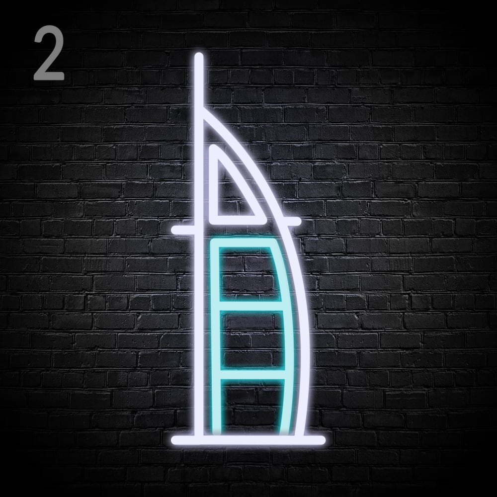
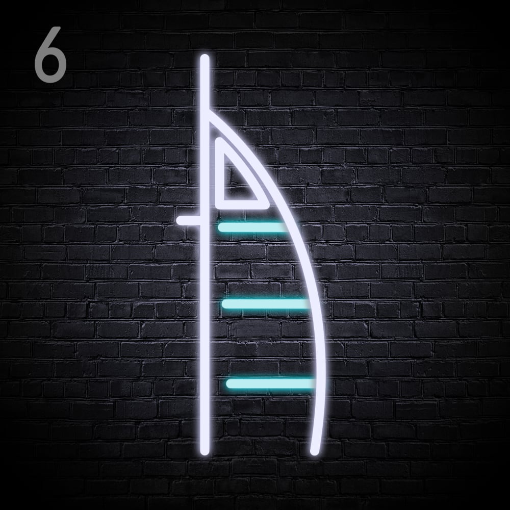
Based on the design, which 'Burj Al Arab' Neon Light would you rather buy?


Option A won this Ranked poll with a final tally of 36 votes after 1 round of vote counting.
In a Ranked poll, respondents rank every option in order of preference. For example, when you test 6 options, each respondent orders their choices from first to sixth place.
PickFu requires a majority to win a Ranked poll. A majority winner differs from a plurality winner. A majority winner earns over 50% of the votes, whereas a plurality winner earns the most votes, regardless of winning percentage.
If an option does not earn a majority of votes, PickFu eliminates the option with the lowest number of votes. The votes from the eliminated option are reassigned based on each respondent’s next choice. This process continues in rounds until a majority winner emerges.
Scores reflect the percentage of total votes an option receives during the vote counting and indicate the relative preference of the respondents. If there is no majority winner, look to the scores to see how the options fared relative to one another.
| Option | Round 1 |
|---|---|
| A | 72% 36 votes |
| C | 20% 10 votes |
| B | 8% 4 votes |
36 Responses to Option A
I would probably buy the light shown in Choice A first. I like that the blue neon lines in here make a completed shape, I find that looks the best. The other two just look 'weird' to me, for lack of a better way to put it, by just having those disconnected lines. The full shape, definitely, feels more right.
i feel like option a looks the most complete so i chose that one first, the other 2 are a close second to each other, but overall i prefer a
I feel like option A will be brighter when in a dark room. The more abstract designs give off less lumens.
This product is most color and design in beautiful buri al arab neon light in good quality and the natural light atrium and world tallest measuring the best in entertainment in the person in like this light
This product is most color and design in beautiful buri al arab neon light in good quality and the natural light atrium and world tallest measuring the best in entertainment in the person
I think that this option looks the most like the actual tower and also just looks better and more appealing overall.
Only A actually looks like the Burj Al Arab.
I voted for option A, it looks the most complete compared to the other two signs. The other two signs look like there are pieces missing.
Option A looks the most full and accurate
I like option A the best because it appears to be a more full and complete product. I like option B the next best because it is the next most complete. I feel like option C looks empty.
I like the bottom portion of it the best in Option A, as it looks fully like a building. I'm referring to the turquoise portions. Option B is last due to the slimmer profile of it not being as appealing in the top portion.
I prefer the option A neon light design because because the inner blue light look more like the profile picture of the luxury hotel in Dubai. I chose option C second because the lack of the frame around the blue lights makes the neon light design look more like a fish or bug than a luxury hotel. I chose option B last because the smaller triangle in this neon light design make the lights look more like a mouse than a luxury hotel.
I love the shape of the light. I also like that the light is fully enclosed. It makes it all look better and classier.
My choice is option A as rank 1 because of the product design and the fully covered light designs are very attractive and unique from others so i choose this as my choice.
I would choose choice A first because it looks more complete and packed well without much spacing and it will give the best light beams in a dark place then I would choose choice B which has a closer design to A with having a closer design which brings the lighting closer then the last option will be C which has a huge spacing between the lighting lines making the design to offer little amount of light which is not really concentrated.
C looked too incomplete; A was the most well fleshed out.
I like option A the best because I like how the lines are perfectly formed to resemble a building with a base. I like that the lines are complete because it makes it look more aesthetic compared to the other options where the lines look incomplete.
I like the maximum design of A, it's more complete looking and sharp, finished, ,B is fuller and eyecatching, it looks a bit off center with the wider arch , C is nice but narrow looking and unfinished.
I like option A the best, it has more light and looks fuller. Options B and C look really similar but I don't think that they look as good as option A.
A looks more like the sail shape of the building.
I put in order by the designs I liked - A is best then C and B
I prefer choice A overall. I think this is the best overall image because it has the most complete looking and appealing design to me. I think the other options look a bit empty to me.
I prefer the option with the full frame because it is easier to see where the object ends.
A's design is way different than C and B. C and B are similar to me but C is a bit better
A is more Meaning Full
A is nice and complete looking. C and B feel unfinished. C looks slightly better since if it is going to look unfinished then might as well go minimalist.
I like Option A. It's attractive and looks complete. I happen to like all the edges closed. The other two designs are too "open" for me.
A is my favorite, it just has that special touch that I really love.
A has the most detail out of all 3
This one looks more complete. It is very nice to look at. It is bright.
A has the most completed look. C looks unbalanced.
This option feels the most "complete", symmetrical, and balanced of all the given options. The other options feel unbalanced and imcomplete.
A the full design looks much better. It feels real.
I prefer a solid base, even if it's just a look with brightness.
I like option A because the design has more detail.
I like the closed look of option A
4 Responses to Option B
I prefer Option B as my first choice. It looks the most like the famous hotel and has a simplicity that's pleasing. Option C is also quite nice and makes a statement. Option A seems to attach too many lines and loses the icon shape and makes it look like a simple boat.
i would buy the light in option B based on the design because it has the best pattern to it
Based on the design, the 'Burj Al Arab' Neon Light I would rather buy is Option B. This logo best reflects the B and As in the words Burj Al Arab.
I don’t really have strong feelings either way. I slightly prefer b as that caught my attention first.
10 Responses to Option C
I like these choices overall, it's pretty close though
I ranked my choices based on my aesthetic preferences for the design of the light.
I just selected in order of designs that most jumped out to me and that I could see myself purchasing.
The less volume that takes up space in the corners givese that mysterious feel.
I based solely on design - C is best then B and A
I prefer this option. I like the spacing of the horizontal lights better than option B and the overall openness of this design as opposed to the boxed in design in option A.
I'm least likely to choose A. I don't like the enclosed bottom design. Somehow it makes it feel heavy and blocky.
Option C and B are similar, I don’t see much difference. Option A looks a lot heavier.
Option C was my first choice because the design of that light struck a good balance as it was neither too simplistic nor too complicated. Option B was my last choice because I felt that design was fine but somewhat too simplistic and boring compared to the first choice. Option A was my last choice because that product design seemed too busy and complicated.
I like that it looks like parts of it are floating.
Explore who answered your poll
Analyze your results with demographic reports.
Demographics
Sorry, AI highlights are currently only available for polls created after February 28th.
We're working hard to bring AI to more polls, please check back soon.

