Poll results
Save to favorites
Add this poll to your saved list for easy reference.
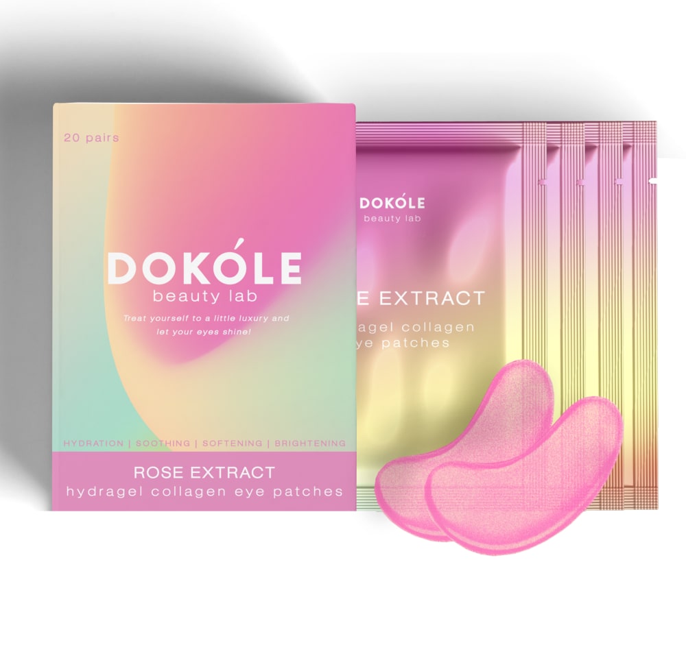
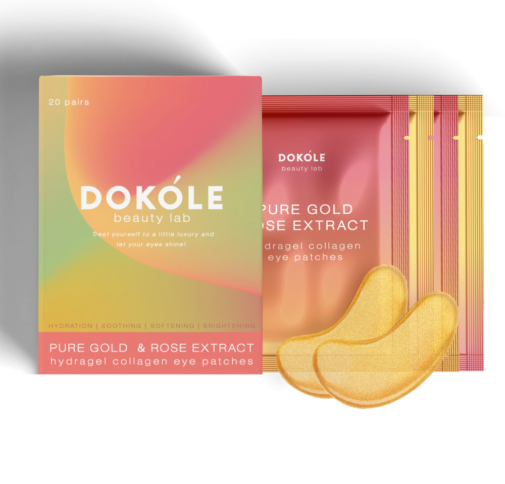
Based on the design, which eye patches(mask) would you rather buy?
27 Responses to Option A
The pink and teal looks much more pleasing and attractive to me
These colors are more complementary and look more "beautified"
I choose Choice A because I find the scent of rose extract pleasing and I also like the pink packaging. I didn't choose Option B because the addition of "Pure gold" confuses me. Is it supposed to be a component of the product, the color, or part of the scent?
I think Option A is a little easier on my eyes to read. It's pleasant to look at with the softer color design. The other one has an almost neon-like quality that makes me look more at the graphics but not at all at the product/content.
the color hue on this looks a lot more premium and not expensive
Option A is my choice for the eye patches mask because the color of pink seems to bring in a cooler effect.
I would rather option A the lighter pink. Option B is okay but option A is much better.
A has a gentle, more soothing and welcoming color to it. B just looks fiery and hot, like it might burn or tingle more.
Pink is my favorite color, so no question, I would pick the pink one
I love how this one is a bit lighter in color as it feels caring and I also can see the difference in colors better
Love A because of the awesome relaxing colors which are very alluring~~superior design.
I think A would be a better choice for something I am going to use on my eyes. Not to sure about the gold and rose extract that is in B.
I like the pink color because it looks so pretty and is probably designed by a woman.
I would choose option A. I like the color of the packaging. The package is bright and stands out. I also like how the eye patches are a light pink shade.
I like this color option better. The pink looks fun to try.
The Option A color combination is super pretty.
I picked option A because I like the lighter pastel color scheme.
I love the colors on this packaging much more. I will always go with those pretty pinks and blues any day over everything else.
I like the design of option A the best I would slightly prefer buying it over the other option I like the blend of colors a little more in this option I prefer the blue that is in this one over the orange tint of the other option. I personally just prefer the color and the style of it more and would like it for my own use.
The pink box and eye patches both are better looking compared to other option.
Because the Rose extract design matches with the color design and looks very impressive.
I prefer Option A as my first choice. The mix of colors, especially the pink tones, are dreamy looking and very eye catching. Option B is perfectly fine but not as striking and the colors do not stand out as much.
The colors are pretty. Orange is not an appealing color to put on your face.
I choose option A. because its pink colour shade was mesmerising and better appealing than option B.
Based on design i would rather buy option A because the soft subtle pastel pink colour packaging is appealing .
Prefer muted colors A rather than bright colors B. Eye patch not something I want to standout
I prefer option A because this product packaging design is more pleasant and effective.
23 Responses to Option B
I would buy this one it like getting two products in one package I like what it has in it and I like the design of the packaging
I don't like pink-based products. So, I wouldn't buy either of these. That said, B looks better than A.
I prefer the yellow color to the pink, which seems inflammatory to me.
I like the color and it is gender neutral.
I like B better because I like the colors better. They're more vibrant.
I like the design of option B. They would fit much better.
I don't like pink, and B looks more interesting.
B is much more attractive and vibrant. It immediately stood out to me.
I like the orange packages much more.
B.. This was very hard to choose from and between the two I chose the one I did because it has more of a deeper color to the packaging and I like the gold eye patches it really pops.
I would rather see the world through a gold tint than a pink tint.
I like the ingredients it's made out of more, pure gold and rose extract and think it would be nice for collagen eye patches
Option b with its rose and gold ingredients intrigue me. The package is very attractive.
I like B because it doesn’t have all the pink. I think it plays to a larger audience.
Based on the design, I would rather buy option B product. Because when compare these product there is only different in colors which is better shade present in option B than option A.
THe package colros a re unique and relaxing. I also like the peach patch color.
I prefer the golden eye patches
Based on the design I prefer B. The image seems to have more going on. Also the colors compliment each other very well. The colors are great for the "pure gold and rose". Orange is also my favorite color.
this looks more like it is infused with gold or something
I loved the design and the combination of option B "Pure Gold and Rose extract" looks more impressive than option A tagline "Rose extract"
Yellow is my favorite color
My choice is option B, because this option product are made two different ingredients rose and gold extract. But other option only used rose extract. The gold extract hydrate and improve skin elasticity and skin tightening property. For this reason choose option B.
I like the gold patches. They look more special.
Explore who answered your poll
Analyze your results with demographic reports.

