Poll results
Save to favorites
Add this poll to your saved list for easy reference.
Based on the design, which product would you rather buy?

Option F won this Ranked poll with a final tally of 30 votes after 5 rounds of votes counting.
In a Ranked poll, respondents rank every option in order of preference. For example, when you test 6 options, each respondent orders their choices from first to sixth place.
PickFu requires a majority to win a Ranked poll. A majority winner differs from a plurality winner. A majority winner earns over 50% of the votes, whereas a plurality winner earns the most votes, regardless of winning percentage.
If an option does not earn a majority of votes, PickFu eliminates the option with the lowest number of votes. The votes from the eliminated option are reassigned based on each respondent’s next choice. This process continues in rounds until a majority winner emerges.
Scores reflect the percentage of total votes an option receives during the vote counting and indicate the relative preference of the respondents. If there is no majority winner, look to the scores to see how the options fared relative to one another.
| Option | Round 1 | Round 2 | Round 3 | Round 4 | Round 5 |
|---|---|---|---|---|---|
| F | 30% 15 votes | 30% 15 votes | 32% 16 votes +1 | 38% 19 votes +3 | 60% 30 votes +11 |
| C | 18% 9 votes | 20% 10 votes +1 | 24% 12 votes +2 | 36% 18 votes +6 | 40% 20 votes +2 |
| B | 26% 13 votes | 26% 13 votes | 26% 13 votes | 26% 13 votes | Eliminated 13 votes reassigned |
| D | 16% 8 votes | 18% 9 votes +1 | 18% 9 votes | Eliminated 9 votes reassigned | |
| G | 6% 3 votes | 6% 3 votes | Eliminated 3 votes reassigned | ||
| A | 4% 2 votes | Eliminated 2 votes reassigned | |||
| E |
Age range
Amazon Prime member
Education level
Gender identity
Options
Personal income range
Racial or ethnic identity
Type of community
2 Responses to Option A
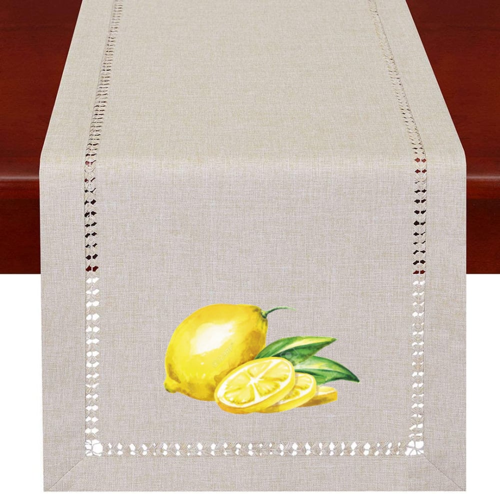
I chose option A because they look like what I would see on my counter when I am working with lemons. These are very beautiful I would be quite pleased with any of them. They would be a great table runner for a breakfast setting.
I like the one with the lemon slices the best.
13 Responses to Option B
I prefer Option B because it has the most retro design. It has a mid-century look that is not too terrible.
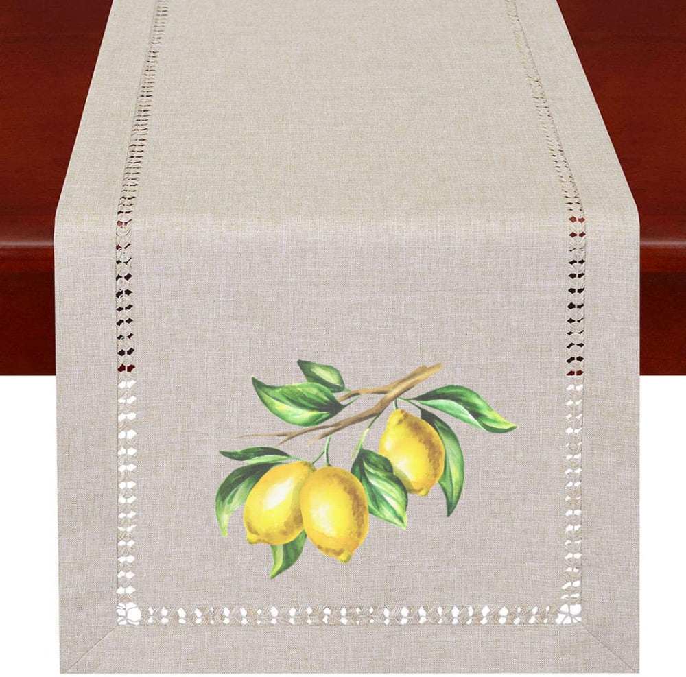
Option B has the most pleasant illustration of a lemon branch. The lemons are smaller than some of the other choices and it feels natural, like a branch I would see on my own lemon tree. I prefer objects in odd numbers so 3 lemons is more attractive than 2 such as seen on F. E is my least favorite because the lemons don't look natural spaced so far apart.
B and F look the most artistic. They're more interesting to look at
Loving the vines along with the lemon and like the color of the table runner best. More on the beige side. D looks cheap to me.
Based on the product design rather buy is listed in the following order:1. Option B because it has more greenery in the photo which makes it the most attractive.2. Option F because it is pretty but I prefer option B over this option.3. Option A because it has a good amount of greenery but the image looks a little faded.4. Option C because it shows the actual cut showing the inside of the lemon in the display .5. Option E because it is separated whereas the other options are more grouped together. 6. Option D because it has an added image but the design is so blended7. Option G because it is less attractive due to a faded look.
I like the larger design on the ends
B: Most balanced composition, liked the placement of the branch / F: Close second, the green branch sticking up was off putting / G: This is the nicest of the cut/whole lemon combos, very balanced composition / A: Nice, but the thin slices and the thin lemon weren't as appealing / C: Two cut lemons balanced against the whole, two leaves nice and tucked under / E: The are just sad lemons randomly placed. No effort for balance or harmony. / D: Don't like the white runner as much as the linen colored.
All of these product designs would be much better WITHOUT the ''lemon'' applique - which, in my opinion, ruins them.
I quite like this look, option b is my favorite, realistic and compliments the runner with the size and scale, option a, f and c are also nicely done, the realism is nicely done, option g is simple in comparison to the others, i dont like the image in option d the color is off, and option e is not natural looking
I think B has more real looking lemons. It stands out more than the others.
I like B and F the best. Being still on the branch just makes it look so much natural and gives it better composition. Of the ones off the branches, C and G are the best because they have the multiple fruit in natural still life positions. I just think the three is a better make up then the 2. A and D are next then E is last, it looks awkward and I just don't like it.
I am not a fan of the lemons. I like option B the most people there are some of the greens to mix it up with the lemons.
I like seeing the lemons attached to the branch. It makes me feel closer to nature.
9 Responses to Option C
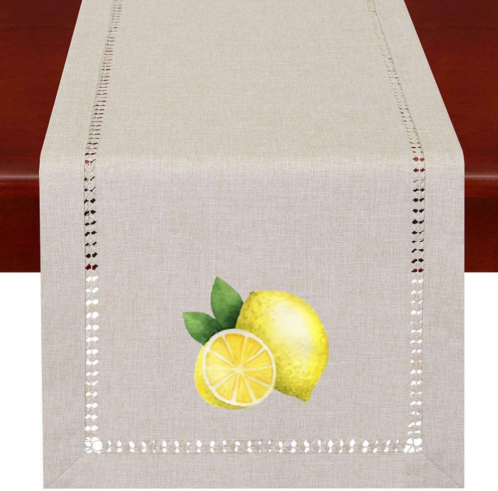
I chose by options that seem the most bold and vibrant.
The cut lemons look the best so those three are first. I like the larger vs. smaller lemons and ranked the rest by that, except I don't like the leaves in B so that's last.
I like these ranked as I have them. I like the ones with a whole lemon and with a few slices. They look fresh and appealing for any kitchen decor
I love the lemon that is sliced in half - I can almost smell it.
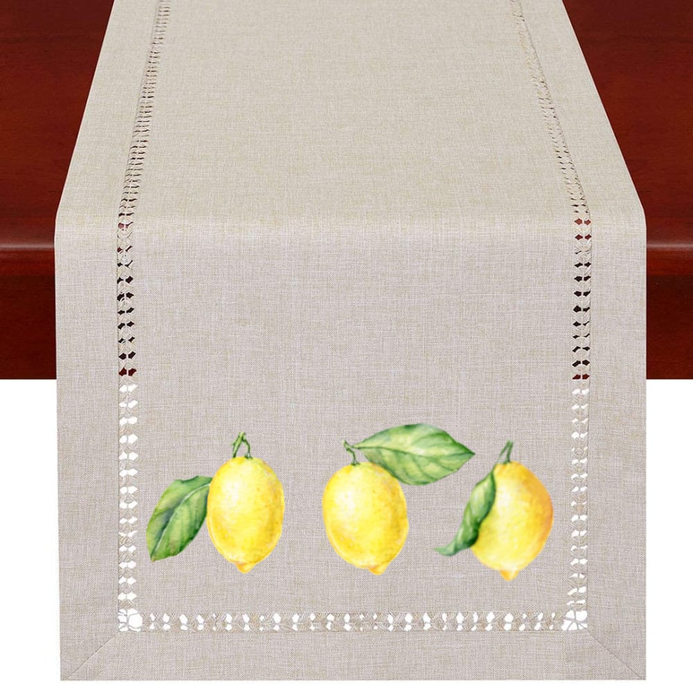
The three in a row in E looks a little unartistic, I like C the best
I love C. The sliced lemons look delicious. I also like the placement for the table runner as well as the color of the table runner.
I like that C has 3 items and the size seems appropriate. Then B has an appropriate branch with lemons. I find it pretty. I like the branch on F but I wish that it had 3 lemons. D is just ok with the lemons and one leaf. A is a pleasant picture but I am not sure that I like the slices. G doesn't look right with just the 2 lemons and E has 3 lemons that are disjointed from each other.
Option C is the image that I think is best and the one that I would want to purchase. I like how the lemons are sliced and the little green leaf makes the bright yellow lemon slices stand out even more. The color yellow makes me so happy and my kitchen is yellow so I would want to buy this table runner
I like the use of most of the space at the border, C is designed beautifully and fills the space without overwhelming it.
8 Responses to Option D
The first 3 I really liked, I however didnt like when the lemons were seperated in the last option
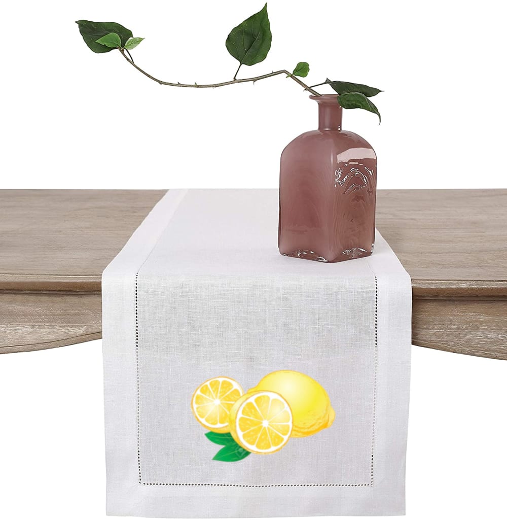
I love lemons, so I really love all of these. I chose D because it looks like the runner is white, and the other runners look more off-white. Also, I really like seeing the 2 halves of the cut lemon next to the whole lemons. This would make a lovely table runner!
Option d has a non perforated border around the runnet. I like the solid look better than holes around the perimeter.
the smaller lemon with the slices is more appealing to me
I love that it's so bright and I love the solid trim, the second is just as bright, but I don't love the "open" trim as much. The others are not as bright, but are brighter in order of preference.
Based on the design, I chose D because its presentation in practical use is helpful in a making a wise decision.
My mind loves elegance and harmony. I love decorating with lemons; I think it the "yellow" that my mind equates with comfort and safety. And, likewise, I preferred these different arrangements with an eye toward general loveliness and symmetry, culminating in downright ugly.
I think that D & C have a more interesting and more balanced look, that just makes the whole thing look more attractive. I do not care for either B or E. To me, they just look rather odd and unbalanced.
15 Responses to Option F
I like the designs where the lemons are bunched together and on a branch the best. I don't like the lemons that are separated, because the design in less harmonious.
I like the way I am drawn to this one it has an appeal that stands out to me more
I like the more natural look of F with the leaves and the fruit whole. Looks pretty and not as artificial.
I like F because I like the way the two lemons are on a branch. and the frame around them. I prefer the lemons not cut and on the branch to the ones that are cut . It looks nicer that way.
I chose F because I like the leaves and more lemons. E is too spread out. The others are all nice and had to choose.
I picked F for the realistic look of the fruit still on a stem. I picked B for the fruit still on a tree limb. I picked G for the fruit with slice and leaves. I picked C for the larger fruit image and the leaves that were too green. I picked A for the arrangement of the fruit and the slices. I picked D for the added vase on the image. I picked E for the non symmetry of the pattern.
I like the colors in the leaves, it provides depth and a realistic quality to it. I also like the wholes pattern on the border, it provides a country feeling.
I like F and B only. The rest are too bland. I picked F first because the colors were more vibrant and bright than B. That said, if the color vibrancy was the same in B as F, I'd probably go with it.
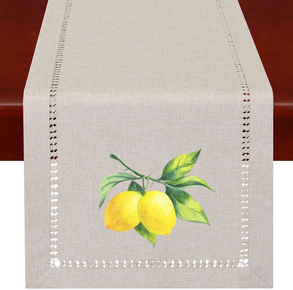
After carefully studying and comparing all seven product images displayed above, I selected Option F as my first choice and the one that I would most likely click on to purchase for myself. I felt that the design and color contrast in this image had the most eye catching appeal. Option B was my second choice followed by Option A, Option G, Option C, Option E and finally Option D with all seven rankings based on my own personal opinion of the relative attractiveness of each product image.
I like the fruit shown in option F because it is shown in its most natural, hence beautiful state: not sliced, ready to be eaten, or arranged. The composition of the drawing is exquisite.
I prefer the whole lemons (not cut) still on the branch. It has a more vintage, botanical look to it.
Having the lemons still attached to the tree branch, gives the room more colors to decorate with.
I like the in nature presentation with the fruit still on the branches. Is a more natural look than with the fruit already cut up.
I chose the lemons that looked most realistic to my eye. I liked only a small amount of greenery. Some of the ones I didn’t liked looked unrealistic or were to lined up or not natural. I also preferred the closer up images (the bigger ones) vs the smaller ones.
I like F and G the best because the lemons look the “freshest” and they show the right amount of green leaves. A and d were my least favorites as the leaves look wilted to me? The example with 3 lemons across the bottom (E) I feel they should be closer together.
3 Responses to Option G
I like the way the lemons look on G. All of them are nice but G is the best
I chose G first because I like the border and the two lemons look nice, not too big, nicely centered. I chose C next because, even though the lemons are larger, they still look nice centered in the table runner. I chose F next because I'm not fond of the branch attached to the lemons but I like the size of the lemons. I chose A next because I don't like the two lemon slices with the lemons. It feels like I'm waiting for a shellfish platter or something where I'd have sliced lemons as decorations. I chose B next because I still don't like the vines and these lemons are the vine are too small and there's too much space around the lemons relative to each other. They should be closer together. I chose E next because I don't like the three lemons spaced out. I know you're supposed to decorate in odd numbers but these lemons are too aligned and symmetrical to give the casual feeling I get from these lemon table runners. I chose D last because I didn't like the smaller holes around the border.
the three whole lemons evenly apart look too arranged, last. G looks clean and fresh, and less crowded. then it's C, then A. D would be nice without the vase on top of it. F is better than B - fewer is better.
Explore who answered your poll
Analyze your results with demographic reports.
Demographics
Sorry, AI highlights are currently only available for polls created after February 28th.
We're working hard to bring AI to more polls, please check back soon.

