Poll results
Save to favorites
Add this poll to your saved list for easy reference.
Based on the image, which color pallet do you like better?
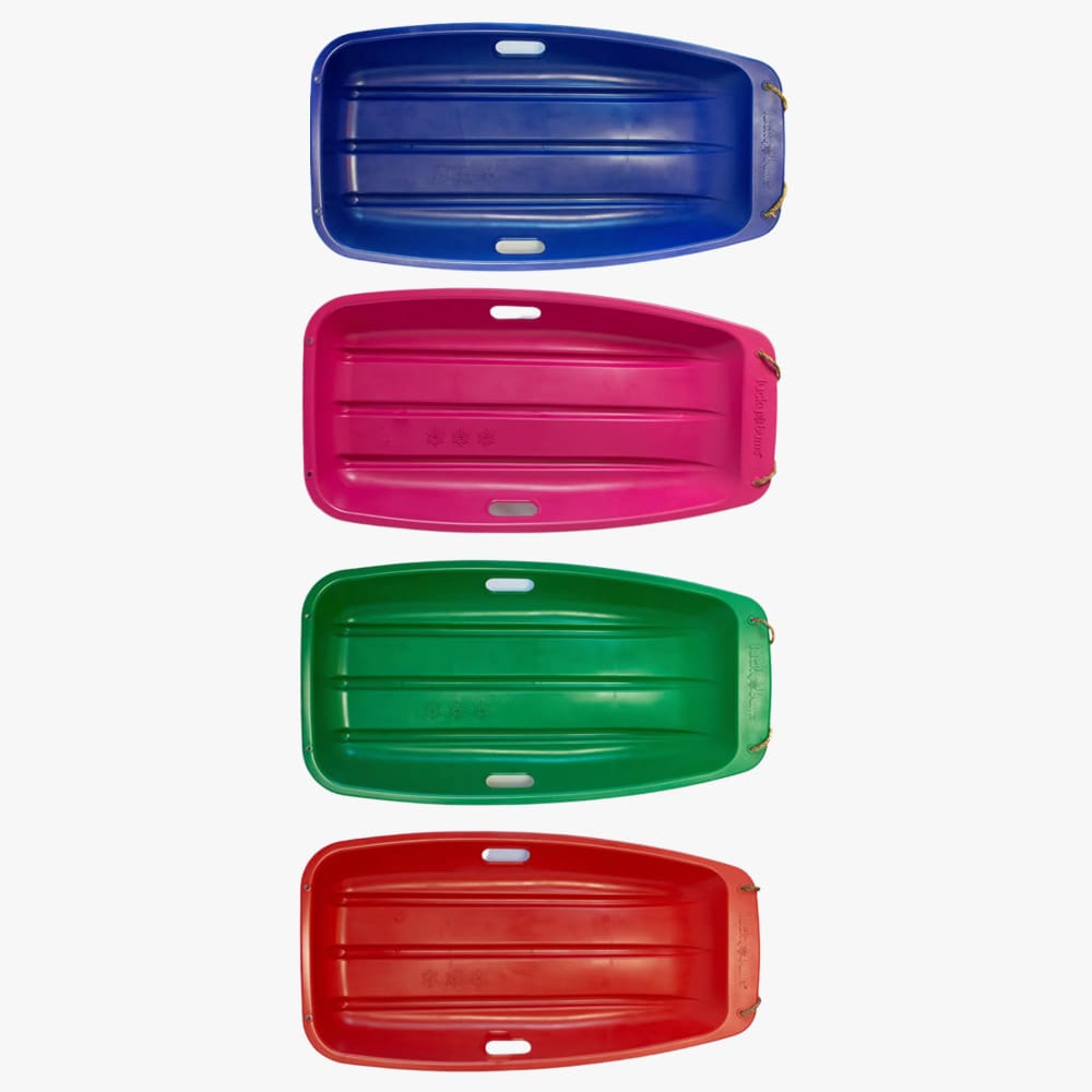
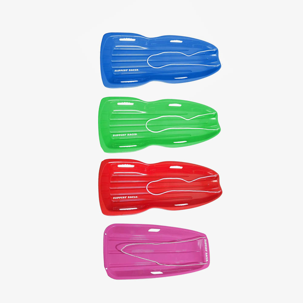
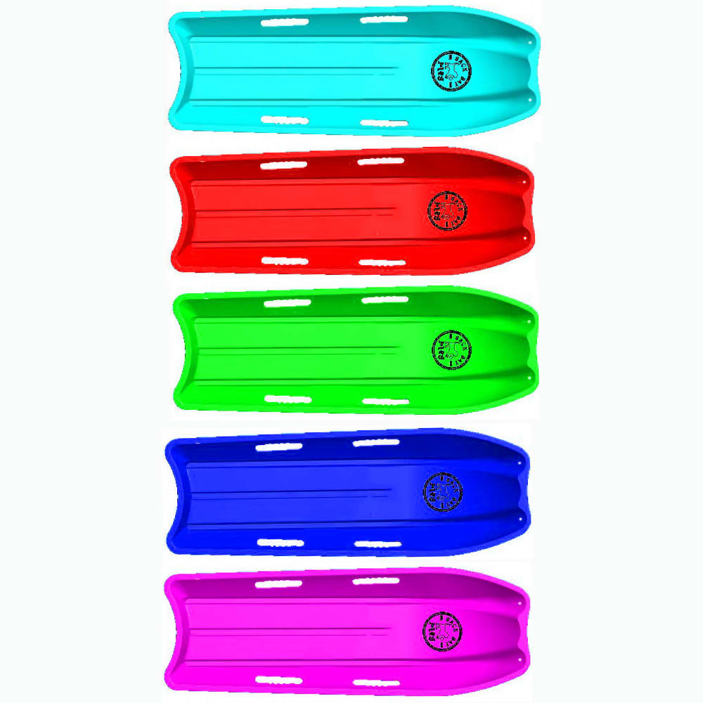
Option C won this Ranked poll with a final tally of 34 votes after 1 round of vote counting.
In a Ranked poll, respondents rank every option in order of preference. For example, when you test 6 options, each respondent orders their choices from first to sixth place.
PickFu requires a majority to win a Ranked poll. A majority winner differs from a plurality winner. A majority winner earns over 50% of the votes, whereas a plurality winner earns the most votes, regardless of winning percentage.
If an option does not earn a majority of votes, PickFu eliminates the option with the lowest number of votes. The votes from the eliminated option are reassigned based on each respondent’s next choice. This process continues in rounds until a majority winner emerges.
Scores reflect the percentage of total votes an option receives during the vote counting and indicate the relative preference of the respondents. If there is no majority winner, look to the scores to see how the options fared relative to one another.
| Option | Round 1 |
|---|---|
| C | 68% 34 votes |
| A | 26% 13 votes |
| B | 6% 3 votes |
13 Responses to Option A
I like the darker colors, they're less "loud" to me over the brighter ones.
I really like the tone of A's colors the best. they seem special.
Just going off of the colors alone, Choice A easily ranks in the top for me. I almost always prefer darker colors, and this time is no exception. All of these shades shone look better darker rather than light.
These colors are a bit darker. They are easier on the eyes.
I like the more muted colors - they are pretty and different than what you usually see. I chose B as my second choice because they are similar colors but a bit more bright and C was my third choice because they are so bright - almost neon - and I tend to prefer more muted colors that don't stick out so much.
Option A looks the best because the colors match each other better, and I prefer the less shiny, matte look of the sled. The colors of B look second best, the shiny look isn't for me.
I can't really tell what the product is supposed to be, but in general I like the matte colors in A the best.
I really like how A isn't super bright, like the other options. I like the simple coloring on it and it caught my eye right away. B and C are just to bright and I don't really like them.
I prefer Option A because it is visually appealing and eye catching in my opinion.
I like A best because it is more visually appealing to me personally and then C more than B because of the vibrant versus dull colors
I like A because I think the darker colors look the best
The darker shades will age better if it flakes off or sun damage, it looks much better than the brighter colors
A isstandard and bright
3 Responses to Option B
With Canva's color palette generator, you can create color combinations in seconds.
I picked B and A as my top choices as the designs look like it's very strong and bold to sled on.
These colors seem more mainstream and natural to me.
34 Responses to Option C
I prefer option C because I think that it is the most interesting and visually appealing color scheme out of the three options.
i like the color palette in option C more because they are bright and vibrant looking
i like these colors the most, they really make it stand out.
I like C's color palette best because it looks bright, modern, and happy. A is also bright but I think the colors are not as vibrant. A looks too dull and washed out.
C has the most bright and energetic format that keeps a strong sense of purpose and vibrancy to the brand.
I chose C 1st because I really like the bright colors. They are vibrant and fun.
I like choice C because the bright colors look good together. I think choice A looks dirty to me
I prefer Option C because they are the most vibrant and I feel like my kids would love them the most.
I really love the way the colors in C pop. They are bright and vivid and offer a nice range in terms of palate.
The colors are bright, and different. I like that they are not just the standard colors.
My choice was C because the colors were more vibrant and seems to have a sleeker shape. B however, I do like the shape but does not really pop as much as the color on C. A looks very plain and old.
I like C and B more than A because they are brighter colors and stand out more.
I like the teal color on C, the design on A and the cute colors on B
I like the bright colors in C.
I choose C, Because I like the design and the color more attractive.
I like the brighter colors of C (and a little bit of B). They're eye-catching and appealing. The also scream "summer" and summer vacation to me.
I like C because I like the brighter colors. They get my attention first. I think the others are okay but I think the brighter colors of C are the most attractive.
C looks the most vibrant to me. A nd B are dull.
This pallet is bright and appealing. The colors pop and inspire attention.
Choice C is the color palette that I like the most because I like how bright it is. It looks really nice to me and I like how the colors of it pop and stand out. It is a nice look and is cheerful. Choice A is second because the darker tone with the more muted colors that it has to it is pretty solid as well. It is a look that is good. Choice B is last because it is kind of in the middle compared to Choices C and A so it does not really stand out either way like they do in terms of the color.
I chose C because I like the brightness of the color choices.
I like the shade and brightness of these colors. They seem more cheerful because of the colors.
Option C look exciting a vibrant while also looking sturdy
THE COLOR PALATTE WHICH IS IN THE OPTION C WAS VERY GOOD AND ATTRACTIVE TOO, THE COLORS WHICH ARE IN THE P[ALATTE HAS AN VIBRANT COLORS. IT WAS MORE ATTRACTIVE AND UNIQUE SET OF COLORS.
Option C has a much more vibrant and lively color pallet, so that is the one I would choose.
Although a bit longer than the other options, the color scheme is a bit brighter in option C. Its more attention grabbing, and seems more modern
Seems to be the brightest and most vibrant and something I would want
I like option C the best because the colors of the product in the image stand out more and grab my attention.
I went with the letter C, because they’re just brighter and gave a nice variety of colors.
Definitely like the bright option C. I'd take the brighter color choice.
The colors in C are nice and bright and you get an extra option with the light blue. B are also bright-looking though you only get four choices. A only gives you four choices and the colors look kind of dull and blah.
I chose based on brightest to dullest.
I like the variety and the bright colors, Image A's colors are a little bland.
I liked how bright and bold the colors in c were
Explore who answered your poll
Analyze your results with demographic reports.
Demographics
Sorry, AI highlights are currently only available for polls created after February 28th.
We're working hard to bring AI to more polls, please check back soon.

